2023 Wrapped
Look back at a year of design system work and get a sneak peak at what's next.
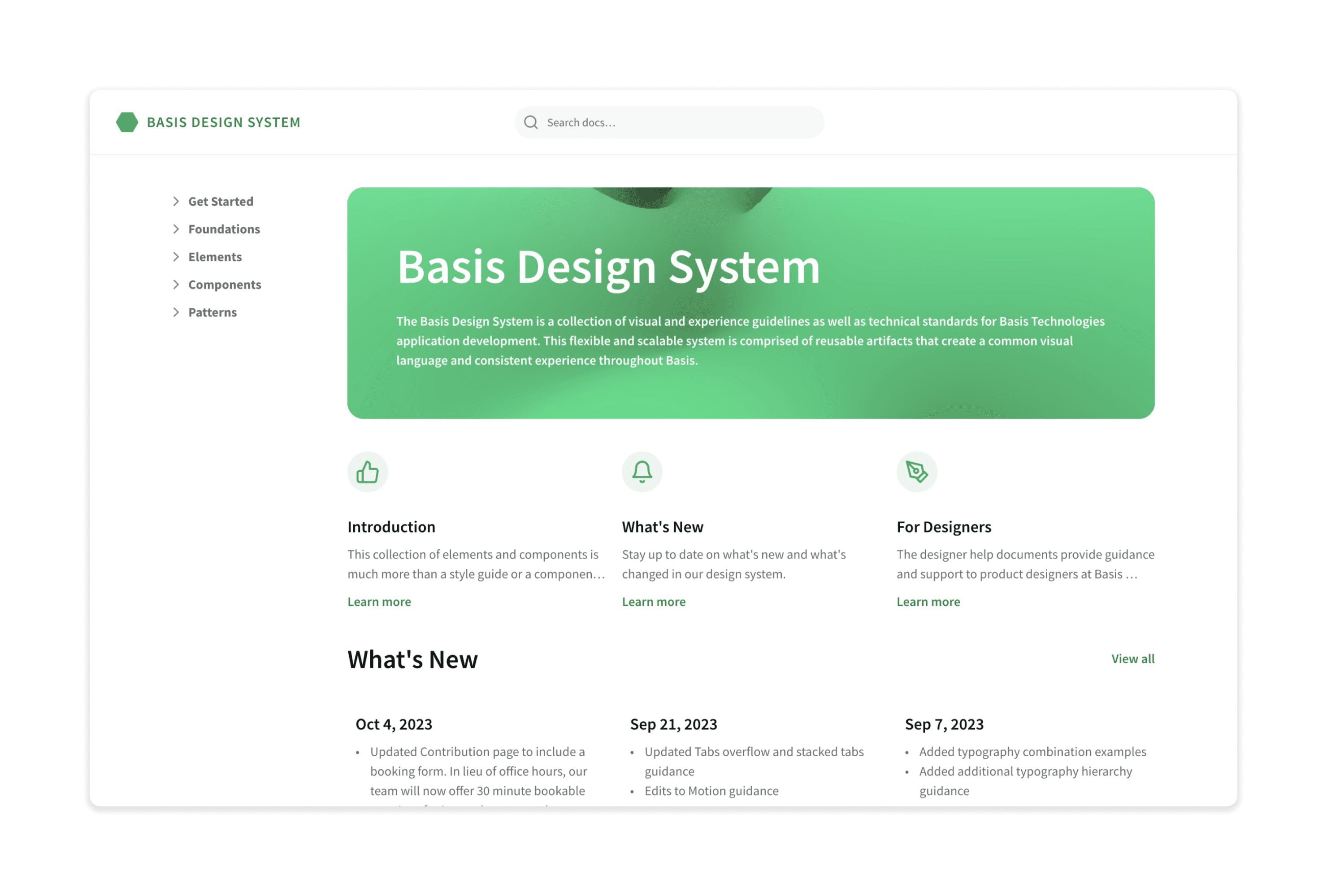
New Design Docs Website
We've rebuilt the design documentation website from the ground up using a platform called Framer. This will give us more customization and easier content management.
New Team Members
We've added several new faces to our team in 2023!

Inna Kogan
QA Manager

Kevin Roesch
Product Manager

Phil Van Tol
Staff Product Designer
New Styles
Shadow Styles
New “elevation” shadows styles that can be used to set up hierarchy in the page content. These have been implemented everywhere there are drop shadows (Modals, dropdowns, Flash, Panels, etc.)
Animation
We created new animation tokens and classes to help us maintain consistent animation across the app. We will also use these to start introducing more animation into Basis.
Responsive Breakpoints
Responsive breakpoints will allow us to adjust our components and page layouts to better adapt to different screen sizes.
Layout Classes
Created new layout classes to help us create more consistent and responsive layouts in Basis.
New Components
We've created several new components this year.
Check out these interactive examples. 👇
Dynamic Search
Dynamic Search allows users to search across multiple data sets and receive instant results as they type.
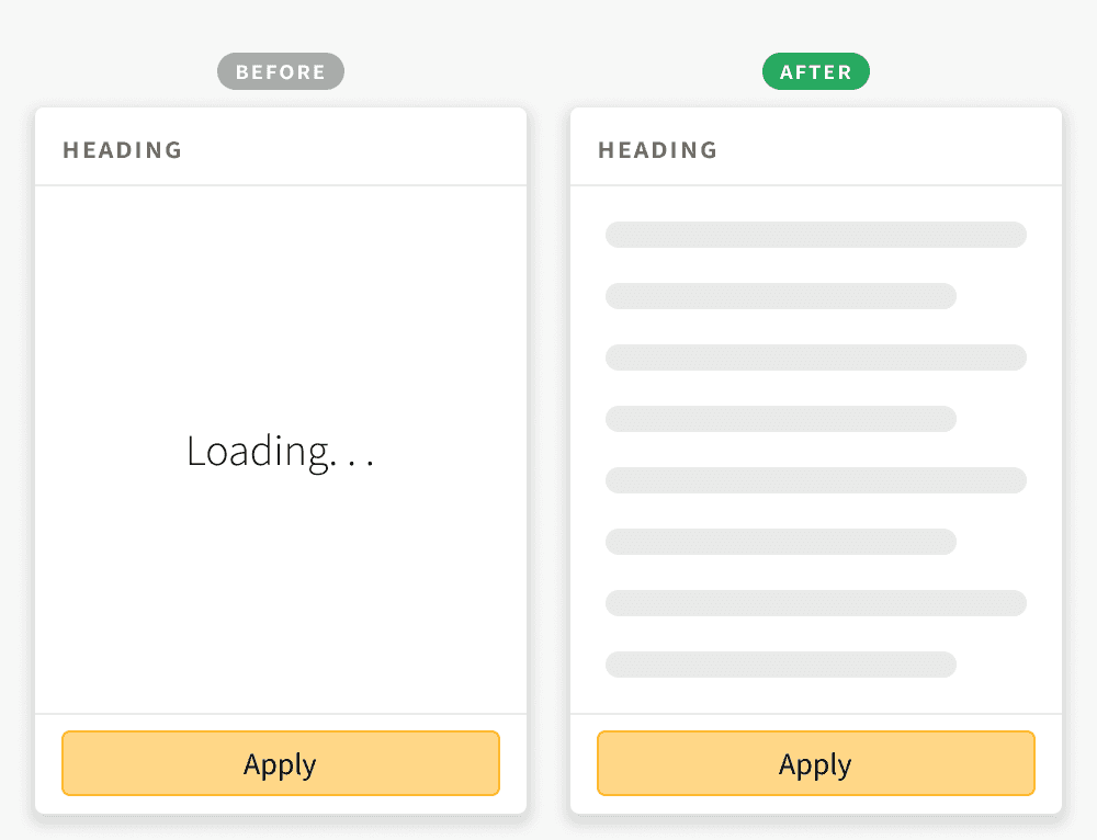
Skeleton Loader
A skeleton loader is a placeholder element that represents the structure of the page content before it is loaded.
Icon Buttons
Created a new Icon Button component to replace numerous clickable icons with tooltip patterns.
Components Updates
Component Animations
Applied new animations to components to better provide visual cues, feedback, and guidance. Animations include color transitions, size transitions and appear / disappear transitions.
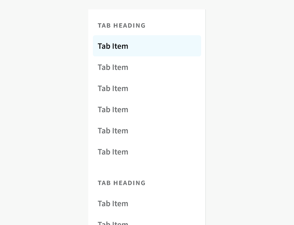
Stacked Tabs
Update the Stacked Tabs styles to better match our main navigation and to have a larger click area.
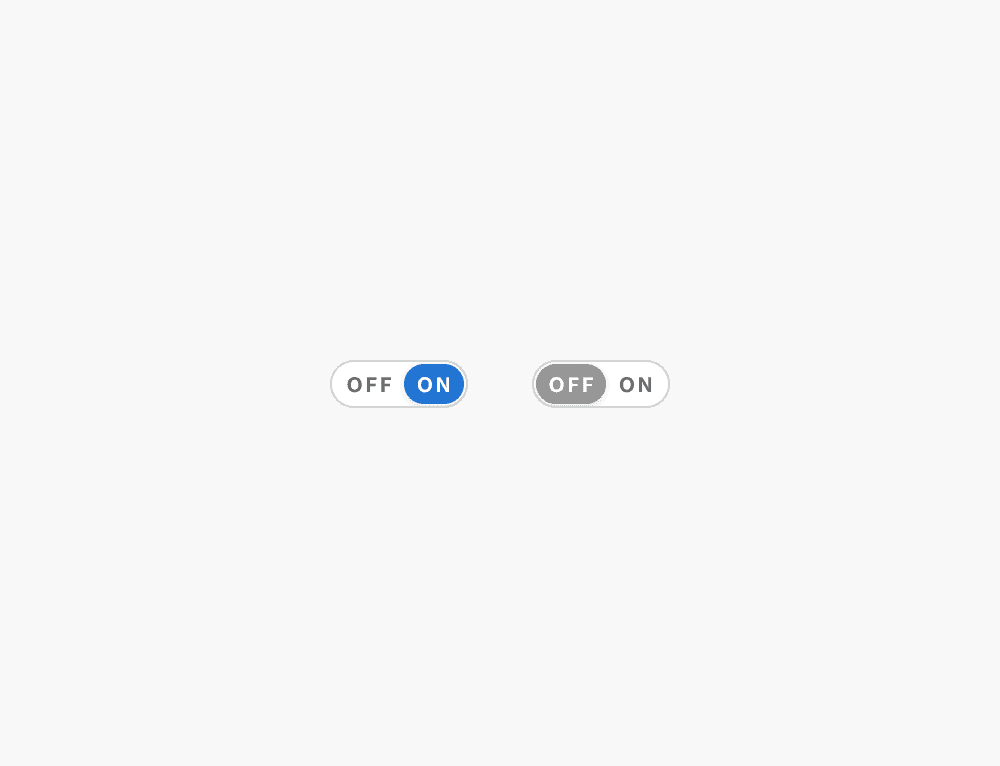
Toggle Switch
Updated the styling and click area of the Toggle Switch.
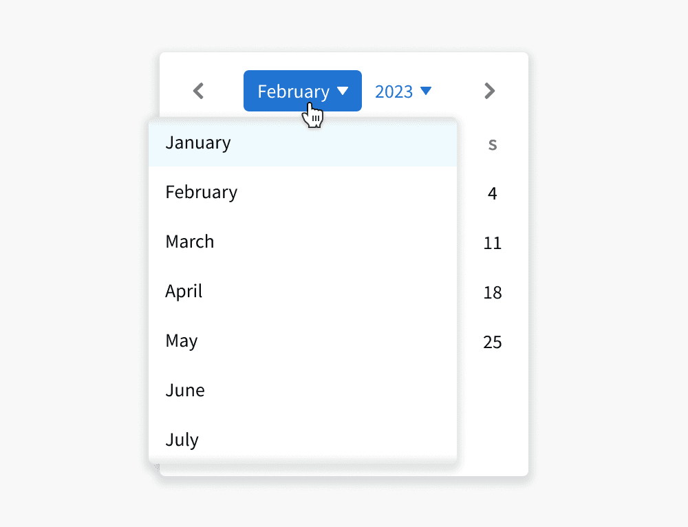
Calendar
Added month and year pickers to allow users to more quickly navigate or select across large time frames.
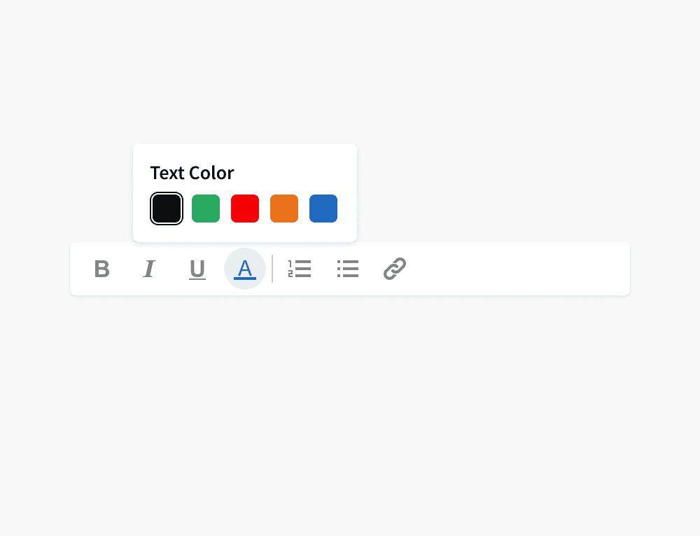
Rich Text Editor
Created new "toolbar" style variant that is always visible on screen. Also added the ability to change text color and add sub-bullets.
Responsive Components
Updated our global components to adapt to larger and smaller screen sizes. We will now begin updating individual page layouts to do the same
Basis Updates
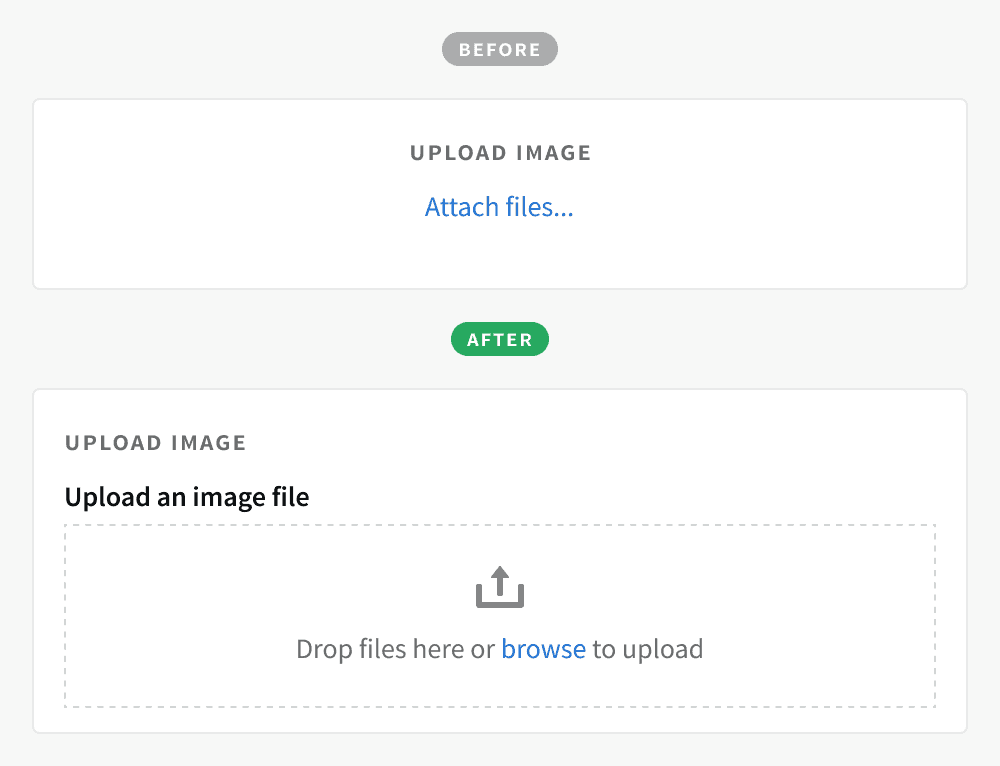
Attaching Files
Replaced many “Attach files...” links with the file drop component. This allows users to drag-and-drop files into a form and can display error messaging at the bottom.
Loading States
Updated the loading states of many components and pages to use the new Skeleton Loader.
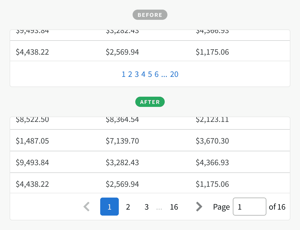
Navigation
Replaced "one-off" versions of pagination with our new Pagination component.
Dashboard & Campaign Overview
Updated these pages to use our new “card” styles, giving them a more modern look and feel.
Accessiblity
We’ve implemented updates and new features to make our existing components and pages more accessible.
Added aria labels to provide additional information for assistive technologies, such as screen readers
Added a Skip to main content link
Improved color contrast to help users with color blindness or low vision
Created semantic association between form labels and inputs

New Storybook Pages
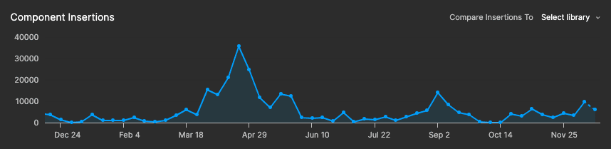
By the Numbers
Figma component inserts
26.6
K
Insert increase from 2022
43.7
%
Total component instances
752
K