

Content
1
Descriptive
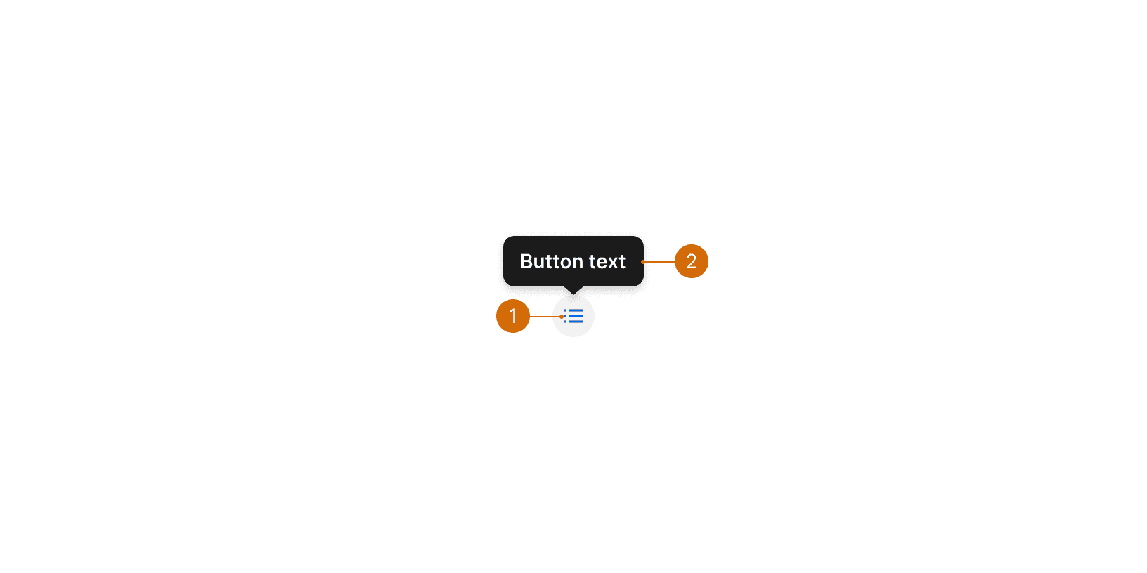
The tooltip should describe the action that occurs when the user selects the icon button. Do not simply use the name of the icon as the tooltip--this is not usually descriptive and helpful enough.
In most cases, you should follow the same principles as you would for text button labels: use a verb phrase that includes the action and a noun. See Buttons.

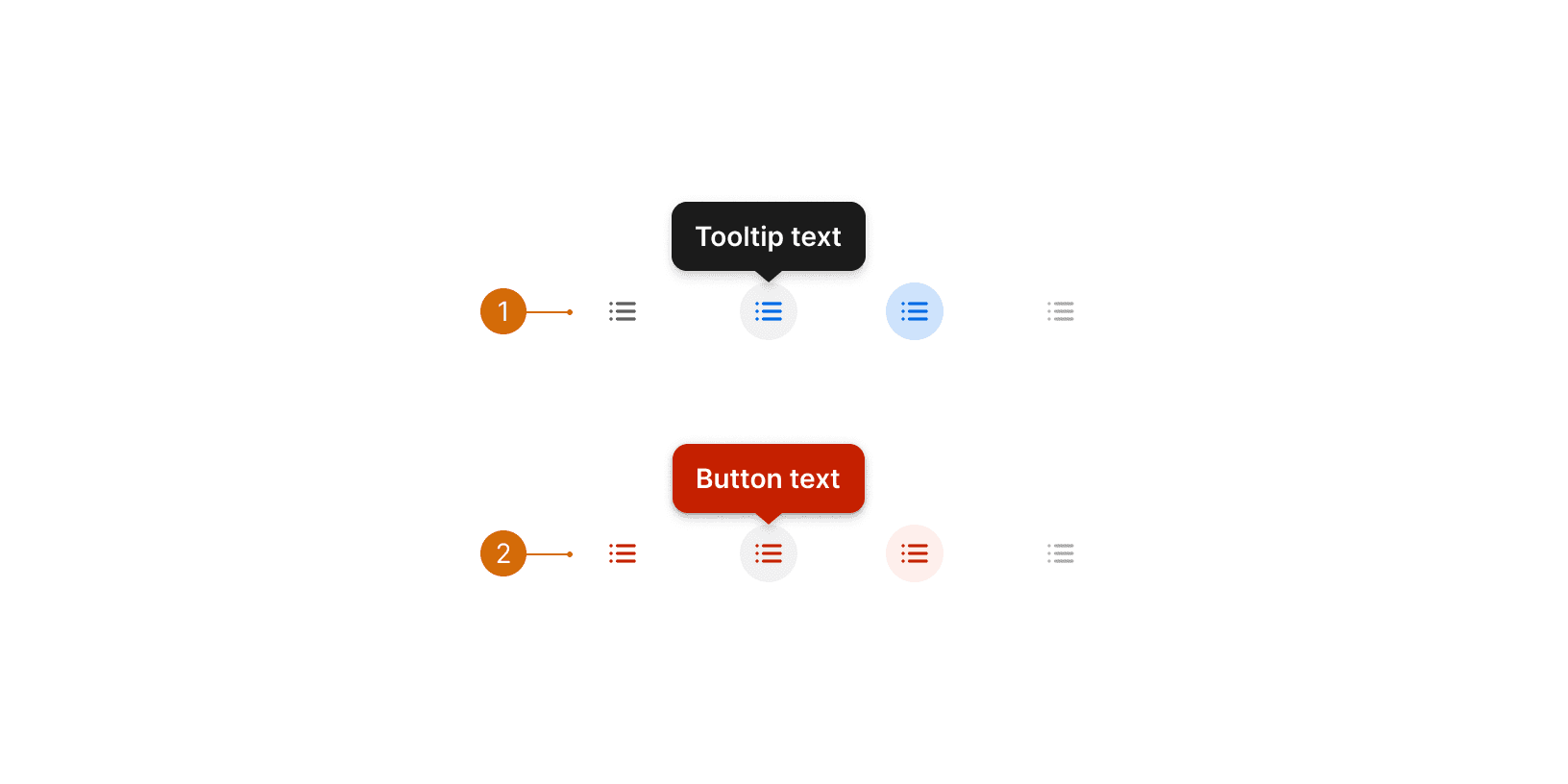
Do

Don't
2
Nouns
For common or generic buttons, it can be appropriate to just use a noun that identifies what will open when the user selects the button. For example, Settings for the gear icon.
