Ready
Links
Links are primarily used for simple navigation to another page, or to an anchor within that page. Link text should be brief, and should clearly indicate what the user will be navigating to. A link is typically placed within or following a sentence, but can also be used by itself.
Details
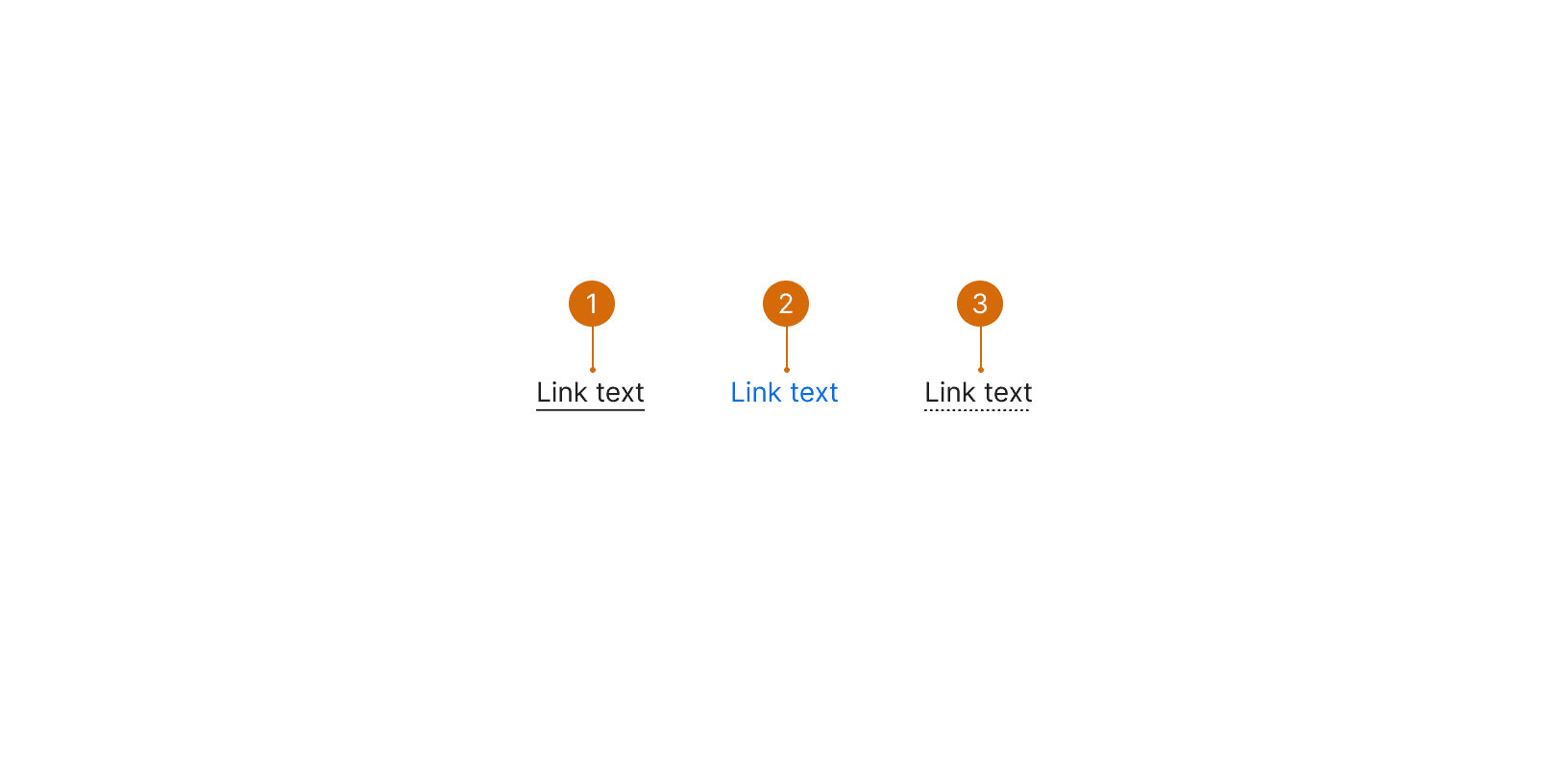
Default: Use when a link is in context of, or near a sentence.
Secondary: Use in situations where the link stands alone, or visually needs more differentiation or call out than the underline.
Underline Dotted: Use when you need to display a tooltip on hover, instead of navigating the user away.
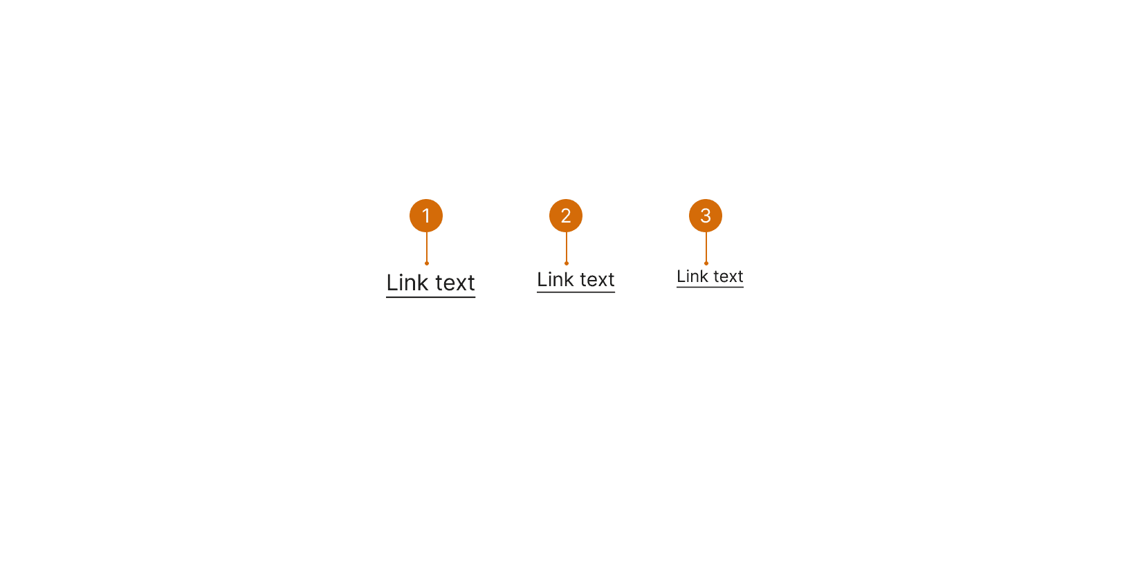
Large
Medium
Small
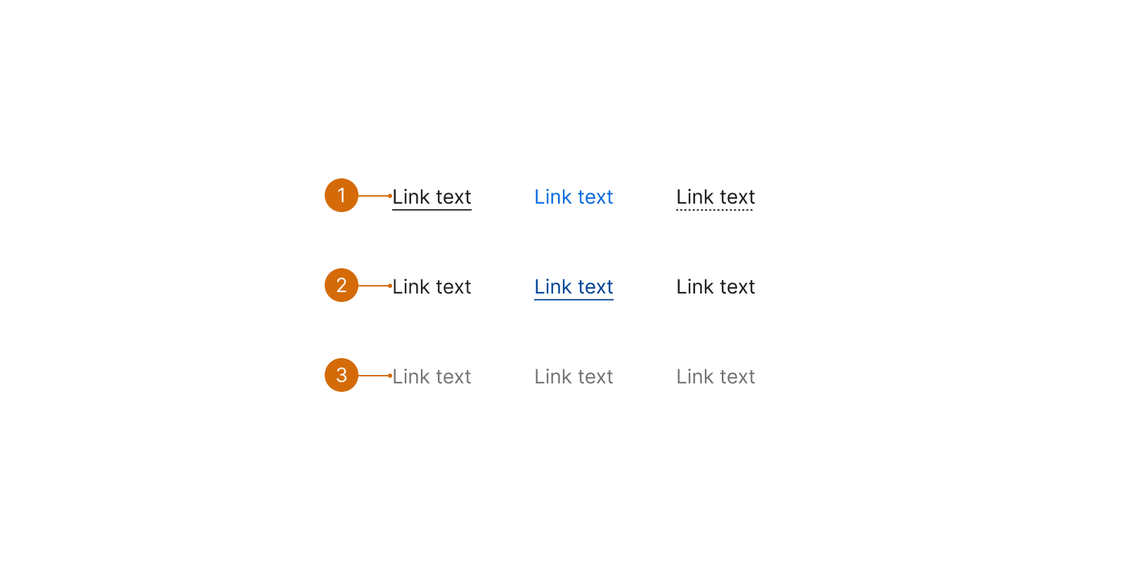
Default
Hover
Disabled
Best Practices
Text
Write helpful link text. The link text should describe its purpose and/or destination.²

Do

Don't
Navigation
Links are use primarily for navigation. If you want a user to take a clickable action or trigger a javascript event use a button.¹ ⁴

Do

Don't
Style
Use the correct style. Default styled black links should have a black underline and on hover, lose that underline. Secondary blue links should not have an underline by default, but gain one on hover.⁵ These hover states are an accessible way to identify interact-ability, besides the default underline or color.
Links in Tables
In tables, when navigating to new pages, use secondary links to add additional emphasis to the link. When opening a modal, default links may be used.

Do
External Links
When linking to external websites, use the icon-external to indicate that the user will be leaving Basis.

Do
More
Related Pages


Additional Reading
“Link.” Shopify Polaris, polaris.shopify.com/components/navigation/link.
Patricios, Emma. “Quick Tip: Creating Valid and Accessible Links.” The A11Y Project, a11yproject.com/posts/creating-valid-and-accessible-links/.
“Web Content Accessibility Guidelines (WCAG) 2.0.” W3C, www.w3.org/TR/WCAG20/.
Nils. “Button versus Link - Accessibility Introduction.” Atom, a11y-101.com/design/button-vs-link.
“Web Accessibility Guidelines v1.0 Foundations - Overview.” Buttons & Links | Accessibility Guidelines, web-accessibility.carnegiemuseums.org/content/buttons/.
“Links and HypertextIntroduction to Links and Hypertext.” WebAIM, webaim.org/techniques/hypertext/.