
Plain
Rich
Stacked

Tooltips have a max-width of 450px
1. Usage
Don’t use tooltips for information that is vital to task completion. Users shouldn’t need to find a tooltip in order to complete their task. Tooltips are best when they provide useful, additional information or clarification. Tooltips disappear, so instructions or other directly actionable information, shouldn’t be in a tooltip.¹
2. Arrows
Use tooltip arrows to avoid confusion with neighboring elements. Tooltips are hard to discover because they often lack visual cues. Arrows are beneficial to clearly identify which element the tooltip is associated with. It’s important to use tooltips consistently to instill confidence in users by meeting their expectations.¹

3. Placement
Position tooltips so they don’t block related content. Test your tooltip positioning to ensure that the content does not block other information pertinent to the user’s goal. Your copy can be single- or multiple-line long as long as it’s relevant and it does not block related content.¹

Tooltip content should be a short, descriptive phrase. Focus on essential information. Tooltips are best when they provide useful clarification. For example, an unlabeled component could include a tooltip that describes what it is or what it does.
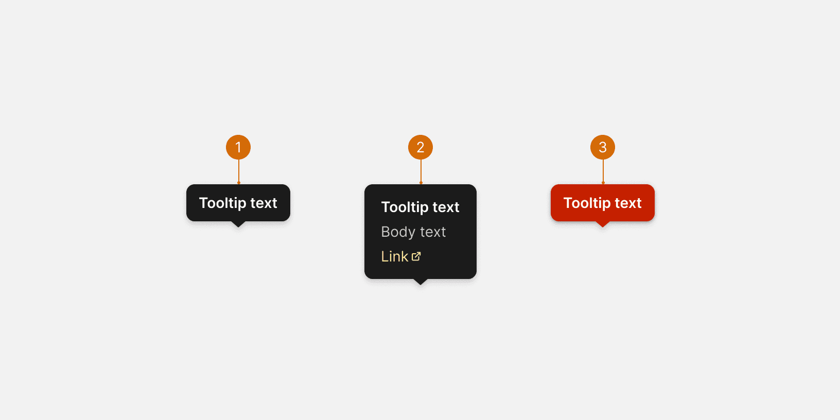
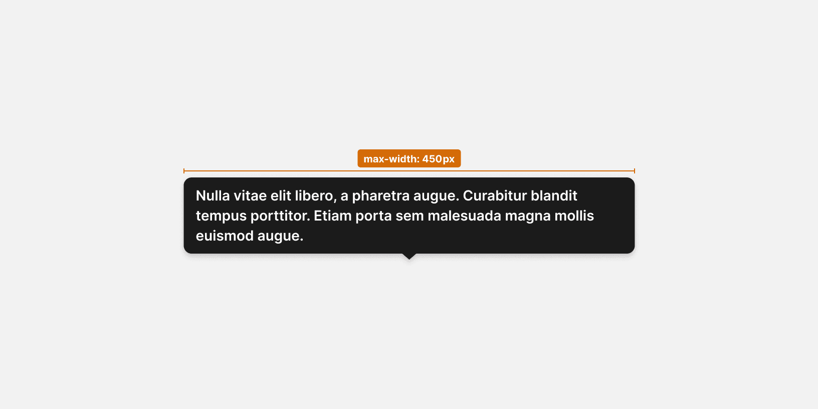
Tooltips with redundant text are not useful for users. Use only when necessary to provide an explanation for an interface element. Lengthy content is no longer a ‘tip’, so keep it brief.¹ If tooltip content requires multiple sentences, consider other components instead (list of components).
Use sentence case and do not include a period at the end unless the phrase is a complete sentence or includes a comma. For definitions and instructive tooltips, use sentence-style capitalization and write the text as complete sentences with punctuation unless space is limited.

Related Components
Additional Reading
World Leaders in Research-Based User Experience. “Tooltip Guidelines.” Nielsen Norman Group, www.nngroup.com/articles/tooltip-guidelines/.
“Web Content Accessibility Guidelines (WCAG) 2.0.” W3C, www.w3.org/TR/WCAG20/.
“Tooltip Widgets (or: Screen Tip, Balloon).” Accessibility Developer Guide, www.accessibility-developer-guide.com/examples/widgets/tooltips/.