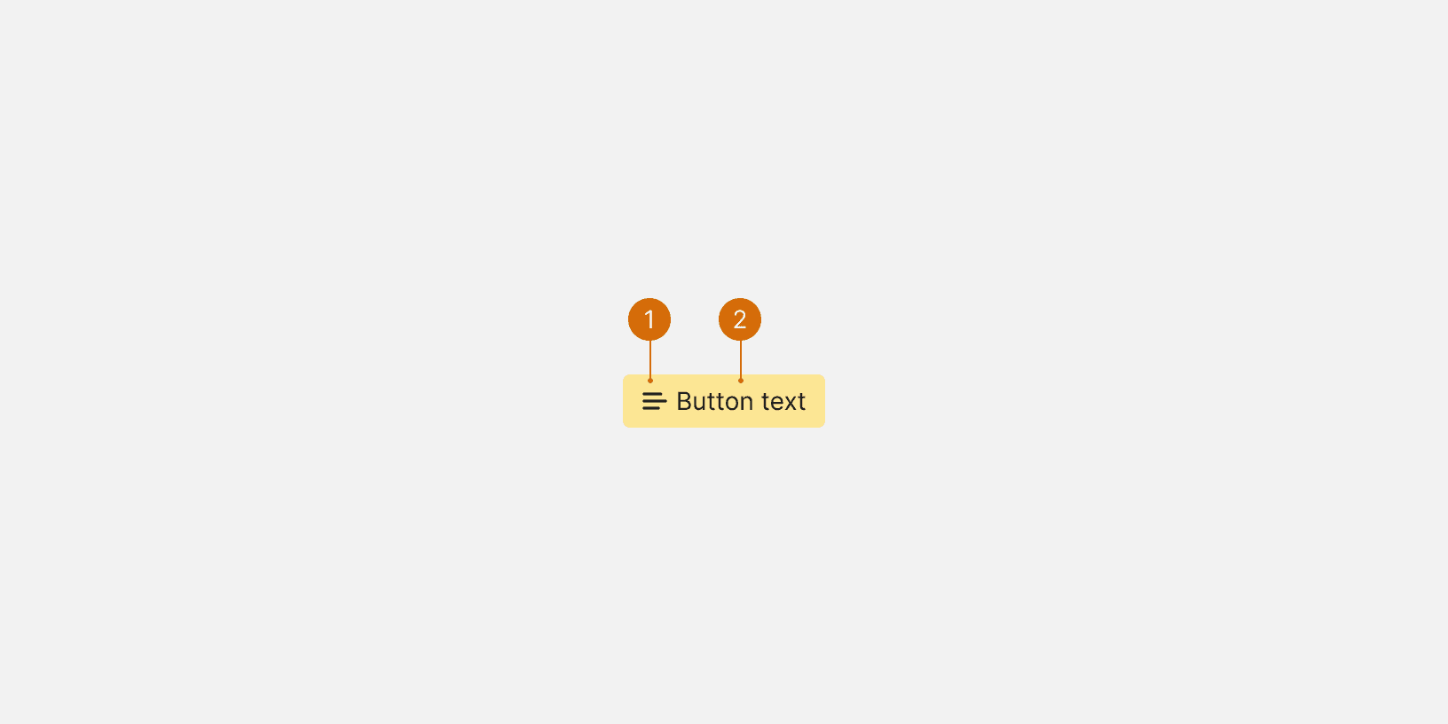
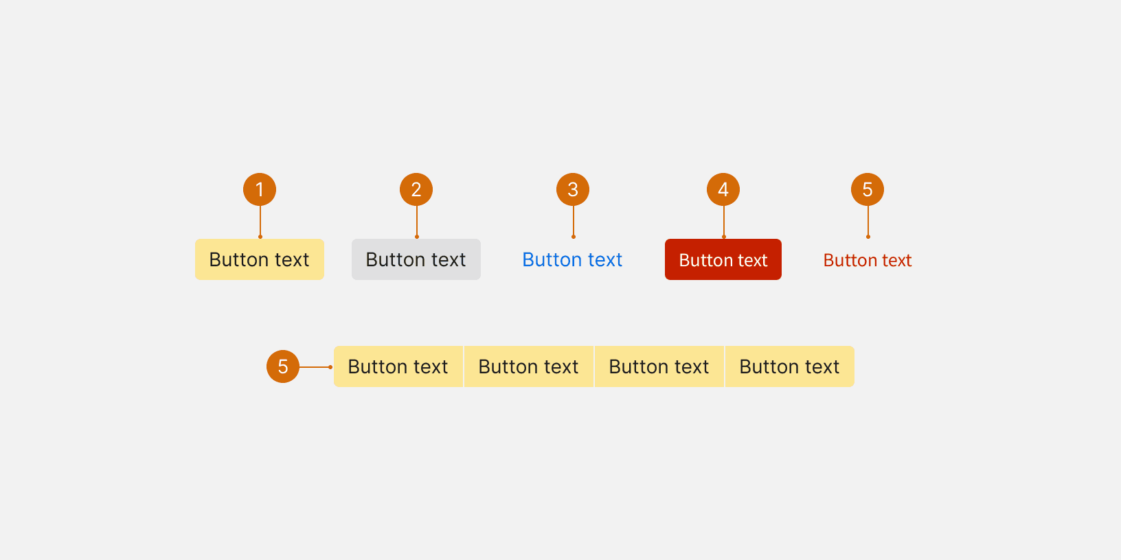
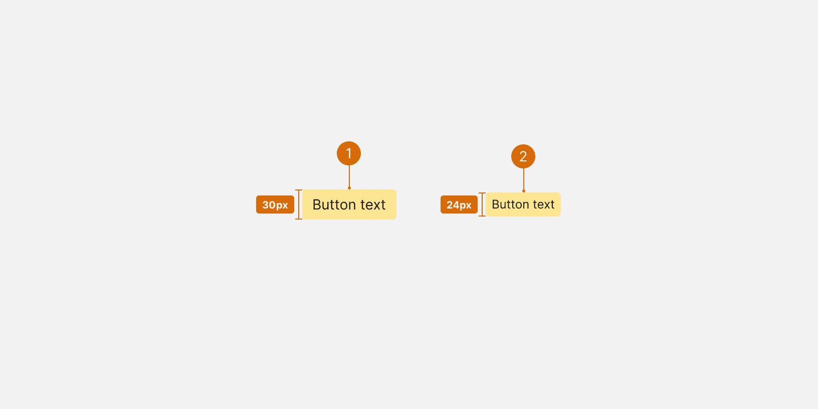
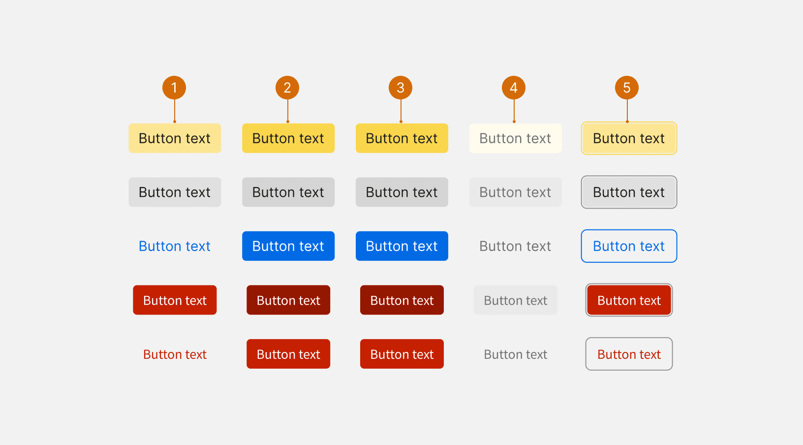
Primary: The primary button is the main call to action for the user, guiding them to next steps in common workflows or recommended actions. There should only be one primary button per page.
Secondary: Secondary buttons typically accompany a primary CTA on a page, or they may stand alone to offer optional actions. Often paired with primary buttons.
Transparent: Transparent buttons offer access to noncritical functionality that the user may need infrequently. Often paired with tertiary buttons.
Danger: Danger buttons alert users to potentially consequential actions
Danger Transparent: The danger transparent button is used to be a subtle alert for consequential actions
Button Group: Button groups are used to group related options. To emphasize the ability to toggle between options, a button group should be housed in a common container.