Variants
Color
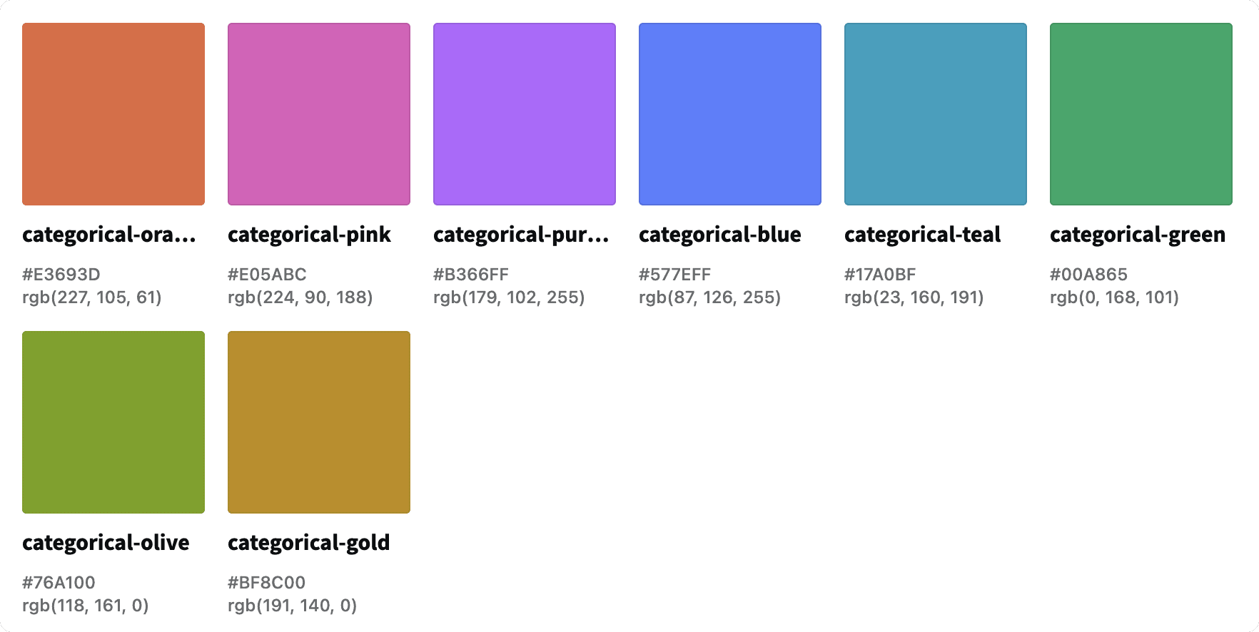
Categorical
Categorical colors are used to represent non-numerical items with no inherent ordering. The colors are chosen to be visually distinct to help users distinguish between the different items in the data visual.
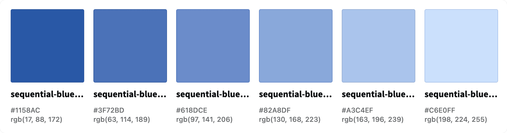
Sequential
Sequential colors are used to represent numerical values with an inherent ordering.
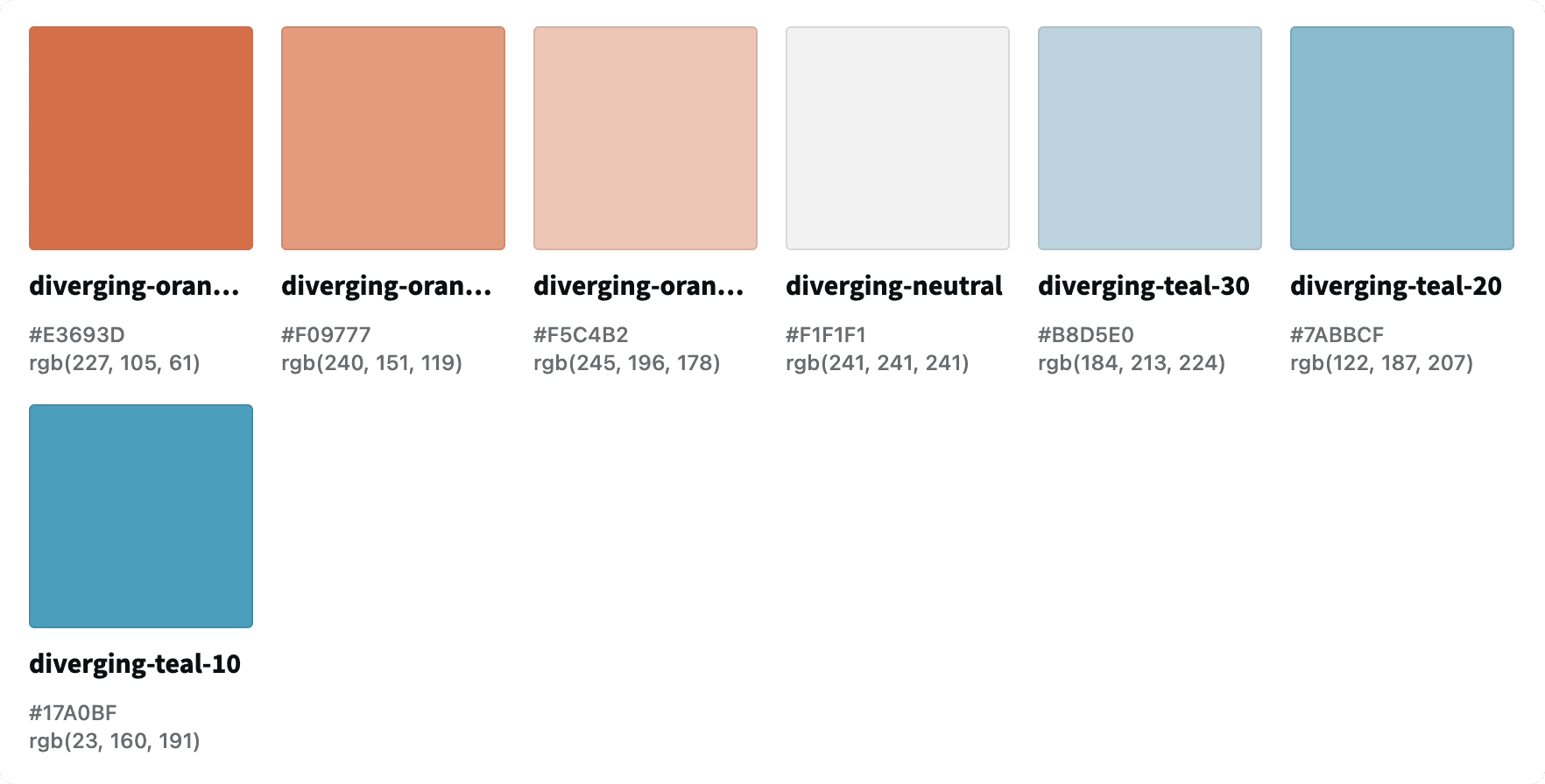
Divergent
Divergent colors are used to represent used to represent numerical values with an inherent ordering that include two extremes. There is a baseline value between the two extremes.
Feedback
Feedback colors are used to represent data that is either within or outside of a defined threshold.

Types
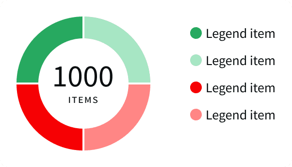
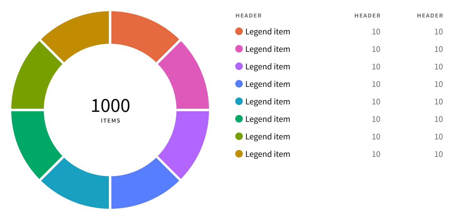
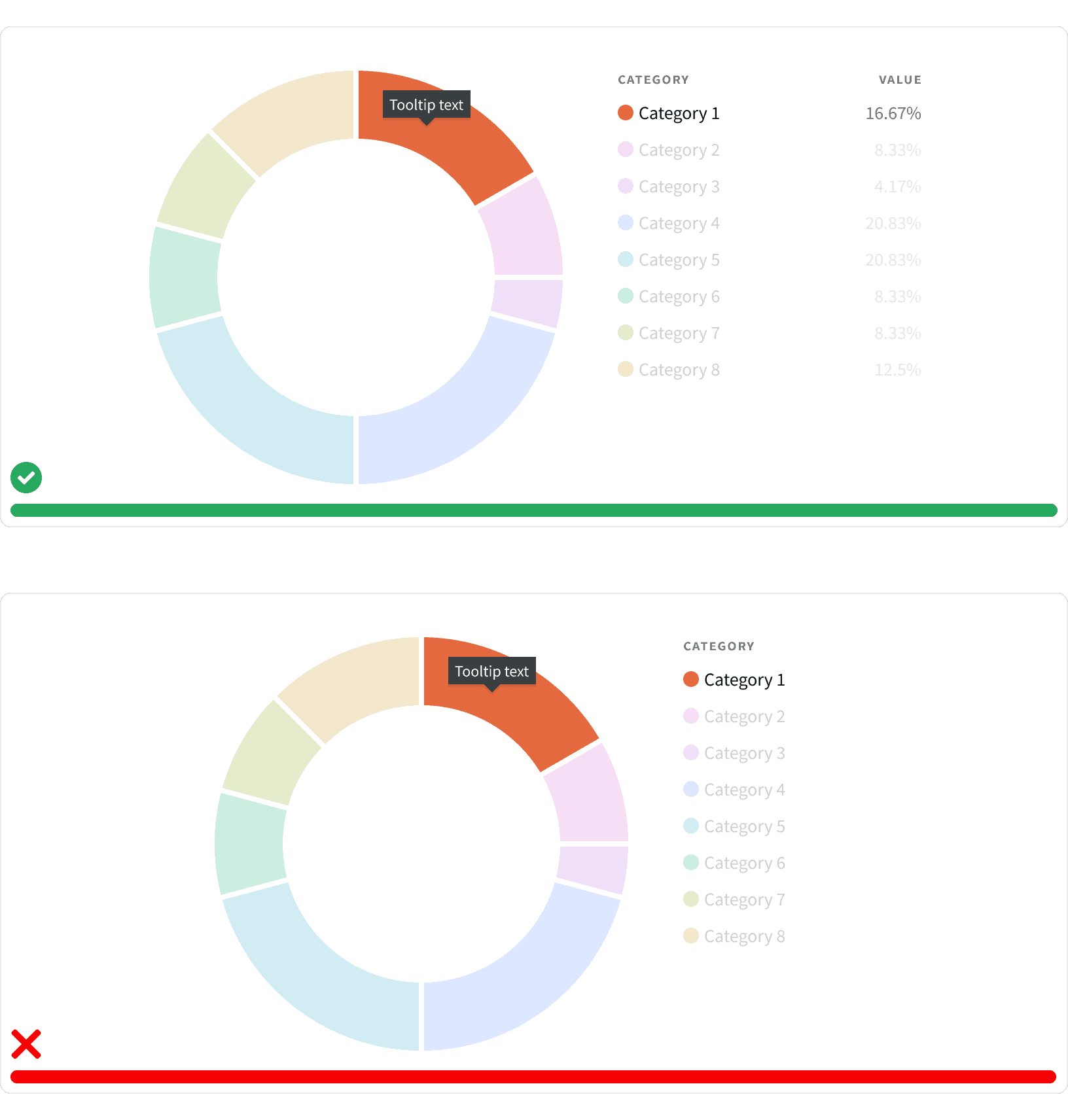
Donut Chart
Use a donut chart to display different categories that represent a portion of the whole data set.
Default
Use the default donut chart to display data that is separated into no more that 4 categories.
Large
Use the large donut chart to display data that is separated into no more that 8 categories. If there are additional categories, they can be combined into an "Other" category that uses
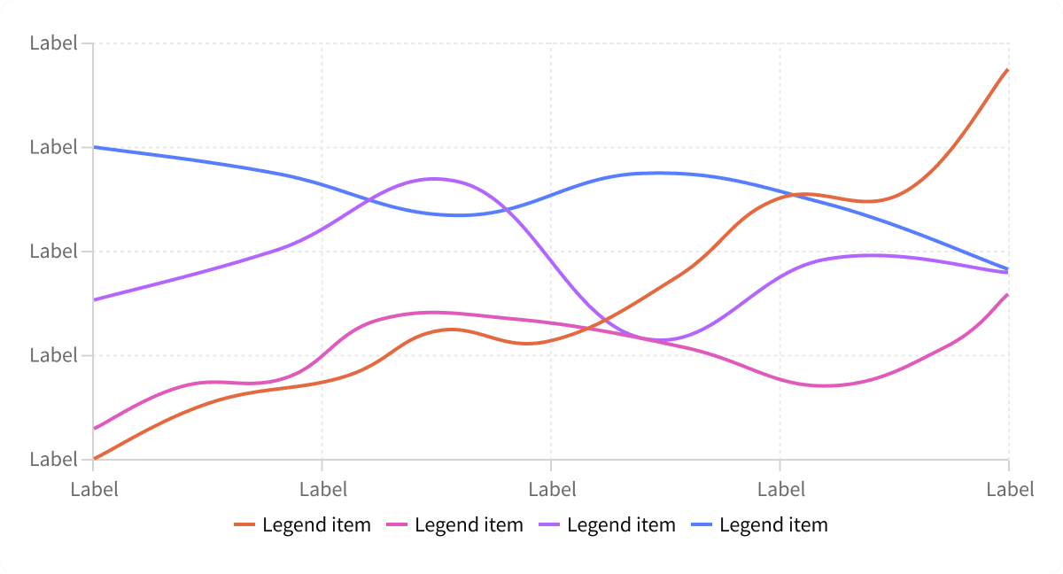
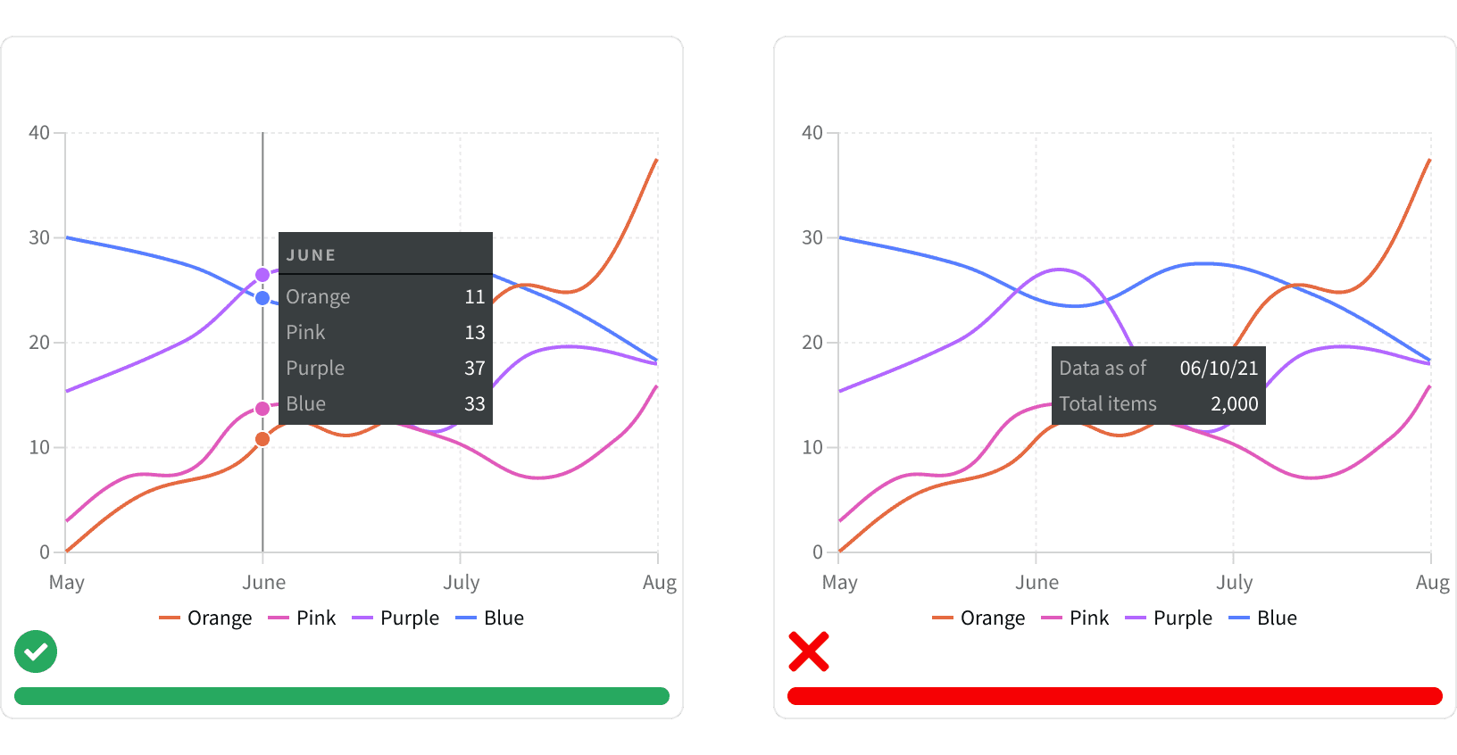
Line Chart
Use a line chart to display a data that changes overtime. A line chart may be used to compare multiple sets of data on a single chart.
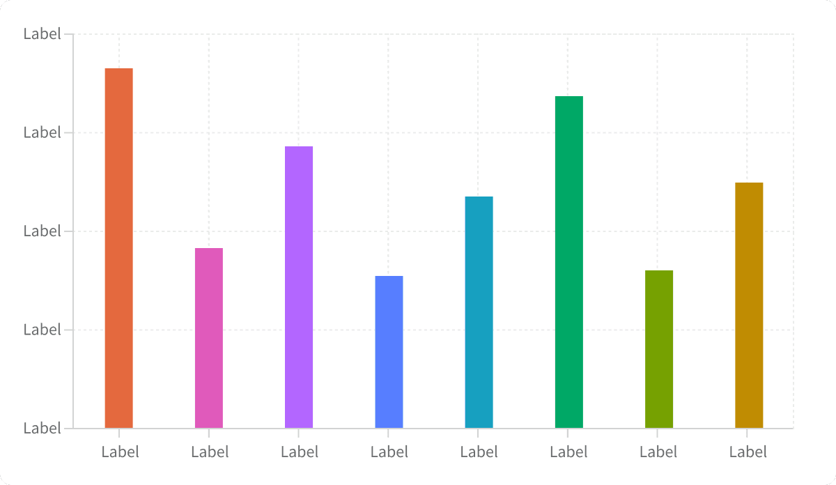
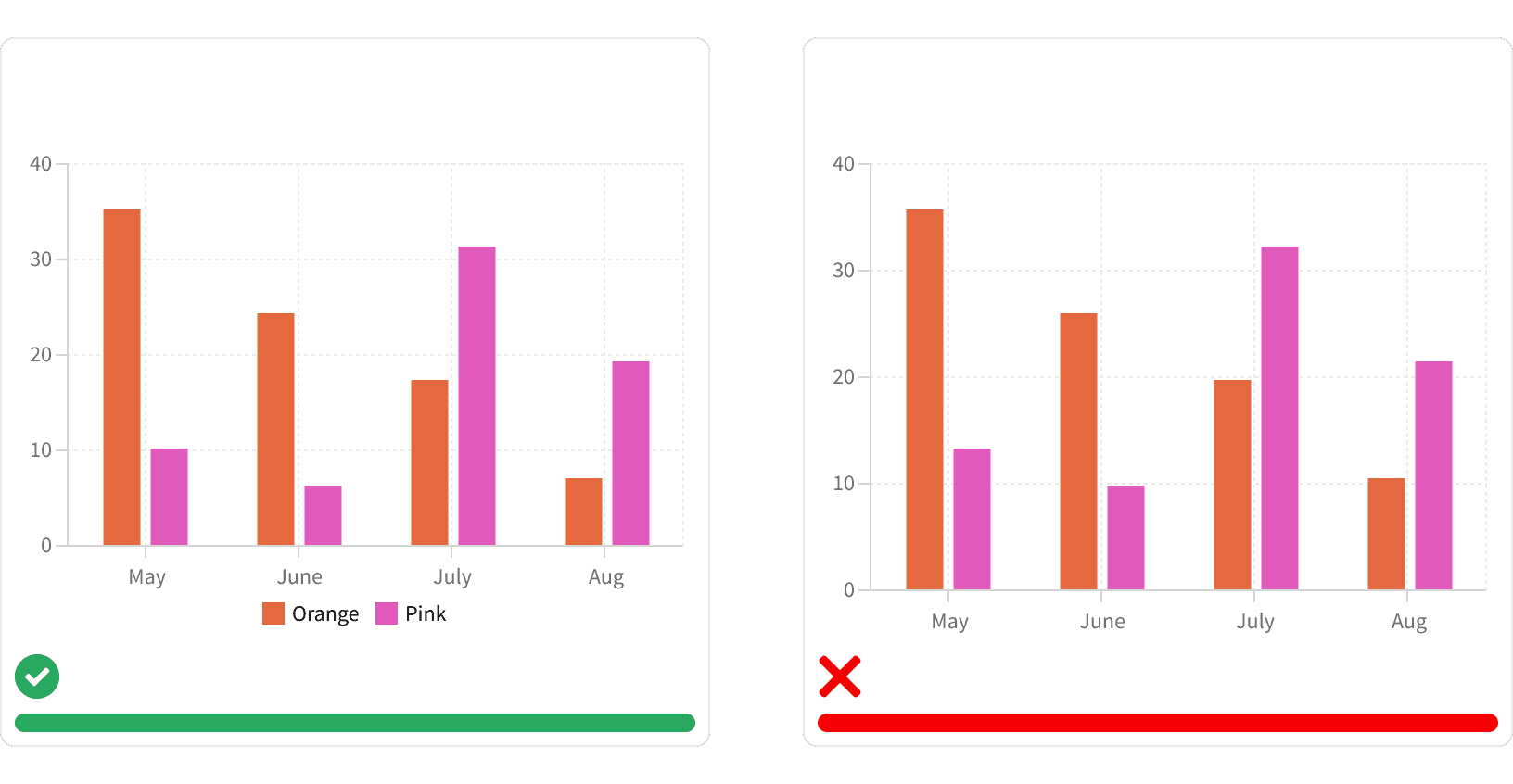
Bar Chart
Use a bar chart to compare data from multiple different categories. A bar chart may also be used to display a data that changes overtime.
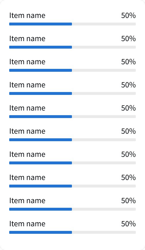
Category Chart
Use a category chart to compare data from multiple different categories. Use a category chart when the data visualization is not the primary focus of the page and only a narrow space is available.
Best Practices
1. Data Visibility
Make data values visible when possible. Do not rely on hover states to convey important data.
2. Data Legend
If a data visual is displaying multiple values within a single category, provide a legend to define what the different colors represent.
3. Tool Tip
Use tool tip to display data values that are directly related to the users cursor position on the data visual. Do not use tool tips to provide generic information about the data visual.
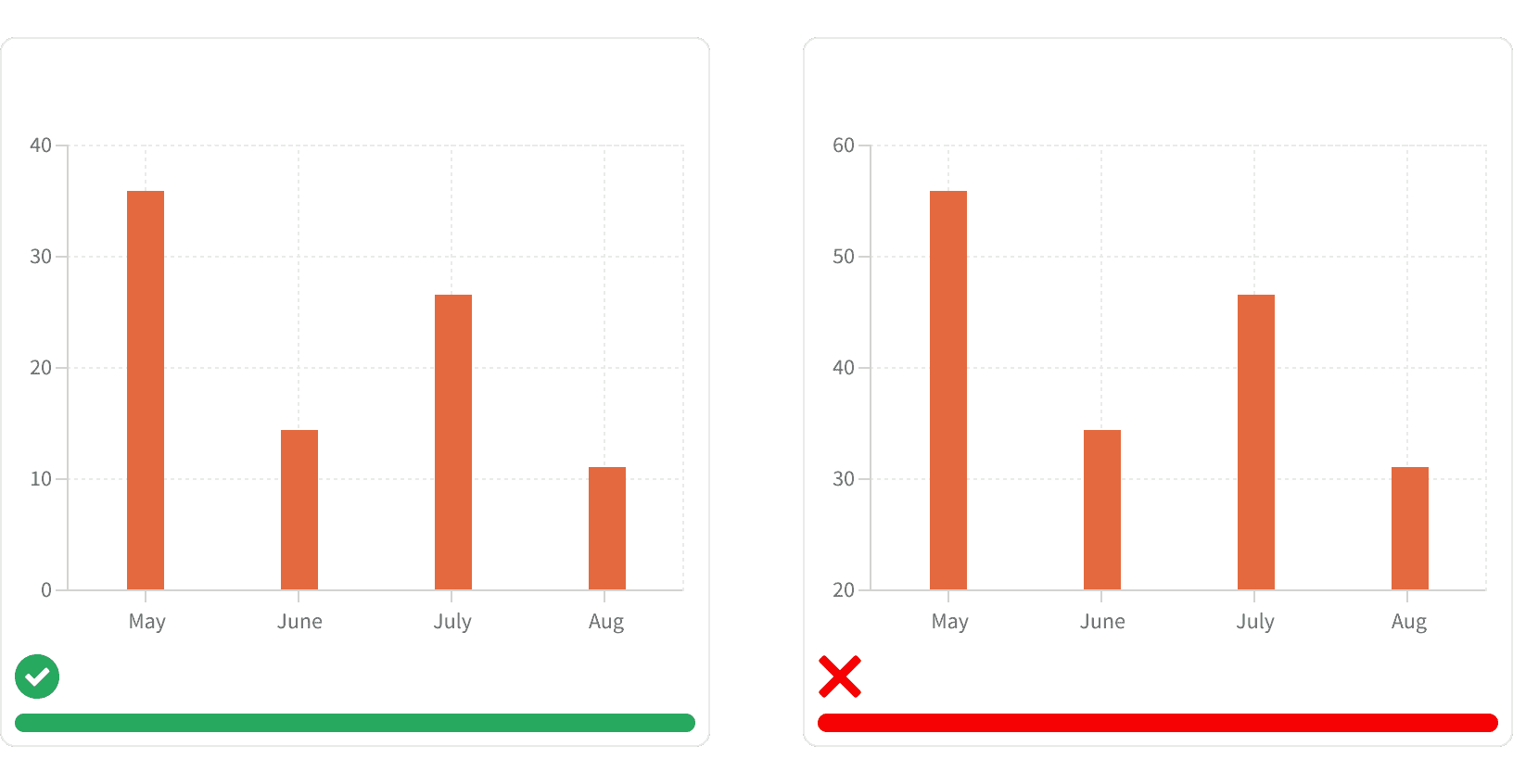
4. Y-axis Start
Data visualizations that have a y-axis should always star at zero. Starting with a number value can skew the results and make the visualization misleading.
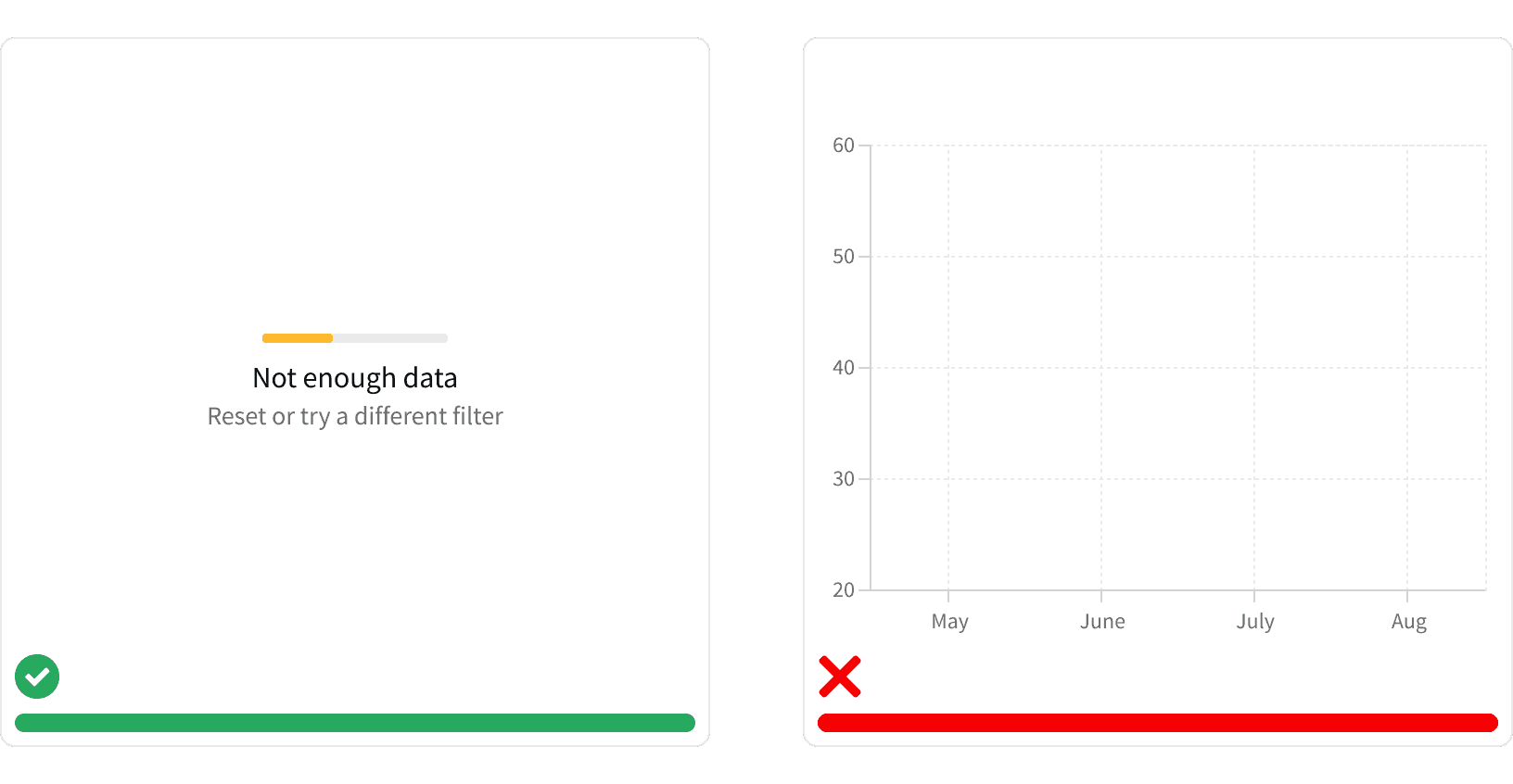
5. Empty States
All data visuals should use appropriate Empty States that explain why the visual is not displayed.
More
Accessibility
Color contrast ratio for our data visuals meets AA standards, based on Web Content Accessibility Guidelines (WCAG) guidelines.
Benefits: People with low vision often have difficulty reading text that does not contrast with its background. This can be exacerbated if the person has a color vision deficiency that lowers the contrast even further. Providing a minimum luminescence contrast ratio between the text and its background can make the text more readable even if the person does not see the full range of colors. It also works for the rare individuals who see no color.
Additional Reading
How to Choose Colors for Your Data Visualizations https://medium.com/nightingale/how-to-choose-the-colors-for-your-data-visualizations-50b2557fa335
Data Visualization – Best Practices and Foundations https://www.toptal.com/designers/data-visualization/data-visualization-best-practices