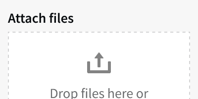
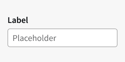
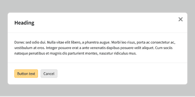
Anatomy
Error handling patterns combine component error states or variants with error messaging. See the component guidelines for the error states and variants. See Voice and Tone for guideline on writing error messages.
Best Practices
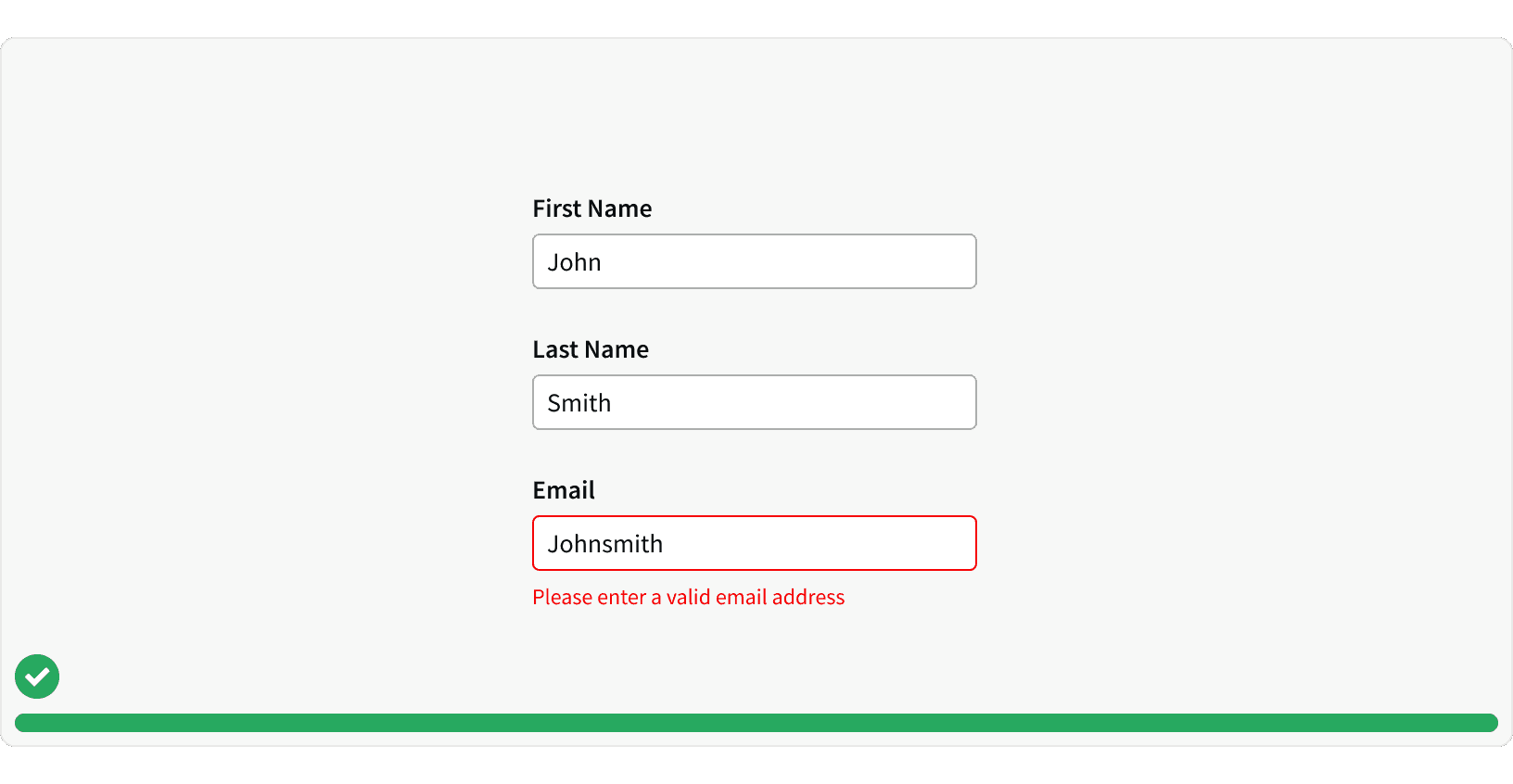
1. Inline Validation
When possible, errors should be displayed in-line, immediately in the location of the error. This can be done using a component error state or a message card. This will help the user quickly identify the error instead of having to navigate back later. ³
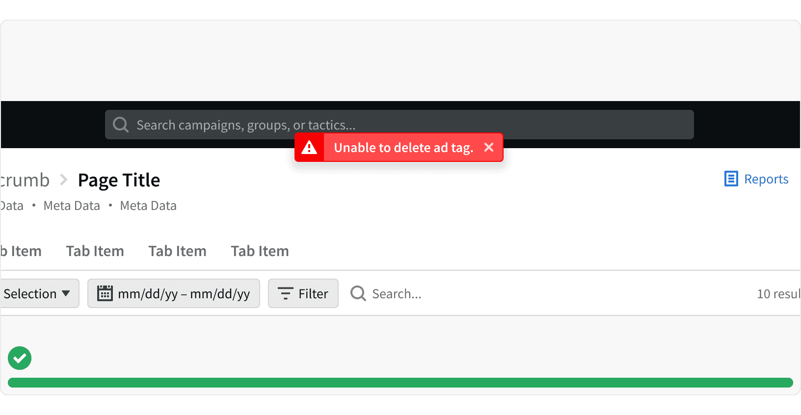
2. Flash Messages
If the error cannot be displayed on the page, a flash message may be used.
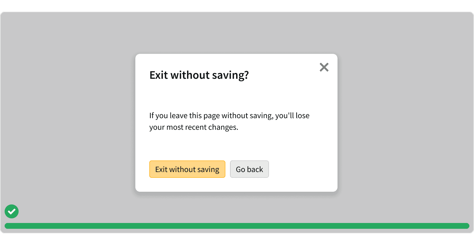
3. Exit Confirmation
If a user tries to take an action that has large implications, use a modal to confirm the action. This will help prevent data lost or unintended actions. These should be used sparingly and should not be used for routine actions. ⁴
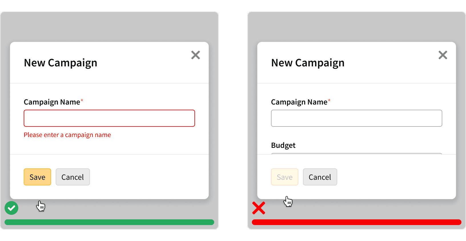
4. Disabled Buttons
Avoid using disabled buttons when the user has not entered required information. This can make it difficult for users to identify what fields they have missed. Instead, leave the button active and use it to trigger error messages on the relevant fields.⁵
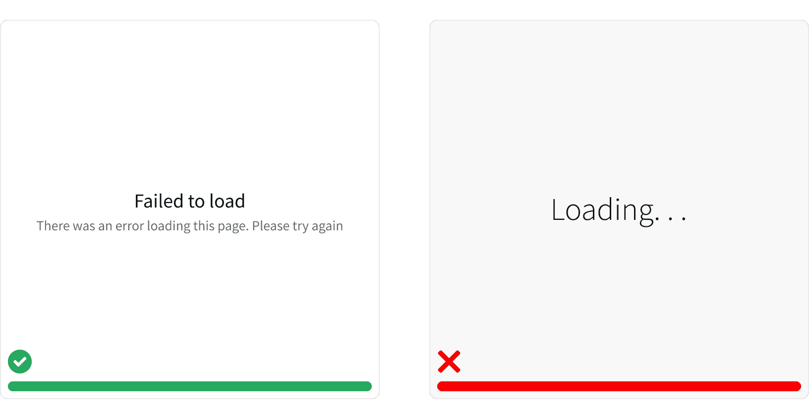
5. Content Failed to Load
If the content of a page fails to load, use an Empty State to explain the error. ¹ Don't leave the page in a loading state.
More
Related Pages
Additional Reading
Creating Error Messages | Best practice in UX Design https://uxdesign.cc/creating-error-messages-best-practice-in-ux-design-cda3be0f5e16
Designing Better Error Messages UX https://www.smashingmagazine.com/2022/08/error-messages-ux-design/
How to Report Errors in Forms: 10 Design Guidelines https://www.nngroup.com/articles/errors-forms-design-guidelines/
Confirmation Dialogs Can Prevent User Errors — If Not Overused https://www.nngroup.com/articles/confirmation-dialog/
Disabled Buttons in User Interface https://uxplanet.org/disabled-buttons-in-user-interface-4dafda3e6fe7
Help Users Recognize, Diagnose, and Recover from Errors https://media.nngroup.com/media/articles/attachments/NNg_Jakob's_Usability_Heuristic_9.pdf
