Best Practices
1. Keep it simple
The fewer fields you ask users to fill out, the more likely they are to complete the form. Only ask for the information you absolutely need. ⁴
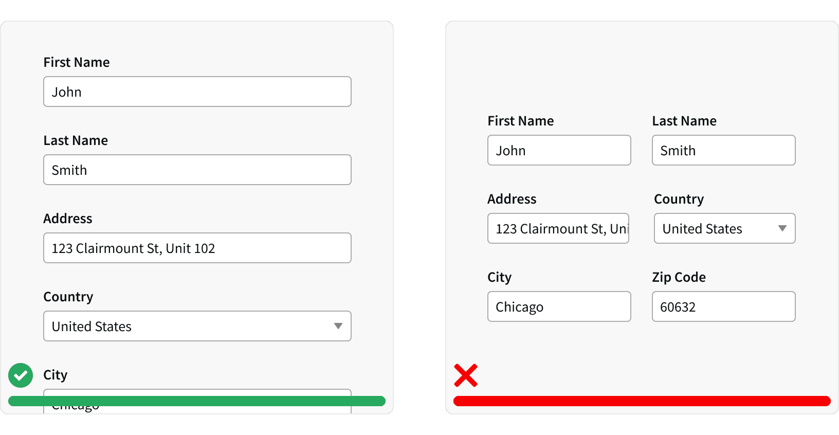
2. Use a single-column layout
This is easier to read and navigate, especially on mobile devices.⁴
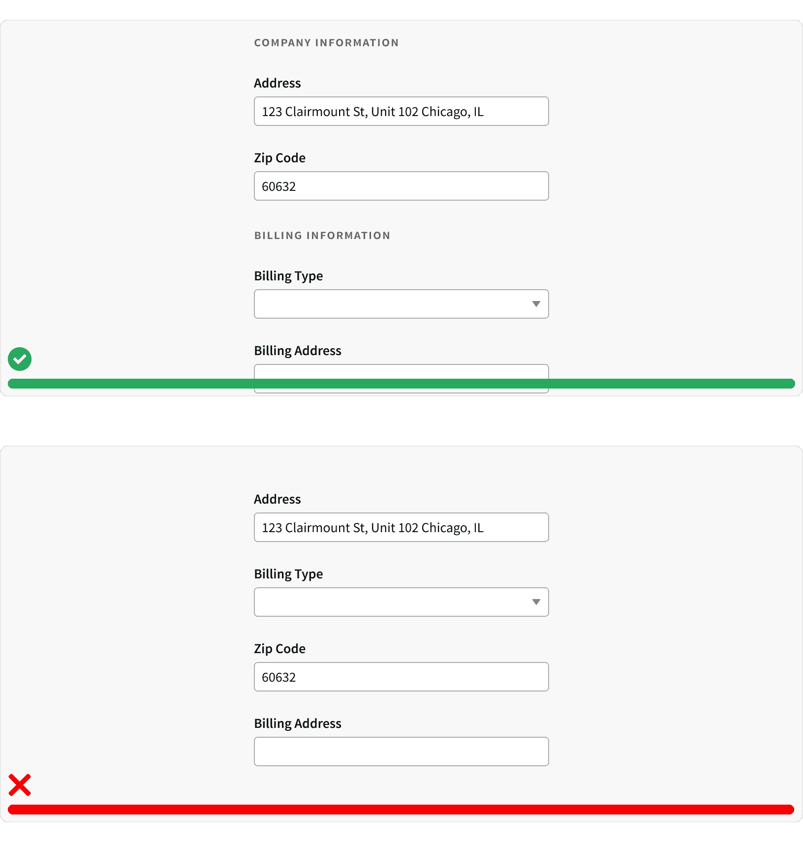
3. Group Related inputs
Inputs that request similar type of information should be grouped together. For example: Contact information fields such as email and phone number should be grouped together.⁴
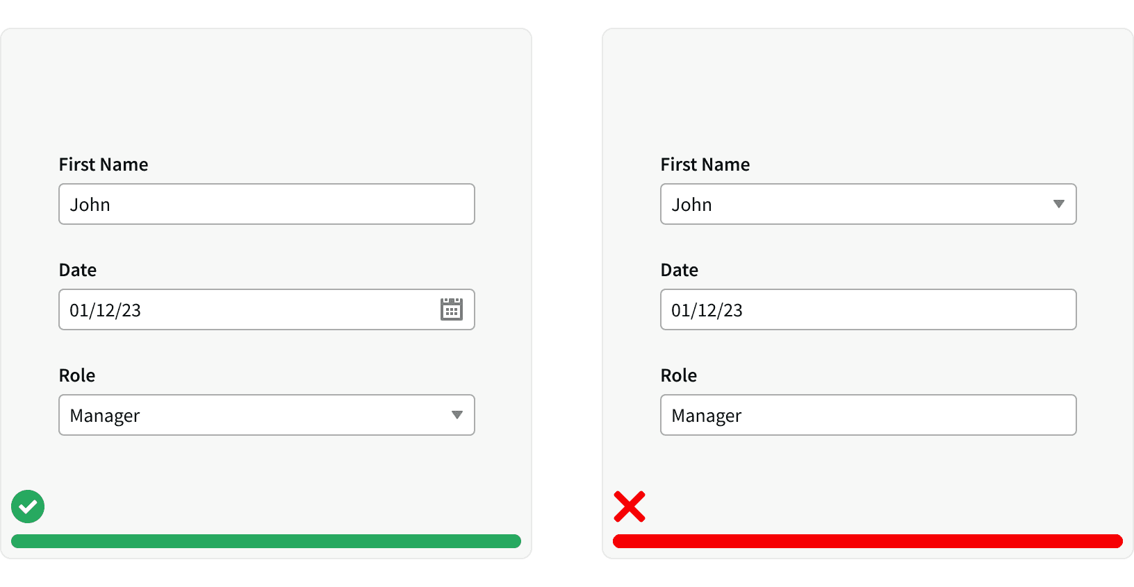
4. Use appropriate input types
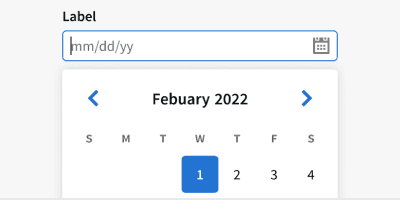
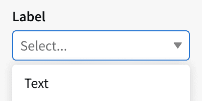
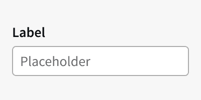
For example, use a default inputs for names and a date picker for dates.
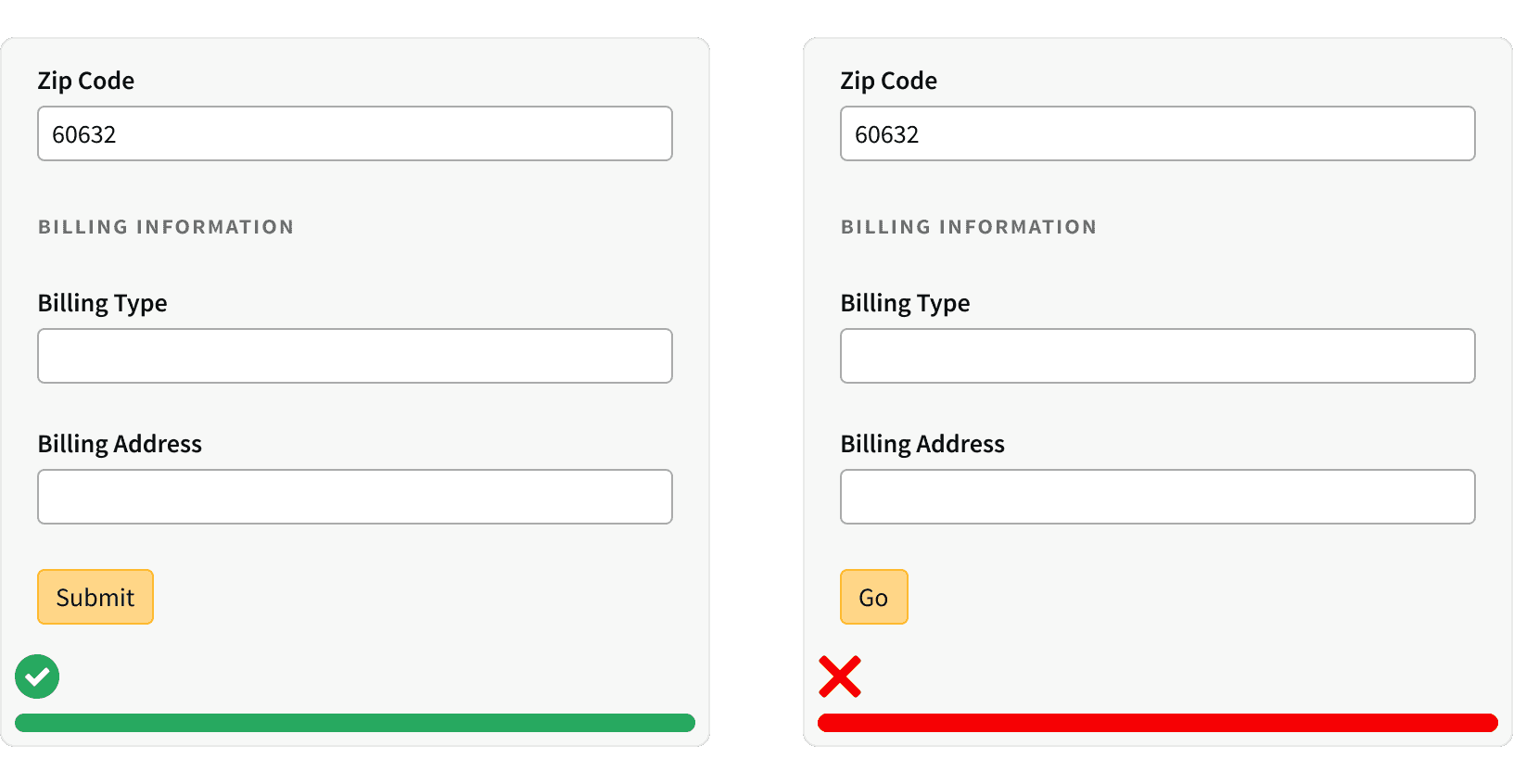
5. Use a clear call to action
Tell the user what they need to do next, such as "Submit" or "Click here to continue." ¹
6. Disabled Buttons
Avoid using disabled buttons when the user has not entered required information. This can make it difficult for users to identify what fields they have missed. Instead, leave the button active and use it to trigger error messages on the relevant fields.³
7. Step Progress Bar
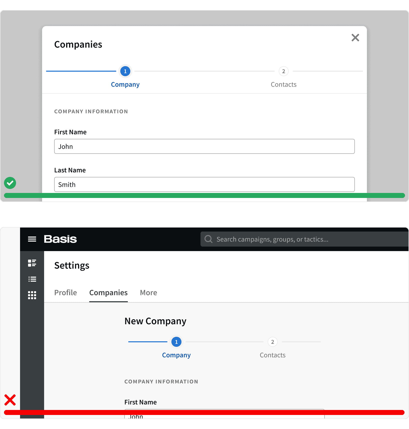
Complex forms should be broken into in to multiple steps using a Step Progress Bar. ³ Further more, forms with multiple steps should be displayed within a Modal in order to hide other page elements and help the user focus on the form. ³
More
Related Pages
Additional Reading
Form UX: How to Design a User-Friendly Form https://blog.hubspot.com/marketing/form-ux
Designing More Efficient Forms: Structure, Inputs, Labels and Actions https://uxplanet.org/designing-more-efficient-forms-structure-inputs-labels-and-actions-e3a47007114f
Form UI Design https://designlab.com/blog/form-ui-design-best-practices/
Website Forms Usability: Top 10 Recommendations https://www.nngroup.com/articles/web-form-design/
