Anatomy
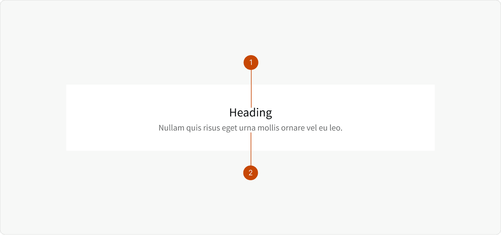
Heading
Body
Variants
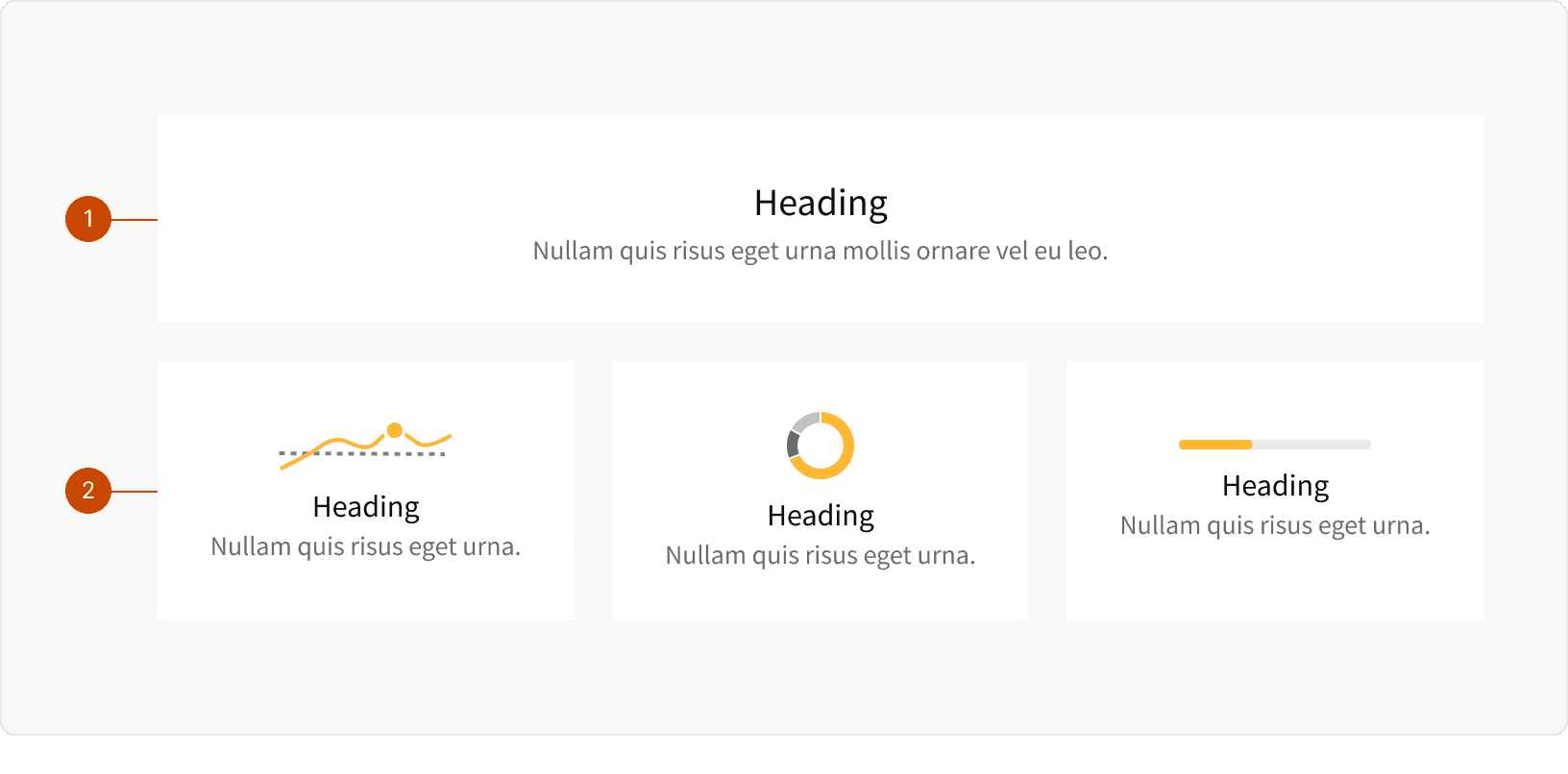
Default
Chart
Best Practices
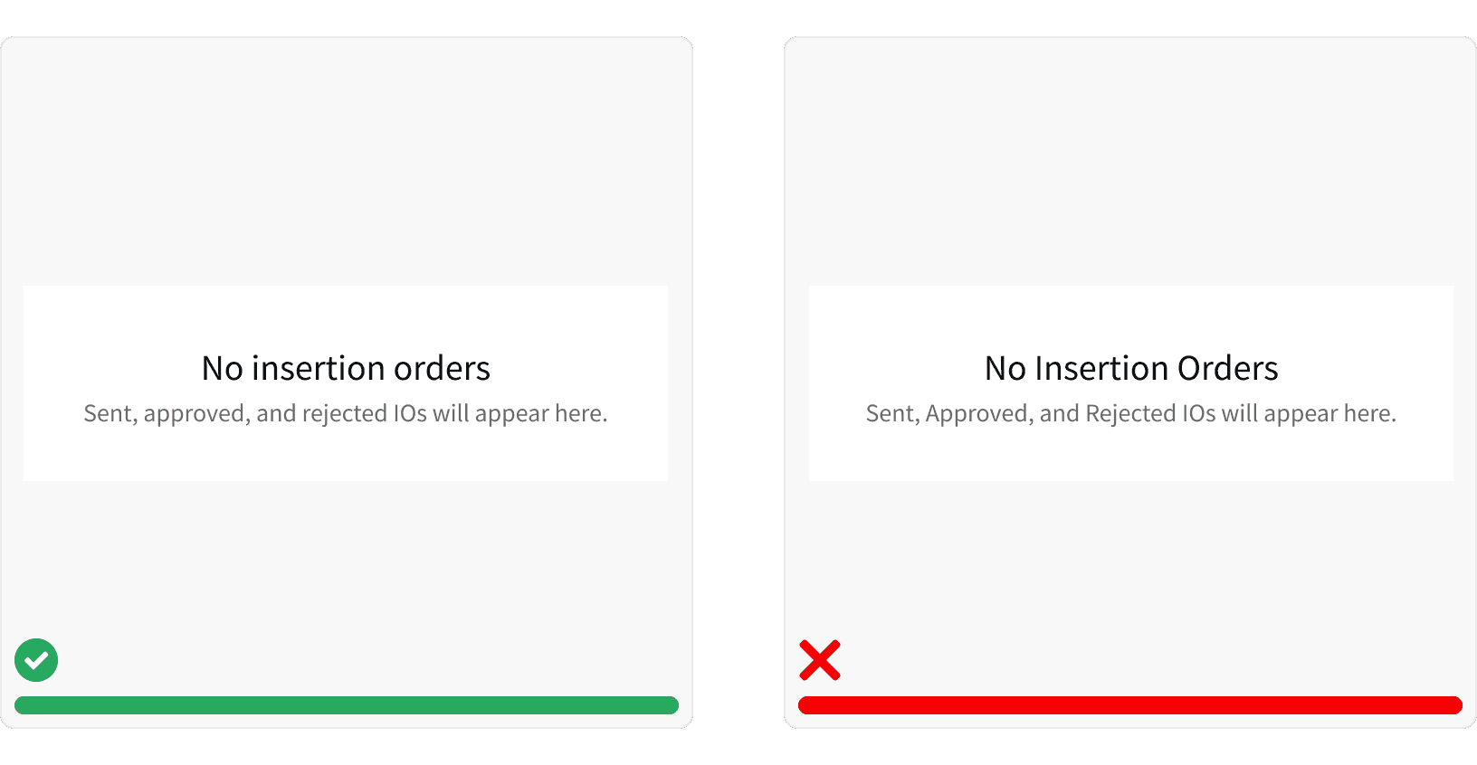
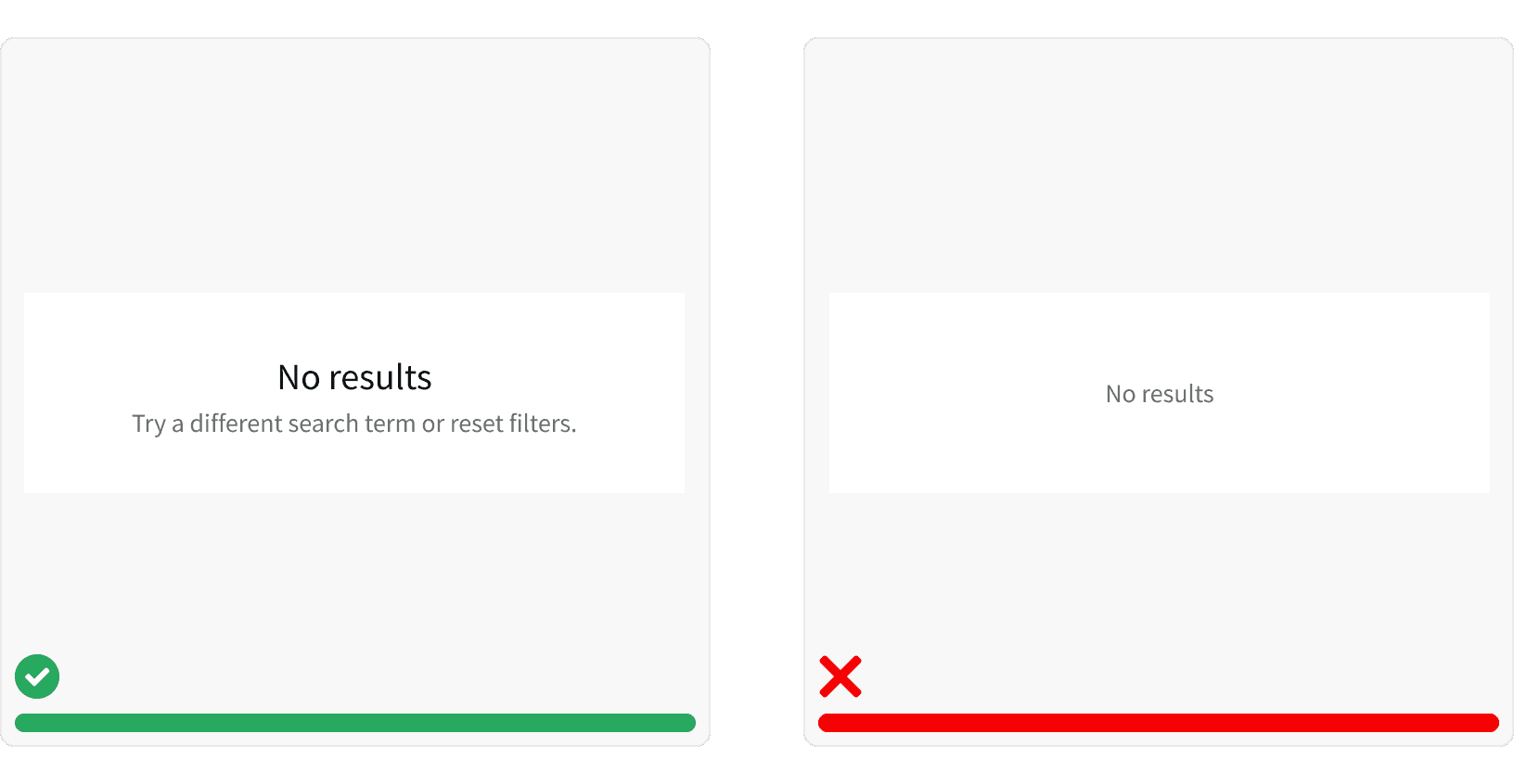
1. Message
Include a clear and simple message. The empty state messaging and context of the page should communicate why there is no content.¹ Empty states always contain a header or text, sometimes both. If it’s the user’s job to take an action in order to populate content, the text should instruct the user what to do next. When a situation doesn’t have an actionable next step, use a header to communicate the state. Use a header and text together when more detail and clarity is needed.
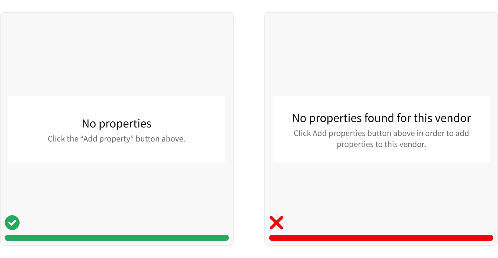
2. Sentence Case
Use sentence case and punctuation, when necessary. Headers never have punctuation. Text has punctuation when following a header or when the message contains a comma. Follow sentence case for both headers and text. Only use title case for proper nouns, referring to other items on the page, or for acronyms. Put quotations around words that refer to buttons or links on the page.²
3. Icons
Use icons to support the messaging. For data visualizations, icons help communicate what chart will be displayed once data is populated. In other areas, icons can help direct users to an element on the page. Before including an icon, consider how many other empty states on the page may have icons and if including will help communicate necessary information, more effectively, to the user. Icons should appear above messaging.³

4. Educate
Educate and prevent confusion. A great empty state message is designed to prevent confusion and teach the user about that area of the application.⁵ Empty states can be used during onboarding, to prompt action, or to communicate when content will be available.⁶
More
Accessibility
A case for including messaging with icons.
Using images without supporting text to convey meaning prevents people from being able to properly access and understand information.⁴
Writing for Web Accessibility⁷
Additional Reading
Ketterman, Shane. “Empty States – The Most Overlooked Aspect of UX.” Toptal Design Blog, Toptal, 31 Jan. 2019, www.toptal.com/designers/ux/empty-state-ux-design.
“Empty States.” Material Design, material.io/design/communication/empty-states.html.
“Empty State.” Empty State - Lightning Design System, lightningdesignsystem.com/guidelines/empty-state/#site-main-content.
Admin. “The Most Common Web Accessibility Issues to Avoid.” Bureau of Internet Accessibility, www.boia.org/blog/the-most-common-web-accessibility-issues-to-avoid.
Pearson. “UI Design for Empty States, Zero Data, and on-Boarding.” Medium, Rareview, 21 Sept. 2016, medium.com/rareview/ui-design-for-empty-states-empty-data-and-on-boarding-264cdb92826e.
Babich, Nick. “The Role Of Empty States In User Onboarding.” Smashing Magazine, 8 Feb. 2017, www.smashingmagazine.com/2017/02/user-onboarding-empty-states-mobile-apps/.
w3c_wai. “Writing for Web Accessibility – Tips for Getting Started.” Web Accessibility Initiative (WAI), 3 Mar. 2020, www.w3.org/WAI/tips/writing/.