Ready
Page Header
The Page Header is a collection of components that allow the user to navigate and interact with the application.
Anatomy
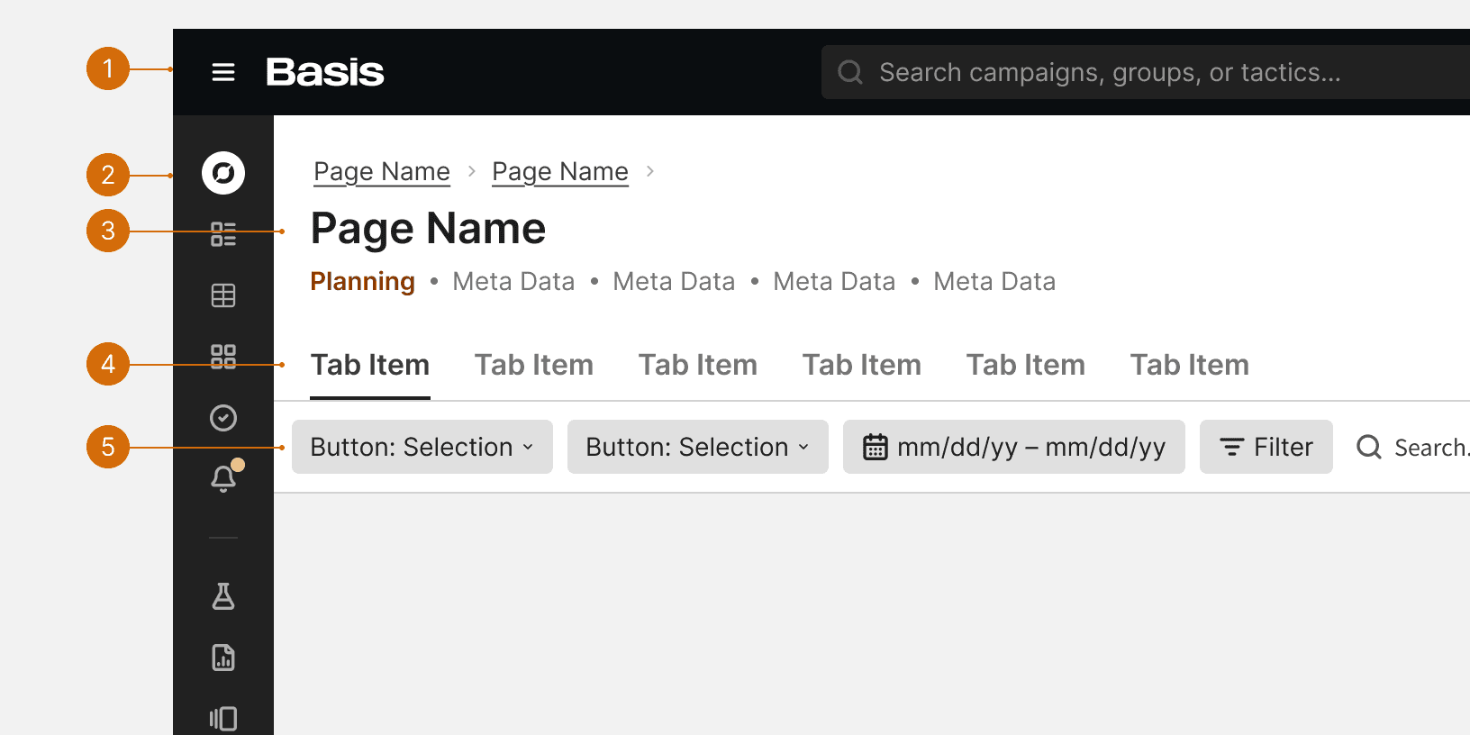
App Header
App Drawer
Title Bar
Tabs
Control Bar
Behaviors
Best Practices
Required Components
The App Header and the Title Bar are required to appear together on every page. This allows users to access global navigation and see the title of every page.
Tabs
The Tabs may be used to allow users to alternate between content at the same hierarchical level. When used in the page header, the Tabs should use the Large size. The tabs should be positioned directly below the App Header.

Do

Don't
Control Bar
The Control Bar may be used in the page header if there is only one data table or list in the body of the page. The Control Bar should be position as the bottom most component of the page header. The control bar shouldn't be used in the page header if there are multiple tables or lists in the page body. If the page has multiple data tables, each table should have it's own attached control bar.

Do

Don't
More
Related Pages


Additional Reading
Sticky Headers: 5 Ways to Make Them Better https://www.nngroup.com/articles/sticky-headers/
Best Practices for Website Header Design https://uxplanet.org/best-practices-for-website-header-design-e0d55bf5f1e2