Anatomy
Menu
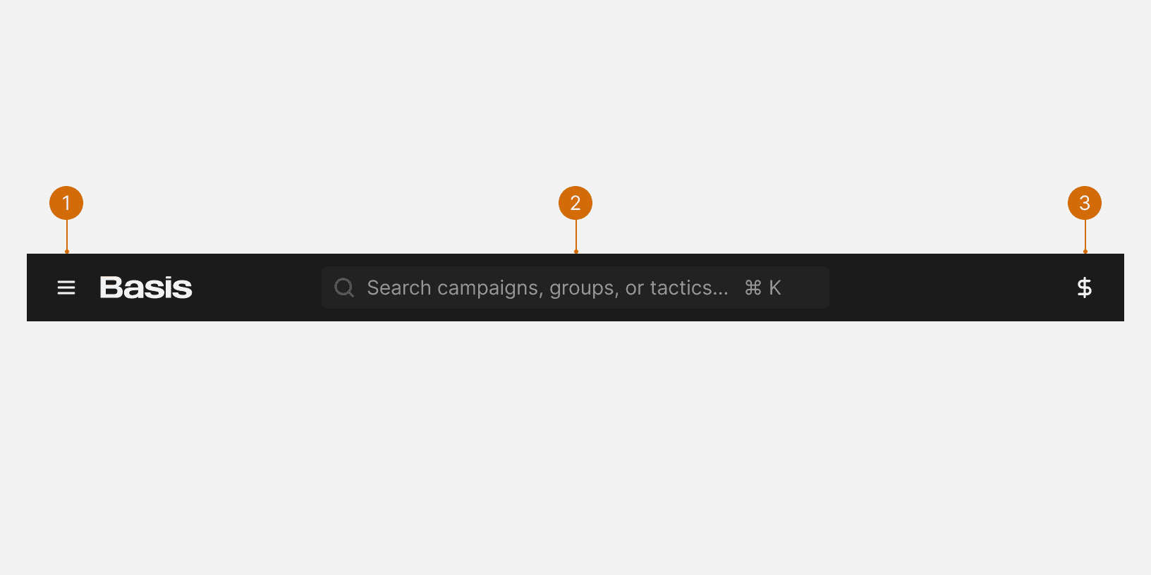
Universal Search
App Nav
States
Universal Search
The app header Universal Search uses the Dynamic Search component to allow use to search across campaigns, groups and tactics.
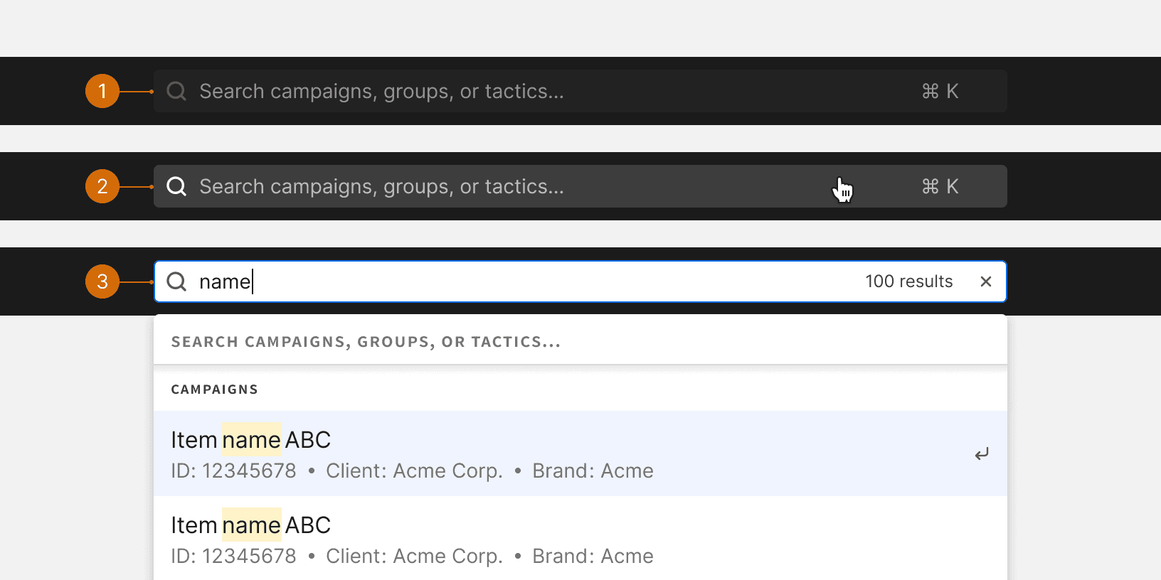
Default
Hover
Active
Behaviors
Responsive Behavior
X-large: Right side navigation items display visible labels.
Large: Right side navigation items labels become hidden
Medium: Search input becomes more narrow
Small: App logo becomes smaller and search input becomes a button
Best Practices
Global
The app header should be displayed globally across all pages. It provides a familiar and persistent way for users to navigate. The app header should be hidden if a modal is open.
Consistent
The content of the app header should remain consistent across all pages.
Fixed
If the page has scrollable content, the app header should remain fixed and visible at the top of the screen.

Do

Don't
More
Related Pages


Additional Reading
The Fastest Navigation Layout for a Three-Level Menu https://uxmovement.com/navigation/the-fastest-navigation-layout-for-a-three-level-menu/
The Rules for Modern Navigation https://www.uxbooth.com/articles/the-rules-for-modern-navigation/