Anatomy
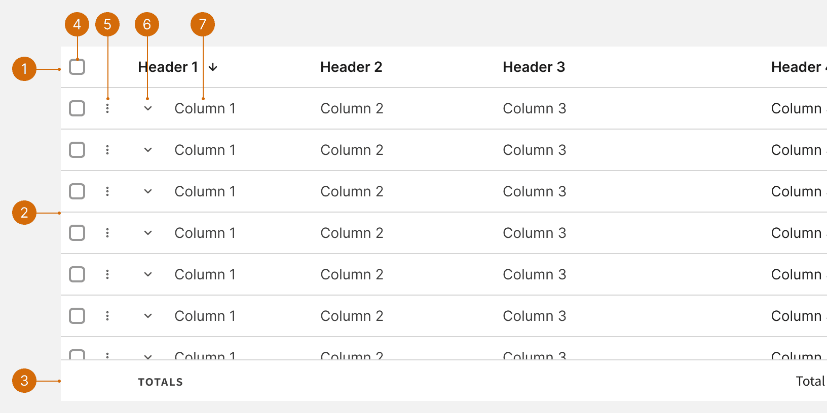
Header Row
Data Rows
Footer Row
Row Selection
Contextual Menu
Nesting Control
Data Cell
Variants
States
Row Default
Row Hover
Row Selected
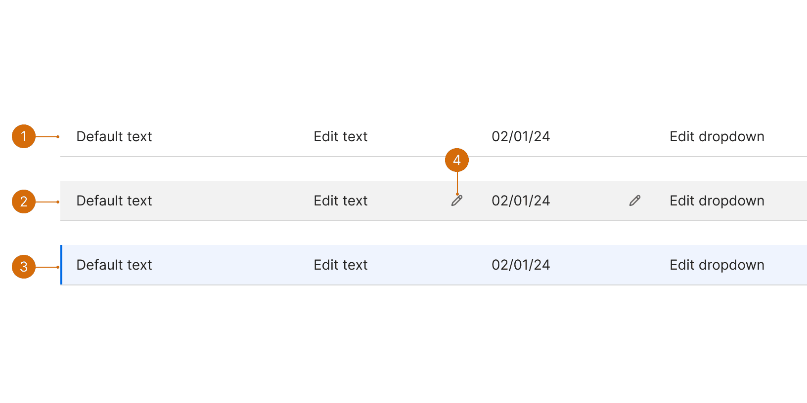
In-line Edit Indicator
In-line Editing
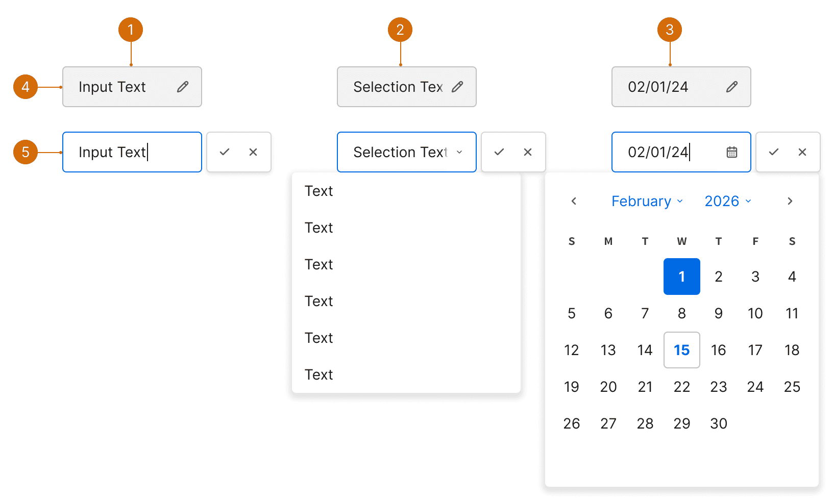
Text
Dropdown Select
Date Picker
Hover
Active
Best Practices
Row Actions
For actions that apply to the whole row, or don’t apply to a specific cell, place the actions on the left side of the row to the right of a checkbox if one is being used.

Do

Don't
Contextual Menu
If there are more than 3 row actions (not including a checkbox), consider placing them in a contextual menu to avoid visually overloading the table. When using a contextual menu, 2 additional actions can be placed in the row to the right of the menu.

Do

Don't
Inline Editing
When users are editing simple data rows, allow inline editing. This helps to reduce friction and keep the other rows and columns in view. ¹

Do
Detail View
When users are working with more complex data rows, a row can be selected to display the editable fields or additional information in a panel. This helps the users focus on the single item and avoid mistakes. ¹
Links
Links should be used to bring users to a new screen or view by clicking on a value within the table.
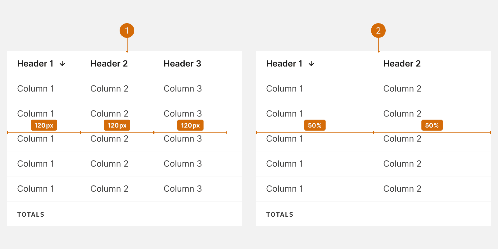
Text Alignment
Always align metrics to the right for improved scan-ability while text should always be aligned to the left. ³

Do

Don't
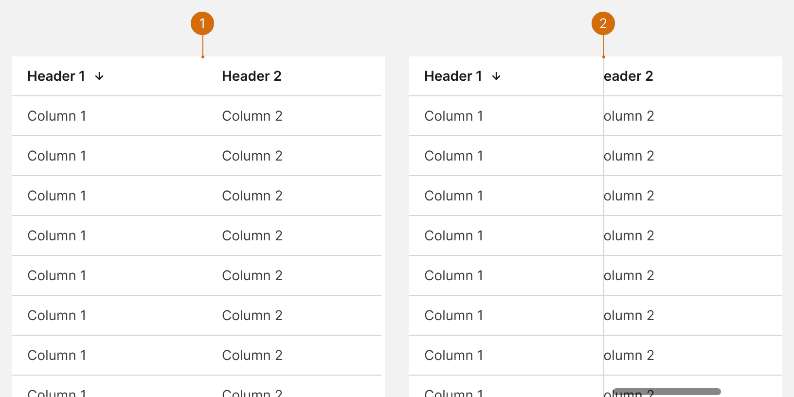
Column Resizing
If the data table contains long strings of text, enable column resizing to allow the user to manually expand the width of columns to adjust the text wrapping or truncation.¹

Do
Bulk Edit
Row selection checkboxes should be used to allow users to be able to batch process tasks. See Bulk Editing for additional guidance. ¹ ²

Do

Don't
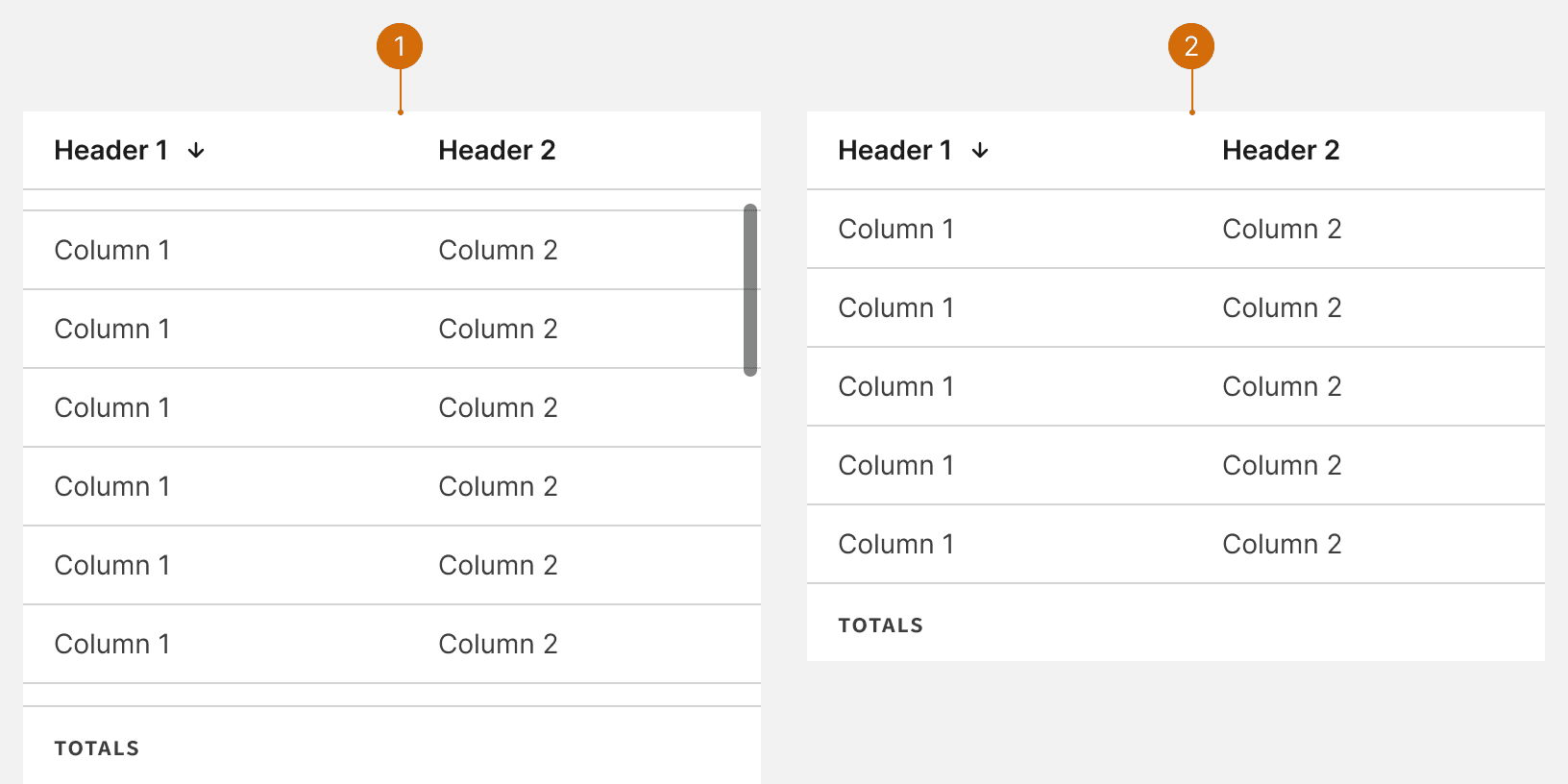
Text Wrapping
If text contains critical information, allowing text to wrap to multiple lines.

Do

Don't
More
Related Pages


Additional Reading
Data Table Design UX Patterns & Best Practices https://www.pencilandpaper.io/articles/ux-pattern-analysis-enterprise-data-tables
Data Tables: Four Major User Tasks https://www.nngroup.com/articles/data-tables/
How to Design the Best UX Table https://www.uxpin.com/studio/blog/table-ux/
Let’s design data tables https://uxdesign.cc/lets-design-data-tables-bf065a60e588