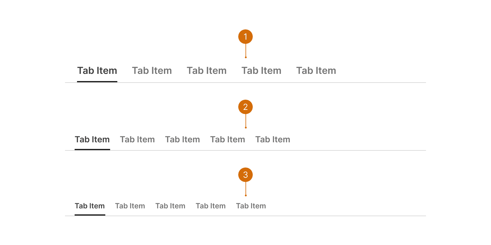
Ready

Tabs

Tabs are used to group related content at the same hierarchical level. They allow the user to be able to alternate between views within the same context.

Ready

Tabs

Tabs are used to group related content at the same hierarchical level. They allow the user to be able to alternate between views within the same context.

Variants

  1. Large: Use the Large Tabs when separating the content of an entire page. These tabs should be positioned directly below the Title Bar.

  2. Default: Use the Default Tabs when separating content within a section of a page or within an element on the page.

  3. Small: Use the Small Tabs to separating content only when space is very limited. These should be used sparingly.

Direction

  1. Default: Use the default tabs when displaying a small number of tabs.

  2. Tabs Stacked: Use the Stacked Tabs when displaying a large number of tabs that would not fit into a horizontal layout, or as sub navigation within a horizontal tab view. Use sections within the Stacked Tabs to groups related items.

States

  1. Default

  2. Hover

  3. Disabled

  4. Active

Behaviors

Overflow

When Tabs container is too narrow to display all tabs, a horizontal scroll indicator should be show and horizontal scrolling should be available. The scroll indicators container an icon button that allows users to move the items left or right without scrolling.

Responsive Behavior

For the Medium and Small breakpoints, the stacked tabs will collapse into a side bar. An icon button will allow user to open the tabs as an overlay.

Best Practices

1

When to use

Only use tabs when users don’t need to see content from multiple tabs simultaneously.

2

Ordering

Tabs should be arranged in a logical order that makes sense to the user. The default tab should be first and contain the most important/frequently-read information. The following tabs should be arranged in order of importance or logic.¹ Tabs also remain in a consistent order regardless of which tab is selected.² If tabs are not organized in a logical way it increases the users cognitive load.³

Do

Don't

Content

1

Labels

Write short, clear labels, one or two words max in most cases. Use parallel construction--every item should be a noun or a verb. Avoid repeating words if possible.

2

Title case

Use title case--capitalize the first letter of every word. Never use ALL CAPS in tab labels because it’s harder for the user to read.²

3

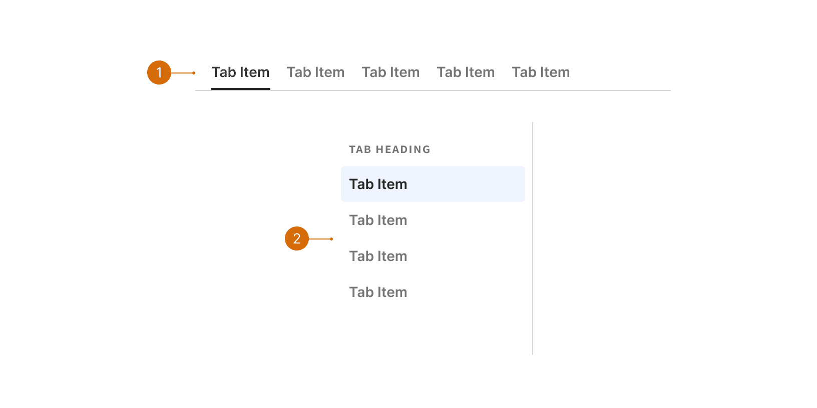
Stacked tabs group heading

The tab heading should clearly describe how the group of tabs are related.

Do

Don't

© 2026 Basis Technologies