Sides
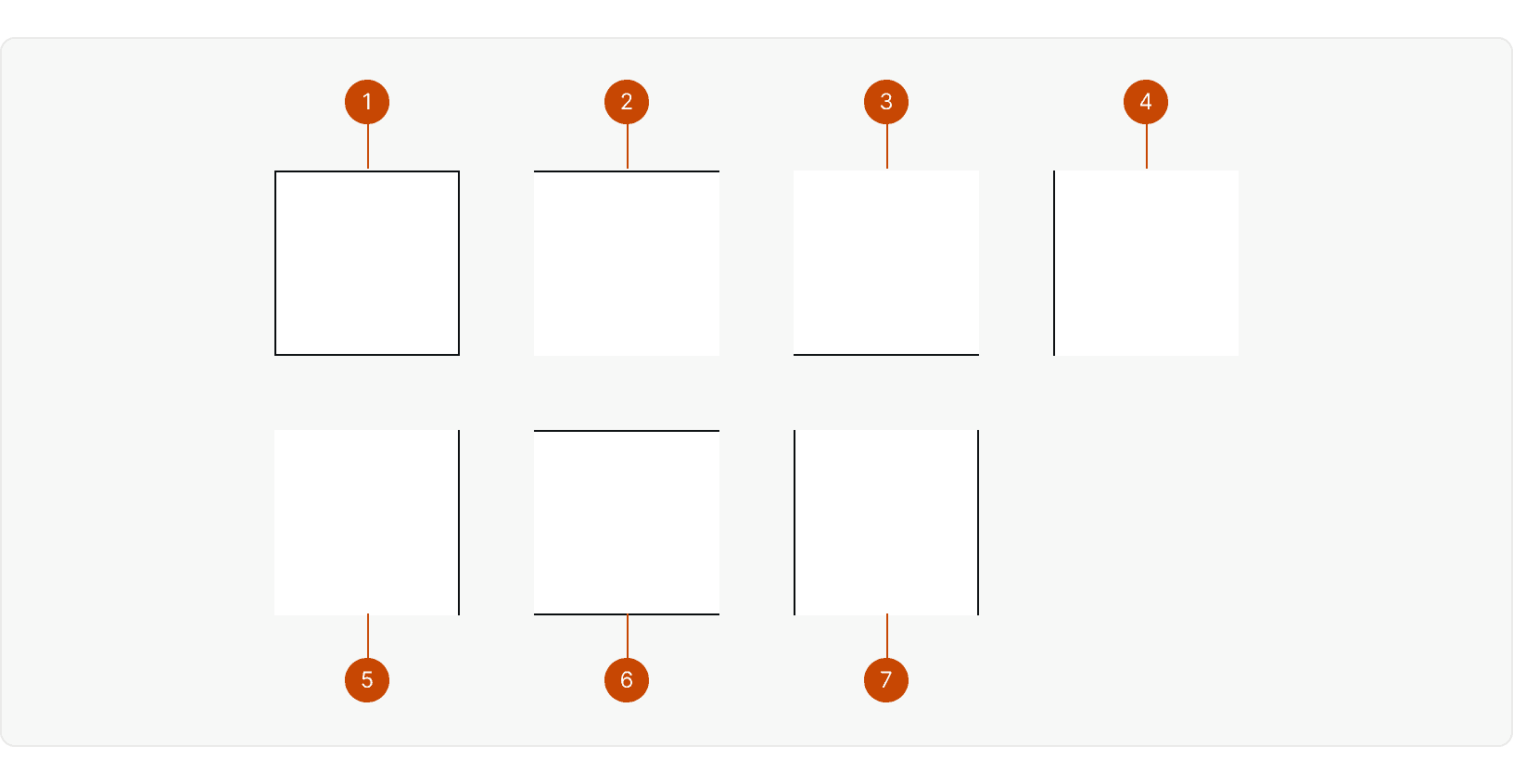
border-solidAllborder-t-solidTopborder-b-solidBottomborder-l-solidLeftborder-r-solidRightborder-y-solidTop and bottomborder-x-solidLeft and right
Color
Light Mode
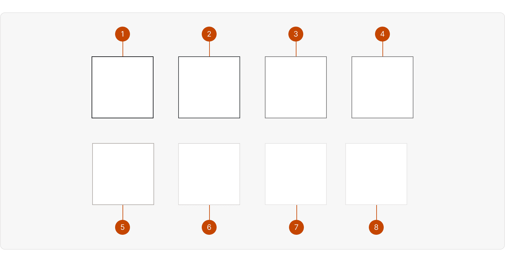
Dark Mode
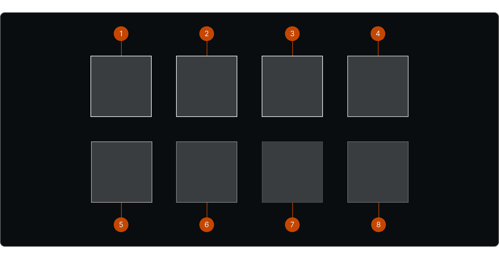
border-charcoal-greyborder-slate-greyborder-smoke-greyborder-graphite-greyborder-concrete-greyborder-cloud-greyborder-mercury-greyborder-fog-grey
Radius
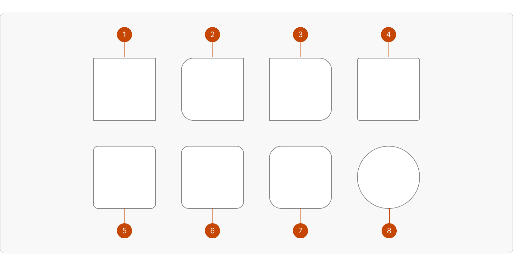
b-radius-none0pxb-radius-noneRightb-radius-noneLeftb-radius-sm4pxb-radius-md8pxb-radius-lg12pxb-radius-xl20pxb-radius-circle50%
Best Practices
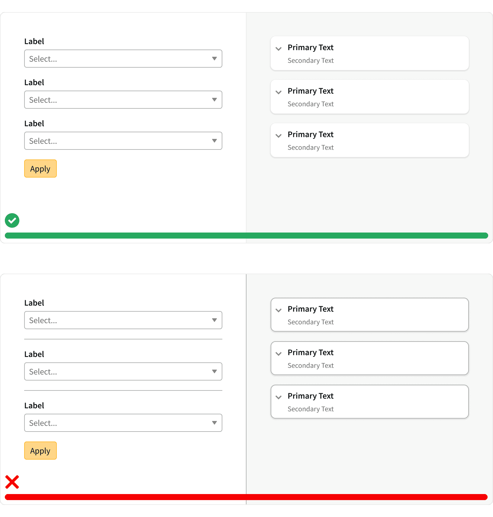
1. Use sparingly
Overusing borders can create visual clutter and detract from the content. Use them sparingly to group related elements, define clear hierarchy, and guide users' attention. ¹
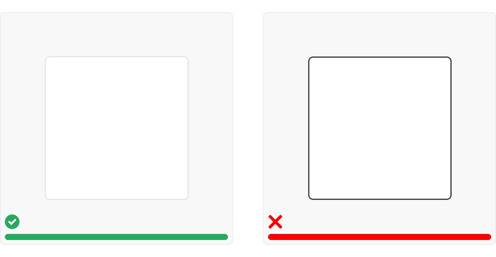
2. Thin and light borders
Dark, thick borders can overwhelm the interface. Subtle lines provide definition without being overbearing. ²
3. Purposeful placement
Every border should have a clear purpose. Don't add them simply for decoration.
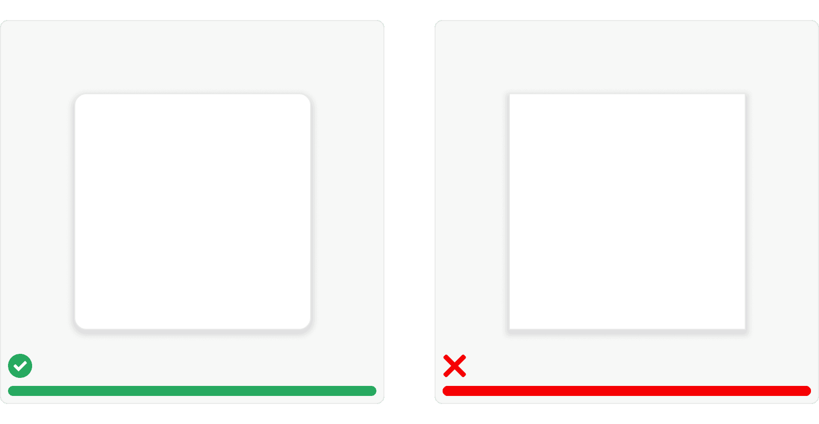
4. Border radius
Rounded corners can soften the look of borders and add a touch of personality. Experiment with different levels of curvature to find the right balance for your design. ³
Tokens
More
Additional Reading
How to Declutter your Design https://medium.com/wdstack/how-to-declutter-your-design-88cbd9e45015#:~:text=At%20first%2C%20it%20seems%20that,add%20to%20the%20visual%20clutter%E2%80%A6
UI Design in Practice Series: Containers, Boxes and Borders https://designerup.co/blog/ui-design-tips-boxes-and-borders/
All you need to know about UI design Shapes and Objects https://hype4.academy/articles/design/all-you-need-to-know-about-ui-design-shapes-and-objects