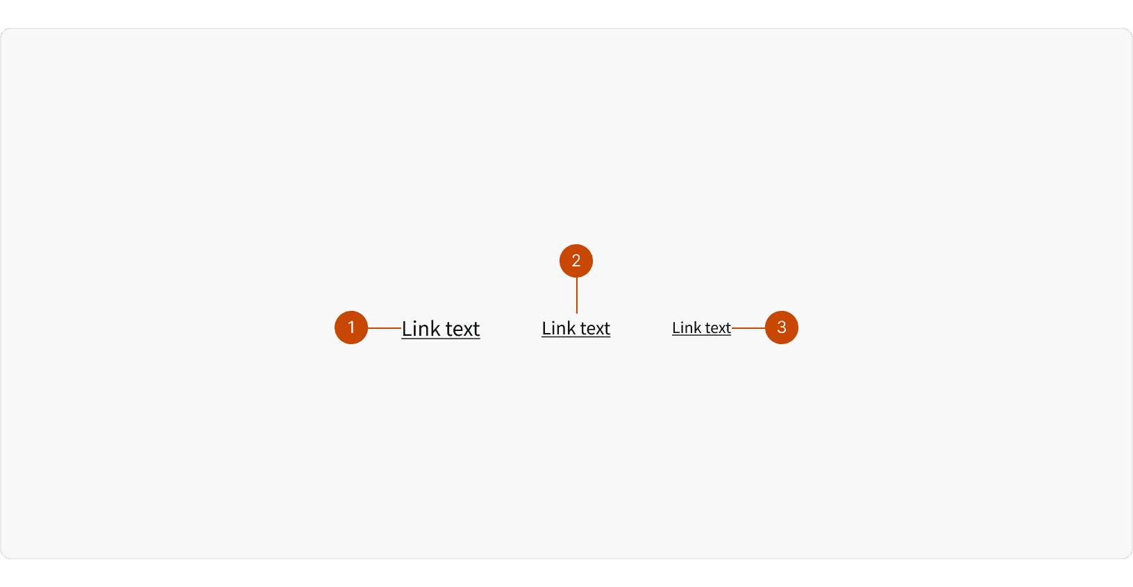
Variants
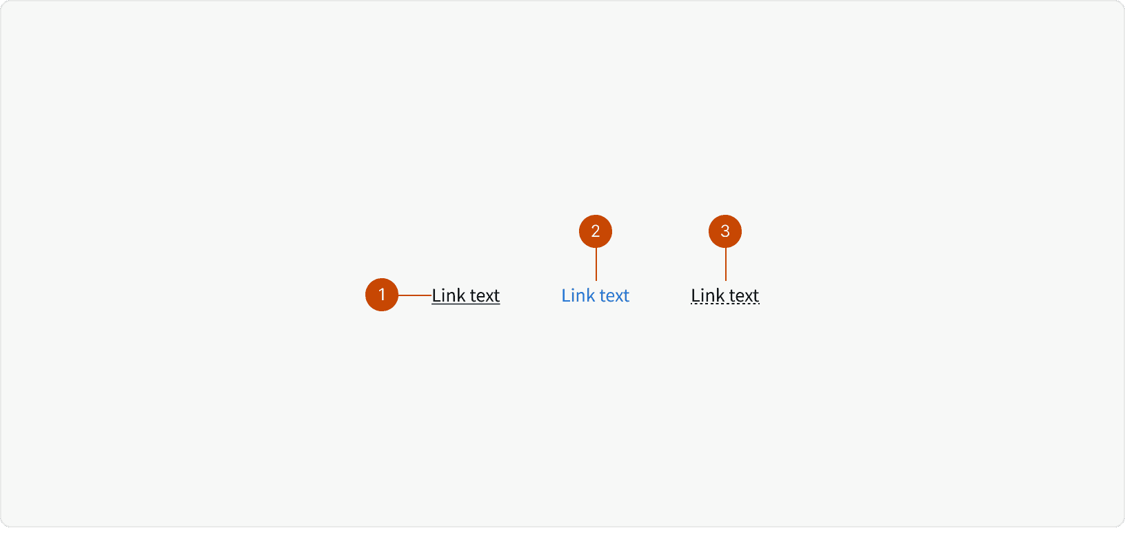
Default: Use when a link is in context of, or near a sentence.
Secondary: Use in situations where the link stands alone, or visually needs more differentiation or call out than the underline.
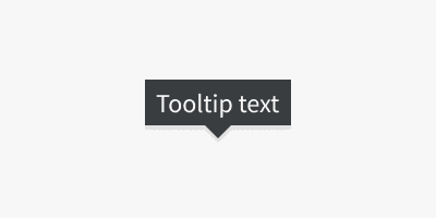
Underline Dotted: Use when you need to display a tooltip on hover, instead of navigating the user away.
Large
Medium
Small
States
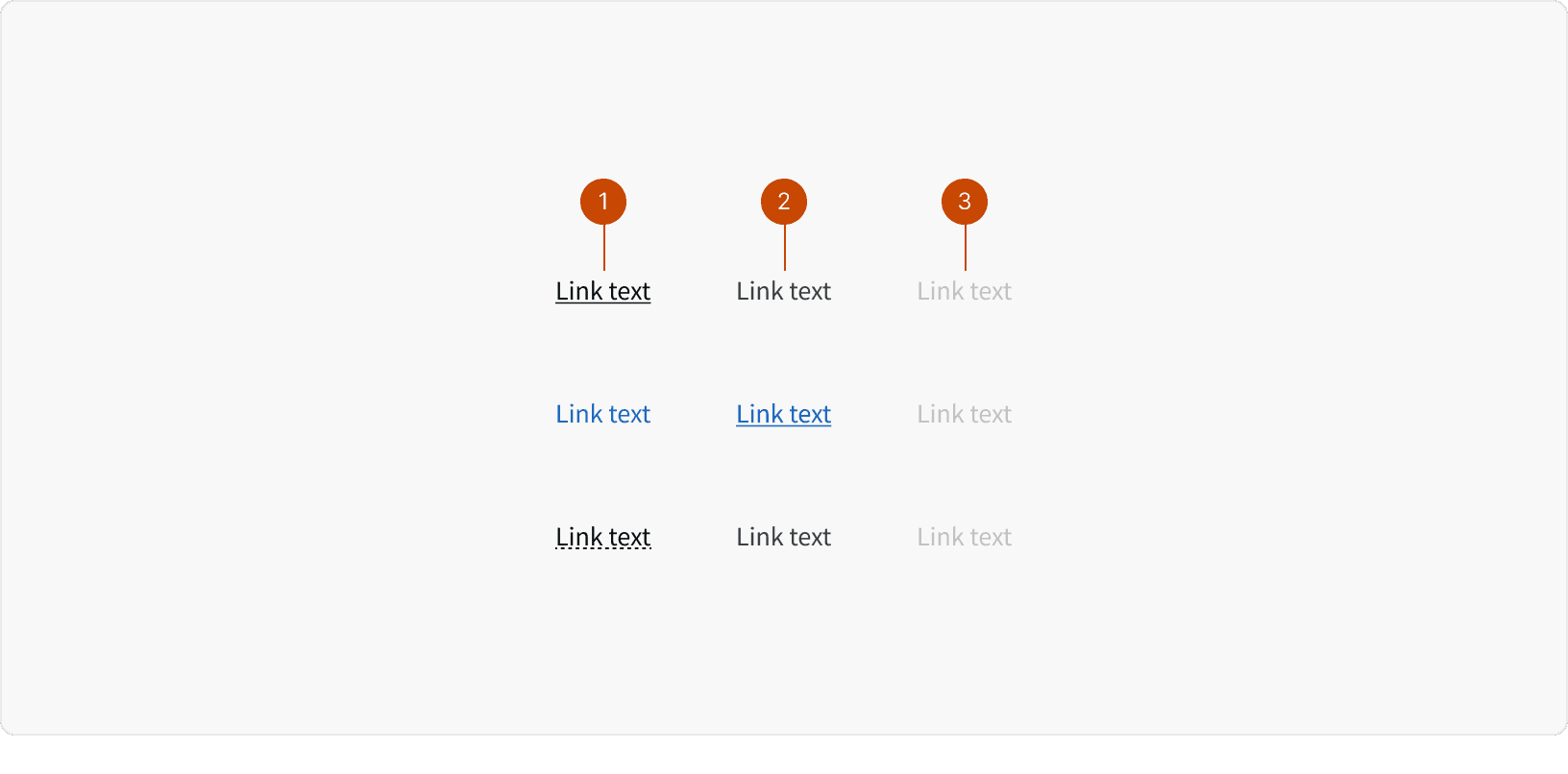
Default
Hover
Disabled
Best Practices
1. Text
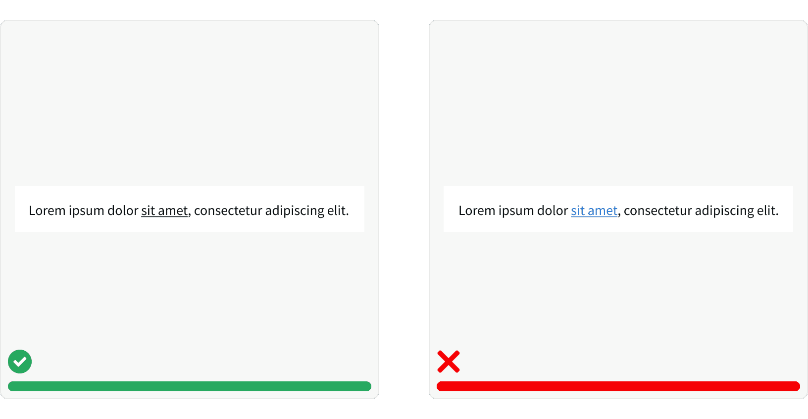
Write helpful link text. The link text should describe its purpose and/or destination.²

2. Navigation
Links are use primarily for navigation. If you want a user to take a clickable action or trigger a javascript event use a button.¹ ⁴
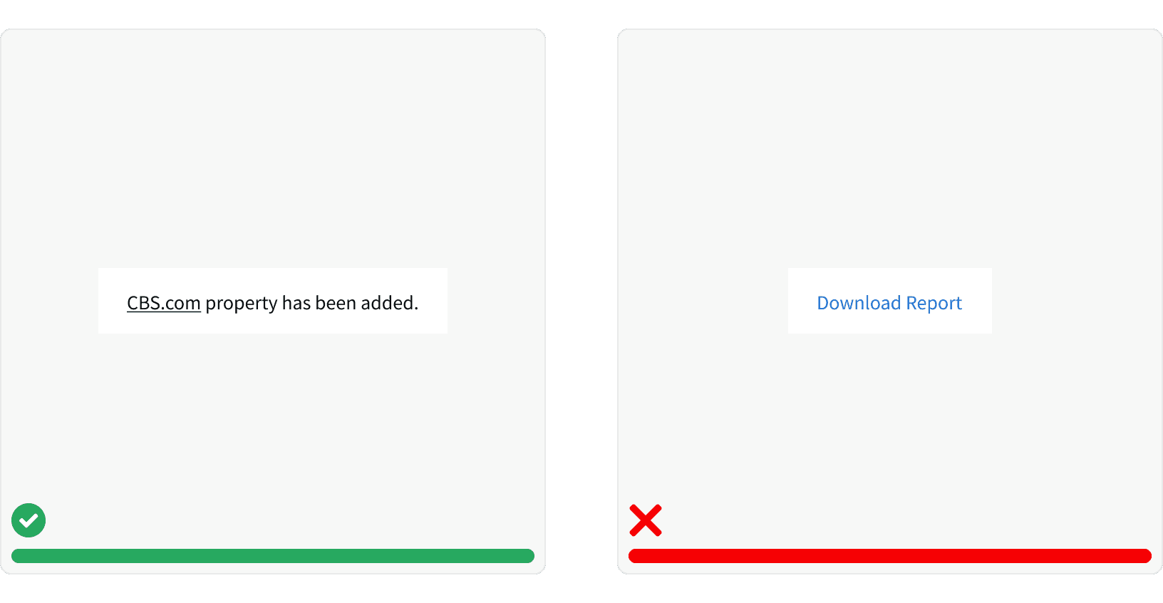
3. Style
Use the correct style. Default styled black links should have a black underline and on hover, lose that underline. Secondary blue links should not have an underline by default, but gain one on hover.⁵ These hover states are an accessible way to identify interact-ability, besides the default underline or color.
More
Related Pages
Accessibility
Color contrast ratio for our Link components meets AAA (black links) and AA (blue links) standards, based on Web Content Accessibility Guidelines (WCAG) guidelines.
Benefits: People with low vision often have difficulty reading text that does not contrast with its background. This can be exacerbated if the person has a color vision deficiency that lowers the contrast even further. Providing a minimum luminance contrast ratio between the text and its background can make the text more readable even if the person does not see the full range of colors. It also works for the rare individuals who see no color.³
The user should be able to
Tabto focus on links ⁶The user should be able to trigger a focused link with
Enter⁶The user should be able to click and open pages in a new browser tab.
Additional Reading
“Link.” Shopify Polaris, polaris.shopify.com/components/navigation/link.
Patricios, Emma. “Quick Tip: Creating Valid and Accessible Links.” The A11Y Project, a11yproject.com/posts/creating-valid-and-accessible-links/.
“Web Content Accessibility Guidelines (WCAG) 2.0.” W3C, www.w3.org/TR/WCAG20/.
Nils. “Button versus Link - Accessibility Introduction.” Atom, a11y-101.com/design/button-vs-link.
“Web Accessibility Guidelines v1.0 Foundations - Overview.” Buttons & Links | Accessibility Guidelines, web-accessibility.carnegiemuseums.org/content/buttons/.
“Links and HypertextIntroduction to Links and Hypertext.” WebAIM, webaim.org/techniques/hypertext/.