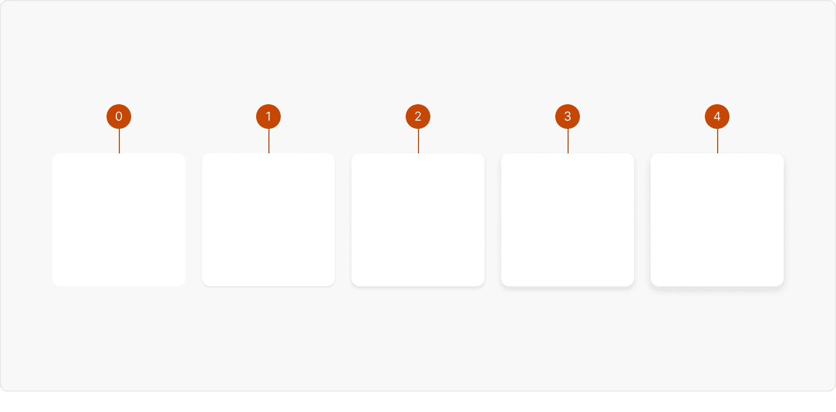
shadow-0
At elevation 0, elements appear seamlessly integrated into the page without any discernible shadow. They are placed directly on the surface, creating a sense of visual continuity and simplicity. This level of elevation is suitable for elements that are part of the core content and do not require additional prominence.shadow-1
Elevation 1 introduces a subtle shadow that gently lifts elements from the surface, giving them a delicate sense of elevation. This minimal lift helps elements stand out slightly from the surrounding content, drawing attention without overwhelming the design. Elevation 1 is ideal for elements that need a touch of emphasis within the context of the page. Ex. Cardsshadow-2
At elevation 2, elements cast a more noticeable shadow, creating a stronger separation between the element and the underlying content. This elevation level is reserved for elements that are directly related to the content but require a distinct visual presence. The shadow adds depth, aiding in the perception of layering within the design.Ex. Card Soft, Tooltipshadow-3
Elevation 3 elevates elements above the content with a prominent shadow, indicating their importance and separate interactive nature. This level is employed for elements that involve distinct interactions, such as pop-over dialogs or pickers with additional information. The shadow signifies that these elements can be interacted with independently from the main content. Ex. Calendar, Picklist, Panelshadow-4
Elevation 4 creates a significant visual separation between an element and the background, placing it far above the content. The intense shadow draws the user's attention, making the element a central focal point. This level is utilized for critical UI components that require immediate and undivided user attention, such as modals or alerts that require urgent action. Ex. Flash, Card Raised, Card Soft: Hover, Modal
Best Practices
1. Use Sparingly
Shadows should be applied sparingly and with intention. Avoid overusing shadows, as excessive shadow effects can clutter the interface and create confusion. Instead, reserve shadows for situations where they truly enhance the design, such as indicating interaction or depth.
2. Layering
Shadows can be employed to visually convey the layering of elements within the interface. Apply lighter shadows to elements that are further back, and slightly more pronounced shadows for elements that are closer to the forefront. This technique helps users understand the spatial arrangement of UI components.
3. Hierarchy
Leverage shadows to establish a clear visual hierarchy in your design. Elevate important elements by giving them stronger shadows, making them appear closer and more prominent. Less important elements can have lighter shadows, reinforcing their position in the hierarchy.
4. Emphasis
Shadows can be a tool to emphasize specific elements within the UI. By giving an element a slightly stronger shadow, you can draw attention to it and make it stand out. However, exercise restraint to ensure that the emphasis is noticeable but not overpowering, maintaining a balanced and cohesive design.