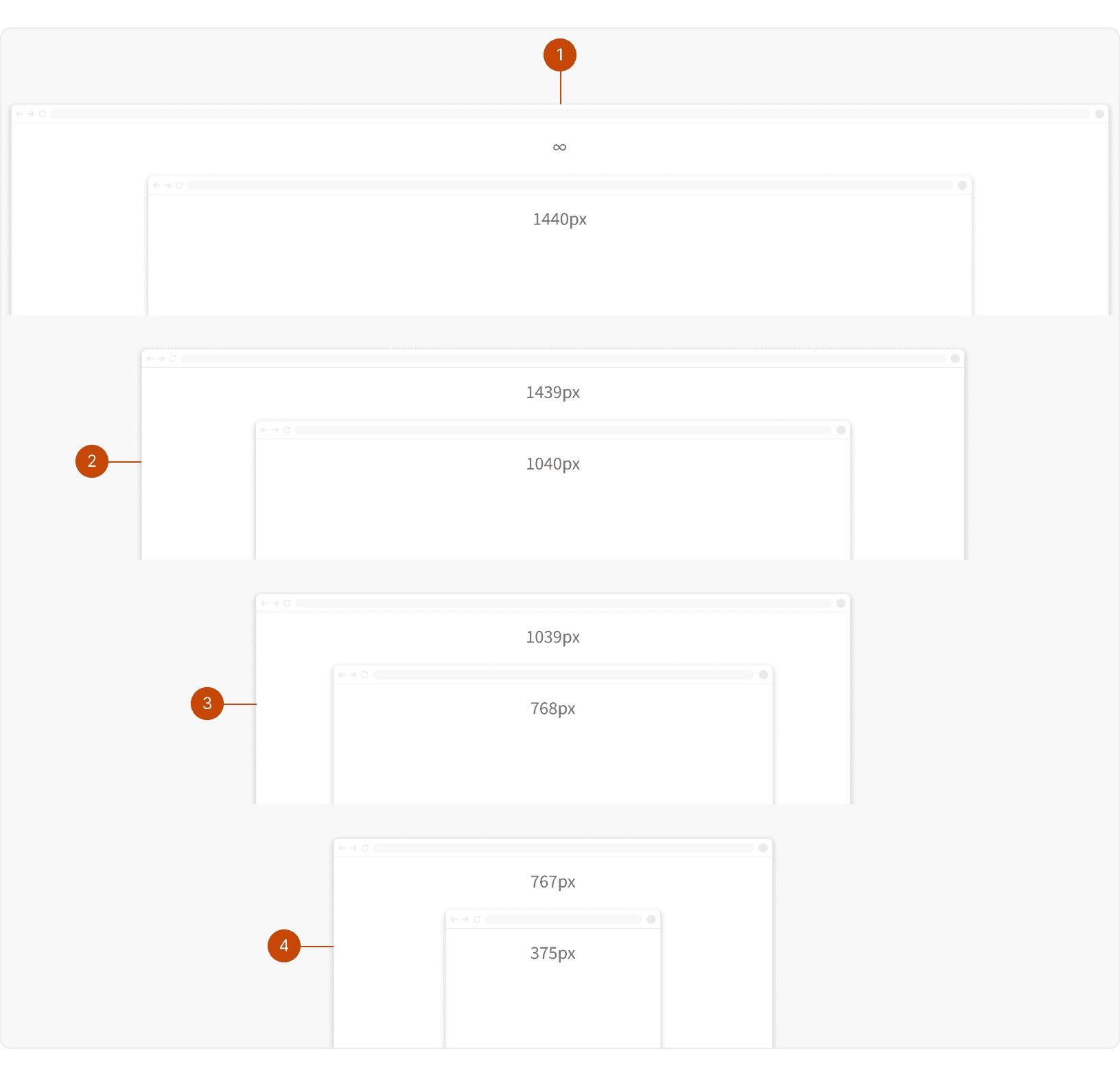
xlarge1440px and up
Devices: Large laptops, desktops, and external monitorslarge1040px - 1439px
Devices: Laptopsmedium768px - 1039px
Devices: Small laptops and landscape tabletssmall375px - 767px
Devices: Portrait tablets and mobile phones
Best Practices
1. Desktop-First Approach
Since Basis is primarily used on desktop, start with the Xlarge breakpoint and scale down from there. This ensures a good user experience for our primary use cases, and then provides support for edge-case mobile use cases.

2. Prioritize and Hide Content
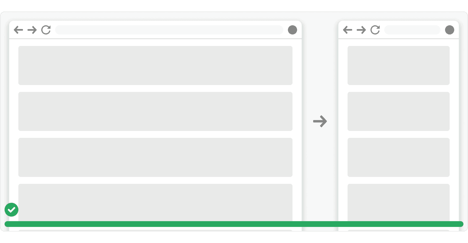
Identify essential content that must always be visible and what can be hidden or accessed differently on smaller screens. Use techniques like progressive disclosure, accordions, or tabs to manage content effectively. ¹
3. Use Layout Classes
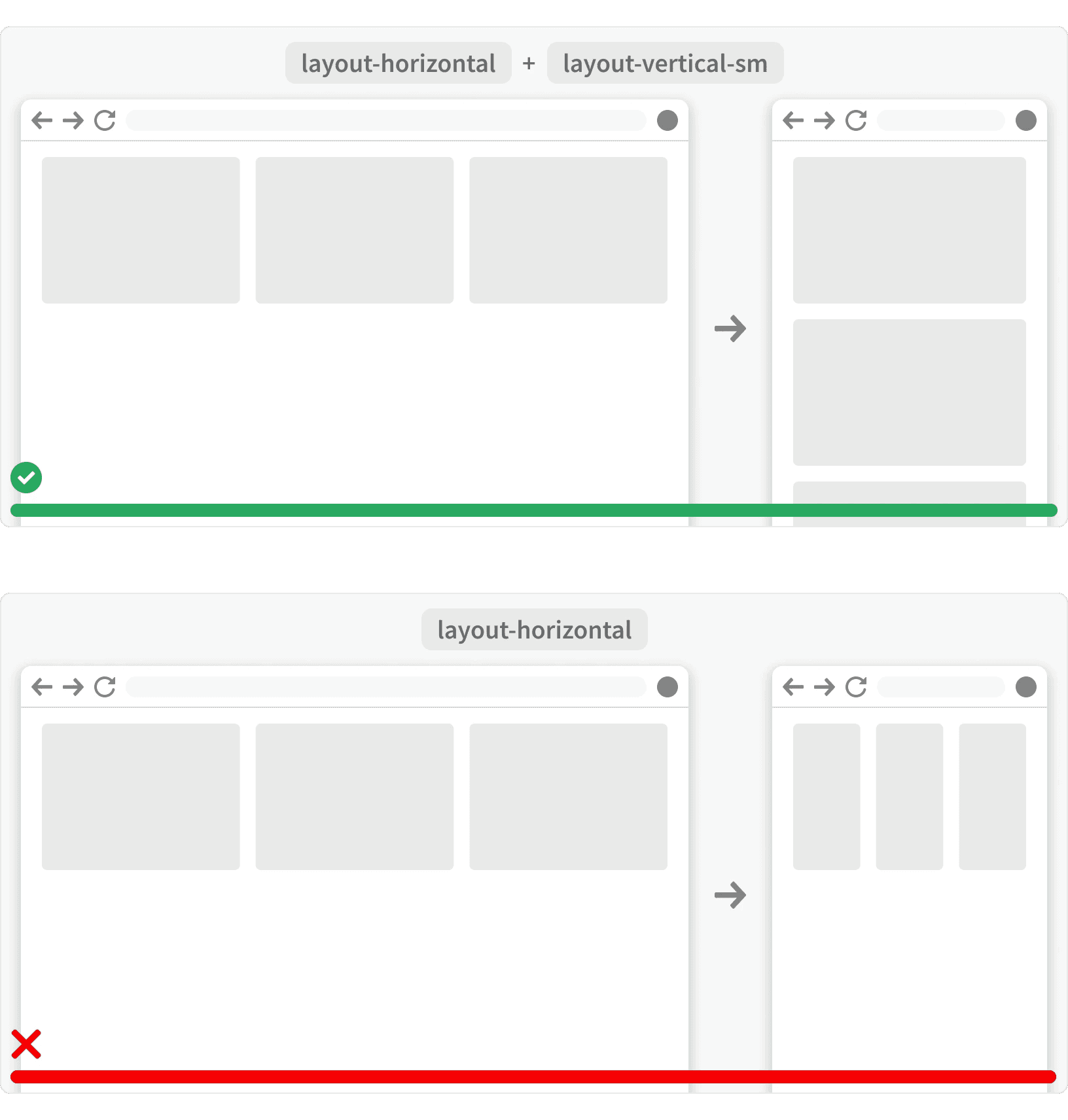
Employ our layout classes to adapt to different screen sizes while maintaining consistency. Use the various stacking method classes to change layout direction depending on available space of that breakpoint.²

4. Testing
Thoroughly test your responsive design on a variety of devices and screen sizes. Use browser developer tools and emulators to simulate different user experiences. ²
More
Additional Reading
Responsive Design: Best Practices & Examples https://www.uxpin.com/studio/blog/best-practices-examples-of-excellent-responsive-design/
Responsive Across All Devices: An Incredible Guide to Responsive UI/UX Design https://bootcamp.uxdesign.cc/responsive-across-all-devices-an-incredible-guide-to-responsive-ui-ux-design-7d710eddc9c8
Responsive Design Best Practices https://uxplanet.org/responsive-design-best-practices-c6d3f5fd163b
Responsive Web Design (RWD) and User Experience https://www.nngroup.com/articles/responsive-web-design-definition/