Variants
Best Practices
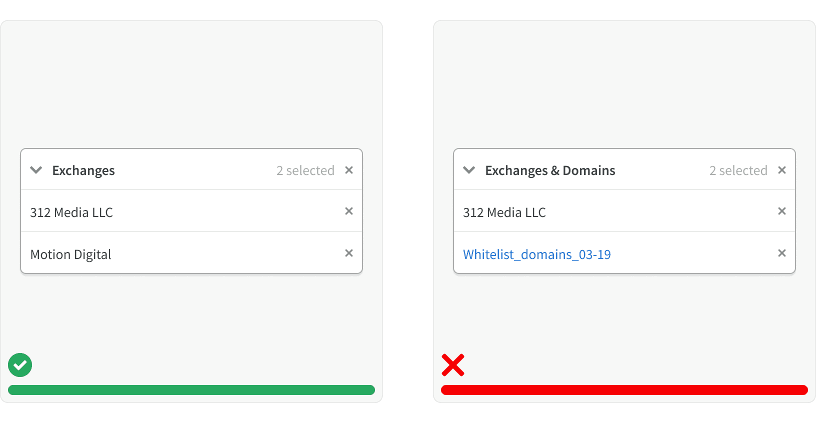
1. Content
Cards should only contain content related to a single subject.
2. Navigation
When used for navigation, cards should only contain a single link to the next page in the work flow.
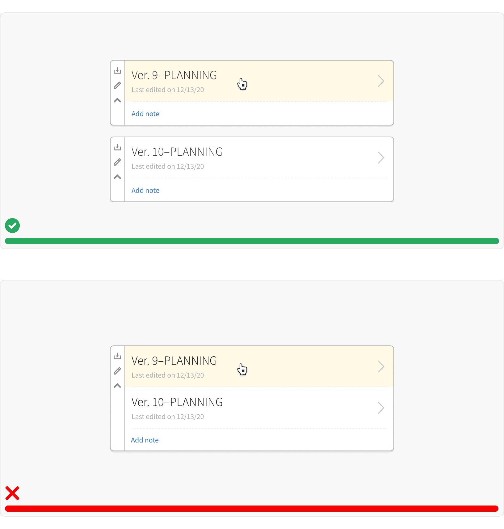
3. Label
If the card has a collapsed state, it should have a visible label.
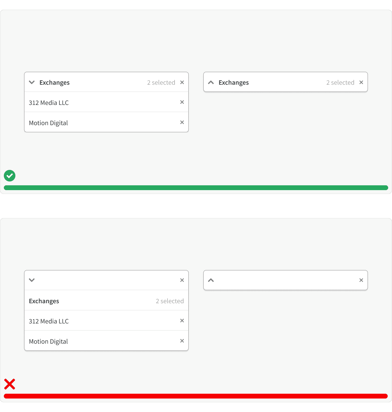
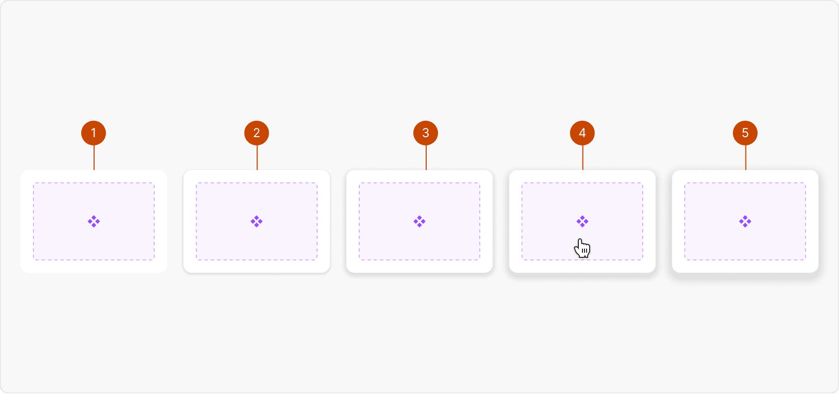
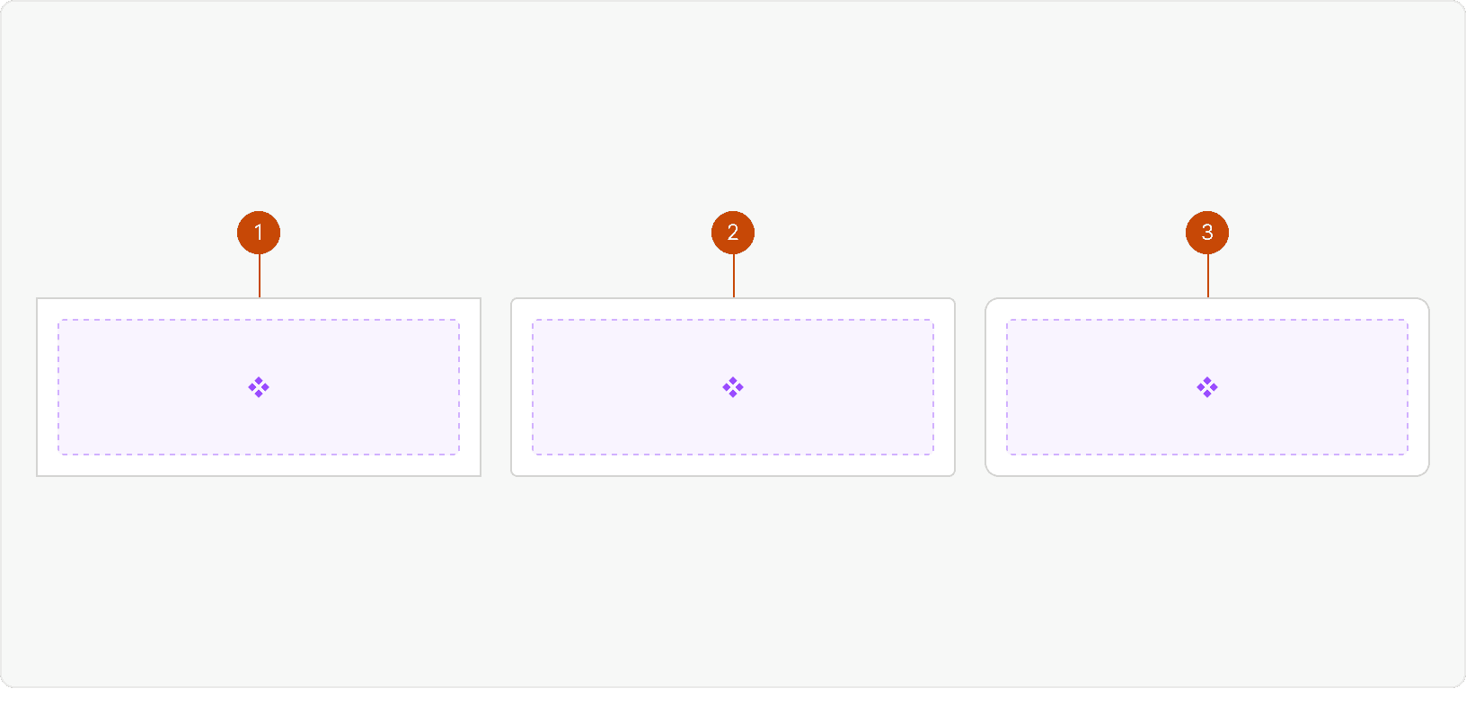
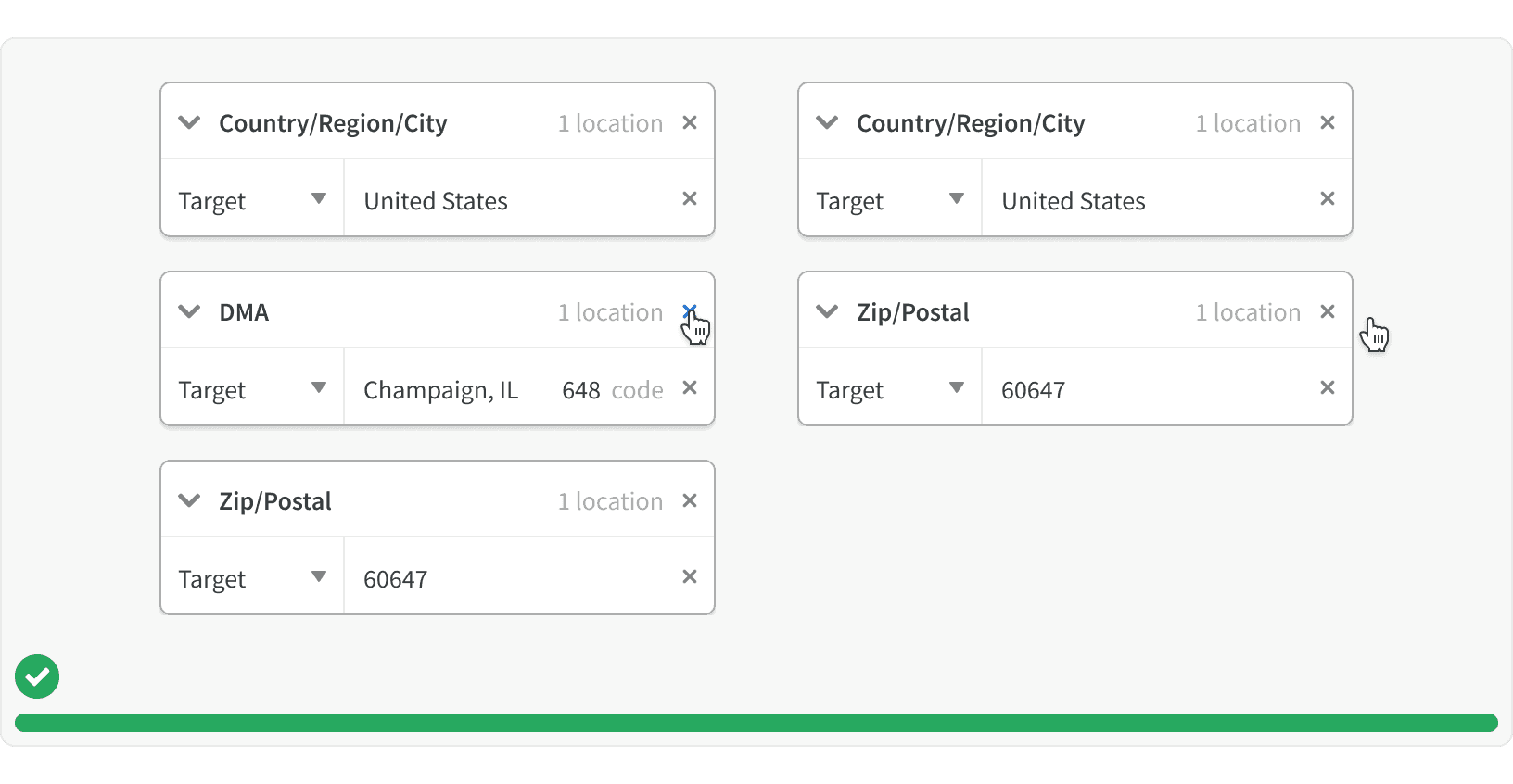
4. List Layout
If a card is removed, the other cards in the list should adjust to fill the space.
More
Accessibility
All Card content color should follow contrast ratio AA standards, based on Web Content Accessibility Guidelines (WCAG) guidelines.
Benefits: People with low vision often have difficulty reading text that does not contrast with its background. This can be exacerbated if the person has a color vision deficiency that lowers the contrast even further. Providing a minimum luminance contrast ratio between the text and its background can make the text more readable even if the person does not see the full range of colors. It also works for the rare individuals who see no color.¹
Cards should display a visible focus state
Additional Reading
Cards: UI-Component Definition https://www.nngroup.com/articles/cards-component/
Best practices for designing cards https://uxplanet.org/best-practices-for-designing-cards-a19f53cab052
Design Better Cards https://uxdesign.cc/design-better-cards-c0d12ab581c4
Law of Common Region https://lawsofux.com/law-of-common-region.html