Ready

Typography

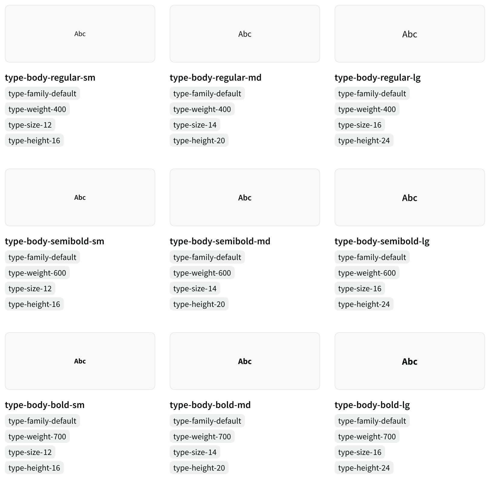
The typographic styles that make up our Basis applications user interfaces. All styles use Source Sans Pro.

Ready

Typography

The typographic styles that make up our Basis applications user interfaces. All styles use Source Sans Pro.

Ready

Typography

The typographic styles that make up our Basis applications user interfaces. All styles use Source Sans Pro.

Variants

Body


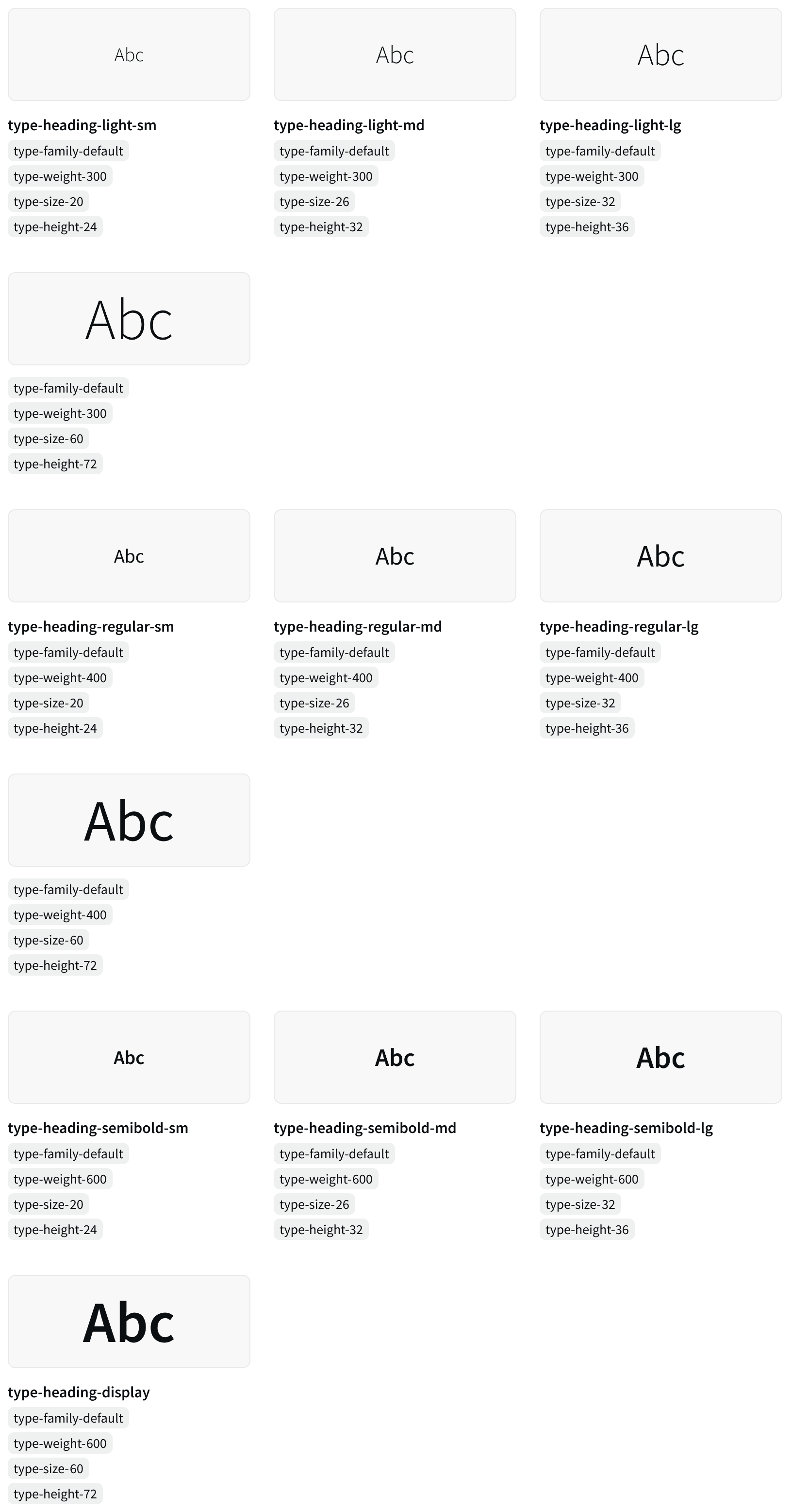
Headings

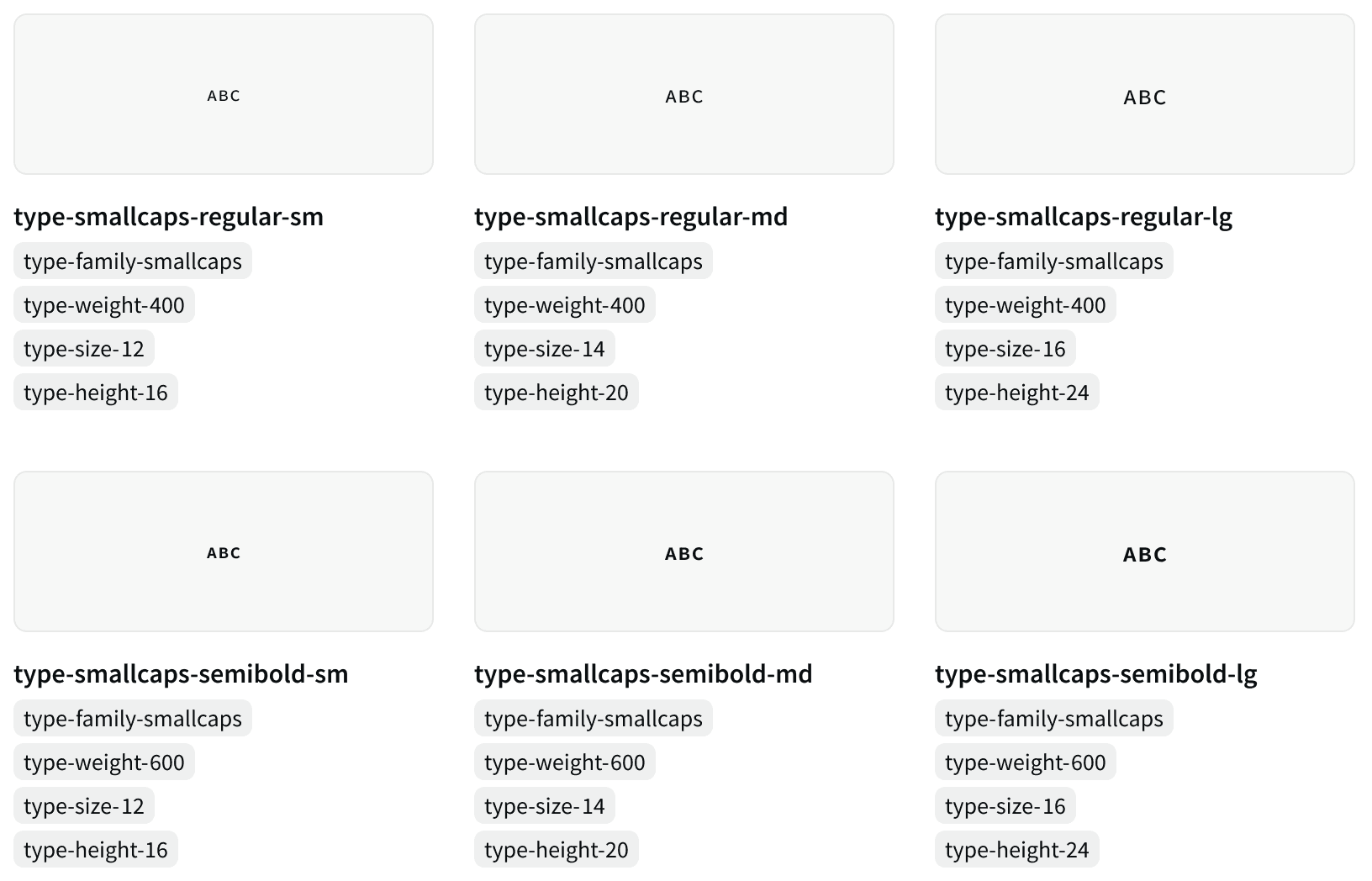
Small Caps

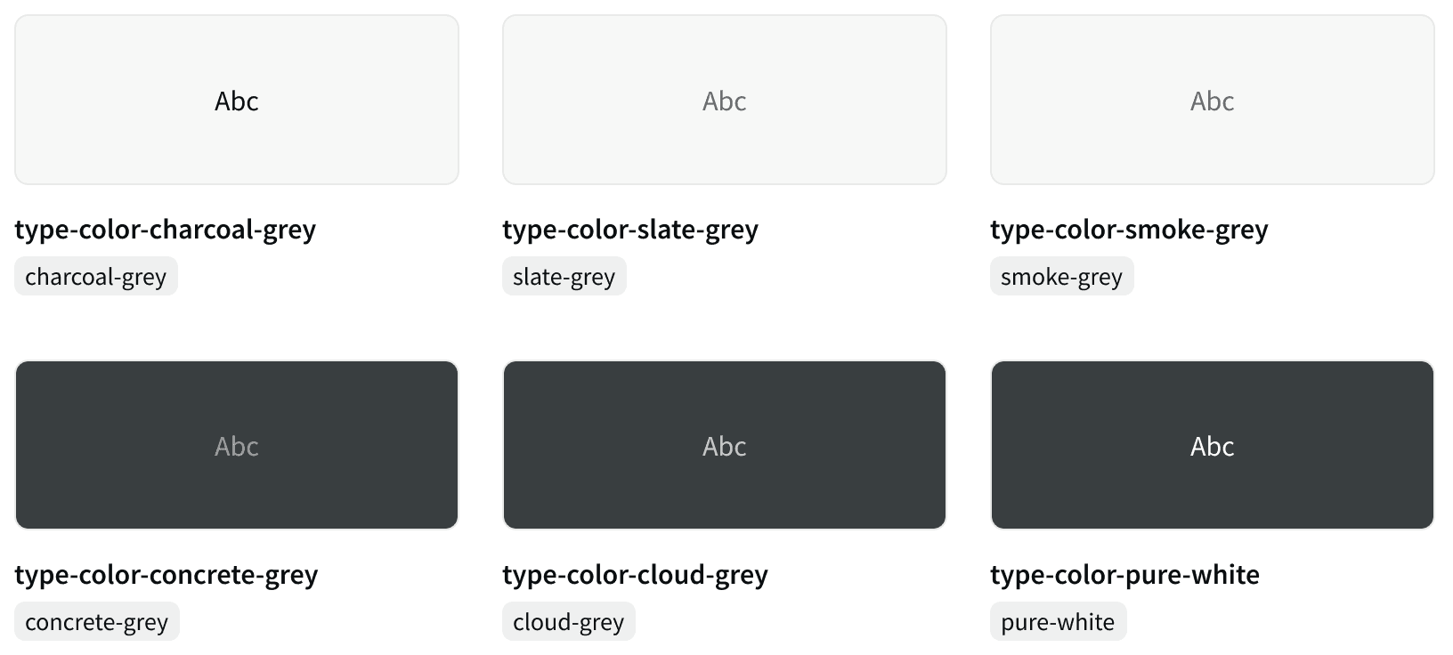
Color

Atomic Classes

Font Size

type-size-12 type-size-14 type-size-16 type-size-20 type-size-26 type-size-32 type-size-60

Line Height

type-height-16 type-height-20 type-height-24 type-height-32 type-height-36 type-height-72

Font Weight

type-weight-300 (light) type-weight-400 (regular) type-weight-600 (semibold) type-weight-700 (bold)

Other

type-family-default (font-family: "Source Sans Pro") type-family-smallcaps (font-family: "Source Sans Pro SC")

type-spacing-smallcaps

type-transform-uppercase type-transform-lowercase

type-align-(left|center|right)

Best Practices

1. Hierarchy

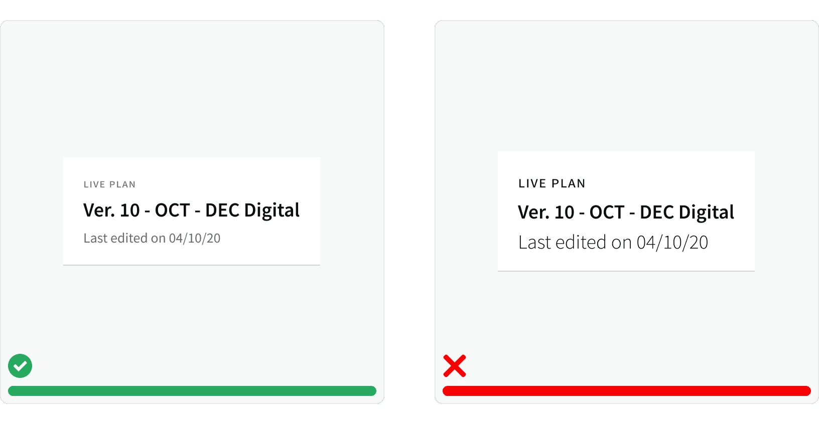
Use the typographic scale and text color scale to establish content hierarchy.¹ Use smaller text for less important information and larger text for more significant information. Use lighter color text for less important information and darker color text for more important information.
2. Line Length

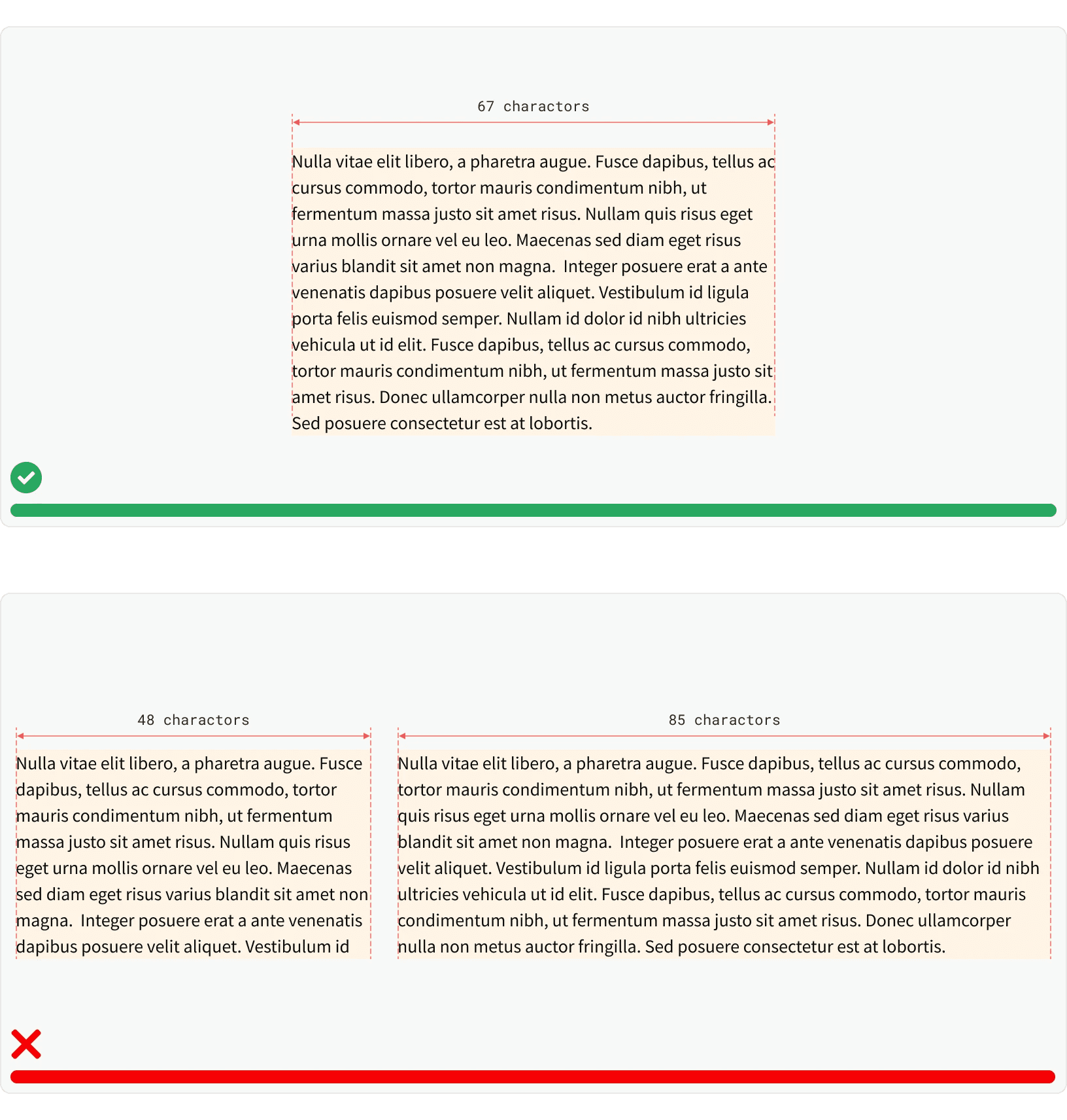
Maintain a proper line length to improve legibility. The suggested line length for on-screen text is within the range of 60 to 80 characters, this is based on a screen size of 1440px and font size of 16px. ¹
3. Combinations

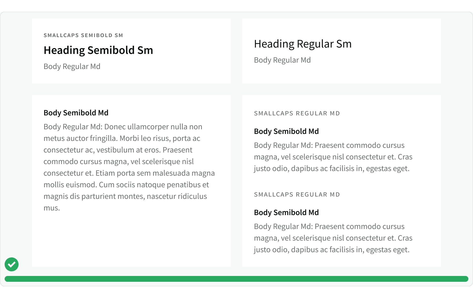
Here are some examples of frequently used typography combinations that can serve as a helpful starting point. It is important to note that these combinations are not obligatory and can be customized according to design requirements.
Tokens

Name

Value

Name

Value

Name

Value

font-weight-700

700 (bold)

font-weight-700

700 (bold)

font-weight-700

700 (bold)

font-weight-600

600 (semibold)

font-weight-600

600 (semibold)

font-weight-600

600 (semibold)

font-weight-400

400 (regular)

font-weight-400

400 (regular)

font-weight-400

400 (regular)

font-weight-300

300 (light)

font-weight-300

300 (light)

font-weight-300

300 (light)

line-height-72

72px

line-height-72

72px

line-height-72

72px

line-height-36

36px

line-height-36

36px

line-height-36

36px

line-height-32

32px

line-height-32

32px

line-height-32

32px

line-height-24

24px

line-height-24

24px

line-height-24

24px

line-height-20

20px

line-height-20

20px

line-height-20

20px

line-height-16

16px

line-height-16

16px

line-height-16

16px

type-size-60

60px

type-size-60

60px

type-size-60

60px

type-size-32

32px

type-size-32

32px

type-size-32

32px

type-size-26

26px

type-size-26

26px

type-size-26

26px

type-size-20

20px

type-size-20

20px

type-size-20

20px

type-size-16

16px

type-size-16

16px

type-size-16

16px

type-size-14

14px

type-size-14

14px

type-size-14

14px

type-size-12

12px

type-size-12

12px

type-size-12

12px

type-color-charcoal-grey

#0A0D10

type-color-charcoal-grey

#0A0D10

type-color-charcoal-grey

#0A0D10

type-color-slate-grey

#3A3D40

type-color-slate-grey

#3A3D40

type-color-slate-grey

#3A3D40

type-color-smoke-grey

#6A6B6D

type-color-smoke-grey

#6A6B6D

type-color-smoke-grey

#6A6B6D

type-color-concrete-grey

#ACACAC

type-color-concrete-grey

#ACACAC

type-color-concrete-grey

#ACACAC

type-color-cloud-grey

#D3D3D3

type-color-cloud-grey

#D3D3D3

type-color-cloud-grey

#D3D3D3

type-color-pure-white

#FFFFFF

type-color-pure-white

#FFFFFF

type-color-pure-white

#FFFFFF

More

Accessibility

Typography should follow the color scale to meet the contrast ratio for AA standards, based on Web Content Accessibility Guidelines (WCAG) guidelines.

  1. Benefits: People with low vision often have difficulty reading text that does not contrast with its background. This can be exacerbated if the person has a color vision deficiency that lowers the contrast even further. Providing a minimum luminance contrast ratio between the text and its background can make the text more readable even if the person does not see the full range of colors. It also works for the rare individuals who see no color.¹

Additional Reading

© 2024 Basis Technologies