Variants
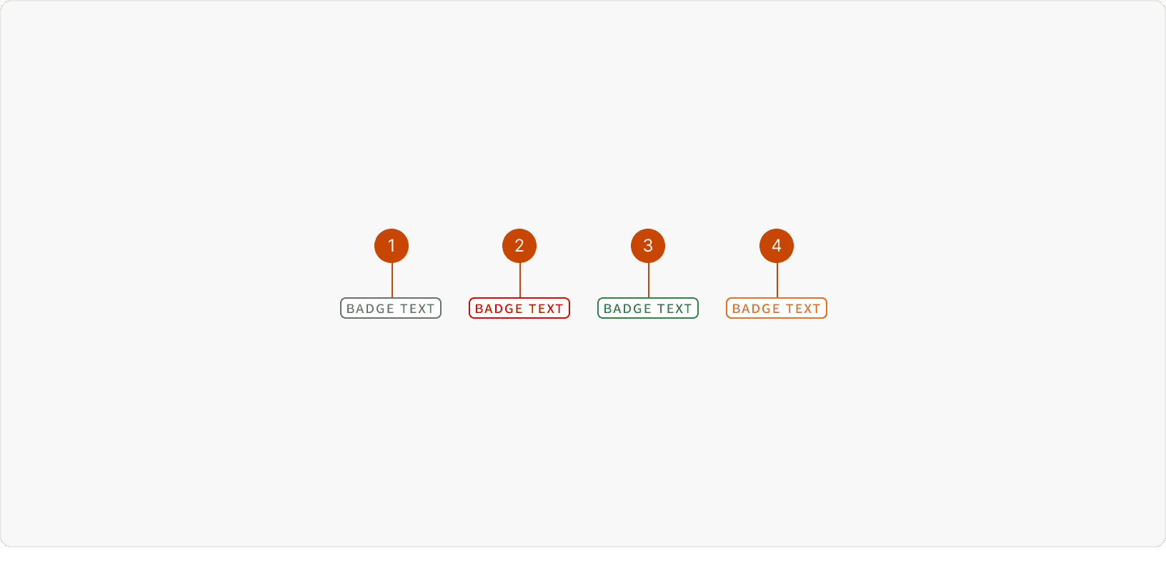
Default: Use to give a non-critical or general status update on a piece of information or action.
Alert: Use to communicate an error, decline, failure, removal or critical state that requires user attention.
Confirm: Use to indicate a successful, completed, or desirable state when it’s important to provide positive reinforcement to the user.
Warning: Use to provide status updates that the user should watch. A warning status may require the user’s attention and potential action.
Best Practices
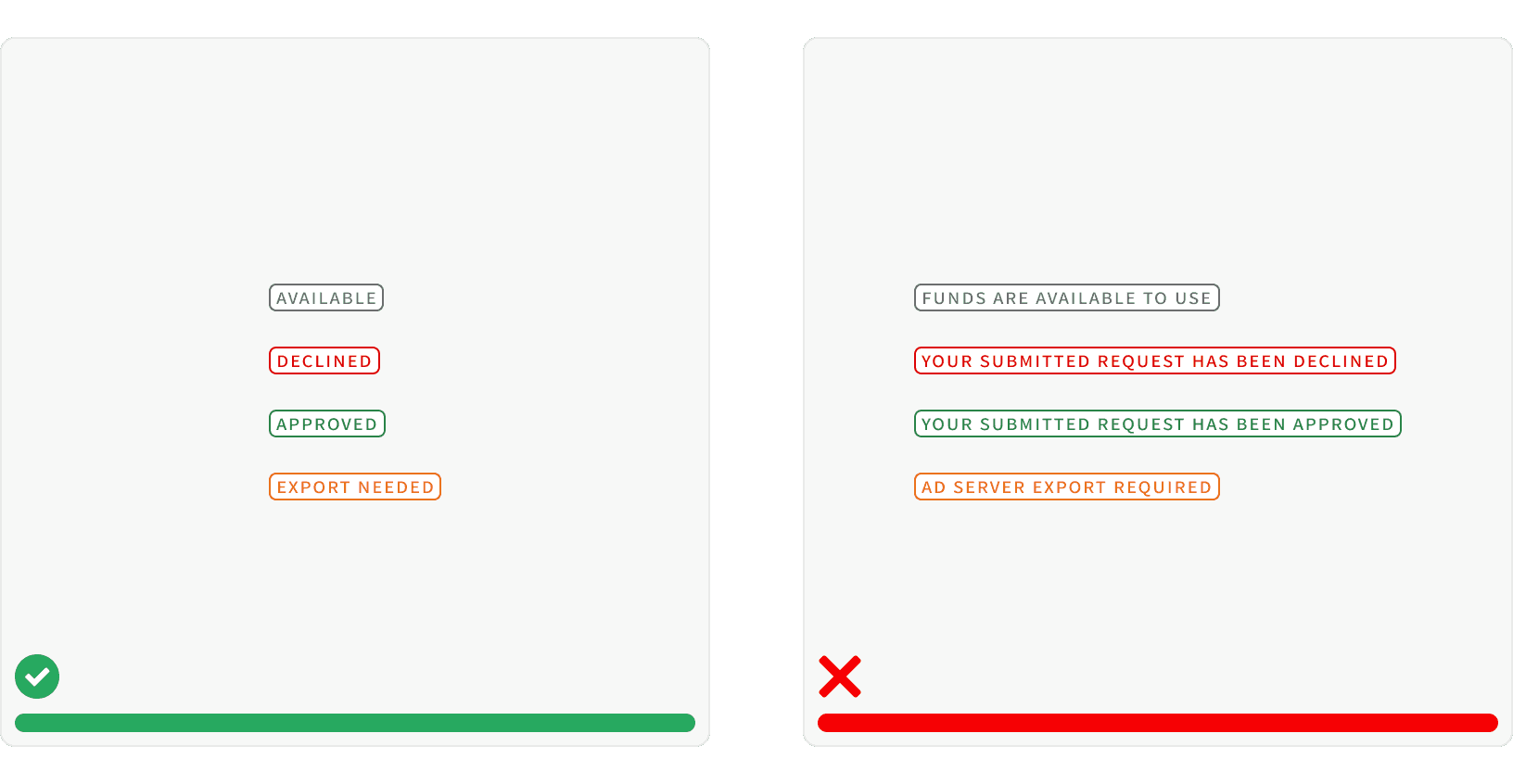
1. Succinct
Text inside a Badge should be written as succinctly as possible. Avoid too many characters and spaces when writing content for a Badge label. Too many characters and spaces makes the badge hard to read for the user.
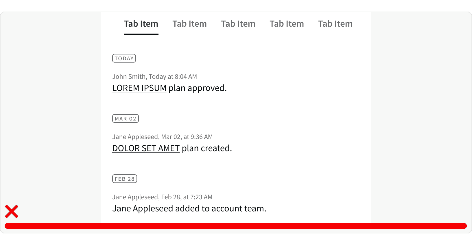
2. Status
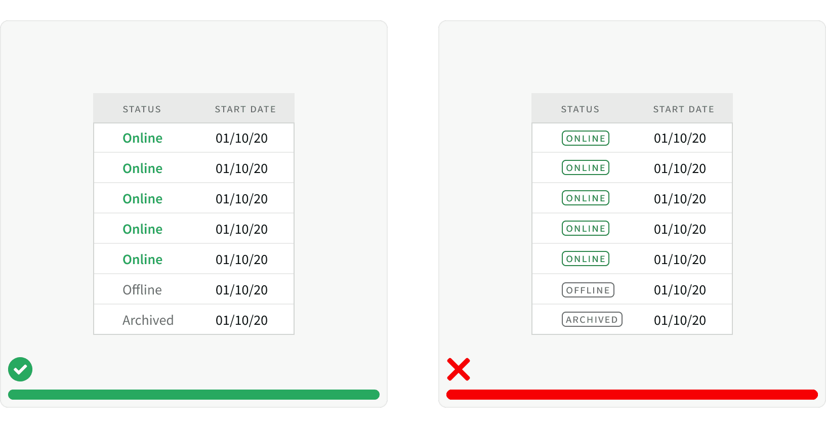
Use Badges for emphasis and a quick comprehension of a status to the user. Badges should not be used as a design element.
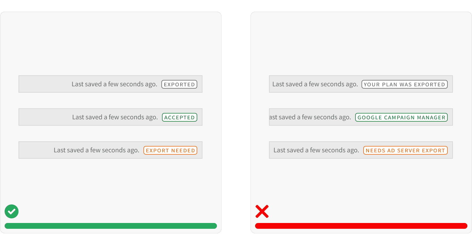
3. Consistent Variant Usage
Use consistent color patterns and variants throughout your layouts and components. This will increase the user’s confidence in our app as it will be less confusing to them.
4. Multiple Badges
Be thoughtful of multiple Badge variants being used in close proximity to each other. Be mindful of the information you are trying to display as it relates to both the user's workflow and existing components on the page. Without that consideration, Badges can create an overly noisy page or component.
More
Related Pages
Accessibility
Color contrast ratio for our Badge components meets AA standards, based on Web Content Accessibility Guidelines (WCAG) guidelines.
Benefits: People with low vision often have difficulty reading text that does not contrast with its background. This can be exacerbated if the person has a color vision deficiency that lowers the contrast even further. Providing a minimum luminance contrast ratio between the text and its background can make the text more readable even if the person does not see the full range of colors. It also works for the rare individuals who see no color.¹
Additional Reading
“Web Content Accessibility Guidelines (WCAG) 2.0.” W3C, www.w3.org/TR/WCAG20/.