Stacking Methods
Default
Use these classes to arrange elements in vertical or horizontal layouts.
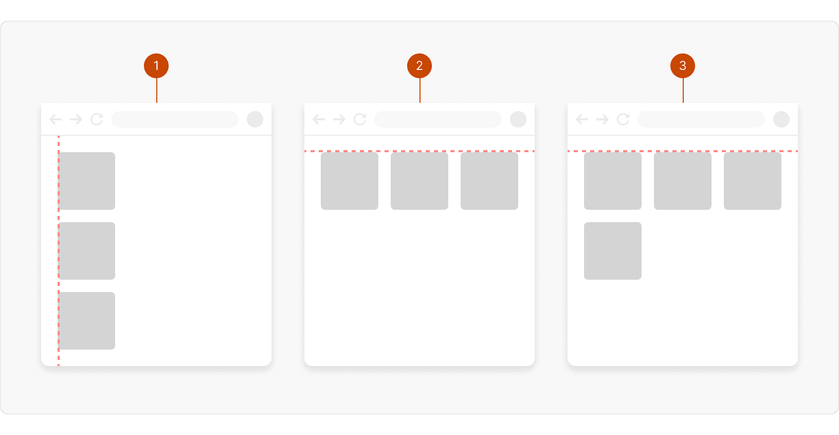
layout-verticallayout-horizontallayout-horizontal-wrap
Breakpoint Specific
Use these classes to change the stacking direction for a specific responsive breakpoint.
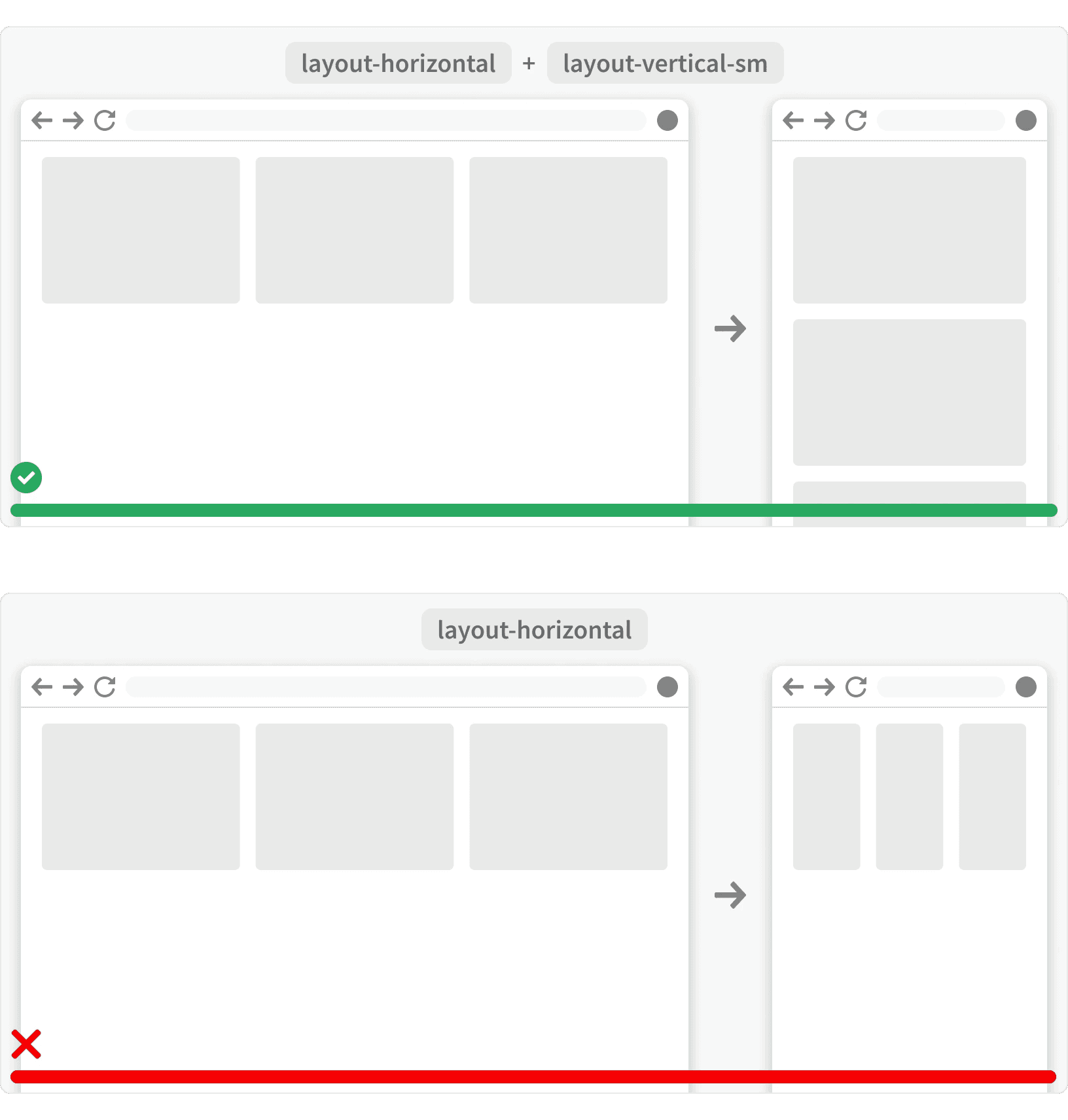
layout-vertical--md: Forces alayout-horizontalcontainer to stack vertically at the small and medium breakpoints.layout-vertical--sm: Forces alayout-horizontalcontainer to stack vertically at the small breakpoint.
Width
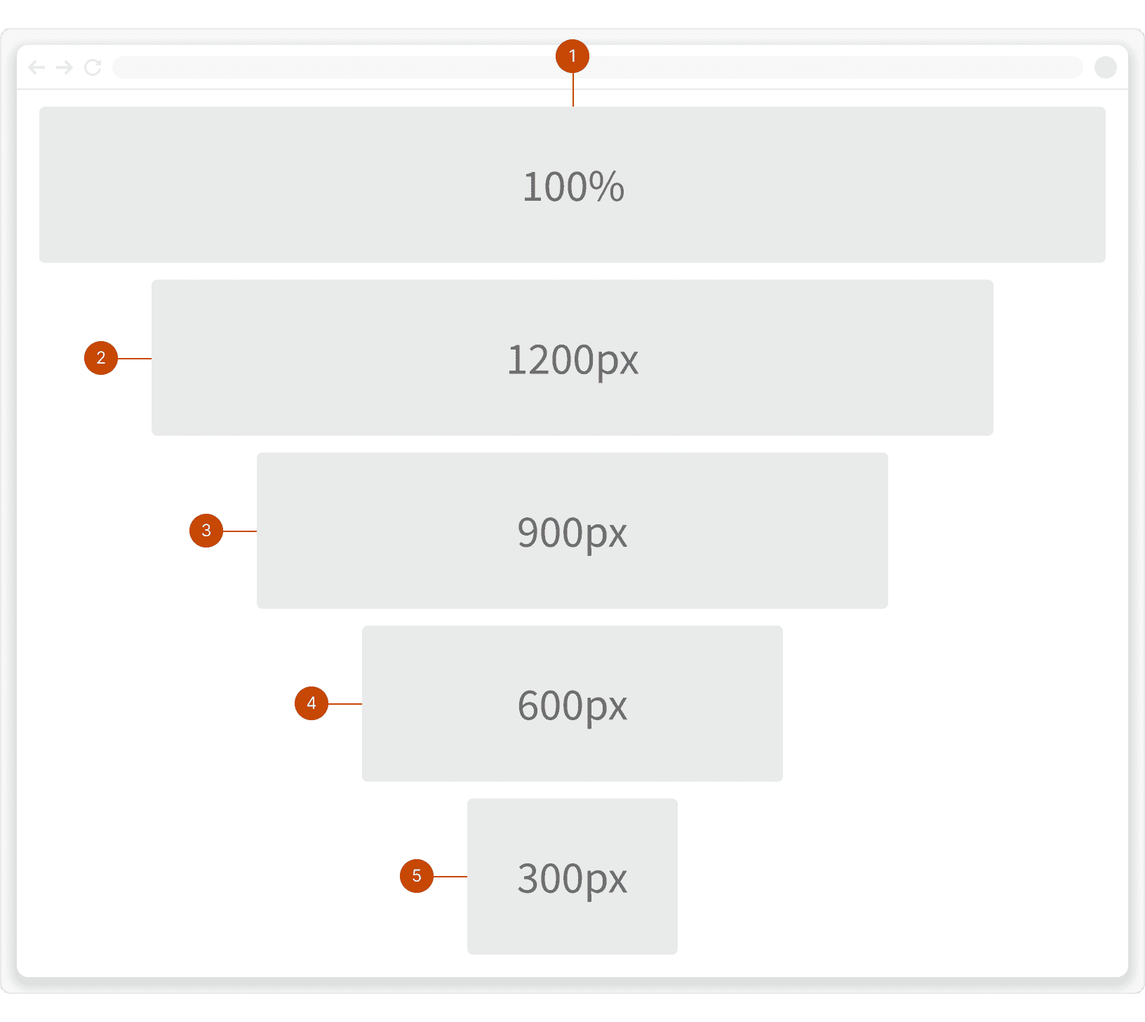
layout-width--full100%layout-width--xlmax-width: 1200pxlayout-width--lgmax-width: 900pxlayout-width--mdmax-width: 600pxlayout-width--smmax-width: 300px
Gap
Our layout gap classes use our spacing units to add space between layout items.
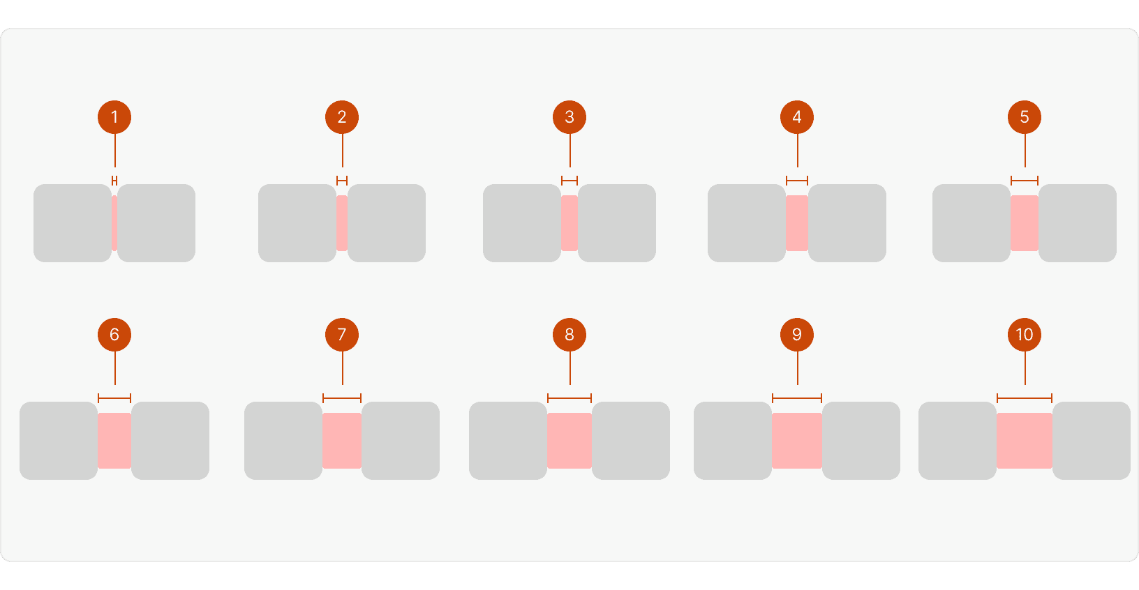
layout-gap--1layout-gap--2layout-gap--3layout-gap--4layout-gap--5layout-gap--6layout-gap--7layout-gap--8layout-gap--9layout-gap--10
Alignment
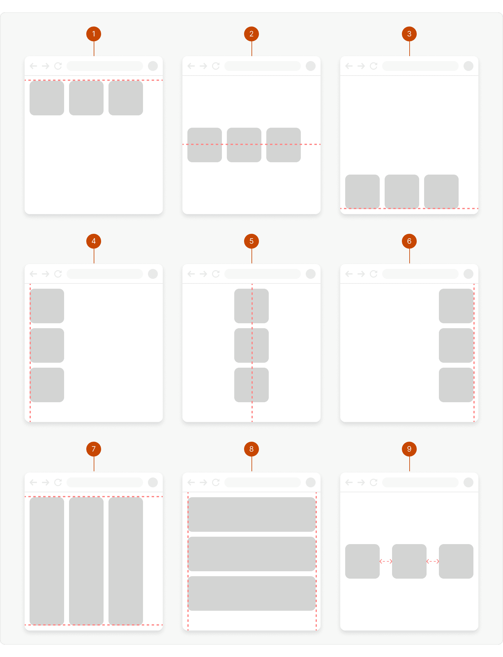
layout-align--topAligns items to the top of the container.layout-align--center-yAligns items in the vertical center of the container.layout-align--bottomAligns items to the bottom of the container.layout-align--leftAligns items to the left side of the container.layout-align--center-xAligns items to the horizontal center of the container.layout-align--rightAligns items to the right side of the container.layout-align--stretch-yStretch the items to fill the vertical space of the container.layout-align--stretch-xStretch the items to fill the horizontal space of the container.layout-align--space-betweenEvenly distribute the items within the container.
Best Practices
1. Structure
Use layout classes to provide a clear structure to a UI design. This will improve the page readability and allow users to easily find what they’re looking for. ¹
2. Gaps
Use the layout-gap classes to create clear separation between different pieces of content on the page. ¹
3. White Space
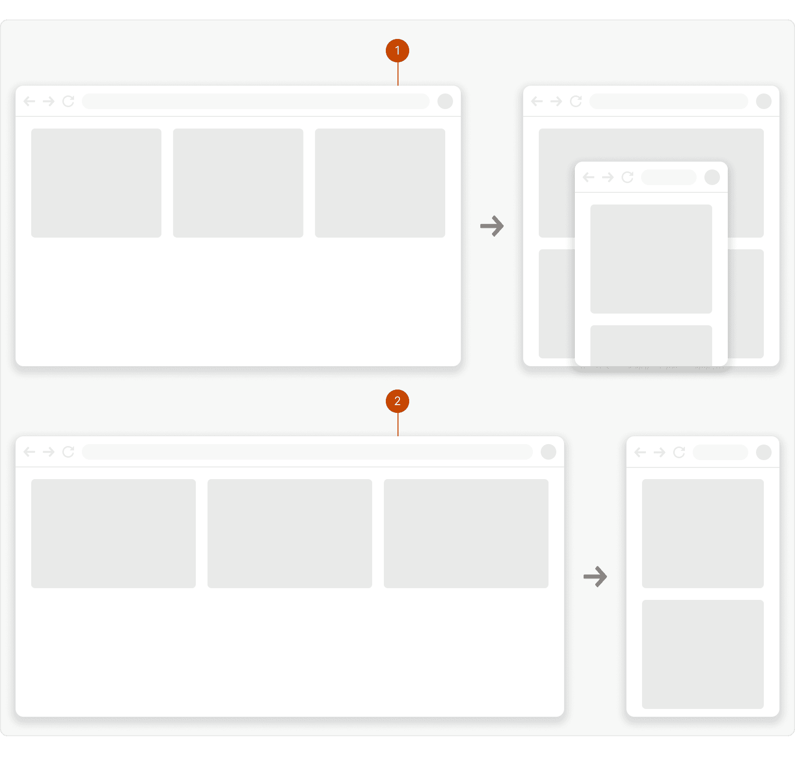
Use white space to give breathing room around your page elements and to help users focus on what’s most important. ² This can be done using the layout-width classes to give a content container a max-width and add white space around around it.
4. Optimize for screen size
Use the breakpoint specific stacking methods to optimize your layouts for different screen sizes.
Tokens
More
Additional Reading
Using Grids in Interface Designs https://www.nngroup.com/articles/using-grids-in-interface-designs/
Understand Layout in App Design…in 10 minutes https://uxplanet.org/layout-in-app-design-in-10-minutes-f05ed6a32c44