Sizes
xxxsmall8pxxxsmall10pxxsmall12pxsmall16pxmedium24px
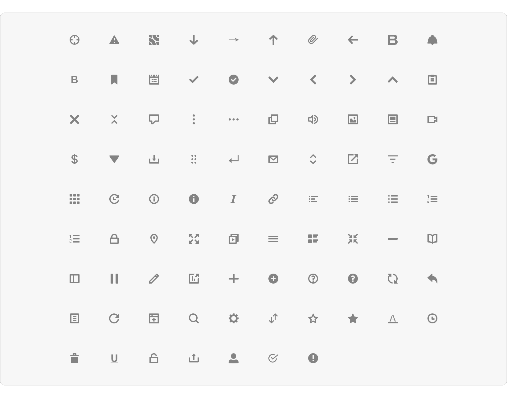
Library
Best Practices
1. Clear Meaning
Icons should be as simple as possible while clearly representing their intended meaning.
2. Recognizable
Use established icons that Basis users will recognize and understand quickly.
3. Clickable Icons
All clickable icon should be displayed using an icon button.
More
Accessibility
Icons should follow color contrast ratio for AA standards, based on Web Content Accessibility Guidelines (WCAG) guidelines.
Benefits: People with low vision often have difficulty reading text that does not contrast with its background. This can be exacerbated if the person has a color vision deficiency that lowers the contrast even further. Providing a minimum luminance contrast ratio between the text and its background can make the text more readable even if the person does not see the full range of colors. It also works for the rare individuals who see no color.¹
Icons should always include a title tag to explain the meaning of the icon
Additional Reading
Icon Usability https://www.nngroup.com/articles/icon-usability/
Icon Usability - Best UX Tips and Design Guidelines https://www.intechnic.com/blog/icon-usability-best-ux-tips-and-design-guidelines/
Icons As Part Of A Great User Experience https://www.smashingmagazine.com/2016/10/icons-as-part-of-a-great-user-experience/