Anatomy
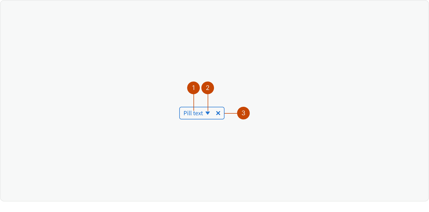
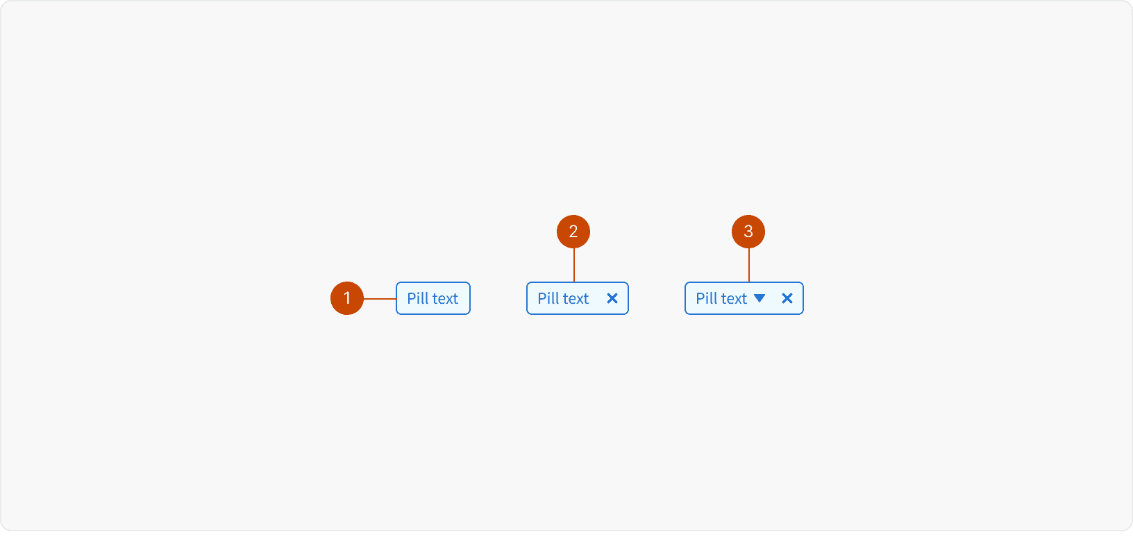
Pill Text
Dropdown Icon
Dismiss Control
Variants
Default
Deletable
Dropdown
States
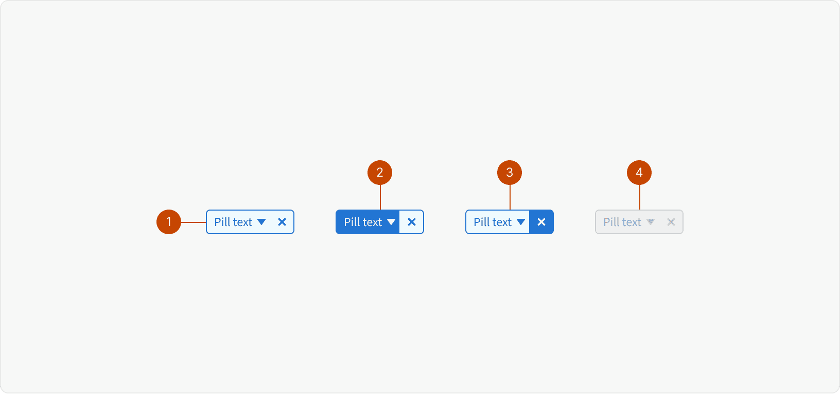
Default
Dropdown: Hover
Delete: Hover
Disabled
Best Practices
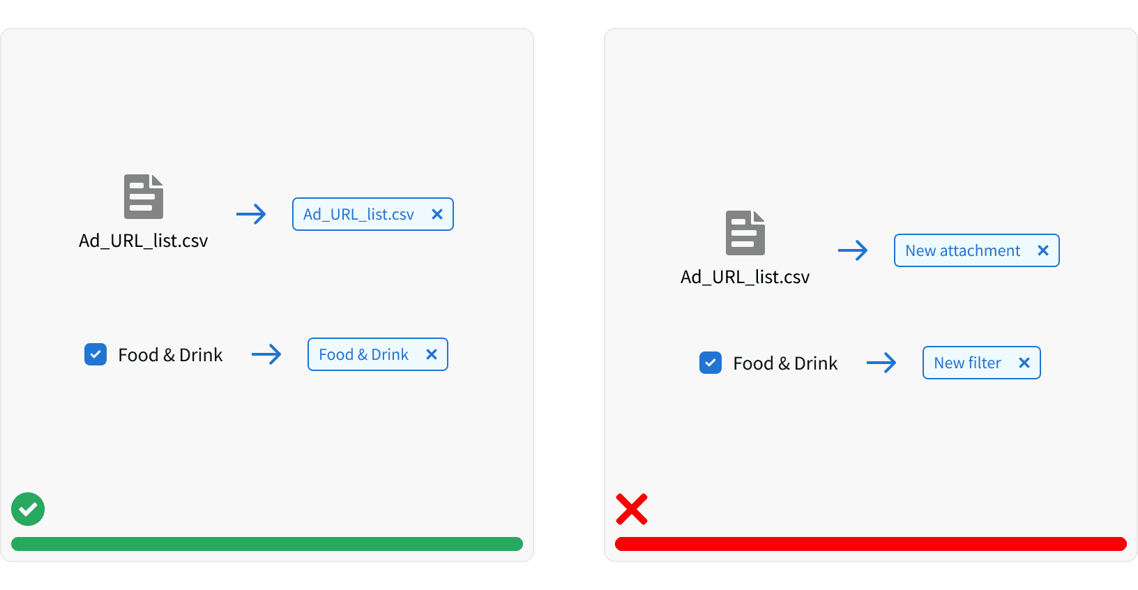
1. Clear
Pills should clearly represent the user input that generated them. If the input contains text, that text should be used in the pill.
2. Concise
Pill text should be concise. Pill text should be short and easy to scan

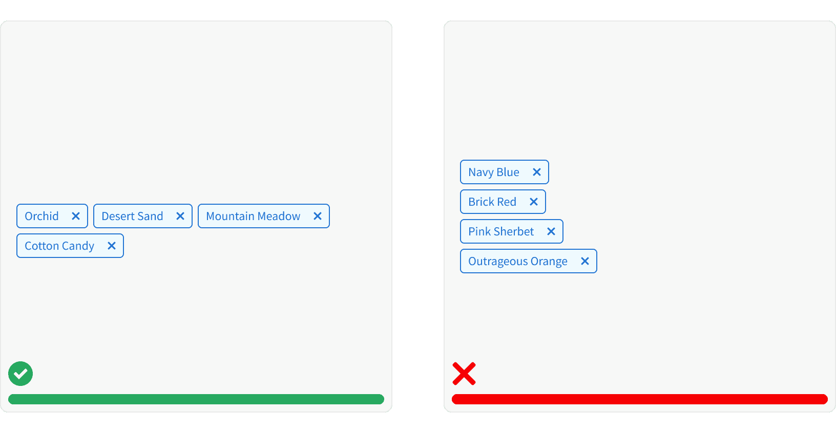
3. Multiple pills
Multiple pills should display in-line. Pills should be separated with 1 core unit See Spacing for unit values.
4. Delete a Pill
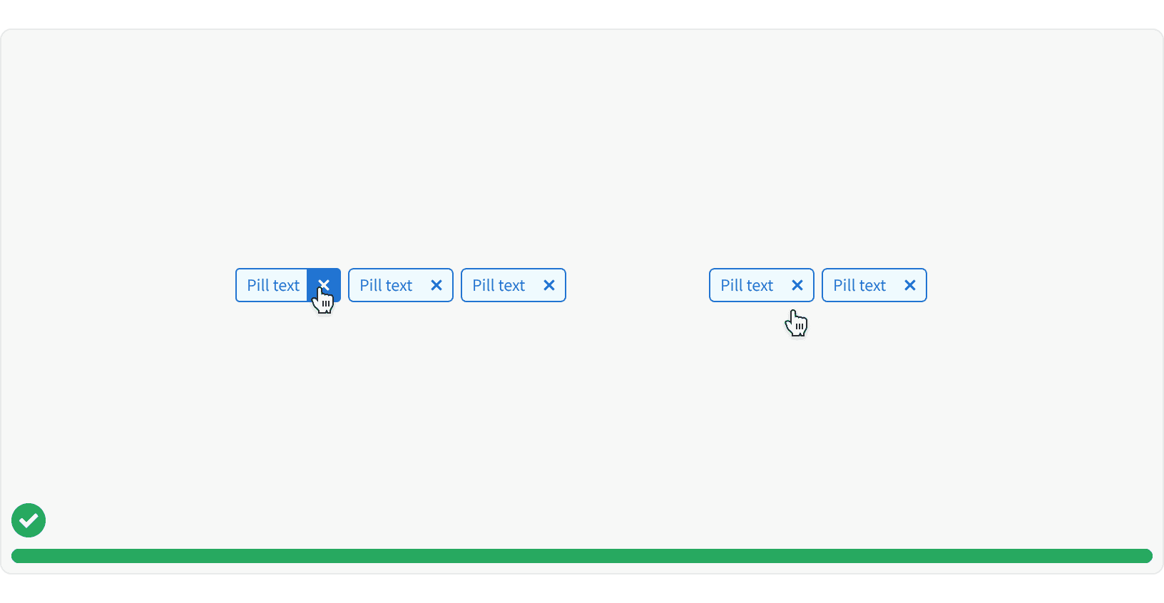
The "Pill-delete" setting gives the user the ability to remove the pill. When a pill is removed, the other pill should shift to the left to fill the space.
More
Related Pages
Accessibility
Color contrast ratio for our Pill components meets AA standards, based on Web Content Accessibility Guidelines (WCAG) guidelines.
Benefits: People with low vision often have difficulty reading text that does not contrast with its background. This can be exacerbated if the person has a color vision deficiency that lowers the contrast even further. Providing a minimum luminance contrast ratio between the text and its background can make the text more readable even if the person does not see the full range of colors. It also works for the rare individuals who see no color.¹
The user should only be able to focus on 1 focused pill per set of pills
The remove button should not be focusable, but should be clickable
The remove button should have a hover state
The user should be able to delete a pill with a keyboard using the
BackspaceorDeletekey when focused on a pillPills should have a title tags
Additional Reading
“Web Content Accessibility Guidelines (WCAG) 2.0.” W3C, www.w3.org/TR/WCAG20/.
Tagging Design Pattern https://ui-patterns.com/patterns/Tag
