Anatomy
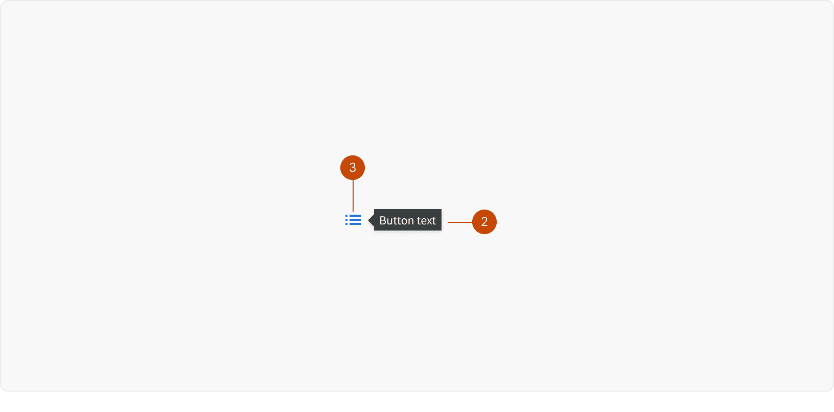
Icon
Tooltip
Variants
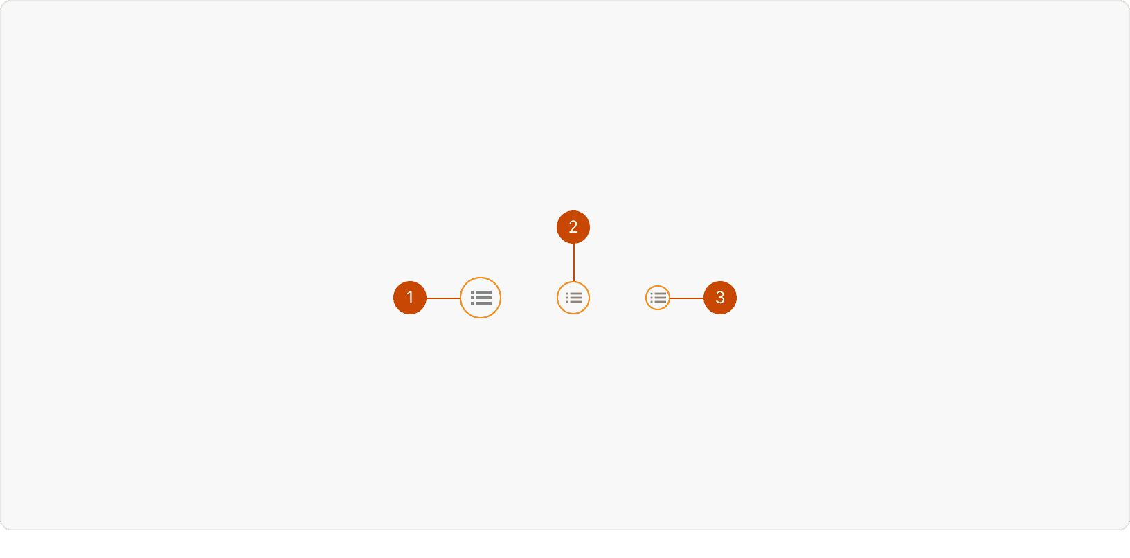
Default
Medium
Small
States
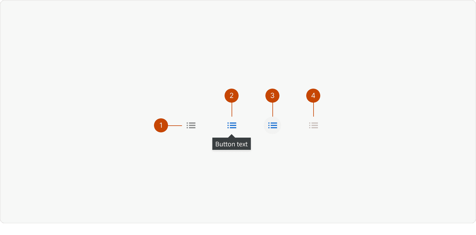
Default
Hover
Pressed
Disabled
Best Practices
1. When to use
Icon buttons should be used to perform specific actions such as "edit" or "close". They should not be used to navigate the user from one page to another. ²
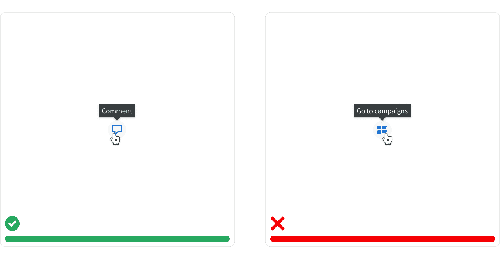
2. Use with caution
The meaning of icons can be misinterpreted. Only use icon buttons for well-known actions that are regularly used and easy to memorize.¹ For lesser-known actions, use our standard buttons with text labels that describe the action.
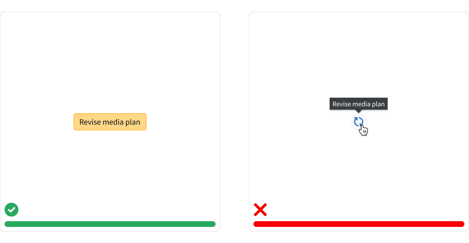
3. Tooltip Label
The button label is displayed in a tooltip on hover. The button labels should use verbs to describe the exact action that will be taken. Avoid using labels that are vague or generic. ²
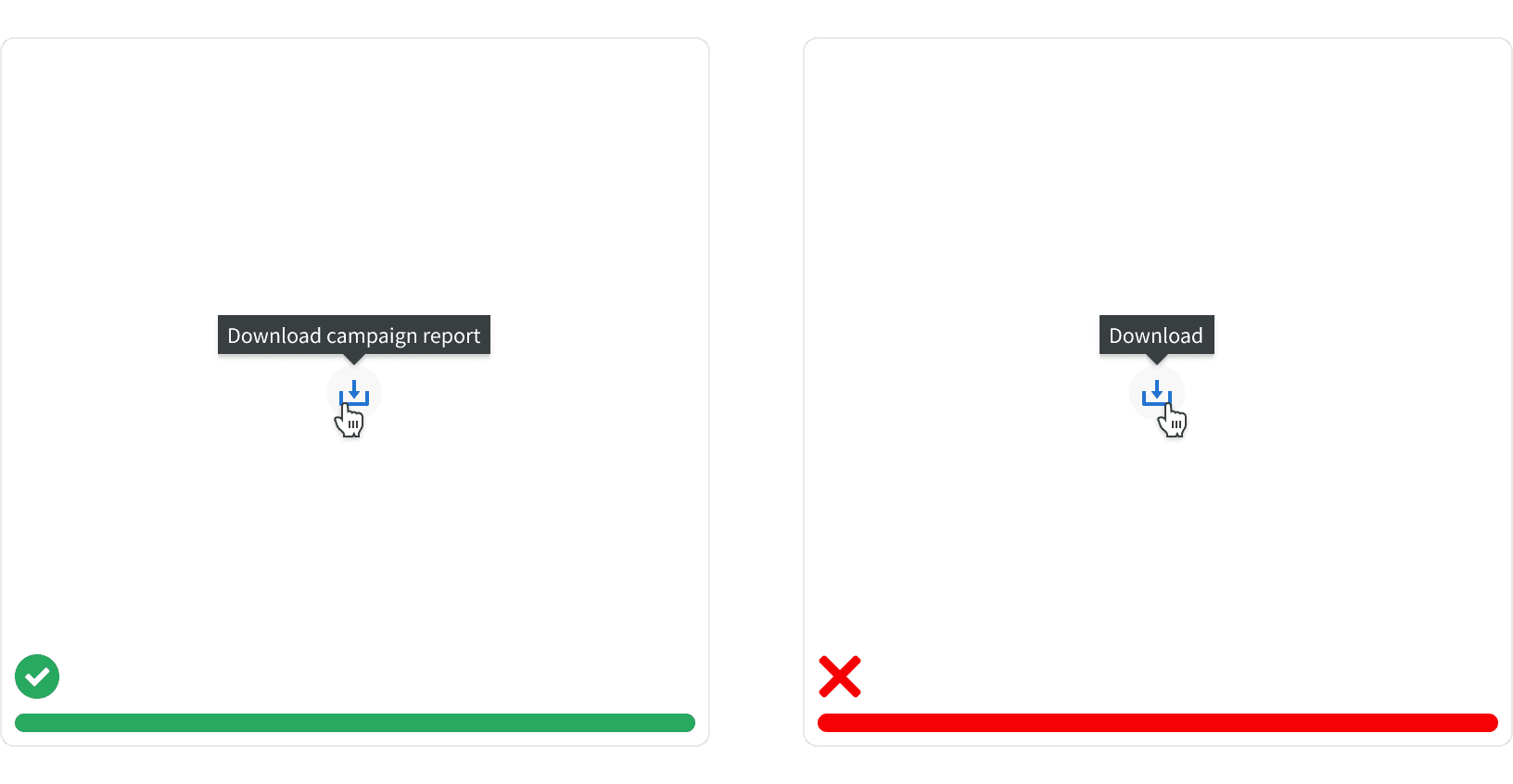
More
Related Pages
Accessibility
Color contrast ratio for our Icon button meets AAA standards, based on Web Content Accessibility Guidelines (WCAG) guidelines.
Benefits: People with low vision often have difficulty reading text that does not contrast with its background. This can be exacerbated if the person has a color vision deficiency that lowers the contrast even further. Providing a minimum luminance contrast ratio between the text and its background can make the text more readable even if the person does not see the full range of colors. It also works for the rare individuals who see no color.
Additional Reading
Designing the Perfect Button https://uxmag.com/articles/designing-the-perfect-button
Button Design — UI component series https://uxdesign.cc/button-design-user-interface-components-series-85243b6736c7
