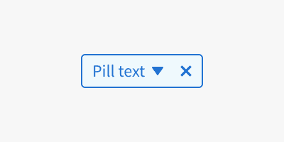
Anatomy
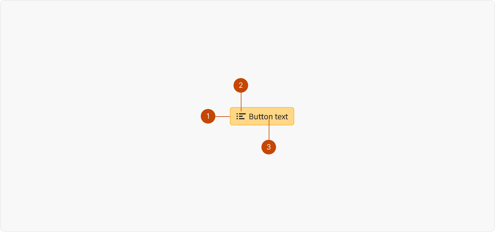
Icon
Text
Container
Variants
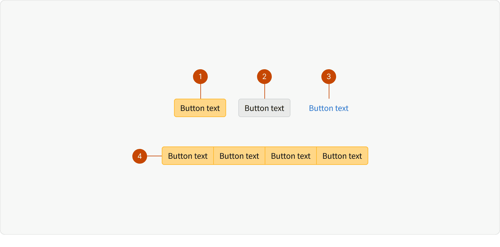
Primary: The primary button is the main call to action for the user, guiding them to next steps in common workflows or recommended actions. There should only be one primary button per page.
Secondary: Secondary buttons typically accompany a primary CTA on a page, or they may stand alone to offer optional actions. Often paired with primary buttons.
Transparent: Transparent buttons offer access to noncritical functionality that the user may need infrequently. Often paired with tertiary buttons.
Button Group: Button groups are used to group related options. To emphasize the ability to toggle between options, a button group should be housed in a common container.
States
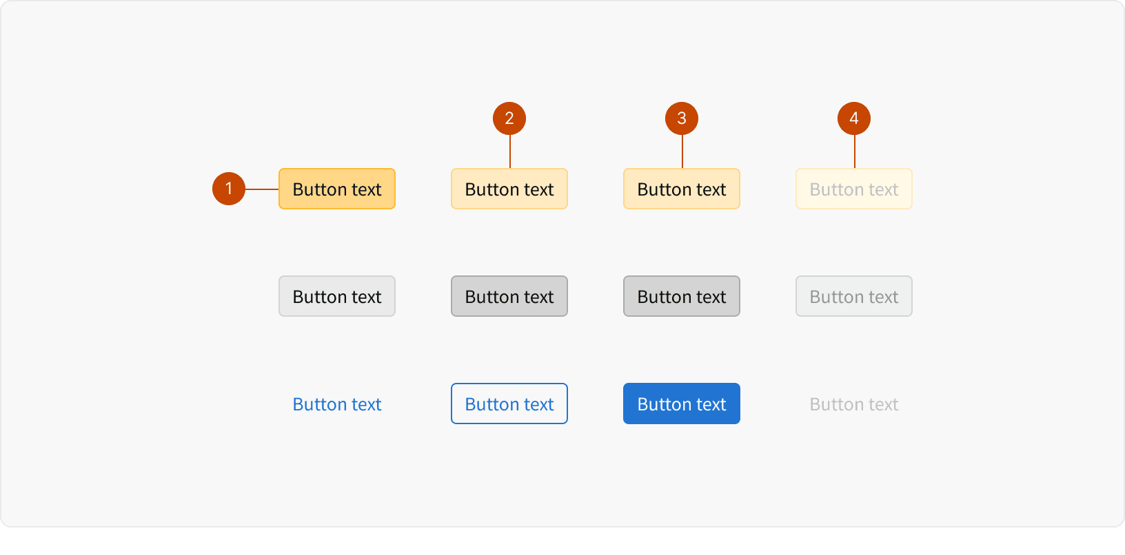
Default
Hover
Pressed
Disabled
Best Practices
1. Labels
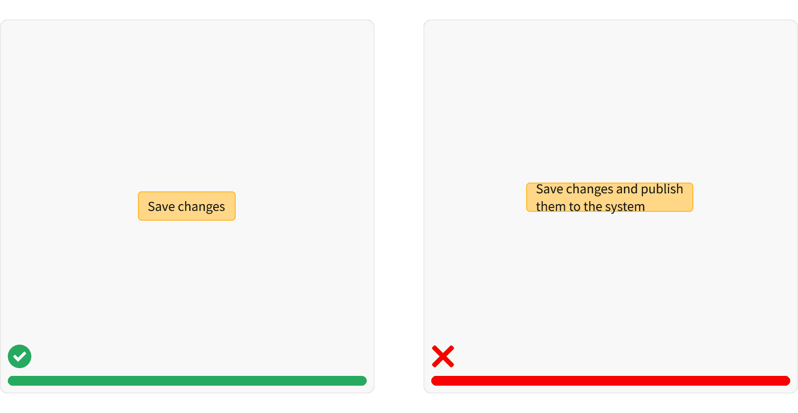
Buttons labels should be clear, concise, and action-oriented.
2. Priority
Prioritize the most important actions. Use secondary styles wisely.
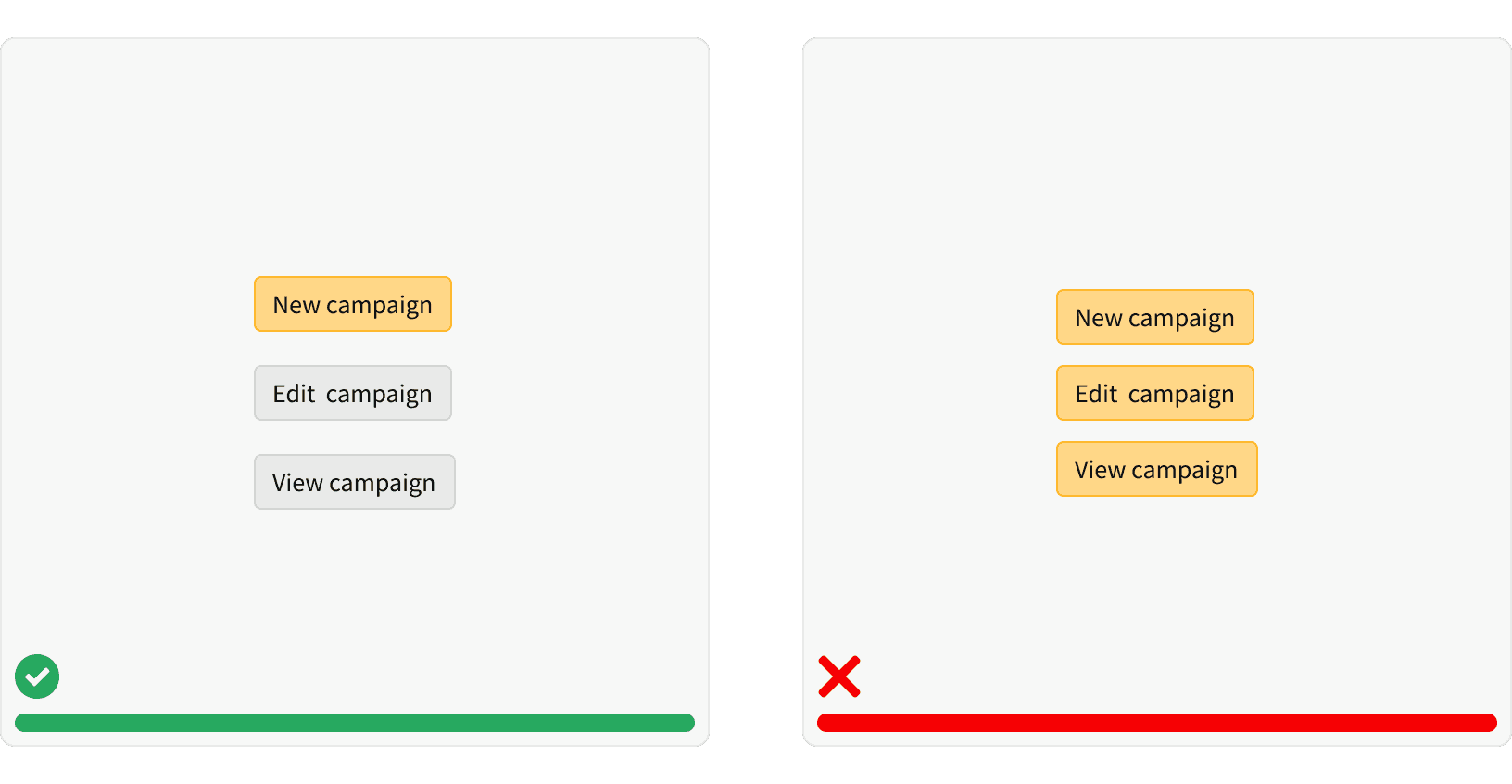
3. Primary vs Secondary
Use button combinations consistently to help the user understand related actions. Primary and secondary buttons are always paired together.
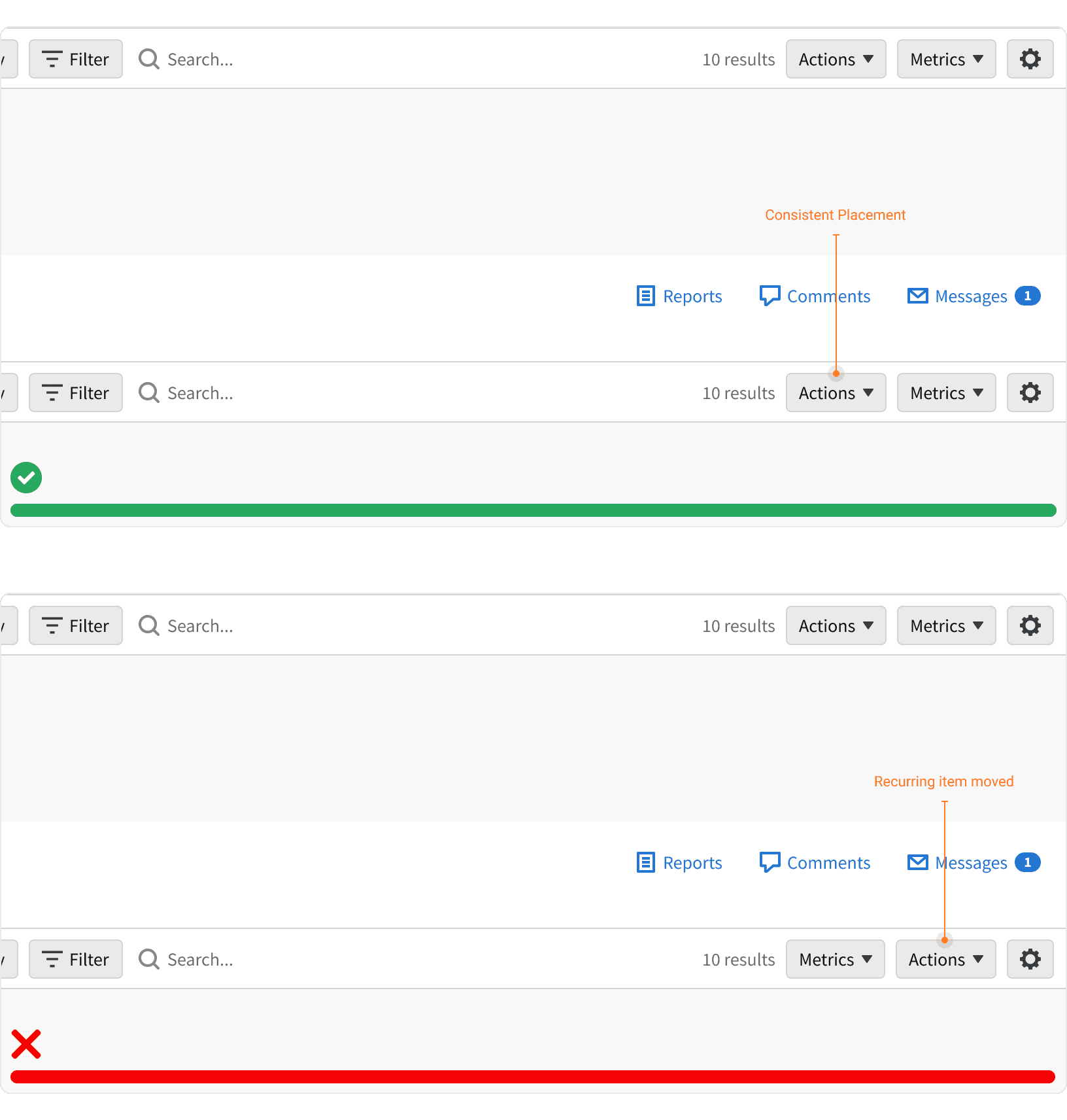
4. Placement
Place commonly used actions in a consistent and familiar location.
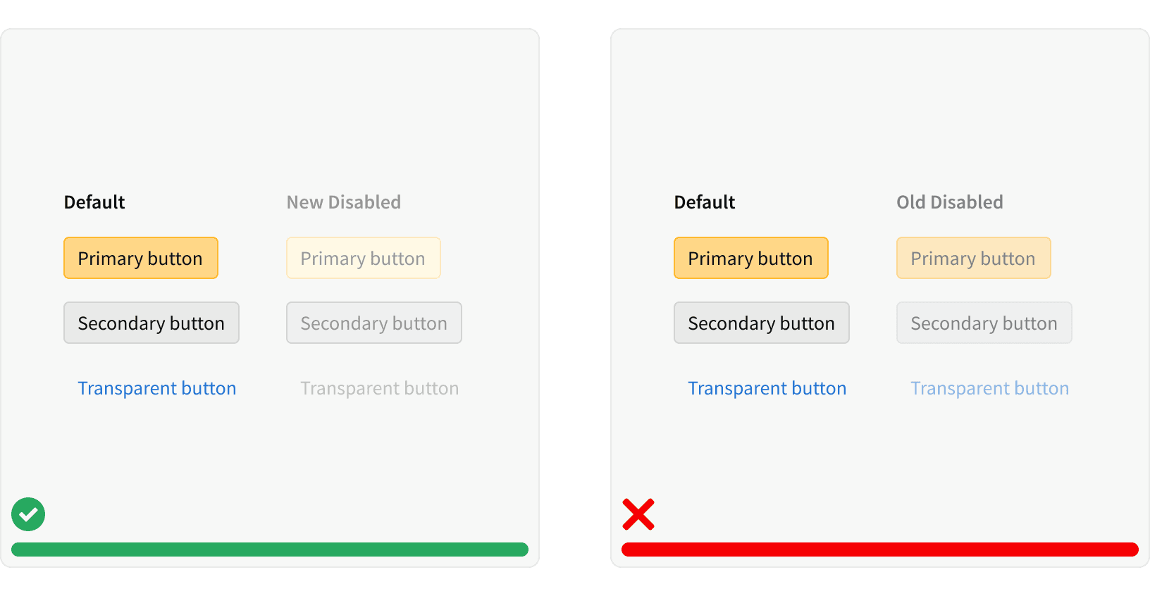
5. Disabled States
Correctly utilize the corresponding disabled state style for each button.
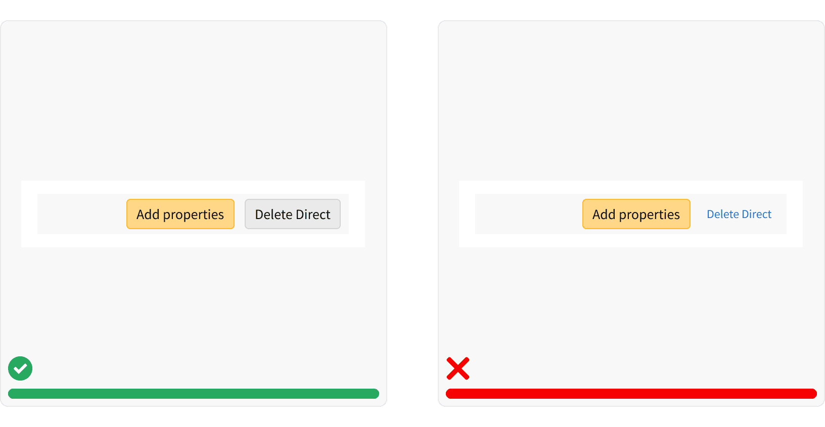
6. Buttons vs links
Buttons are used primarily for actions, such as “Add”, “Close”, “Cancel”, or “Save”. Plain buttons, which look similar to links, are used for less important or less commonly used actions, such as “view shipping settings”.
For navigational actions that appear within or directly following a sentence, use the link pattern. Links are used primarily for navigation, and usually appear within or directly following a sentence.
7. Button Group Usage
Button groups are used to select an option or set a preference, not as an element for navigation between different types of data. Consider tabs for this type of treatment.
8. Button Group vs Dropdown Button
Button groups provide higher visibility while dropdowns save space, so consider users' needs for the context.
More
Related Pages

Additional Reading
Button Placement Conventions
UX Movement, and UX Movement. “How Button Placement Conventions Reinforce User Habits.” UX Movement, 22 June 2017, uxmovement.com/buttons/how-button-placement-conventions-reinforce-user-habits/.
Button Size
Bailey, Eric. “Quick Test: Large Touch Targets.” The A11Y Project, a11yproject.com/posts/large-touch-targets/.
“Fitts's Law.” Wikipedia, Wikimedia Foundation, 10 Mar. 2020, en.wikipedia.org/wiki/Fitts's_law.
“An Interactive Visualisation of Fitts's Law with JavaScript and D3.” Visualising Fitts's Law, simonwallner.at/ext/fitts/.
UX Movement, and UX Movement. “Optimal Size and Spacing for Mobile Buttons.” UX Movement, 28 Feb. 2019, uxmovement.com/mobile/optimal-size-and-spacing-for-mobile-buttons/.
Number of Choices
Hick's Law.” Wikipedia, Wikimedia Foundation, 12 Mar. 2020, en.wikipedia.org/wiki/Hick's_law.
Best Practices
World Leaders in Research-Based User Experience. “Website Forms Usability: Top 10 Recommendations.” Nielsen Norman Group, www.nngroup.com/articles/web-form-design/.
World Leaders in Research-Based User Experience. “OK-Cancel or Cancel-OK? The Trouble With Buttons.” Nielsen Norman Group, www.nngroup.com/articles/ok-cancel-or-cancel-ok/.
https://uxmovement.com/buttons/why-segmented-buttons-are-better-filters-than-dropdowns/
https://uxmovement.com/mobile/stop-misusing-toggle-switches/
https://blog.statsbot.co/dropdown-vs-buttons-in-slack-ux-comparison-4443010952c5