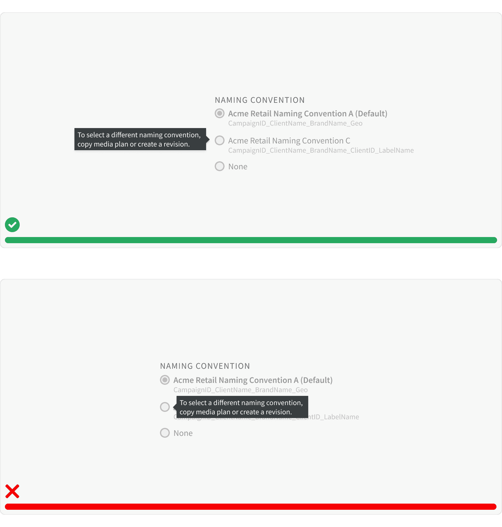
Variants
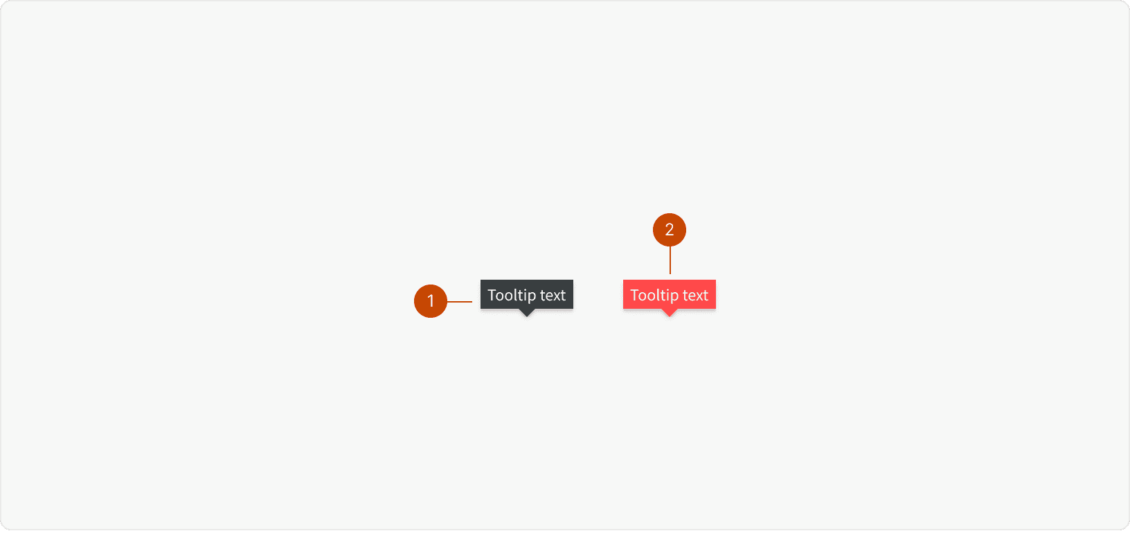
Default
Error
Best Practices
1. Text
Tooltips contain read-only text and not interactive elements like buttons.
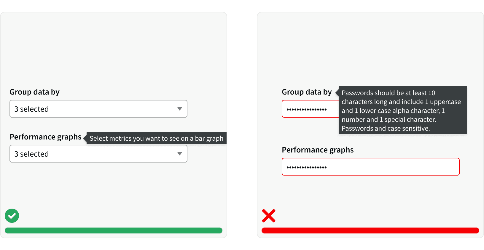
2. Usage
Don’t use tooltips for information that is vital to task completion. Users shouldn’t need to find a tooltip in order to complete their task. Tooltips are best when they provide useful, additional information or clarification. Tooltips disappear, so instructions or other directly actionable information, shouldn’t be in a tooltip.¹
3. Content
Provide brief and helpful content inside the tooltip. Tooltips with redundant text are not beneficial to users. Use only when necessary to provide an explanation for an interface element. Lengthy content is no longer a ‘tip’, so keep it brief.¹
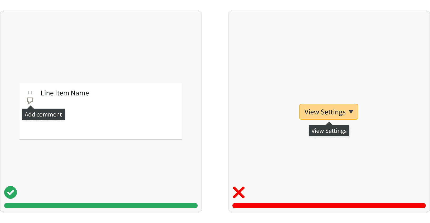
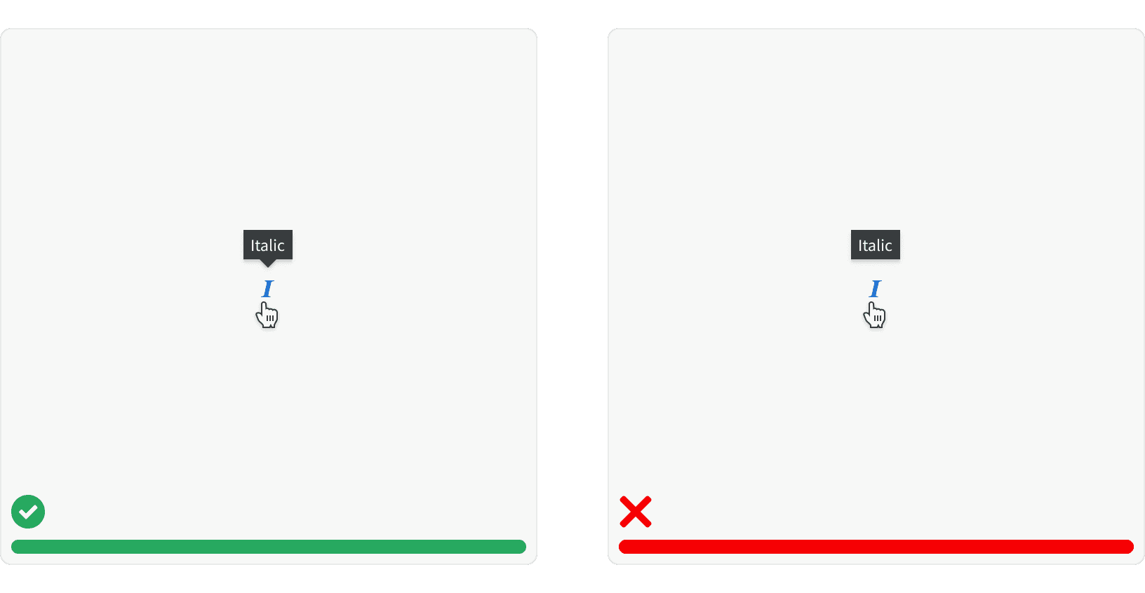
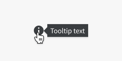
4. Arrows
Use tooltip arrows to avoid confusion with neighboring elements. Tooltips are hard to discover because they often lack visual cues. Arrows are beneficial to clearly identify which element the tooltip is associated with. It’s important to use tooltips consistently to instill confidence in users by meeting their expectations.¹
5. Placement
Position tooltips so they don’t block related content. Test your tooltip positioning to ensure that the content does not block other information pertinent to the user’s goal. Your copy can be single- or multiple-line long as long as it’s relevant and it does not block related content.¹
More
Related Pages

Accessibility
Tooltips should appear on both 'hover' and 'focus.' Do not have tooltips appear on click. Tooltips that rely only on hover are inaccessible to users not using a mouse.¹
Color contrast ratio for our tooltips meets AAA standards, based on Web Content Accessibility Guidelines (WCAG) guidelines.
Benefits: People with low vision often have difficulty reading text that does not contrast with its background. This can be exacerbated if the person has a color vision deficiency that lowers the contrast even further. Providing a minimum luminance contrast ratio between the text and its background can make the text more readable even if the person does not see the full range of colors. It also works for the rare individuals who see no color.²
Developer guidelines: When the user focuses on an element that triggers a tooltip, a hidden copy of the tooltip text should be included in the HTML for the triggering element, so that it is accessible to those using assistive technologies. Or, alternatively, the tooltip itself can be made tab-focusable, so that a mousedown/keydown on the triggering element forces tab focus to move onto the tooltip element.³
Additional Reading
World Leaders in Research-Based User Experience. “Tooltip Guidelines.” Nielsen Norman Group, www.nngroup.com/articles/tooltip-guidelines/.
“Web Content Accessibility Guidelines (WCAG) 2.0.” W3C, www.w3.org/TR/WCAG20/.
“Tooltip Widgets (or: Screen Tip, Balloon).” Accessibility Developer Guide, www.accessibility-developer-guide.com/examples/widgets/tooltips/.