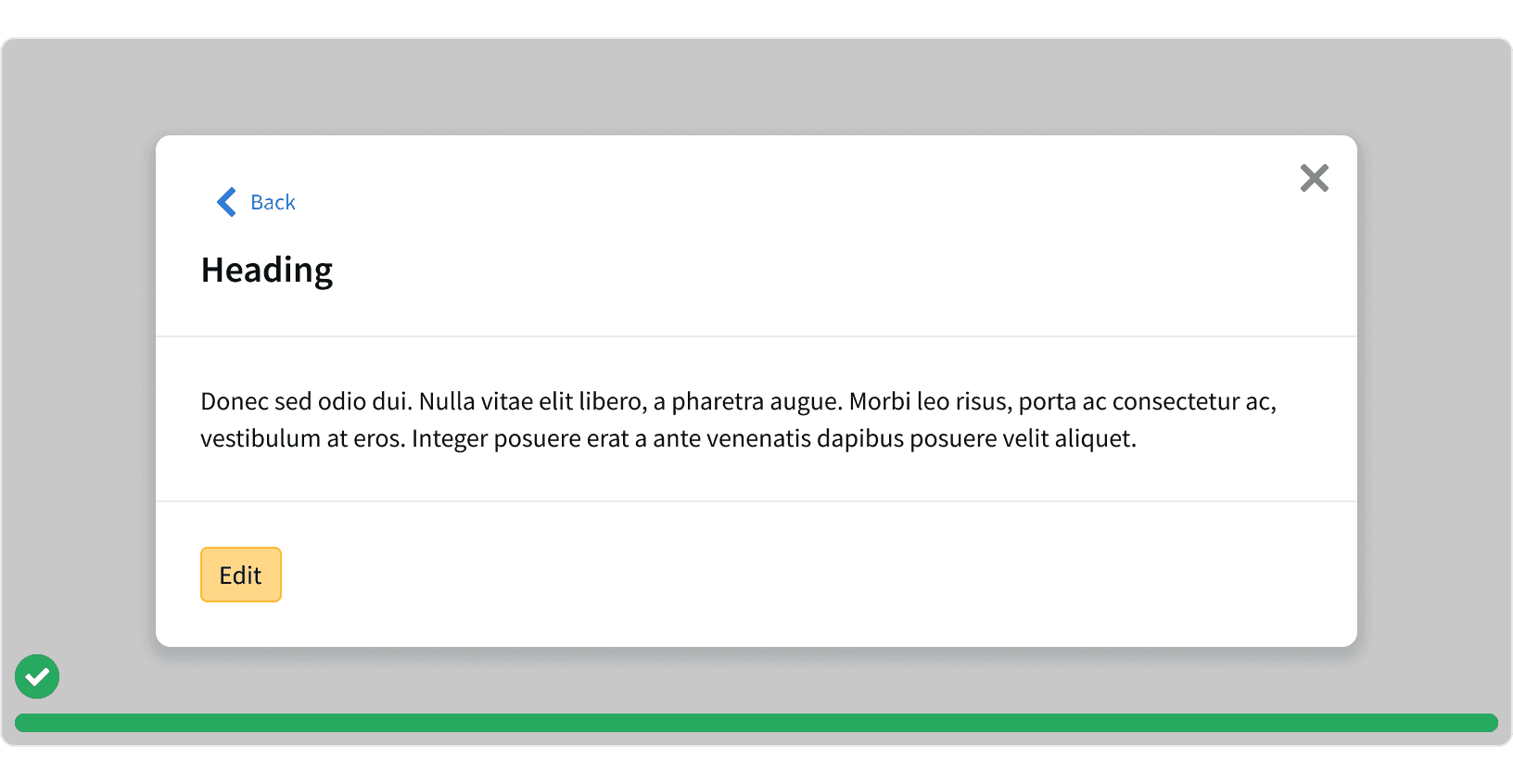
Anatomy
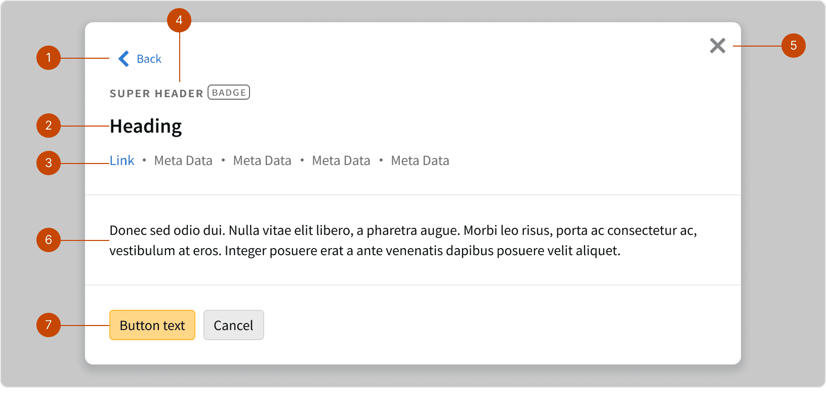
Back control
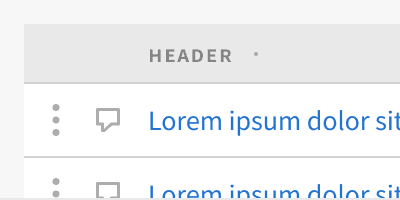
Modal Heading
Meta Data
Super Header
Dismiss control
Content
Actions
Variants
The background overlay should always cover the entire browser window. The width and height of the content container may be adjusted depending on the content.
Width
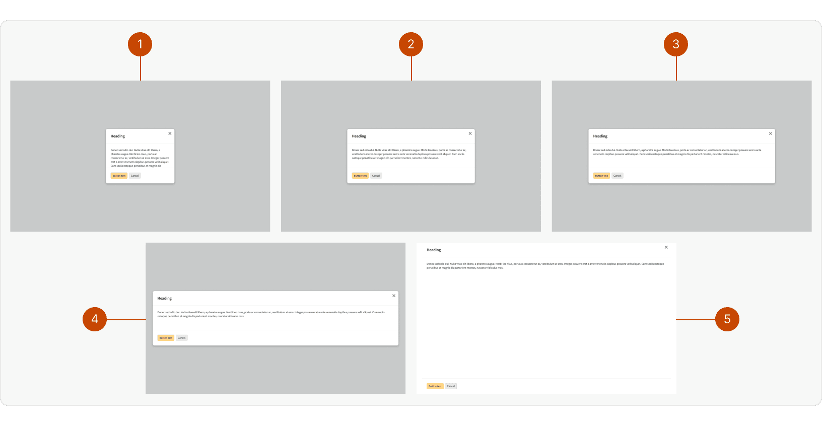
Small:
max-width: 348pxMedium:
max-width: 648pxLarge:
max-width: 948pxX-Large:
max-width: 1248pxFull Width:
100%of the page width and height with no padding or border radius around the content.
Height
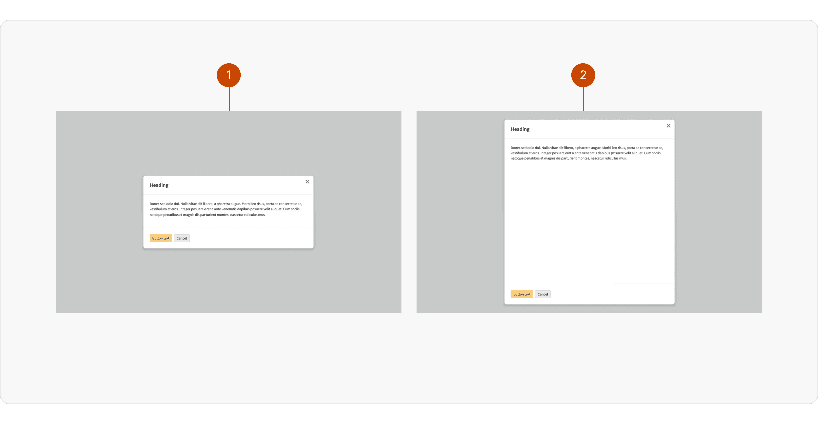
Default: The content container is vertically centered and the height is determined by the amount of content
Full Height: The content container stretches the full height of the modal with
32pxof space on the top and bottom
Behaviors
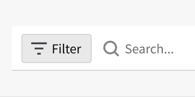
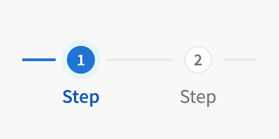
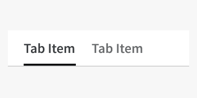
Content Controls
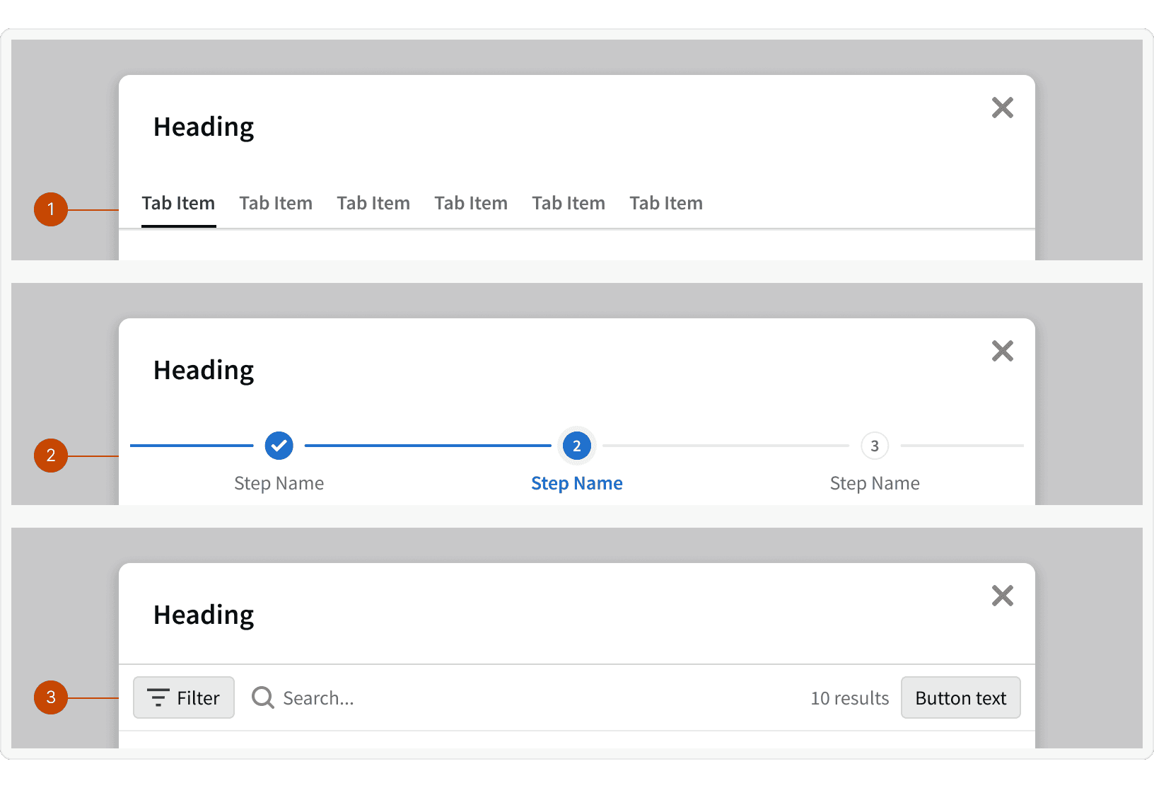
Additional Content Controls will be display at the bottom of the header.
Tabs: Groups related modal content at the same hierarchical level.
Step Progress Bar: Displays the modal steps in a specific process and indicate the user's progression though the steps.
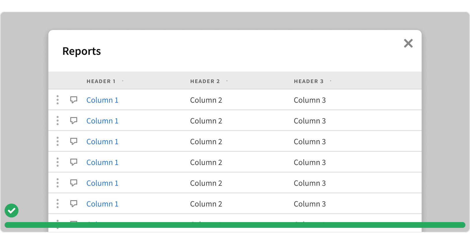
Control Bar: Modals containing tables or other information and data that a user can interact with by customizing, saving, exporting, or filtering the data in a particular way
Best Practices
1. Usage
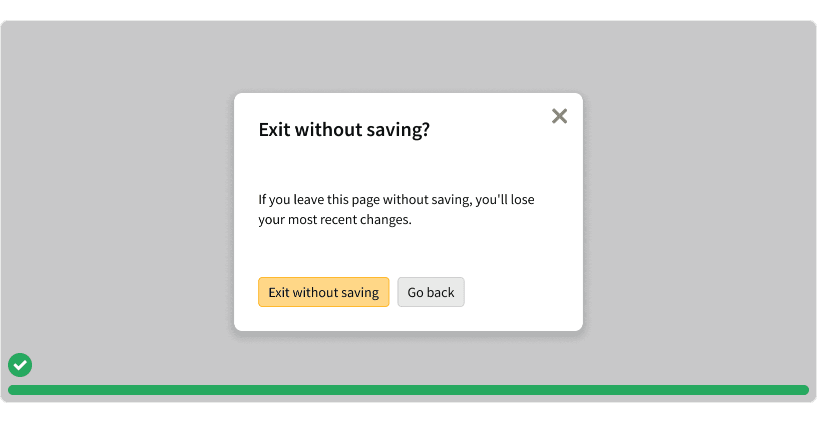
Use modals sparingly. Modals are purposely interruptive and should only be used for content that requires the users full attention.
2. Decisions
Decision modals should not be use to display simple help text, notifications or confirmations. For these types of messages, consider using Message cards or Flash messages.
3. Information
Information modals should only be used for complex content. For simple content, consider using a side panel to allow the user to continue interacting with the page content.
4. Tasks
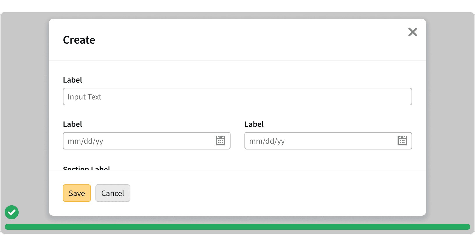
Task modals should only be used for complex tasks with multiple inputs. For smaller tasks with a single input, consider using a popover or an in-line edit mode.
5. Full Width Modals
Full Screen modals should be used for modals containing complex data or critical workflows. This will help the use focus on modal content without the distraction of the page underneath.
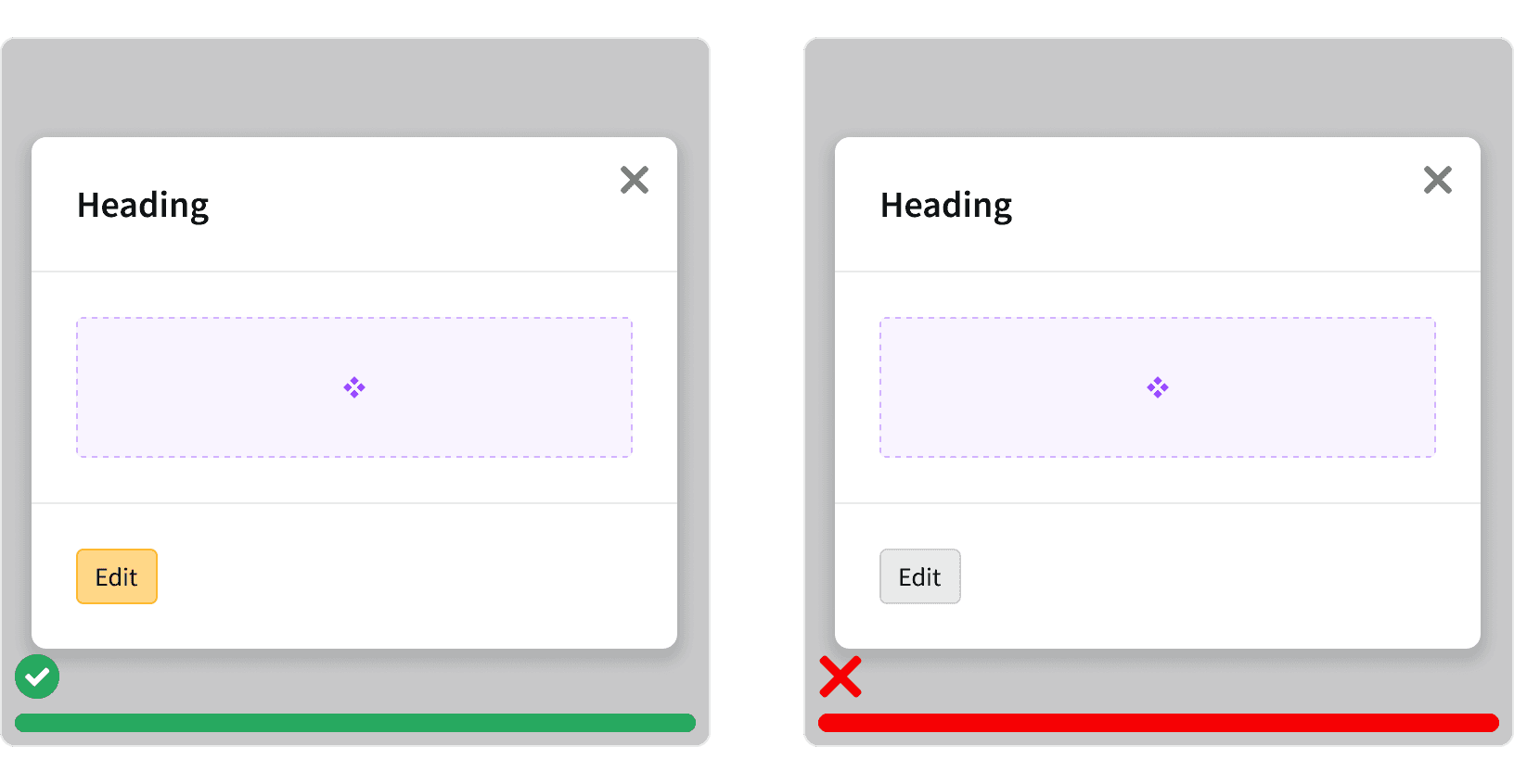
6. Single Action
Task modals with only one action should use a primary button. This button should be aligned to the left side of the footer.
7. Back Control
When the user has advanced a step in a workflow or navigated down a level in the modal hierarchy, then a back control button may be provided.
More
Related Pages
Accessibility
All modal content color should follow contrast ratio AA standards, based on Web Content Accessibility Guidelines (WCAG) guidelines.
Benefits: People with low vision often have difficulty reading text that does not contrast with its background. This can be exacerbated if the person has a color vision deficiency that lowers the contrast even further. Providing a minimum luminance contrast ratio between the text and its background can make the text more readable even if the person does not see the full range of colors. It also works for the rare individuals who see no color.¹
Additional Reading
Modal & Nonmodal Dialogs: When (& When Not) to Use Them https://www.nngroup.com/articles/modal-nonmodal-dialog/
10 guidelines to consider when using overlays / modals http://www.uxforthemasses.com/overlays/