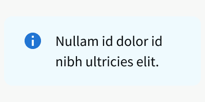
Anatomy
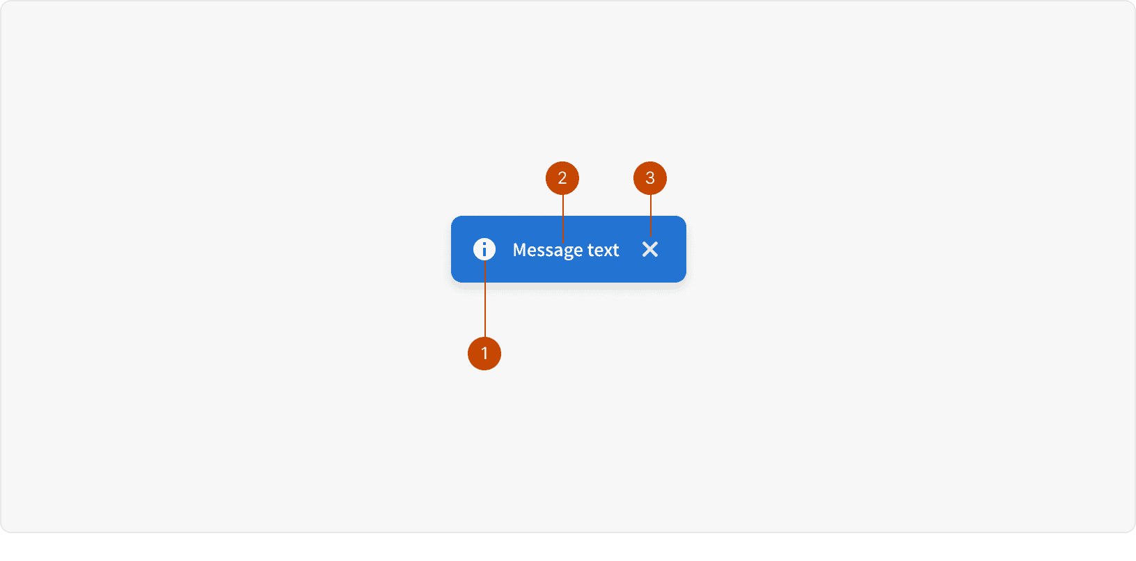
Icon
Text
Dismiss Control
Variants
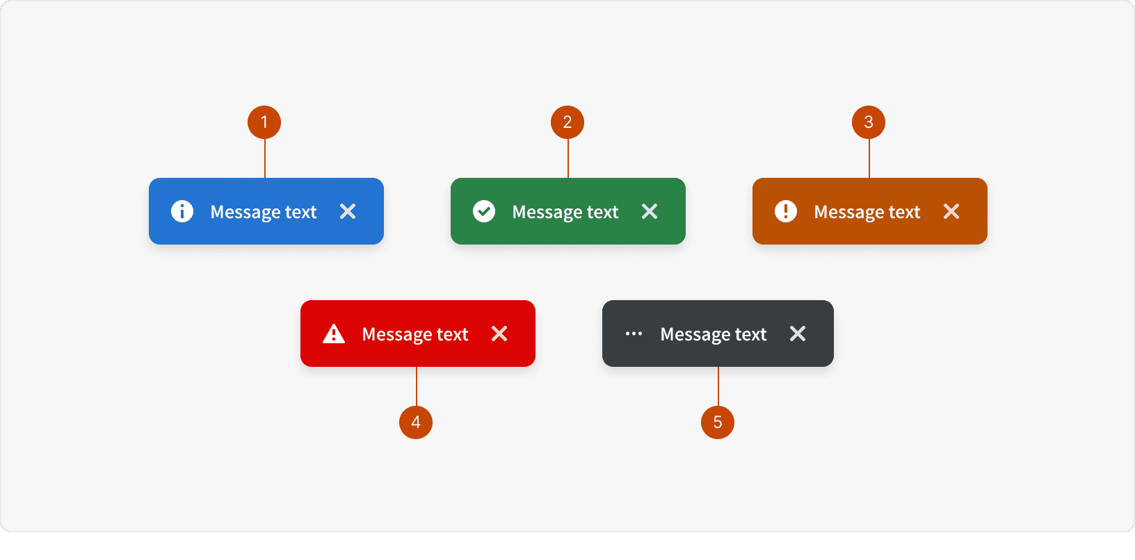
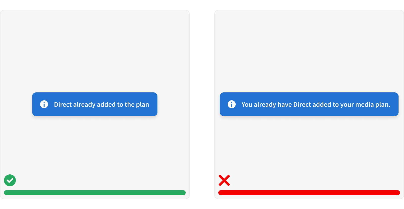
Informational: Provides additional or contextual information to the user.
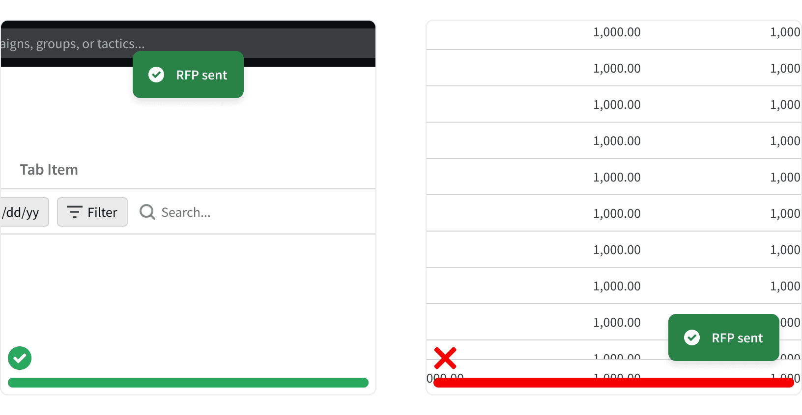
Confirm: Indicates the successful completion of an action the user has taken.
Warning: Informs the user that an error has occurred during the course of a workflow; should be used as a warning.
Alert: Indicates a system-level error has occurred.
Action: Indicates an action is processing.
Best Practices
1. Placement
Flash messages should be placed in a consistent location across all pages. Our Flash messages are always positioned on top of the App Header and on the highest Z-index setting of 9999.¹
2. Non-Dismissive
Non-dismissive Flash messages should stay on the screen for 8-10 seconds, then automatically fade out. Flash messages that are less than that amount of time, are hard for the user to read.²
3. Succinct and Informative
Keep Flash content succinct and informative – using a positive, clear, active voice. For more guidance on copywriting, please consult our Voice and Tone documentation.
More
Related Pages
Accessibility
Color contrast ratio for our Flash component meets AA standards, based on Web Content Accessibility Guidelines (WCAG) guidelines.
Benefits: People with low vision often have difficulty reading text that does not contrast with its background. This can be exacerbated if the person has a color vision deficiency that lowers the contrast even further. Providing a minimum luminance contrast ratio between the text and its background can make the text more readable even if the person does not see the full range of colors. It also works for the rare individuals who see no color.⁴
Developer guidelines:
Avoid using Flash for critical information that users need to act on immediately. Flash might be difficult for users with low vision or low dexterity to access because it:
Disappears automatically⁵
Can’t be easily accessed with the keyboard⁵
Might appear outside the proximity of the user’s current focus⁵
Additional Reading
“Toast Notifications.” PatternFly, www.patternfly.org/v3/pattern-library/communication/toast-notifications/index.html.
Munot, Sneha. “Toast Notification or Dialog Box?” Medium, UX Planet, 13 Dec. 2018, uxplanet.org/toast-notification-or-dialog-box-ae32ad53106d.
“Readability: the Optimal Line Length.” Readability: the Optimal Line Length - Articles - Baymard Institute, baymard.com/blog/line-length-readability.
“Web Content Accessibility Guidelines (WCAG) 2.0.” W3C, www.w3.org/TR/WCAG20/.
“Toast.” Shopify Polaris, polaris.shopify.com/components/feedback-indicators/toast.