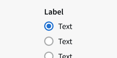
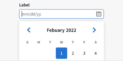
Anatomy
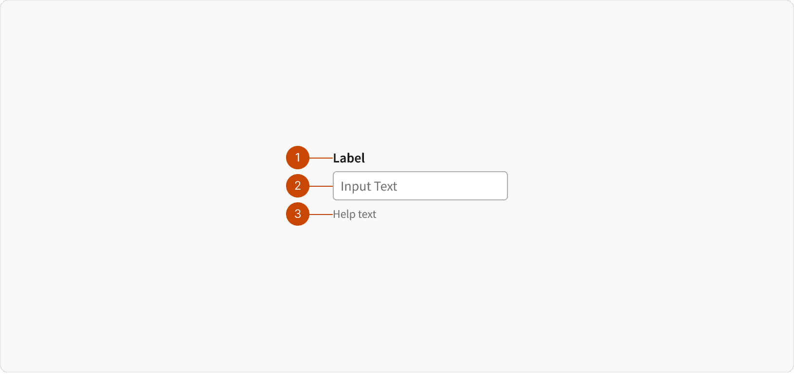
Label
Input
Help Text
Variants
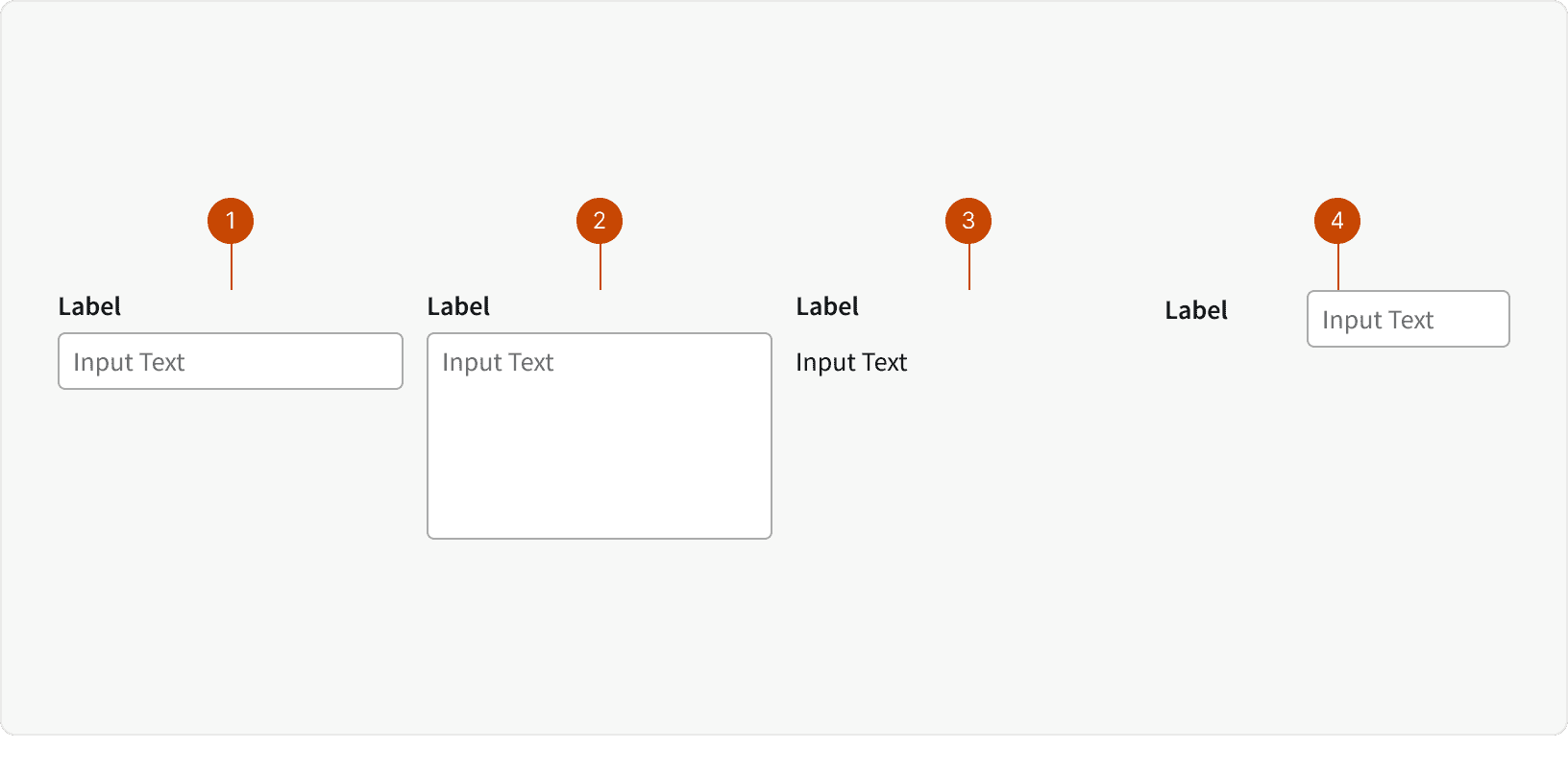
Default
Text Area
Read Only
Horizontal
States
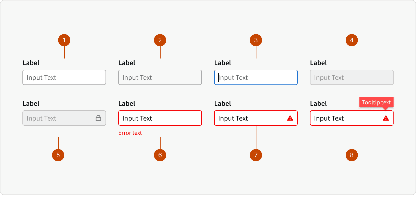
Default
Hover
Focus
Disabled
Locked
Error
Error with Tooltip
Error with Tooltip Active
Behaviors
Text Overflow
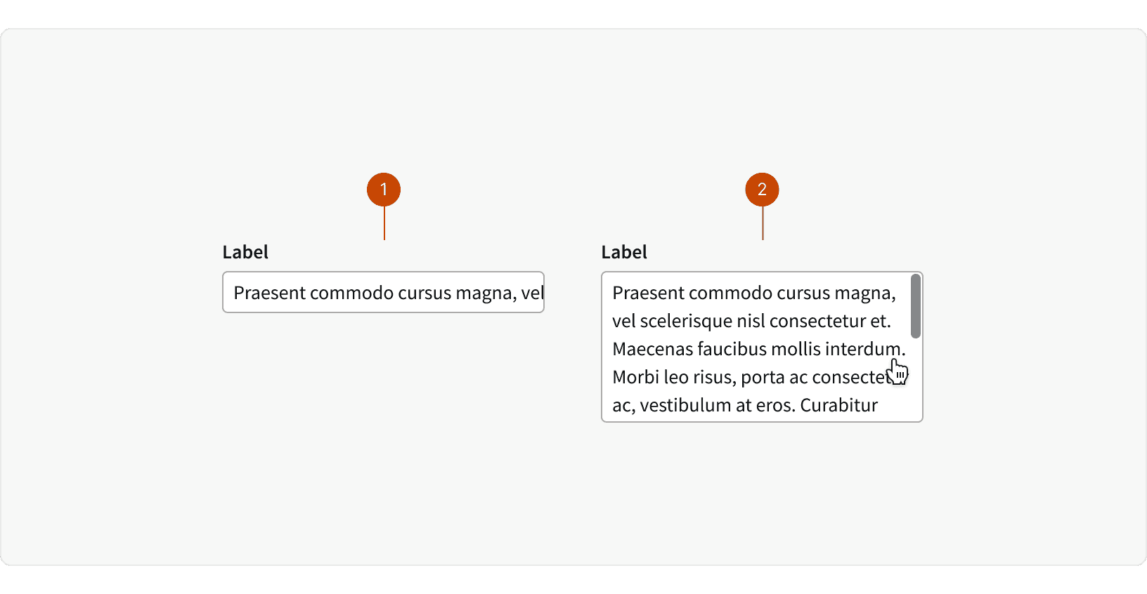
Default: Single line form inputs will overflow additional text horizontally within the field. The user can use the keyboard or scroll horizontally to view the hidden text.
Text Area: Text areas allow multiple lines of text by wrapping the text. If the text exceeds the max-height of the field, then the user may use the keyboard or scroll vertically to view the hidden text.
Best Practices
1. Label
Form inputs should always include a label. ²
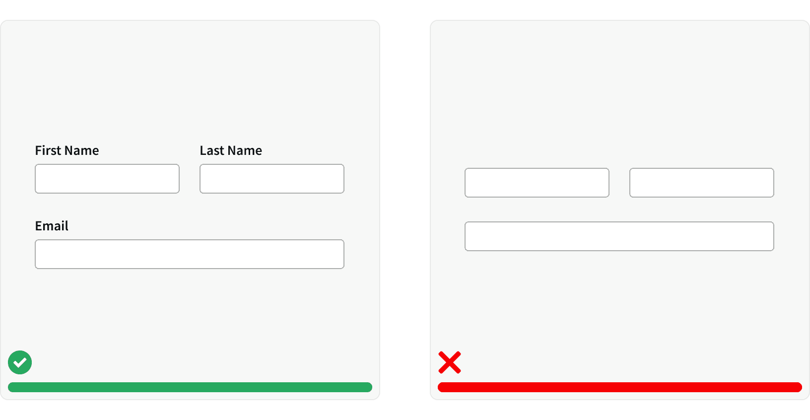
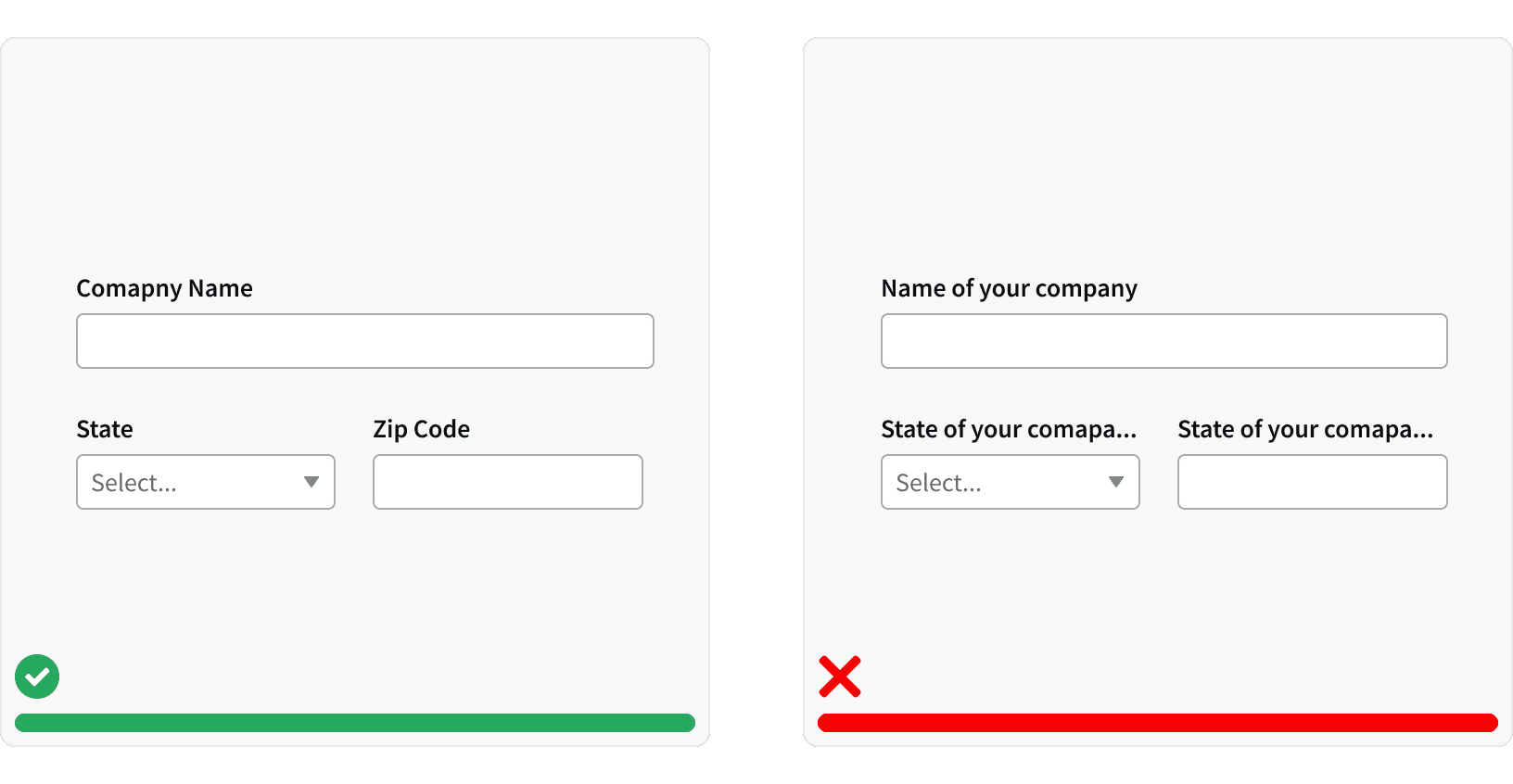
2. Concise and Clear
Labels should be concise and clear. Labels should not be truncated and they should use title case. ¹
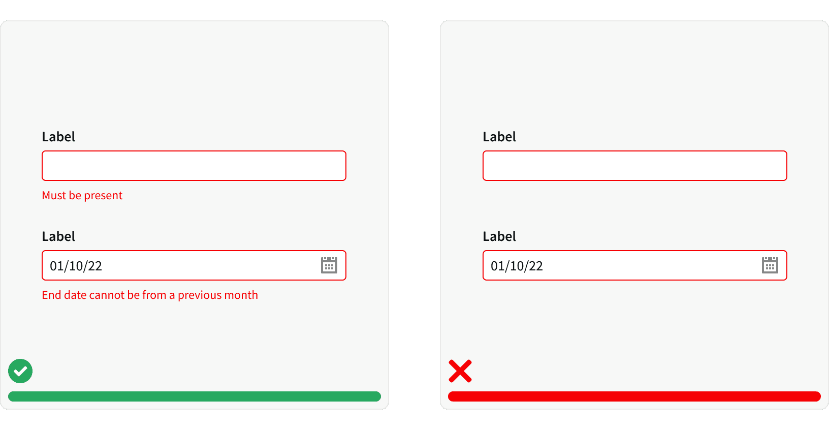
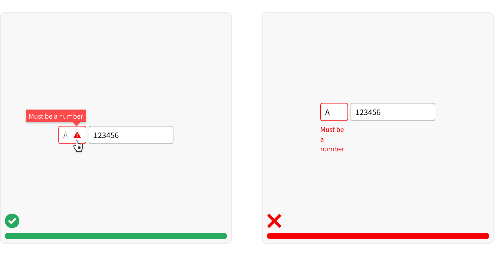
3. Errors
If there is a validation error, text explaining the error should be displayed. ³
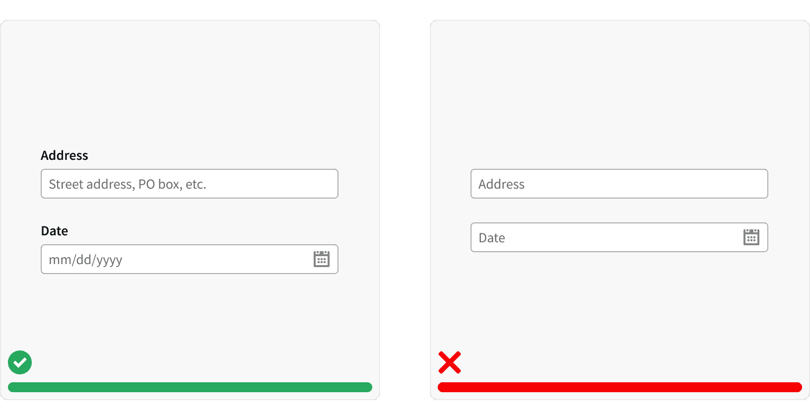
4. Placeholder Text
Placeholder text can be used to provide helpful hints or to demonstrate the format to use. It should not include critical information and should not be used as a replacement for a label. ²
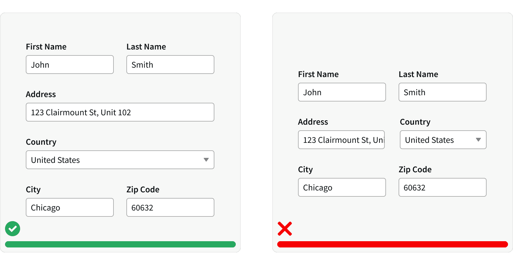
5. Sizing
The Input size should support expected user input. ¹ Using equally size form inputs may look clean but this can constrain the input area and make it harder to fill out.³
6. Error with Tooltip
For situations where limited space prevents displaying a clear error message, use the tooltip error state. However, remember that tooltips are less accessible than visible text, so use them sparingly.
More
Related Pages
Accessibility
Color contrast ratio for our form inputs meets AA standards, based on Web Content Accessibility Guidelines (WCAG) guidelines.
Benefits: People with low vision often have difficulty reading text that does not contrast with its background. This can be exacerbated if the person has a color vision deficiency that lowers the contrast even further. Providing a minimum luminance contrast ratio between the text and its background can make the text more readable even if the person does not see the full range of colors. It also works for the rare individuals who see no color.
Support Keyboard Navigation. Allow users to use the tab key to move between form fields. Form field should use the active styling to indicate which field is in focus.⁶
Code A Programmatic Label. Using the html
<label></label>tags allows the label to be read by screen readers.⁶Use semantic HTML form elements such as
<form>and<button>to clearly define the purpose of the from elements in the code.
Additional Reading
https://uxplanet.org/the-anatomy-of-input-field-c3ef863e01d7
https://uxplanet.org/designing-more-efficient-forms-structure-inputs-labels-and-actions-e3a47007114f
https://uxdesign.cc/text-fields-forms-design-ui-components-series-2b32b2beebd0
https://blog.prototypr.io/the-ultimate-guide-for-text-fields-in-ux-part-i-b6e5eb58b0e4