Anatomy
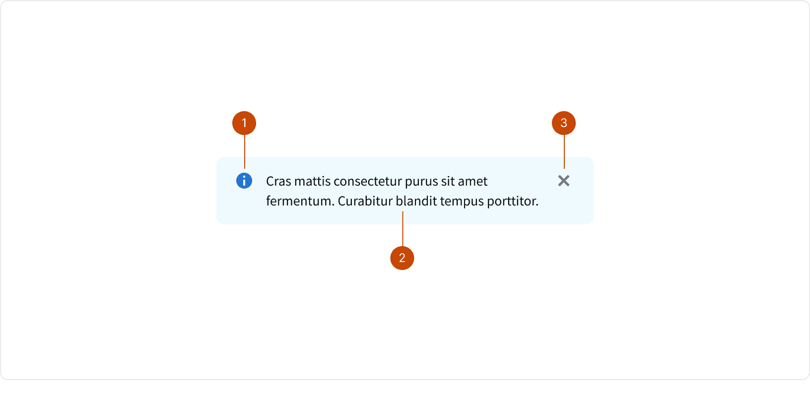
Icon
Message Text
Dismiss Control
Variants
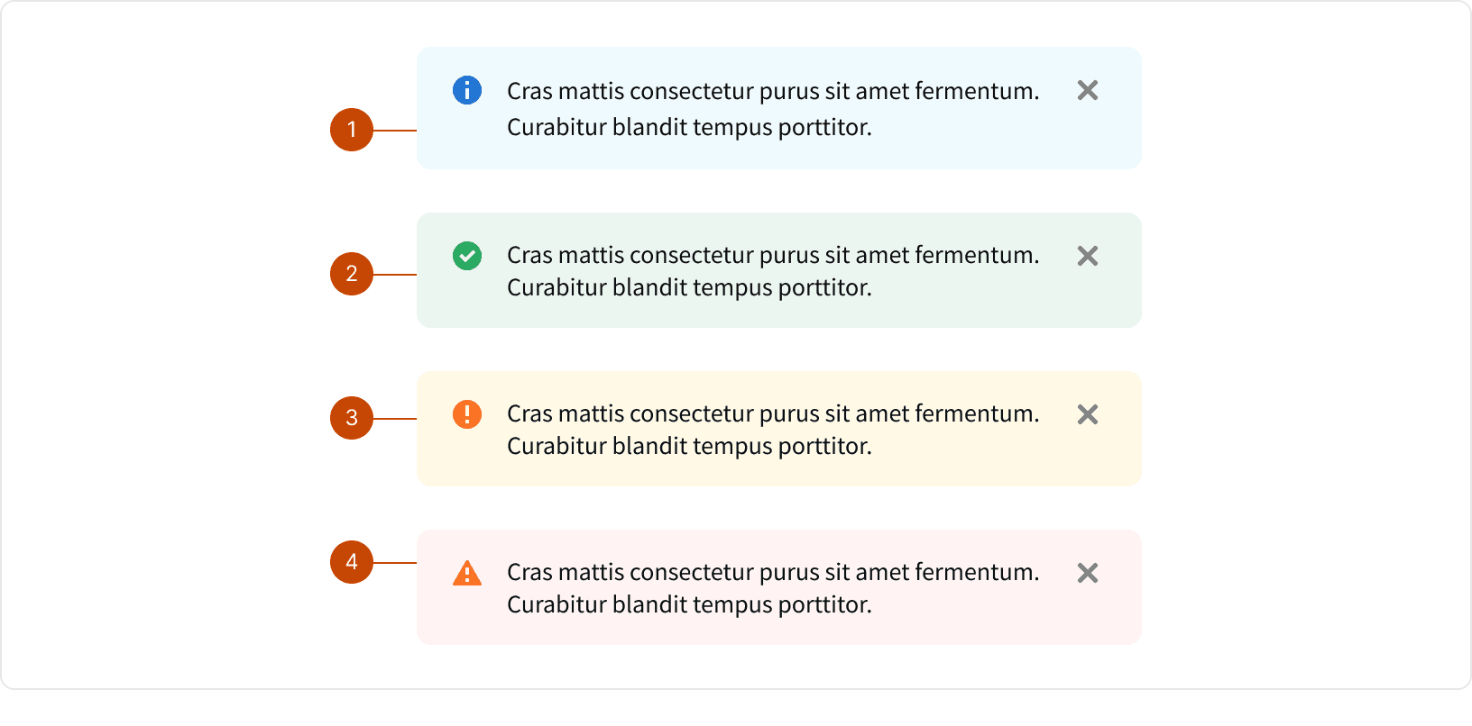
Info: Use to give a non-critical or general information or instruction.
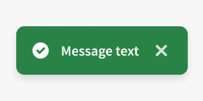
Confirm: Use to indicate a successful, completed, or desirable state when it’s important to provide positive reinforcement to the user.
Warning: Use to provide status updates that the user should watch. A warning message may require the user’s attention and potential action.
Alert: Use to communicate an error, decline, failure, removal or critical state that requires user attention.
States
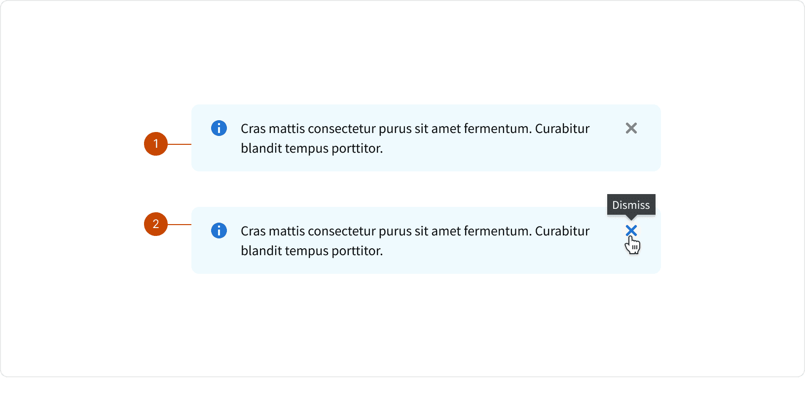
Default
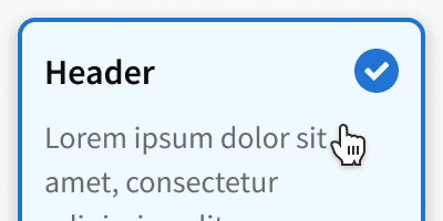
Hover
Best Practices
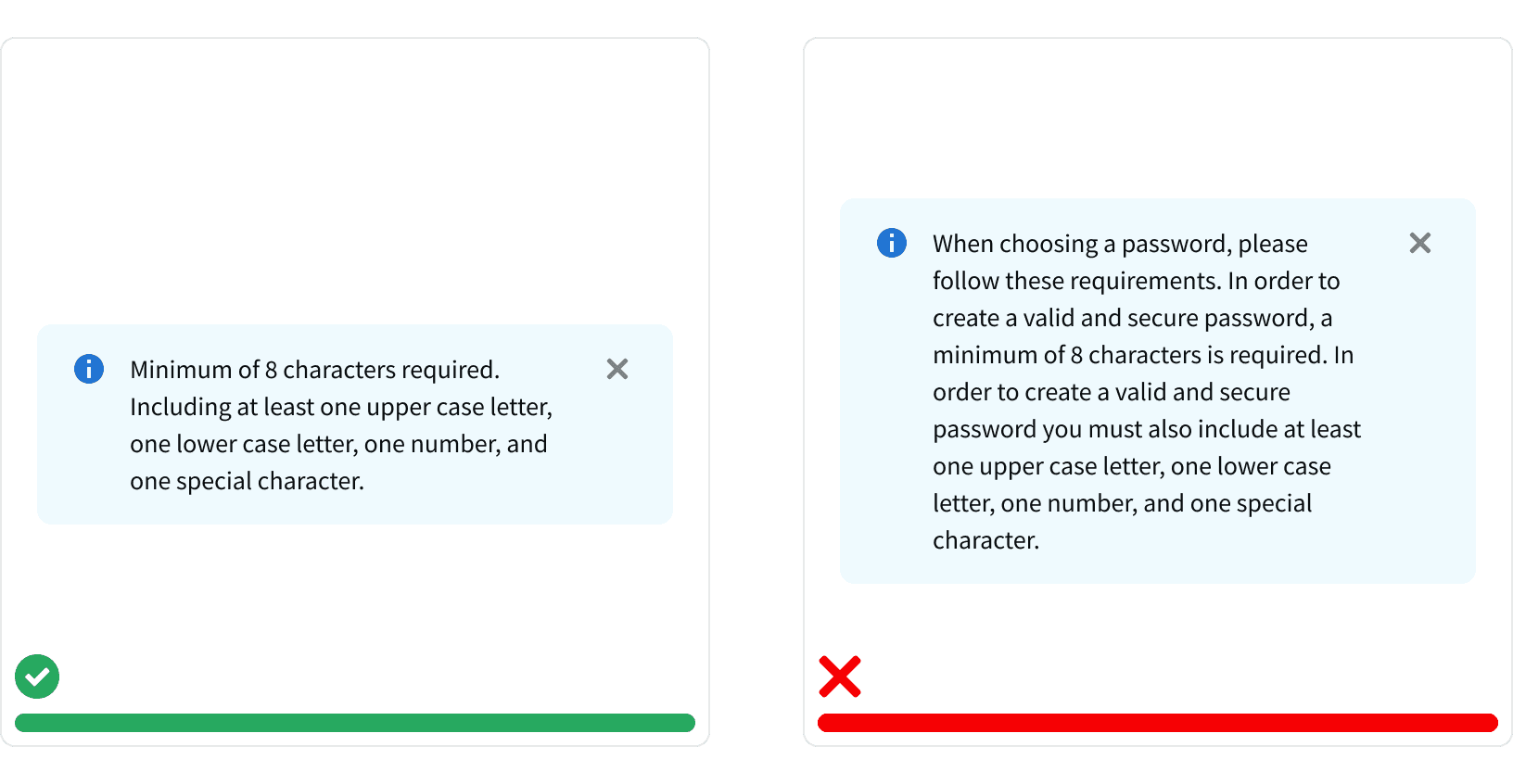
1. Brief and Concise
Message card content should be brief and concise.
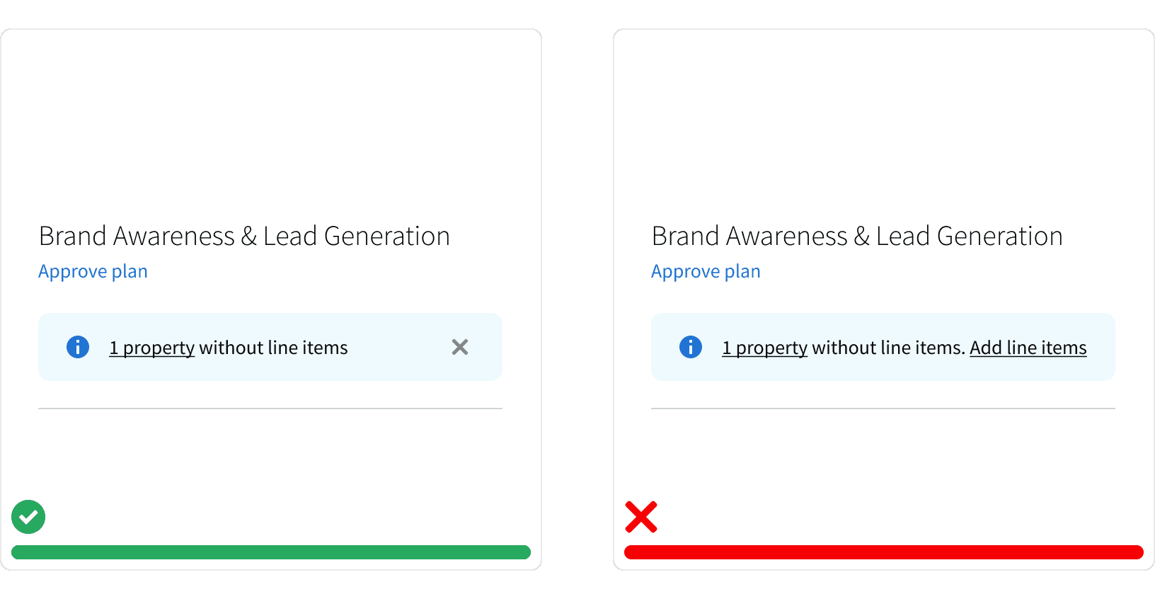
2. Links
Message card may contain a single navigation link. This can be used to direct the user to additional resources or to another area of the application.
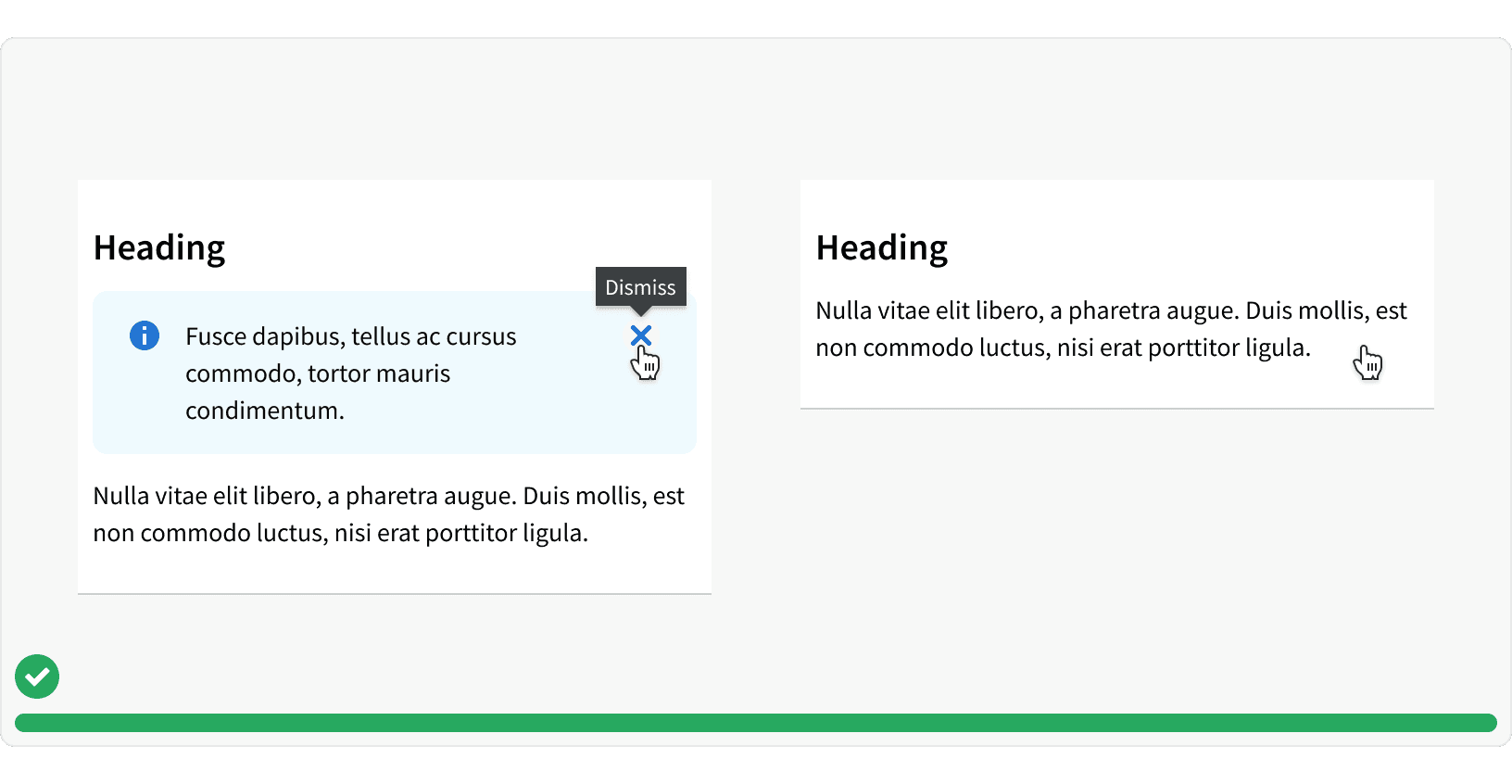
3. Dismissible
The "Dismissible" property gives the user the ability to remove the message card. When the message card is removed, the other elements and parent container should adjust to fill the space. Message cards should be dismissible unless they contain critical information or an important step users need to take.
More
Related Pages
Accessibility
Color contrast ratio for our Message Card components meets AA standards, based on Web Content Accessibility Guidelines (WCAG) guidelines.
Benefits: People with low vision often have difficulty reading text that does not contrast with its background. This can be exacerbated if the person has a color vision deficiency that lowers the contrast even further. Providing a minimum luminance contrast ratio between the text and its background can make the text more readable even if the person does not see the full range of colors. It also works for the rare individuals who see no color.¹
Message cards should display a visible focus state
Additional Reading
Cards: UI-Component Definition https://www.nngroup.com/articles/cards-component/

