Anatomy
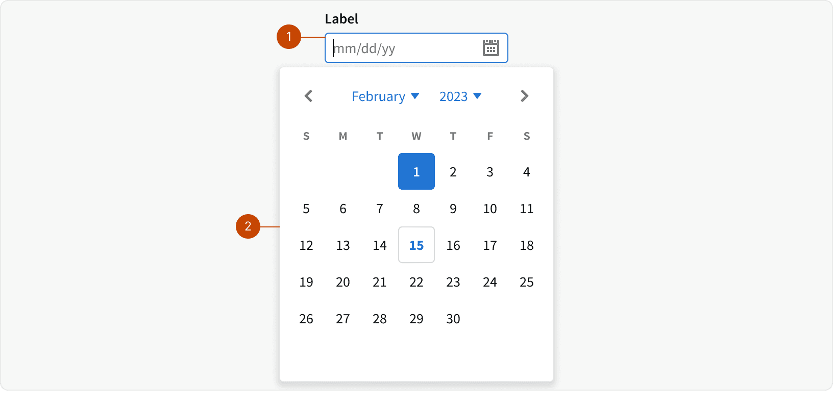
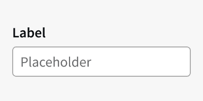
Input
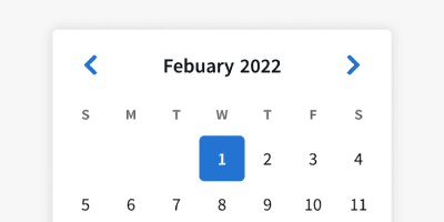
Calendar
Variants
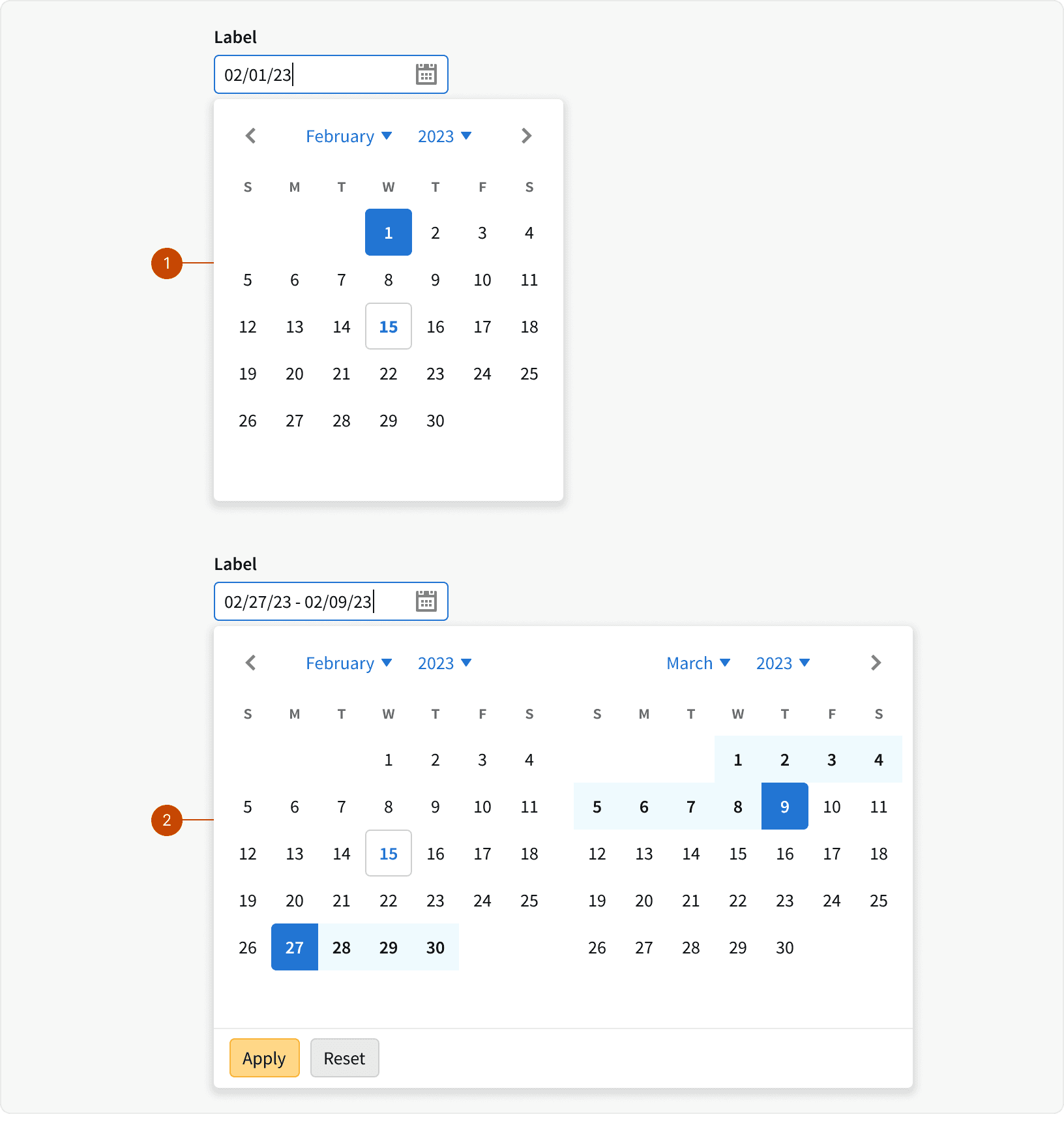
Default: Uses a single calendar
Range: Uses a Range Calendar or a Range Calendar with Presets
States
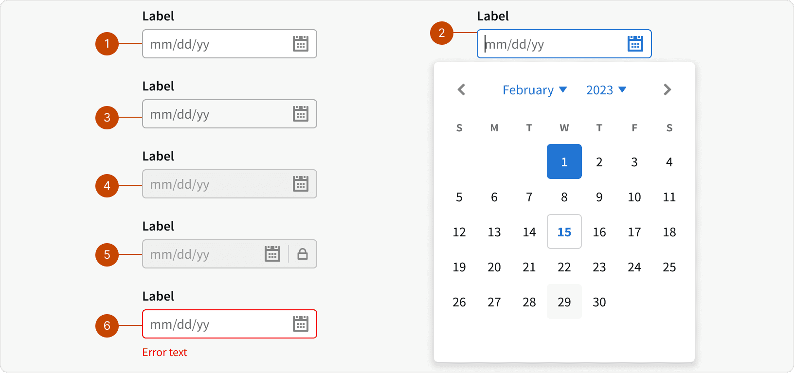
Default
Focus
Hover
Disabled
Locked
Error
Behaviors
Month & Year Selectors
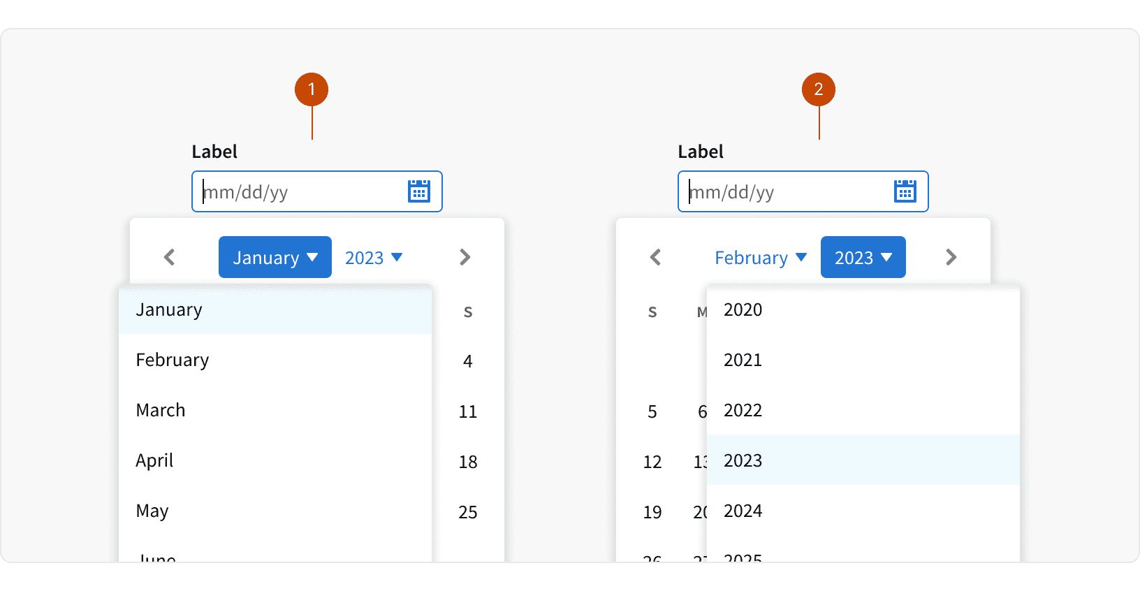
Month and year selectors allow users to navigate or select across large date ranges more easily.
Month Select
Year Select
Auto Formatting
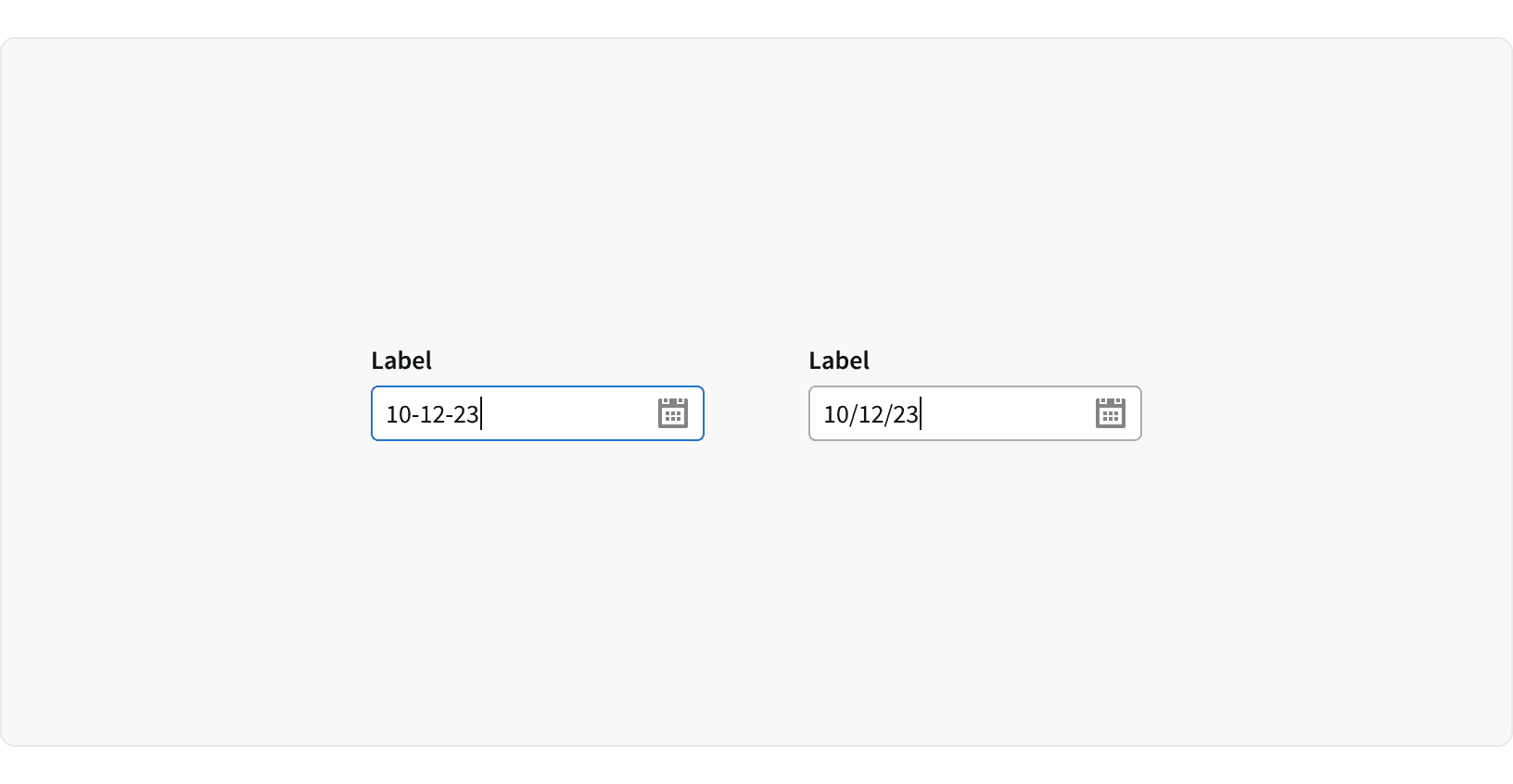
If a date is entered using alternate separators, the date will be auto formatted to use "/" instead.
Best Practices
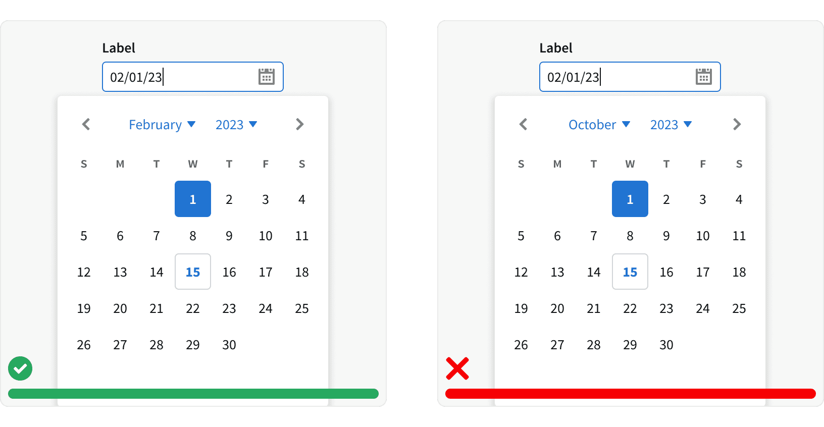
1. Default Month
Date picker should default to the month of the current selection. Setting random values for the user will introduce extra work and increase the interaction cost.
2. Dismissal
When selecting a single day, the Calendar should automatically disappear once a date is selected.
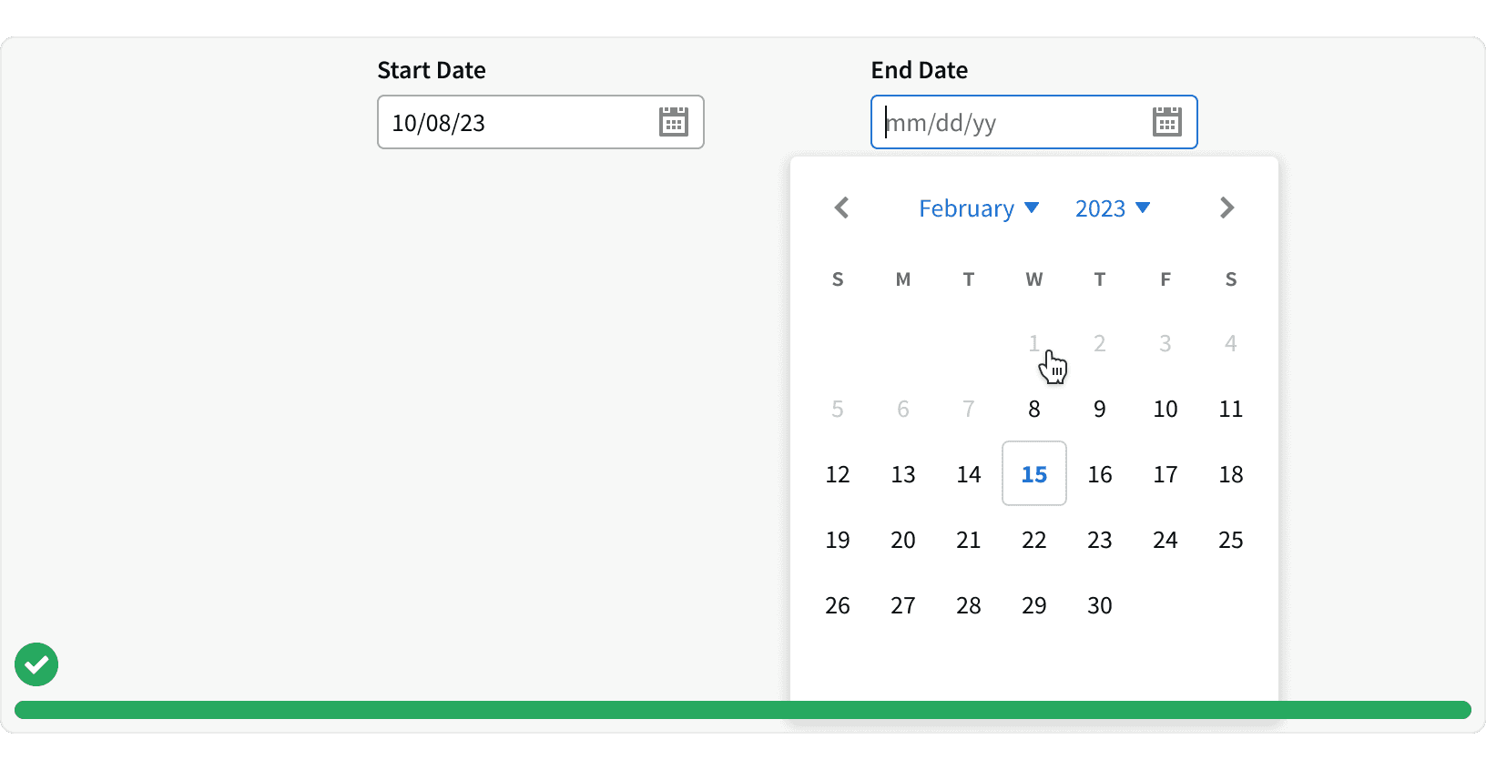
3. Illogical Date Options
Date picker should eliminate illogical date options to reduce human error. For instance, the date picker should not allow users to enter a campaign end date before the start date.
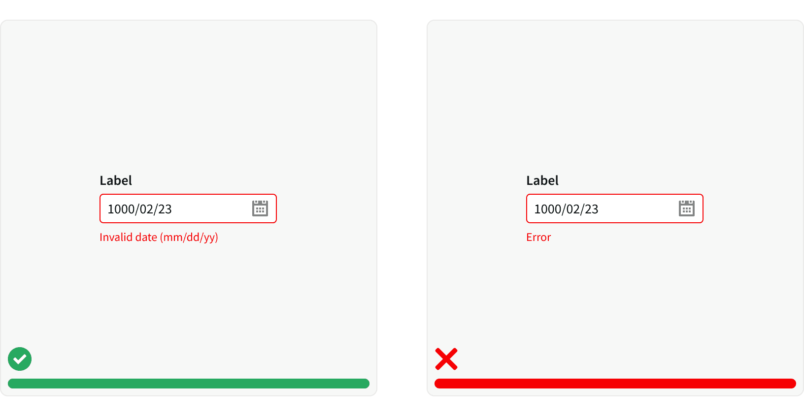
4. Errors
Date picker should report errors appropriately. If user enters an invalid date, the input field should give user feedback and provide the correct format.
5. Typing
Allow user to type the date. Typing the date is the most basic option for date input, especially when the date is further away in the past. It is the most effective way to allow users to type the date.
More
Related Pages
Accessibility
Color contrast ratio for our Date Pickers meets AA standards, based on Web Content Accessibility Guidelines (WCAG) guidelines.
Benefits: People with low vision often have difficulty reading text that does not contrast with its background. This can be exacerbated if the person has a color vision deficiency that lowers the contrast even further. Providing a minimum luminance contrast ratio between the text and its background can make the text more readable even if the person does not see the full range of colors. It also works for the rare individuals who see no color.
Additional Reading
Date-Input Form Fields: UX Design Guidelines https://www.nngroup.com/articles/date-input/
Date Picker Design Best Practices https://uxplanet.org/date-picker-design-best-practices-41bd522f10a5
Designing The Perfect Date And Time Picker https://www.smashingmagazine.com/2017/07/designing-perfect-date-time-picker/
Tips and tricks to design better date pickers https://ergomania-ux.medium.com/tips-and-tricks-to-design-better-date-pickers-98c57fab3bdc