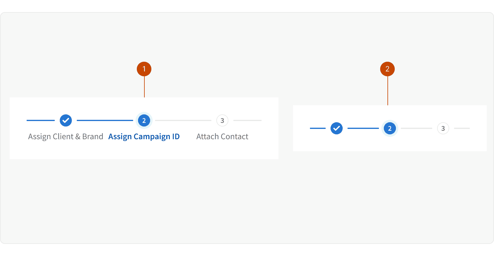
Anatomy
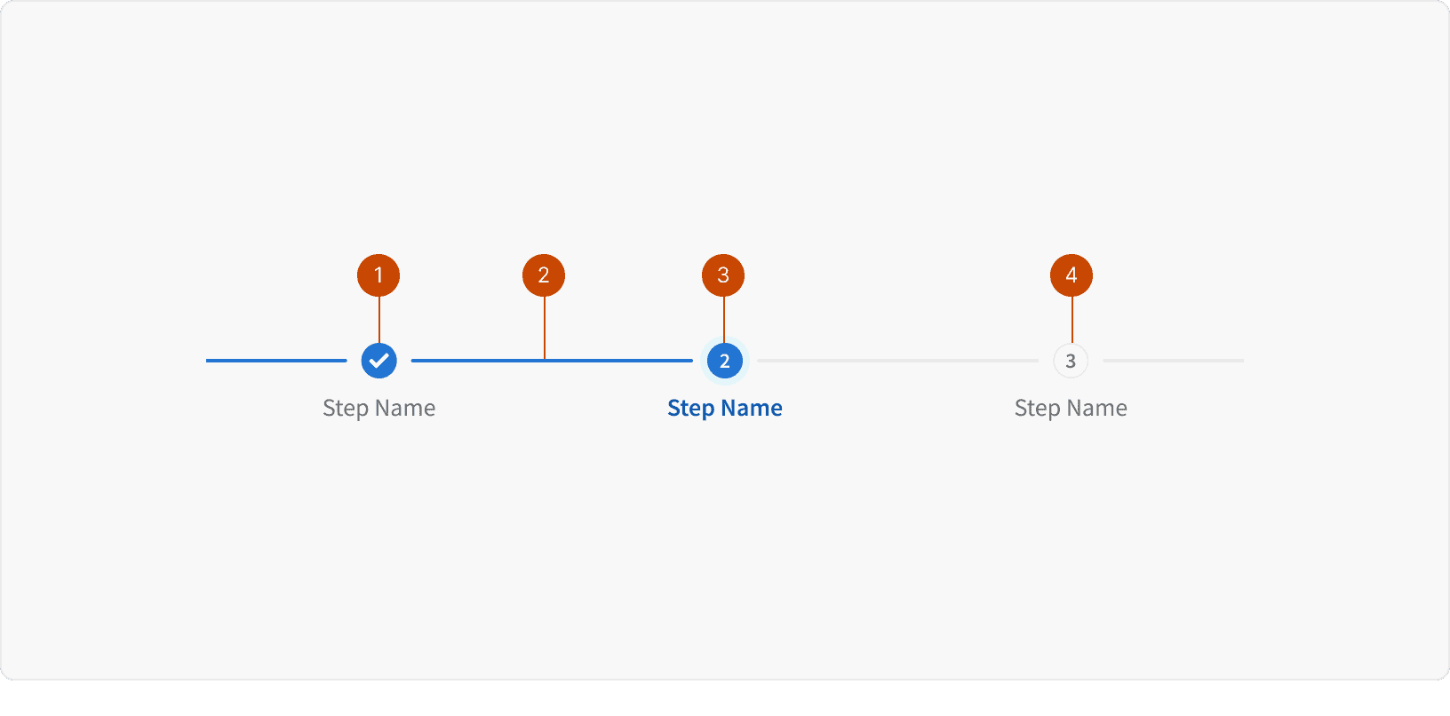
Completed Step
Progress Line
Active Step
Default Step
Variants
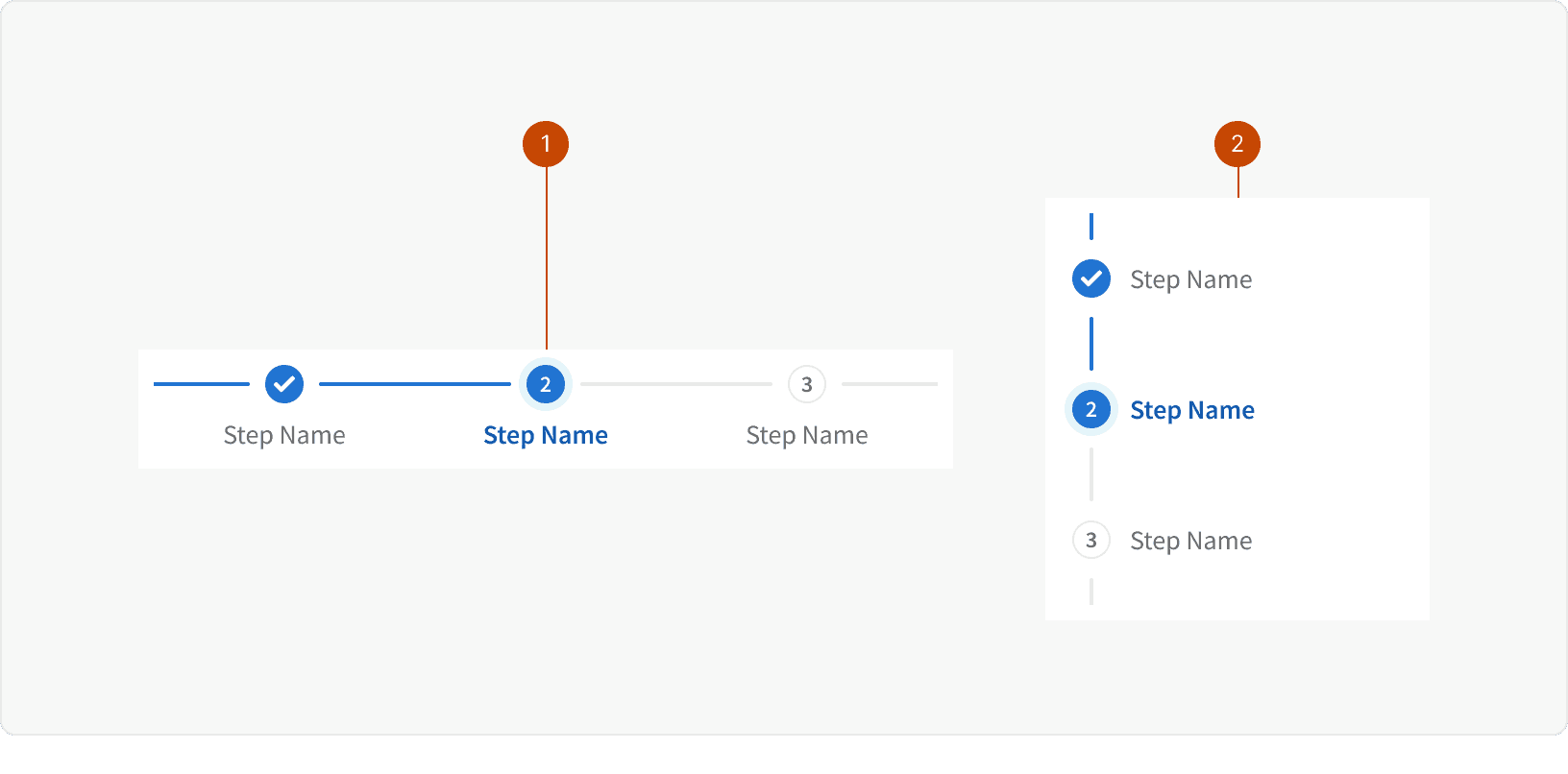
Default
Vertical
States
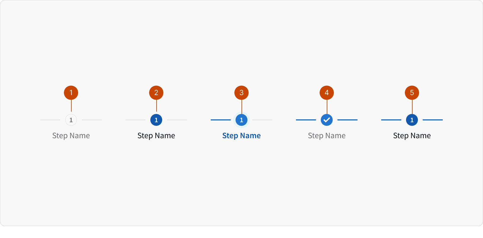
Default
Default: Hover
Active
Complete
Complete: Hover
Behaviors
Return Link
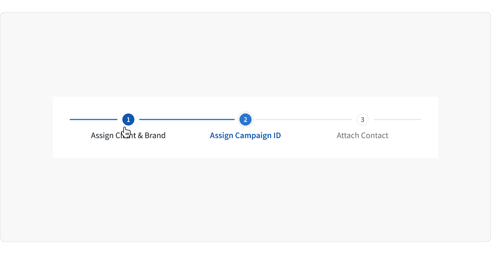
The steps may be used as links to return to a previous step to review their content submission.
Responsive
At the
Xlarge,LargeandMediumMD breakpoints, the step labels are visibleAt the
Smallbreakpoint, the step labels become hidden
Best Practices
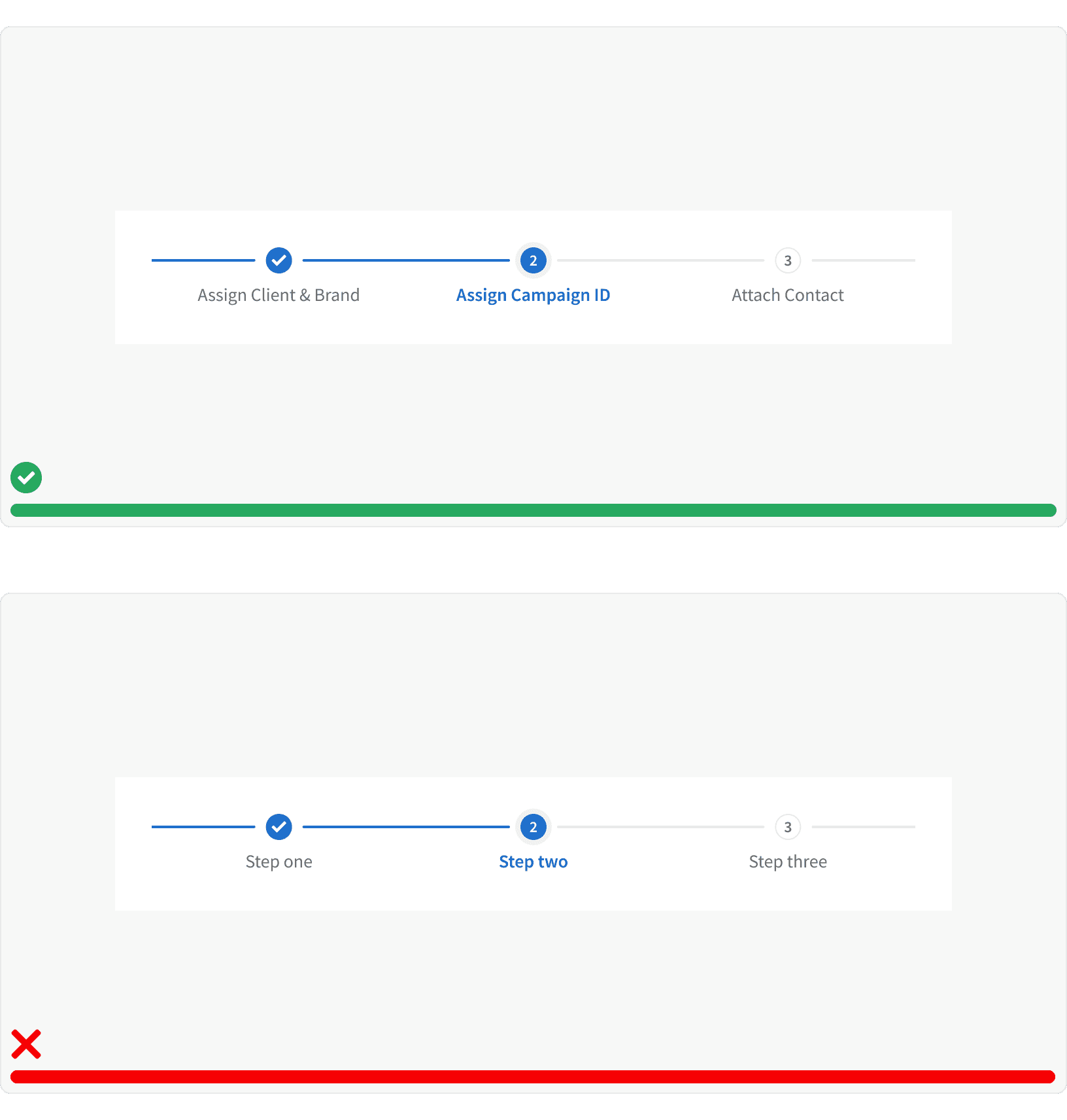
1. Labels
The Step Progress Bar should use descriptive step labels and should use a is-active step to indicate the user's progress.
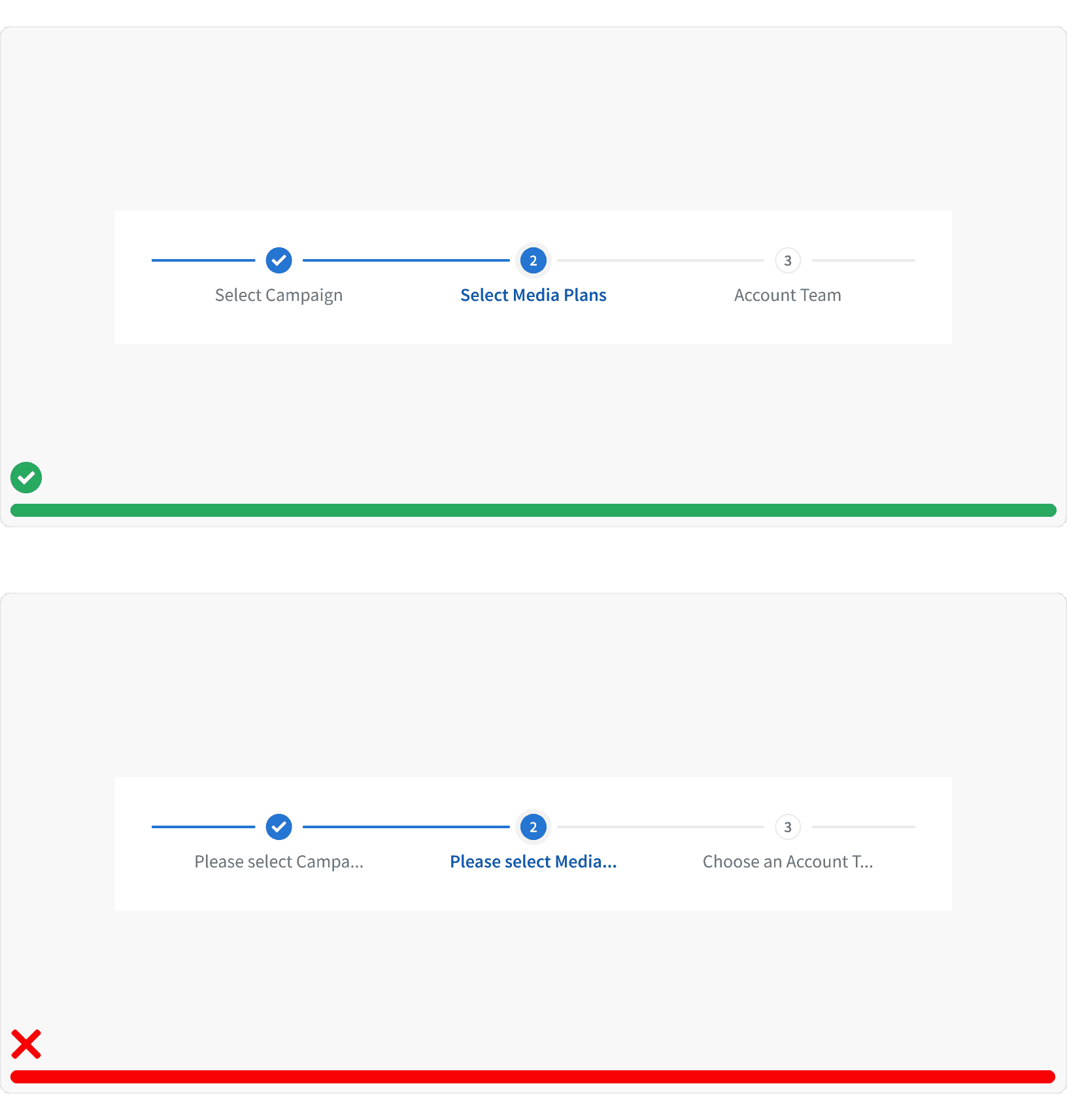
2. Short and Concise
The Step Progress Bar labels should be short and concise.
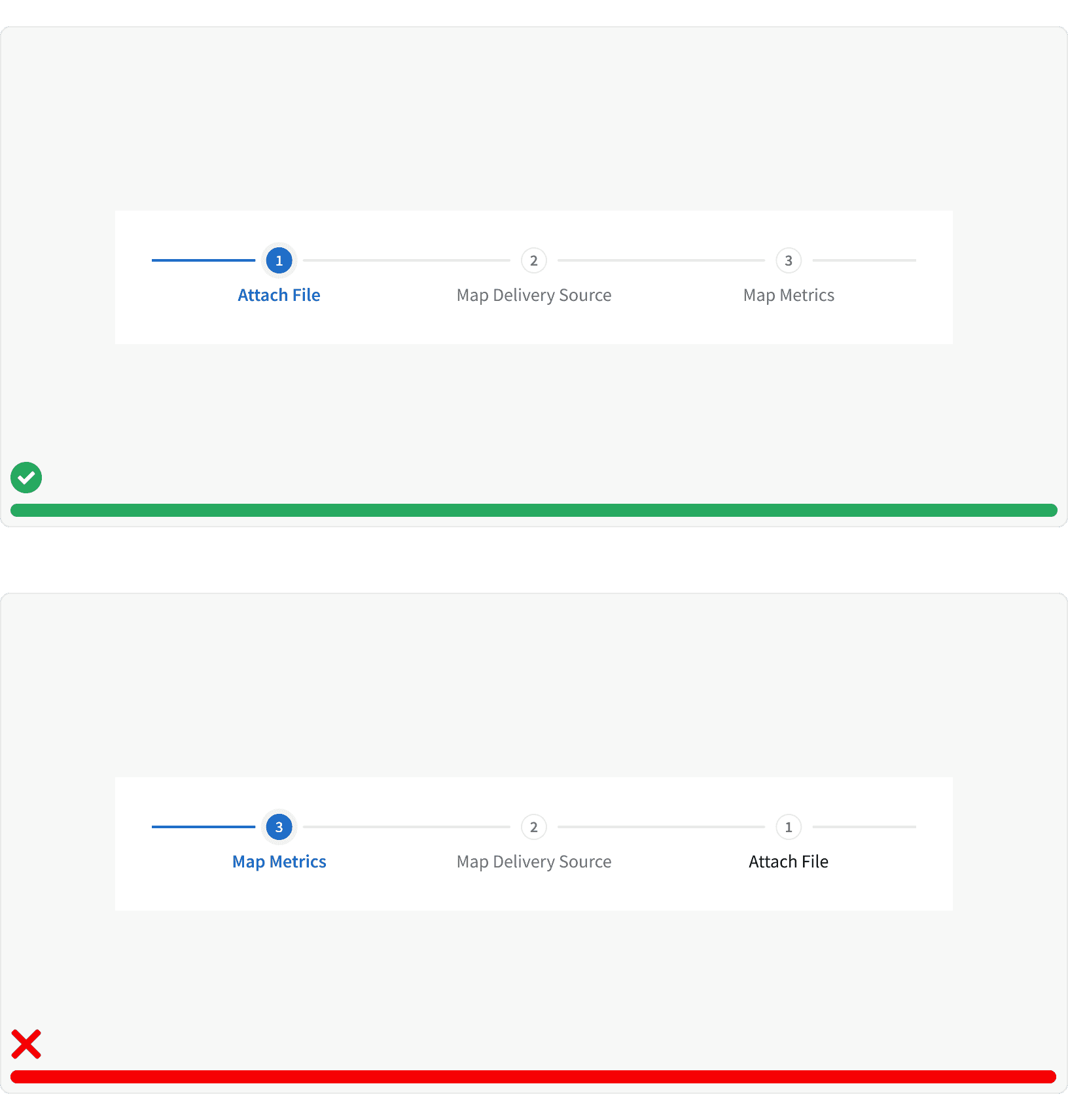
3. Ordering
The steps should be displayed in logical order from left to right to illustrate the movement through the steps.
More
Related Pages
Accessibility
Color contrast ratio for our Step Progress Bar meets AA standards, based on Web Content Accessibility Guidelines (WCAG) guidelines.
Benefits: People with low vision often have difficulty reading text that does not contrast with its background. This can be exacerbated if the person has a color vision deficiency that lowers the contrast even further. Providing a minimum luminescence contrast ratio between the text and its background can make the text more readable even if the person does not see the full range of colors. It also works for the rare individuals who see no color.
Additional Reading
Progress Trackers in UX Design https://uxplanet.org/progress-trackers-in-ux-design-4319cef1c600
Progress Trackers in Web Design: Examples and Best Practices https://www.smashingmagazine.com/2010/01/progress-trackers-in-web-design-examples-and-best-design-practices/
