Anatomy
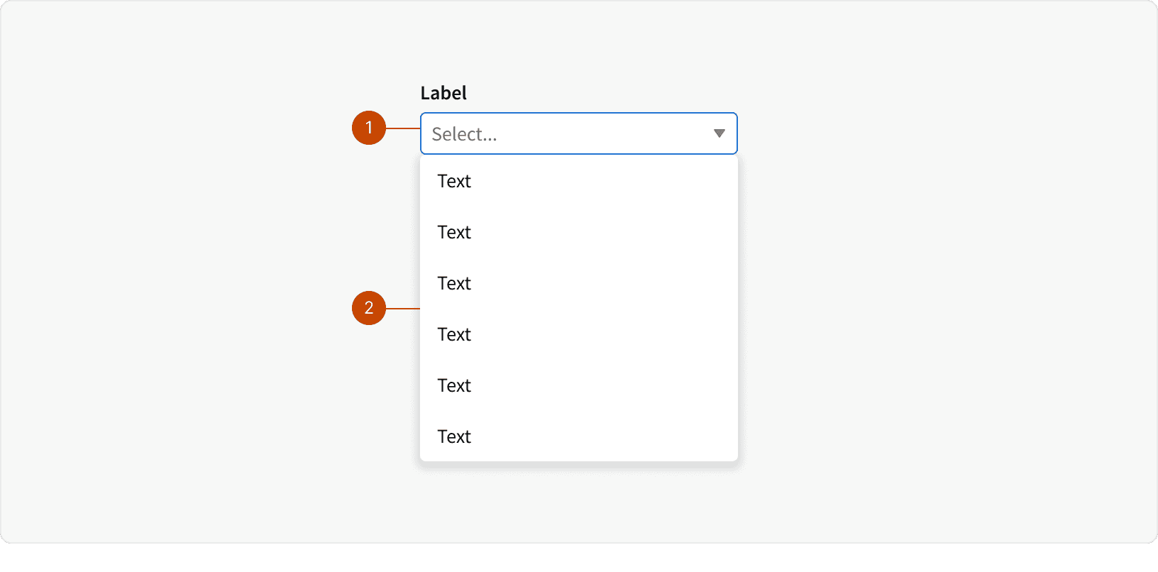
Input
Picklist
States
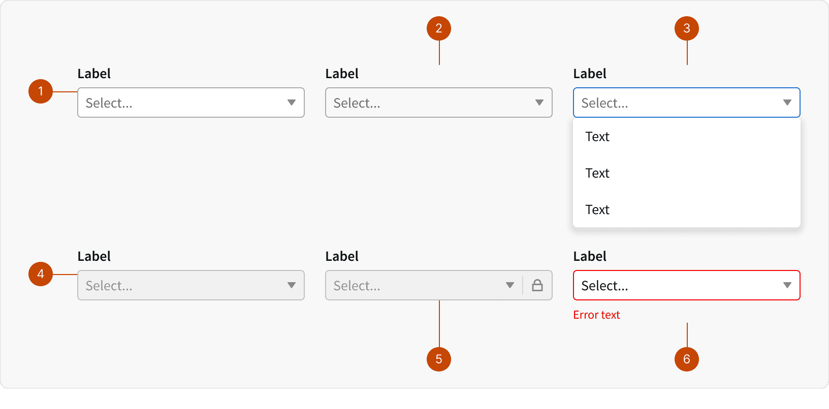
Default
Hover
Focus
Disabled
Locked
Error
Best Practices
1. When to use
Use a dropdown select when there are more than 5 options. When there are less than 5 options, consider using checkboxes or radios for quicker scan-ability. ¹
2. Input Label
Include a clear and concise label that helps the user understand the purpose of the dropdown select. ³
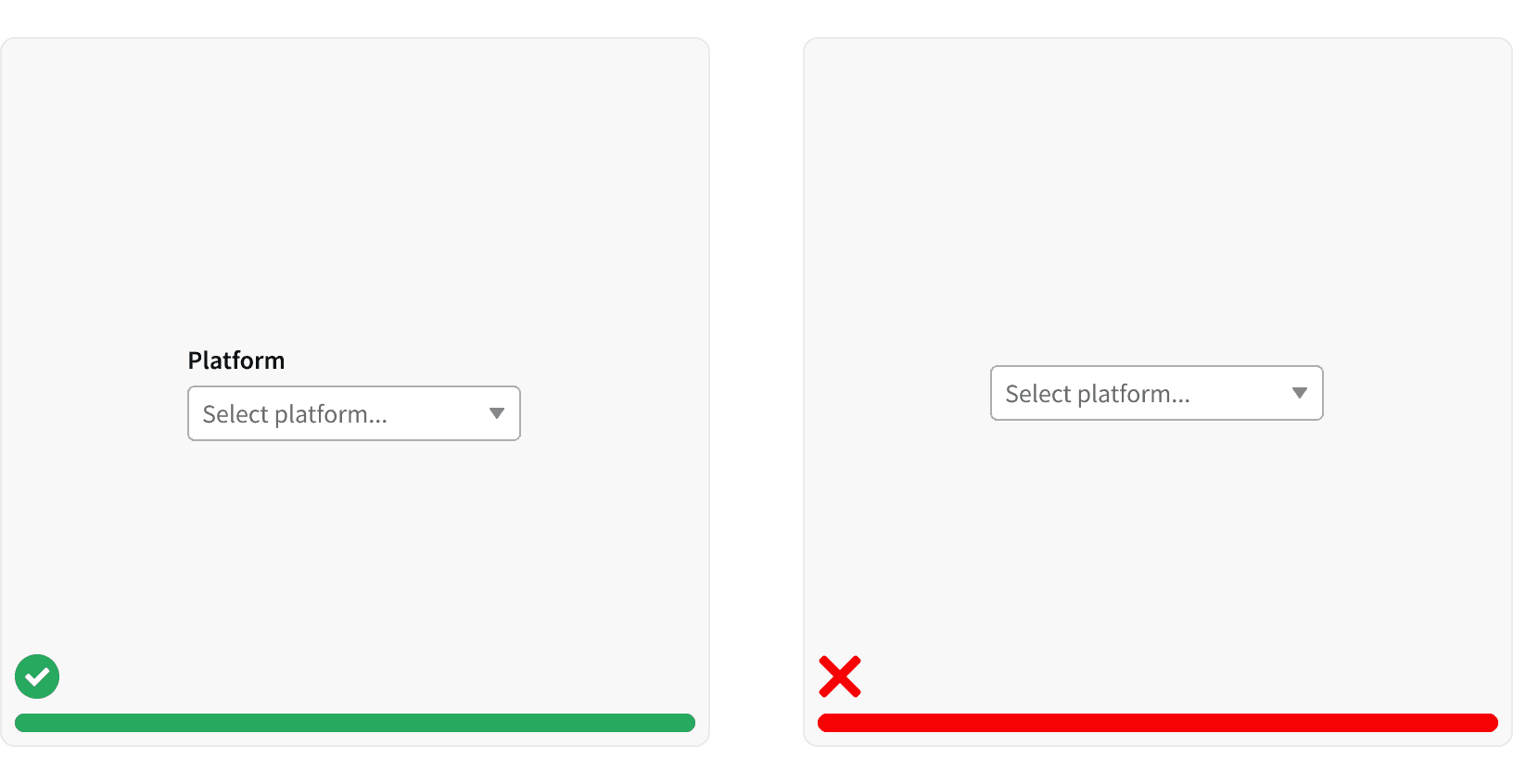
3. Placeholder Text
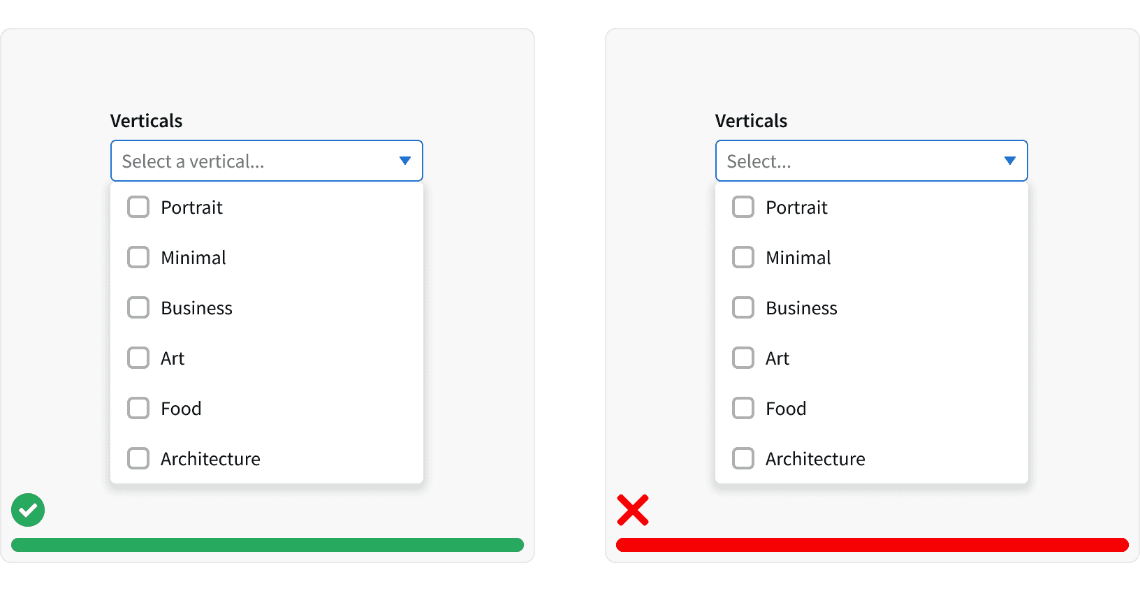
Use placeholder text to indicate the type of information they will be providing. ²
4. Mutli select count
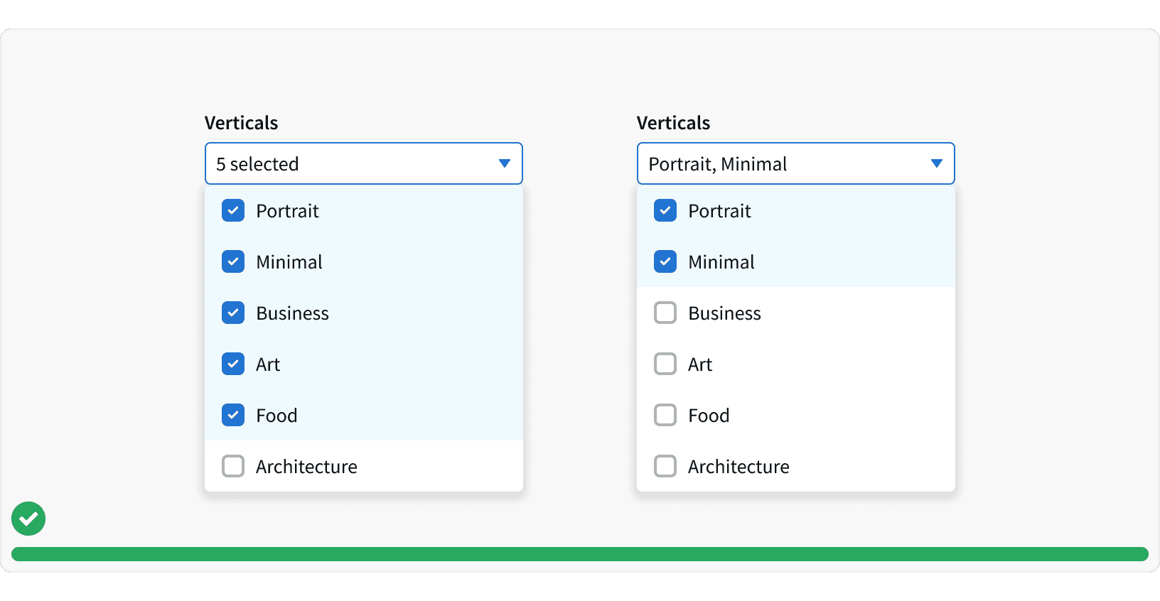
Display the a count of the selected items if there are many choices. If there are only a few choices, display selection values in the form input. ²
5. Searchable Options
Include a search field if the list of options in extensive, such as a long list of line items names. ²

More
Related Pages
Accessibility
Color contrast ratio for our Dropdown Selct meets AA standards, based on Web Content Accessibility Guidelines (WCAG) guidelines.
Benefits: People with low vision often have difficulty reading text that does not contrast with its background. This can be exacerbated if the person has a color vision deficiency that lowers the contrast even further. Providing a minimum luminance contrast ratio between the text and its background can make the text more readable even if the person does not see the full range of colors. It also works for the rare individuals who see no color.
Additional Reading
How to design a form dropdown menu https://formsort.com/article/how-to-design-a-dropdown-field-in-a-form/
Dropdown UI design guide https://www.setproduct.com/blog/dropdown-ui-design
UX Design: Drop-Downs in Forms https://uxplanet.org/ux-design-drop-downs-in-forms-c6943ec30037
