Anatomy
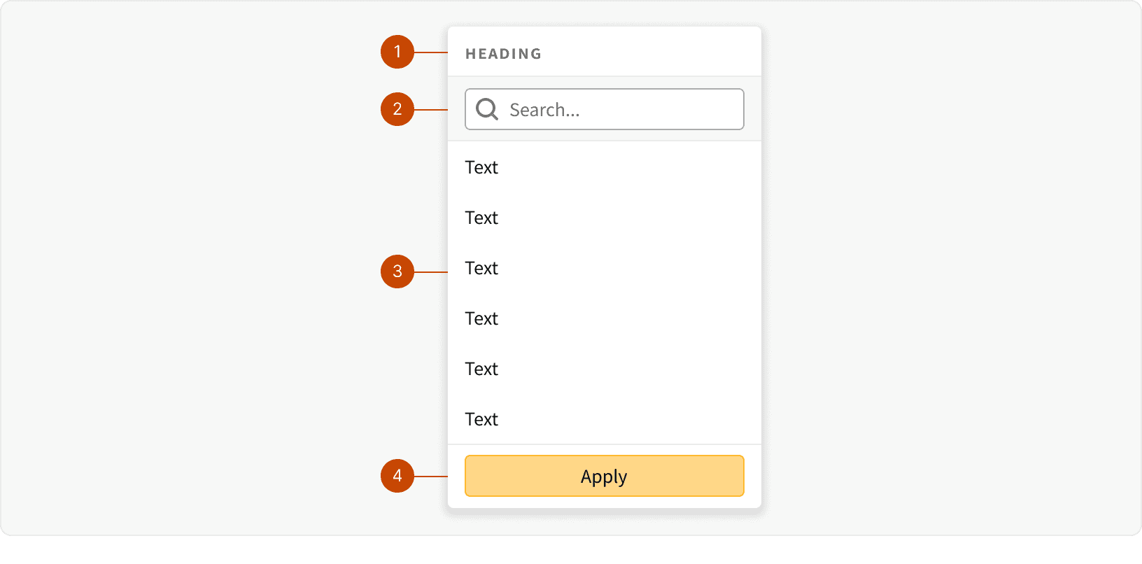
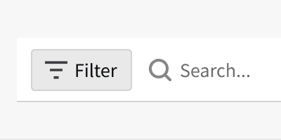
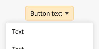
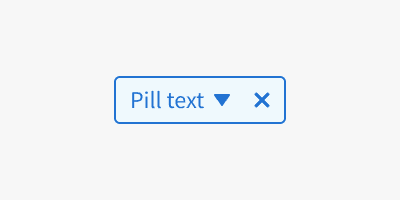
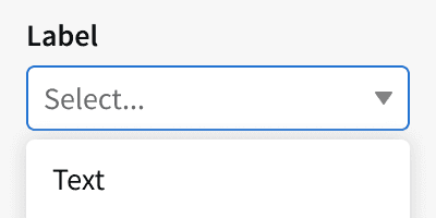
Heading: Optional. Used as a label for the entire picklist if the picklist control does not include a label. (ex. Add new filter button, filter pill)
Search: Optional. Used to search within the picklist if there are many option to choose from.
List: Required. Use to show the list of available choices.
Footer: Optional. Use to display "Apply" button for filter bar selections.
Variants
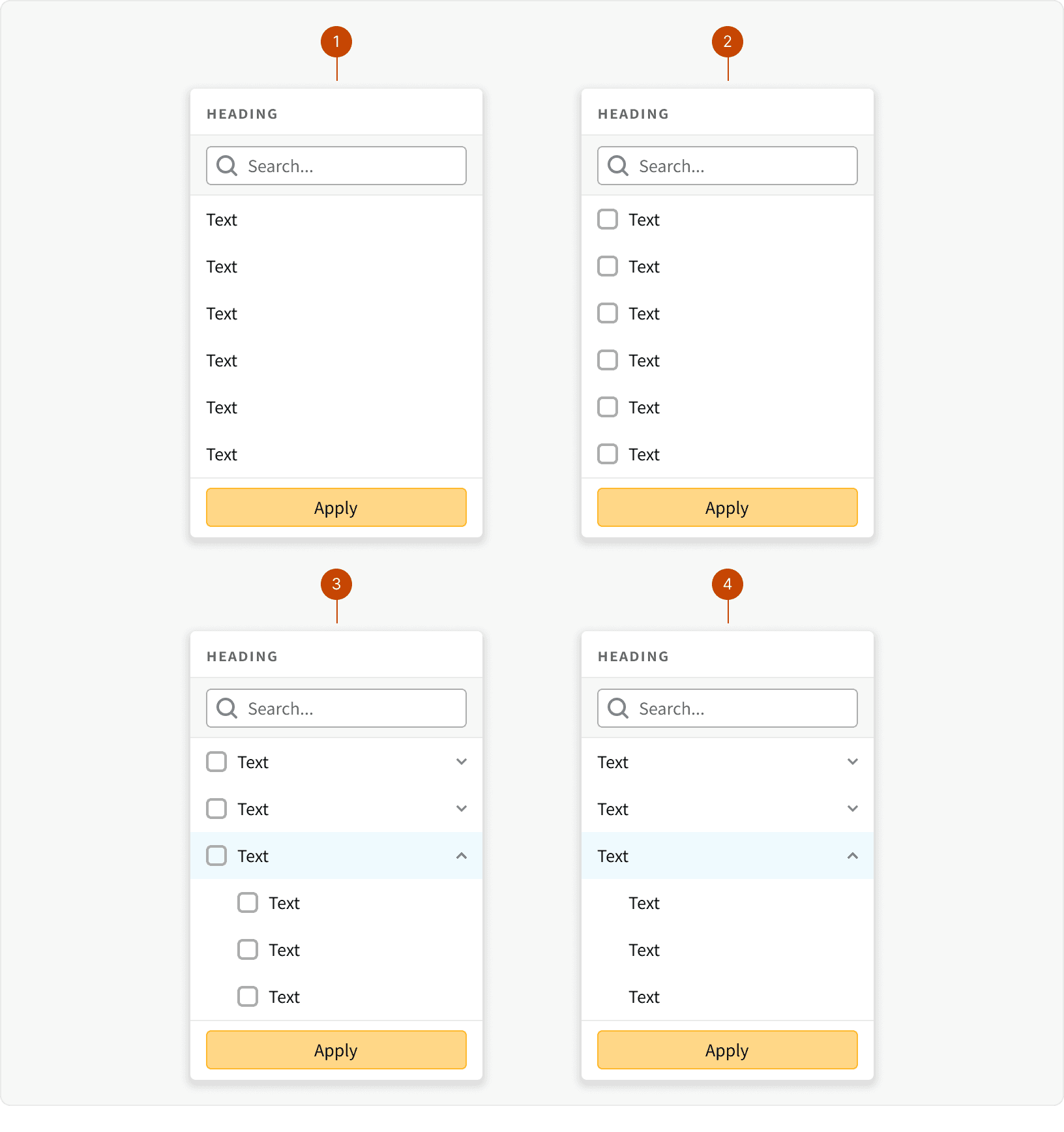
Default
Multi Select
Parent Child
Parent Child Single Select
States
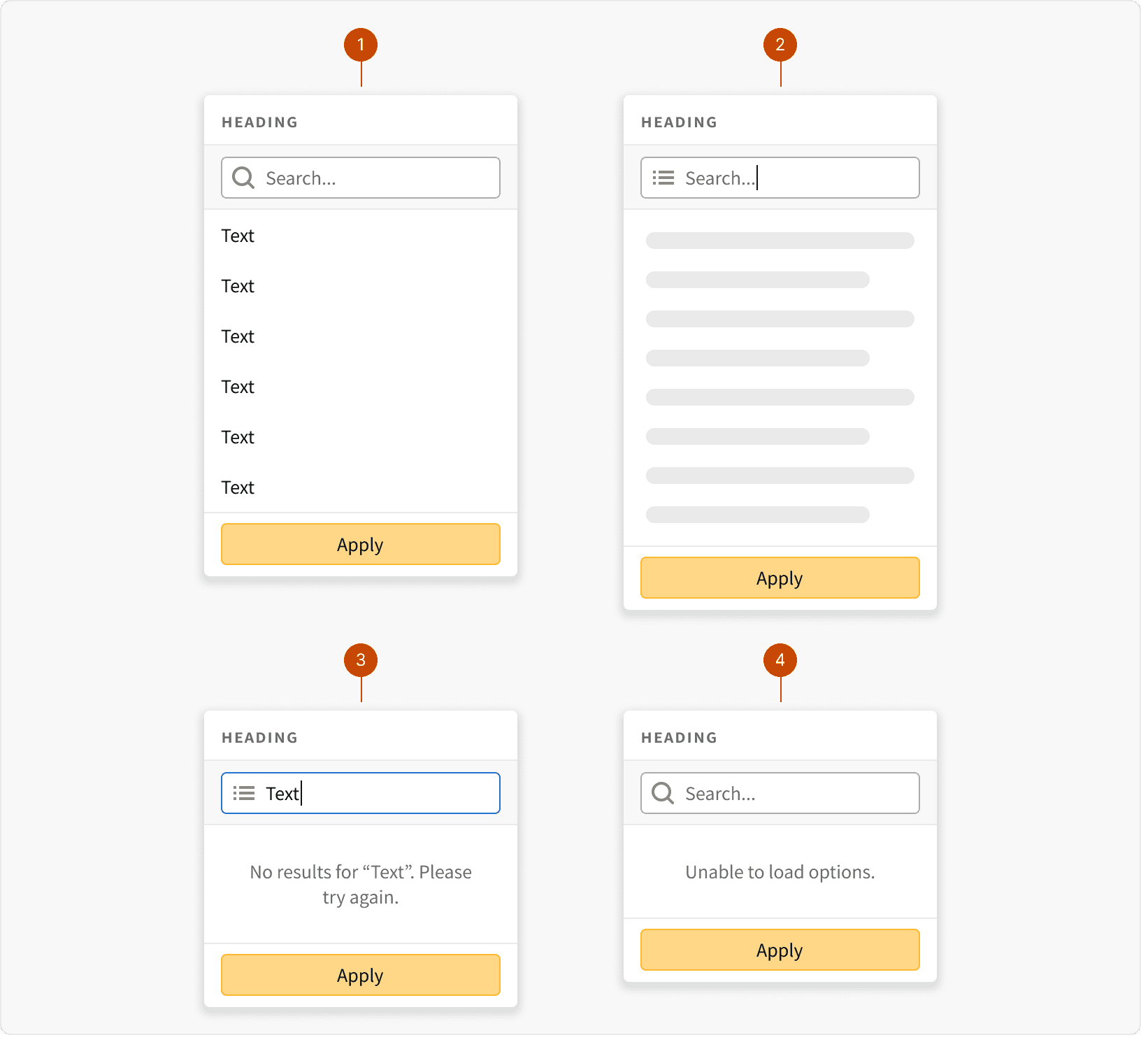
Default
Loading
No Results
Error
Behaviors
Max Height
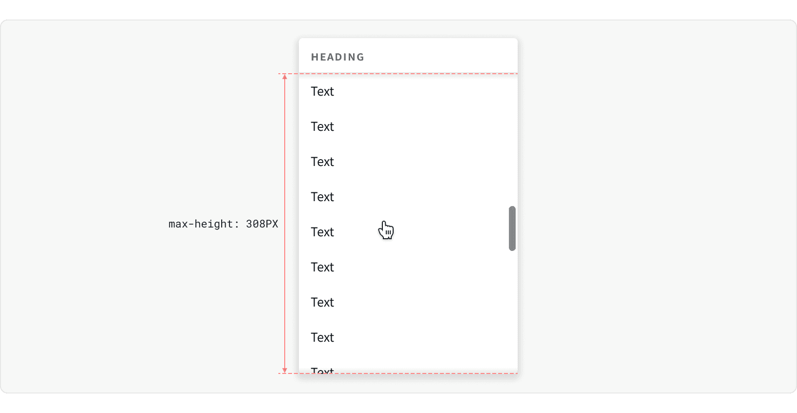
The list container has a max-height of 308px. Once it reaches this height, the overflow can be seen by scrolling.
Min Width and Truncation
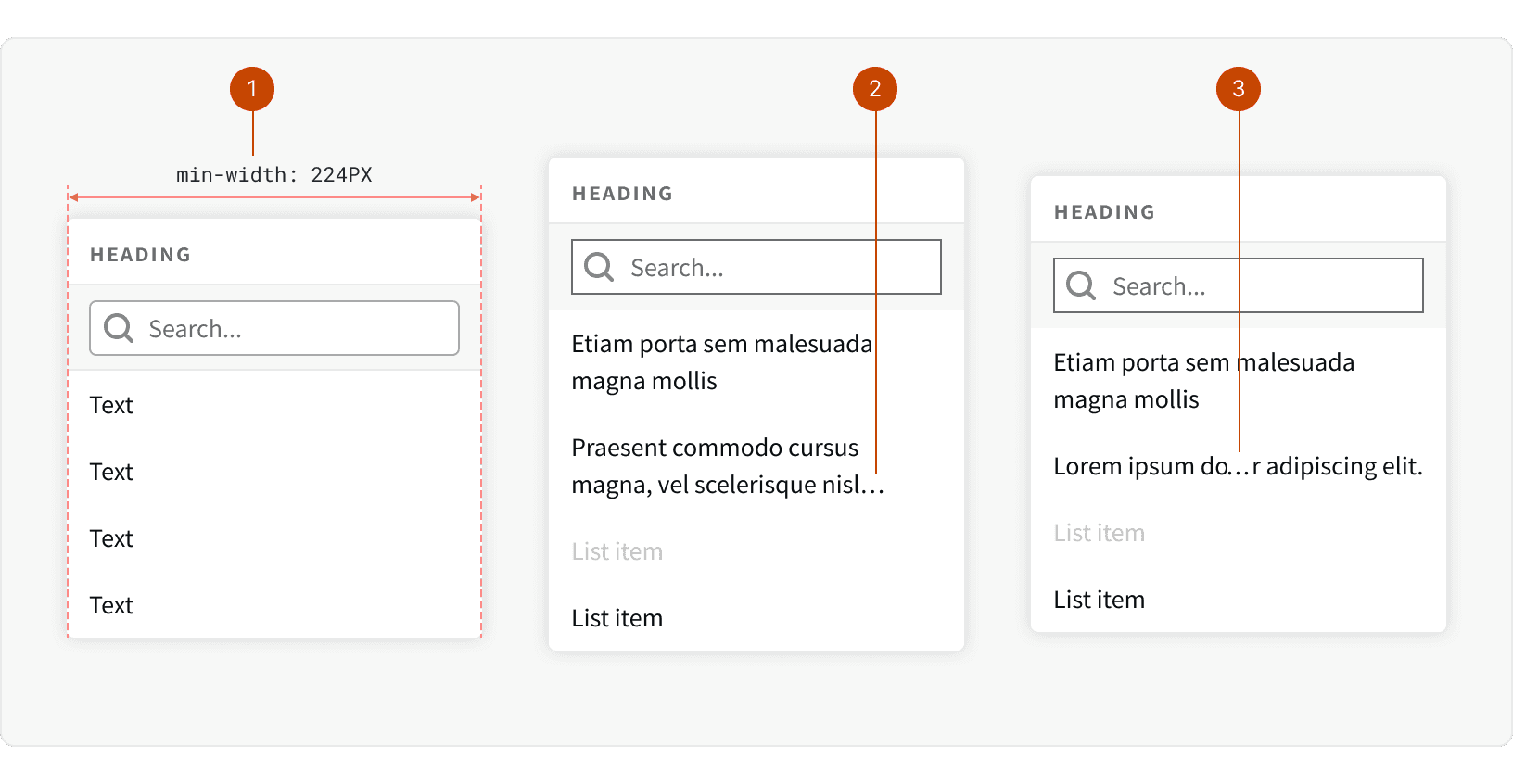
Min Width: The min-width of the picklist is 224px. The width may be increase to suite the needs of the design.
End Truncation: By default, text will be truncated to 2 lines.
Middle Truncation: Items may also be set to truncated in the middle if there are important identifiers at the end of the item text.
Best Practices
1. Usage
The picklist list should be used for navigation, selections or actions. It should not be used to display static information. Consider using a tooltip instead.
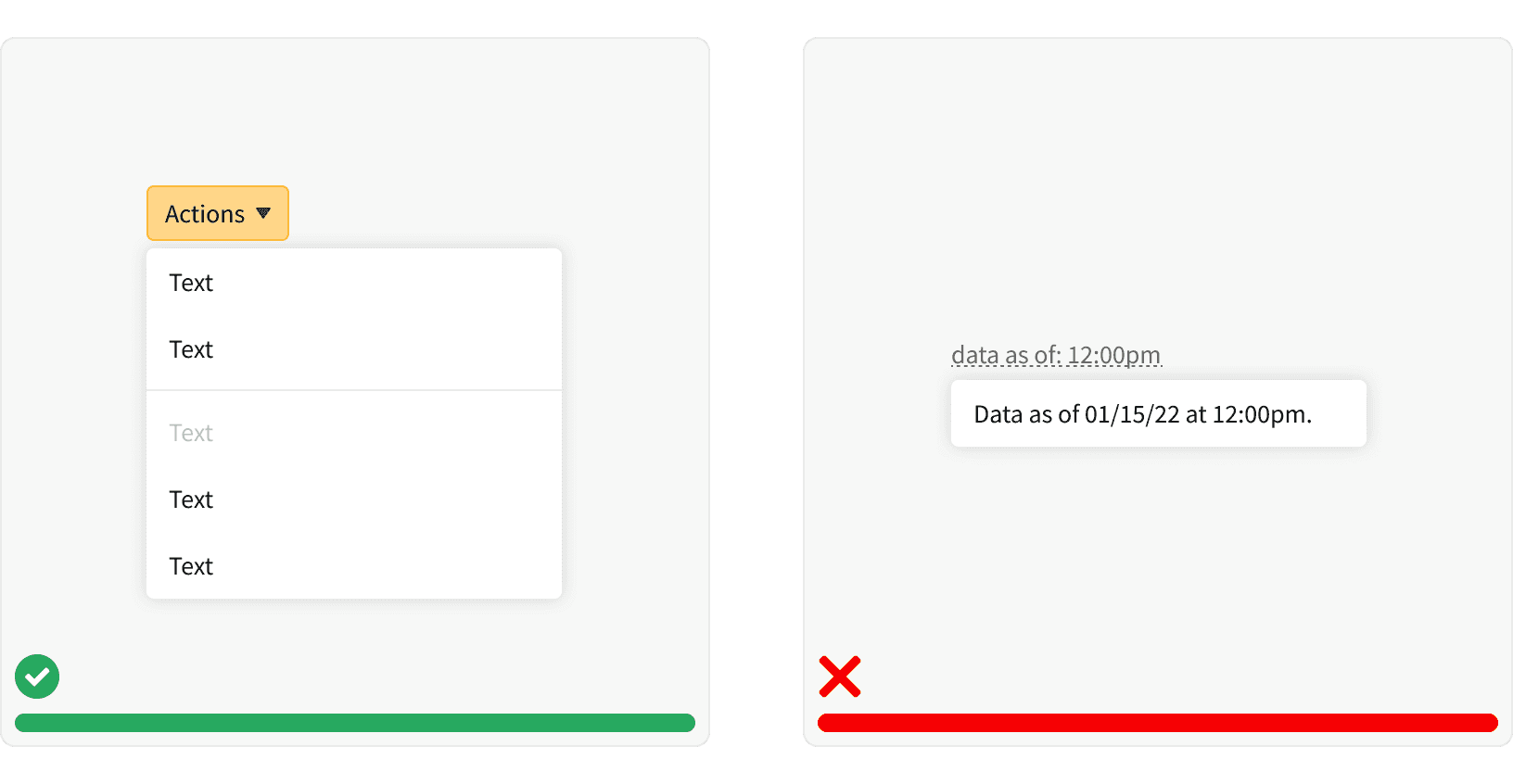
2. Hidden
The picklist should be hidden until opened with a control element. It should not be left open on a page as a visible element. If vertical, visible navigation is needed, consider using stacked tabs.
3. Labels
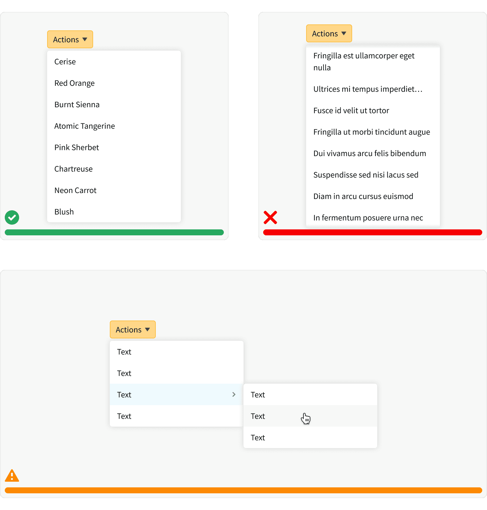
When using the picklist to display actions, use for simple labels. The number of choices should be limited to 5-8 items. Additional options may be placed in a nested menu. Nested menus should be uses sparingly.
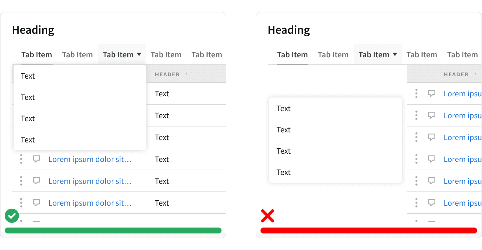
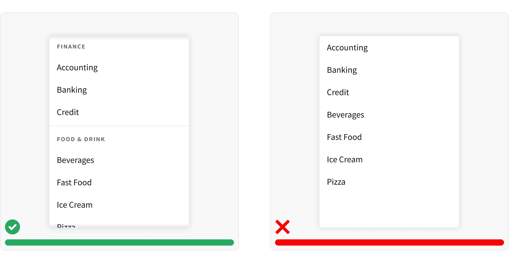
4. Ordering
Items in the picklist should be organized in a logical order. Related items should be grouped using section headings, dividers or both.
5. Elevation
The picklist should be elevated above the page content. The picklist should be positioned to always be visible and should not be cut off by page.
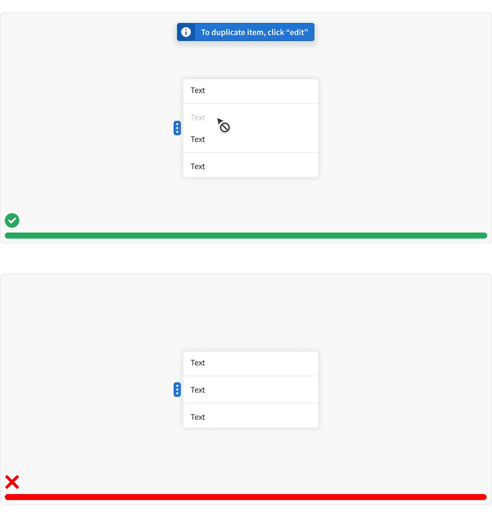
6. Unavailable Choices
Disable any unavailable choices. When user clicks a disabled choice, display a flash message explaining why the item is disabled and how to make it active. Do not remove unavailable items. This decreases spacial consistency and makes the interface harder to learn. Use this pattern with caution and try to avoid UX that creates scenarios with unavailable choices.
7. Permissions
If the user doesn't have permission to access a certain feature then it should be removed from the picklist.
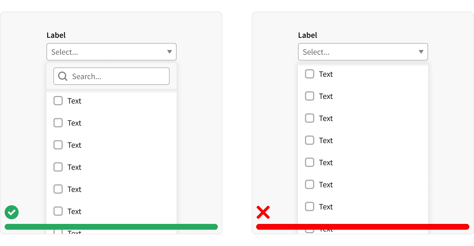
8. Scrolling
Avoid long scrolling lists when possible. When a list is scrollable, not all of the choices are visible and it can be challenging for users to scroll while keeping the mouse within the picklist. If this is unavoidable, include a search input to help users navigate list.
More
Related Pages

Accessibility
Color contrast ratio for our the Picklist component meets AA standards, based on Web Content Accessibility Guidelines (WCAG) guidelines.
Benefits: People with low vision often have difficulty reading text that does not contrast with its background. This can be exacerbated if the person has a color vision deficiency that lowers the contrast even further. Providing a minimum luminescence contrast ratio between the text and its background can make the text more readable even if the person does not see the full range of colors. It also works for the rare individuals who see no color.
The picklist should be keyboard friendly. Allow users to navigate the picklist using the arrow keys.
When using a picklist with a search input, the search input should auto-focus to indicate that a search can be performed quickly.
Like other form inputs, when using a picklist with dropdown input, always include a label (W3C standard).
Additional Reading
Dropdowns: Design Guidelines https://www.nngroup.com/articles/drop-down-menus/
Similarity Principle in Visual Design https://www.nngroup.com/articles/gestalt-similarity/
Law of Similarity https://lawsofux.com/law-of-similarity/
UI cheat sheet: dropdown field https://uxdesign.cc/ui-cheat-sheet-dropdown-field-a30025c0f432
UX Design: Drop-Downs in Forms https://uxplanet.org/ux-design-drop-downs-in-forms-c6943ec30037
7 Rules of Using Radio Buttons vs Drop-Down Menus https://uxdworld.com/2018/05/06/7-rules-of-using-radio-buttons-vs-drop-down-menus/