Anatomy
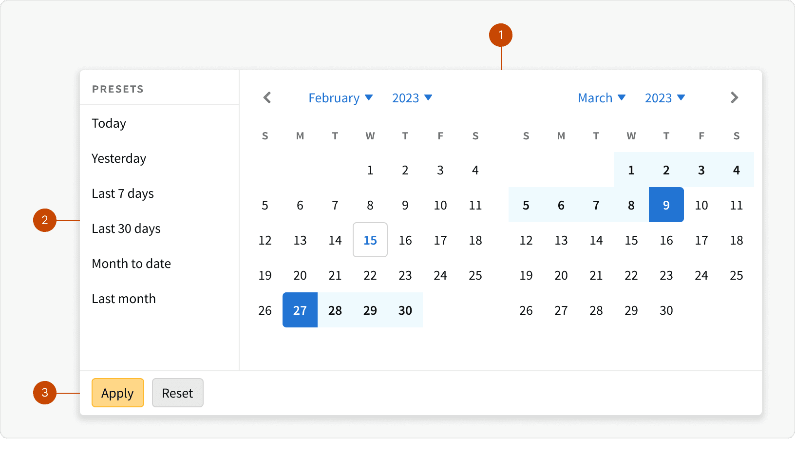
Calendar Slider
Presets
Buttons
Variants
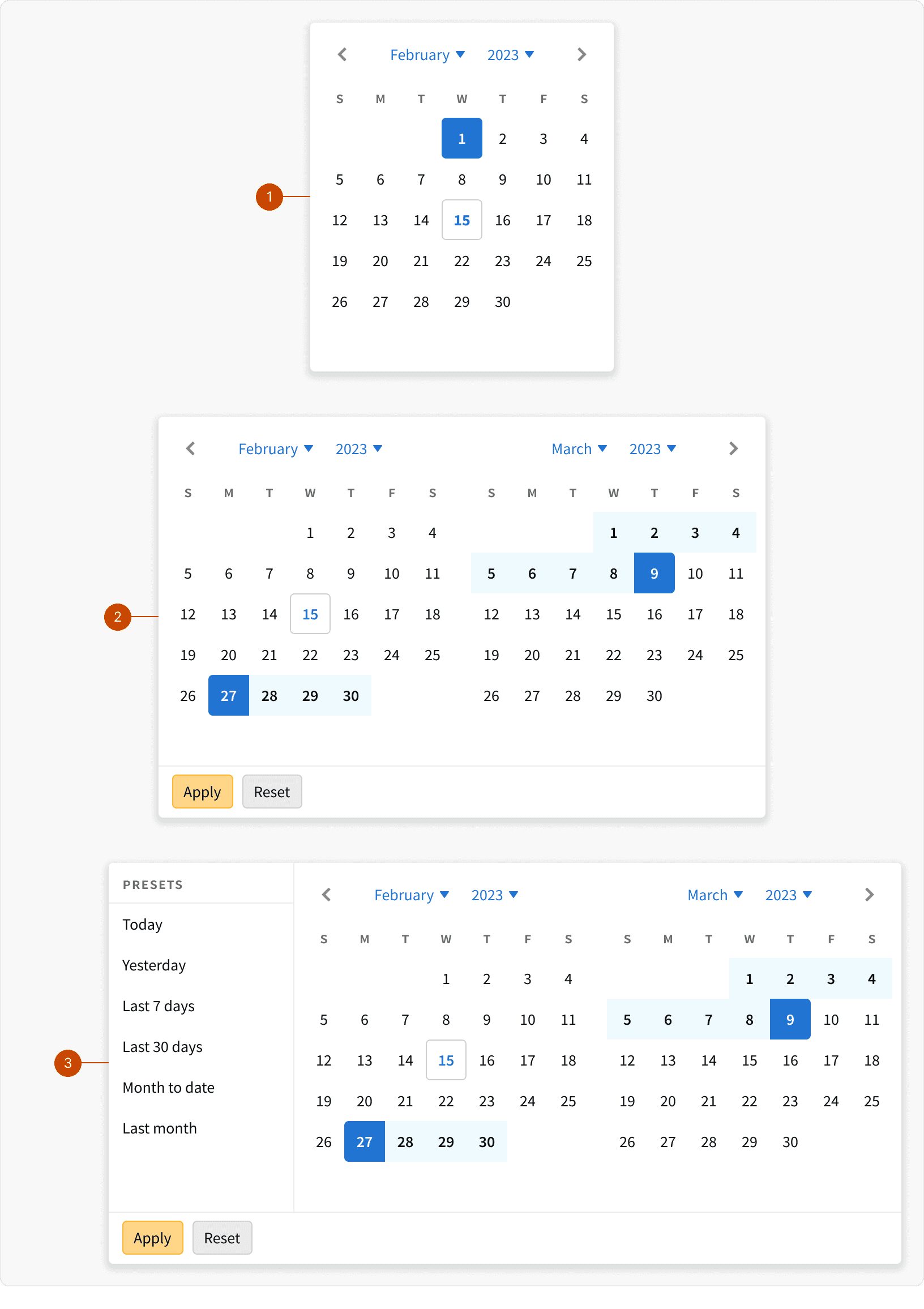
Default
Range
With Presets
States
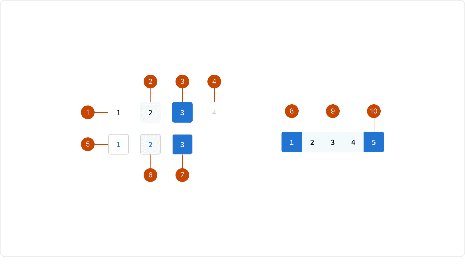
Default
Hover
Selected
Disabled
Today
Today: Hover
Today: Selected
Range: Start
Range: Middle
Range: End
Behaviors
Month & Year Selectors
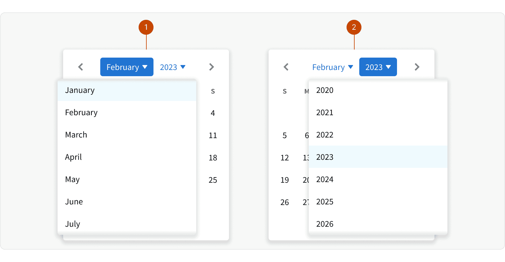
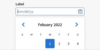
Month and year selectors allow users to navigate or select across large date ranges more easily.
Month Select
Year Select
Slide Animation
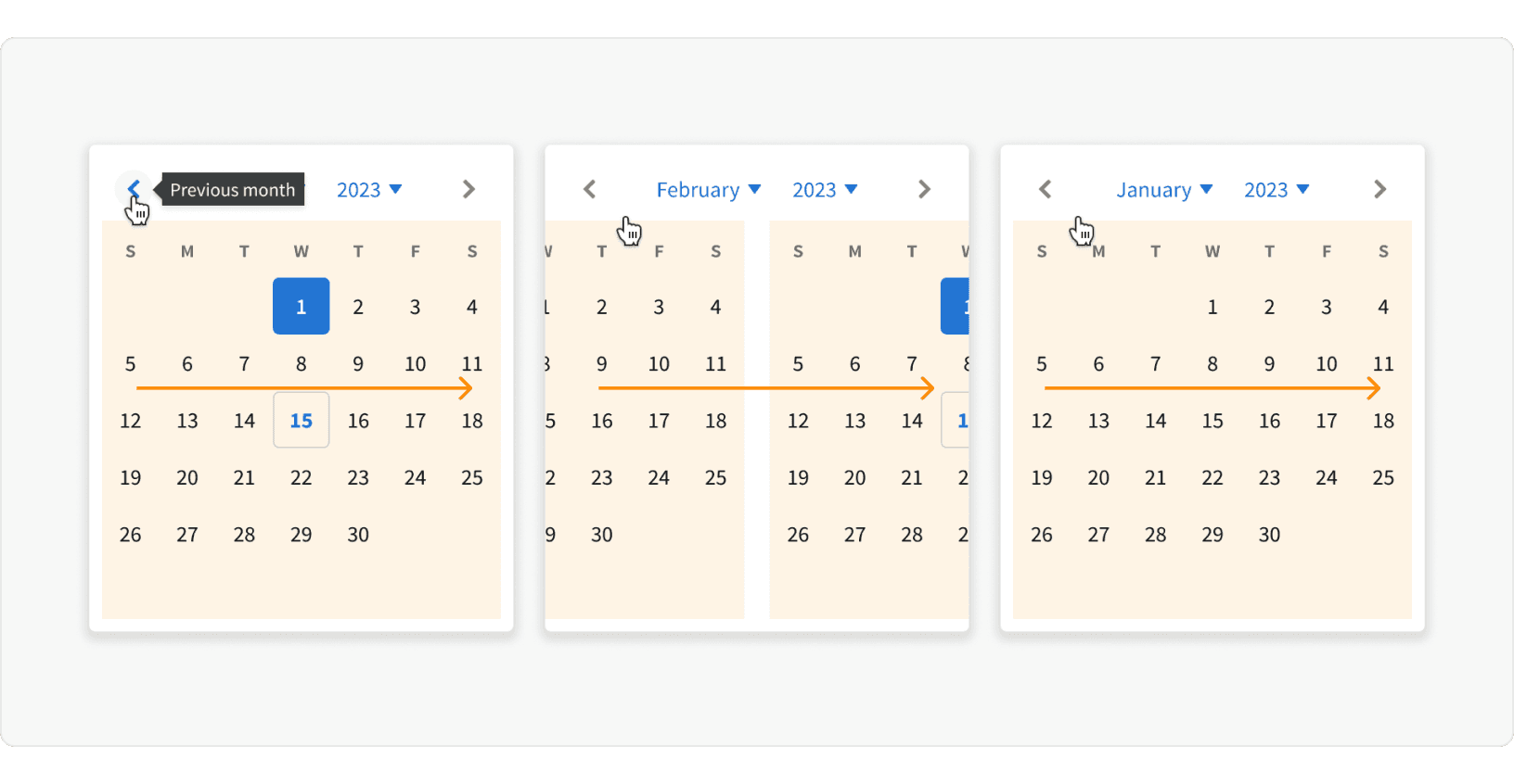
The calendar uses a --anim-ease-in-out --anim-duration-md animation to help users better understand the direction of movements within the calendar.
Best Practices
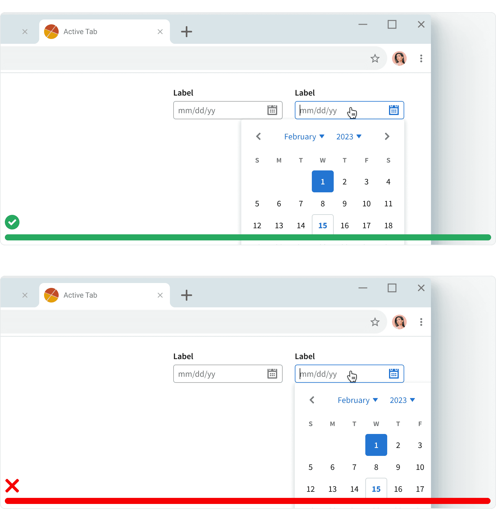
1. Positioning
Ensure that the calendar component is visible and is not being cut off by the side of the browser window or by the viewport of smaller breakpoints.
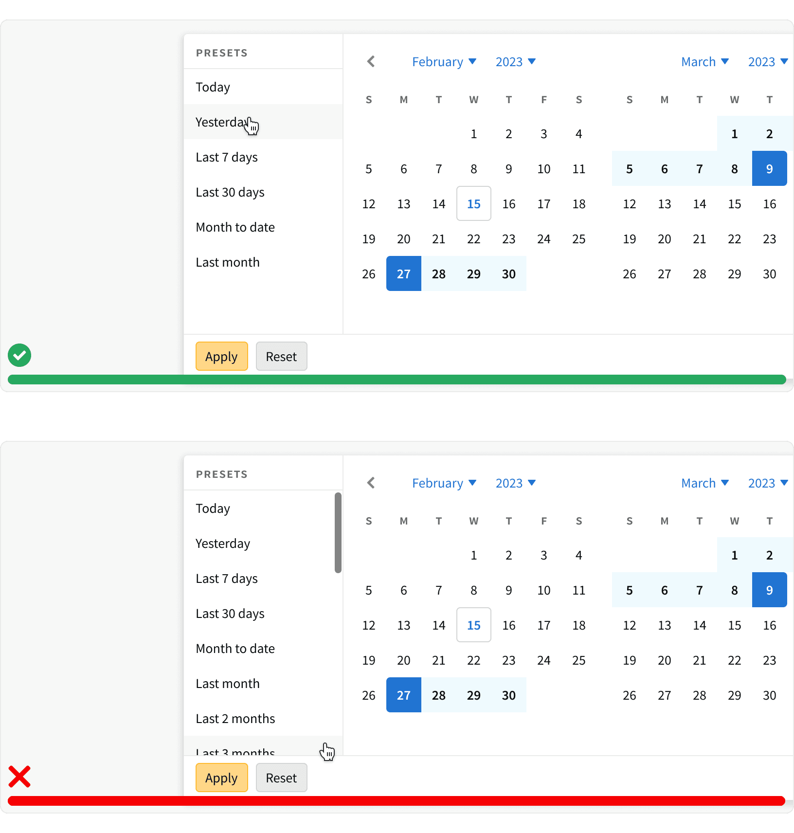
2. Range with Presets
Use the Calendar with presets variant to provide a list of common date ranges. This list should be short and should not include unnecessary options that will confuse the user. ¹
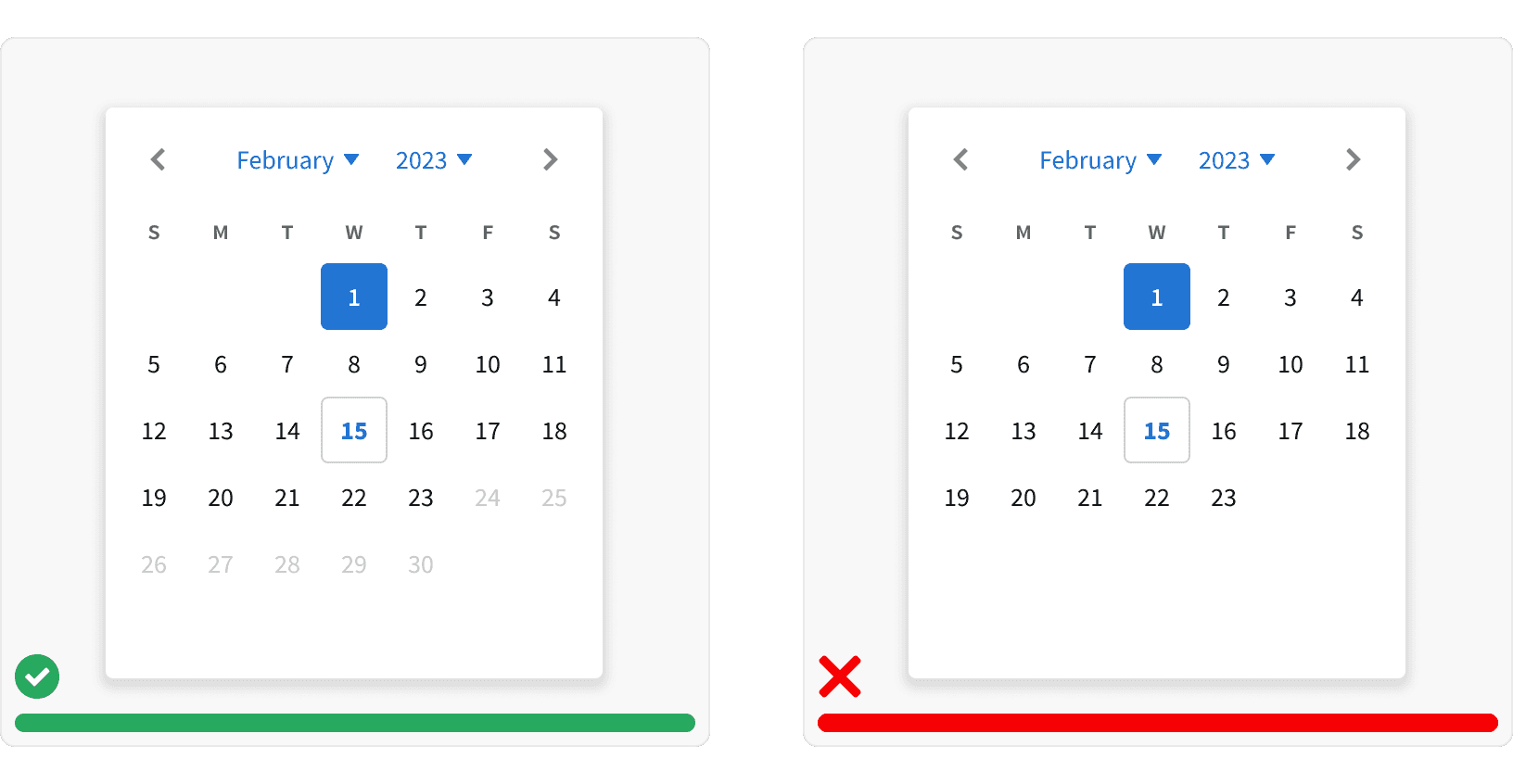
3. Unavailable days
Use the calendar day button disable states to display unavailable days. Do not hide them from within the calendar.¹
More
Related Pages
Accessibility
Color contrast ratio for our Calendar component meets AAA standards, based on Web Content Accessibility Guidelines (WCAG) guidelines.
Benefits: People with low vision often have difficulty reading text that does not contrast with its background. This can be exacerbated if the person has a color vision deficiency that lowers the contrast even further. Providing a minimum luminance contrast ratio between the text and its background can make the text more readable even if the person does not see the full range of colors. It also works for the rare individuals who see no color.
Additional Reading
The Ultimate Guide to Design a Perfect Date Picker https://uxdworld.com/2019/03/02/how-to-design-a-perfect-date-picker/
