Content
1
Consistent
Preset options should be consistently formatted. Use numerals (1, 2, 5) instead of spelling out numbers to save space. Use sentence case.
Do
Last 7 days
Last 3 months
Don't
Last seven days
Last 12 Months
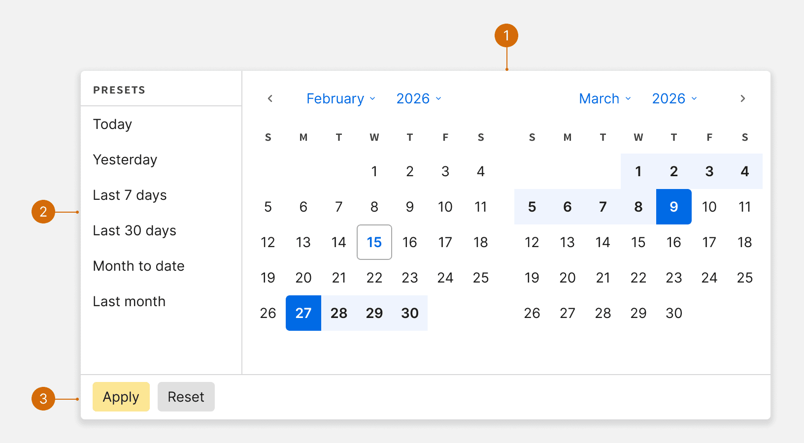
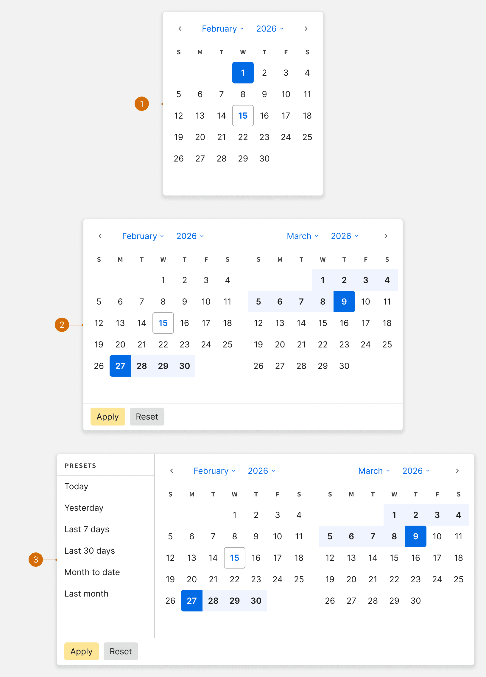
Calendar Slider
Presets
Buttons
Default
Range
With Presets
Default
Hover
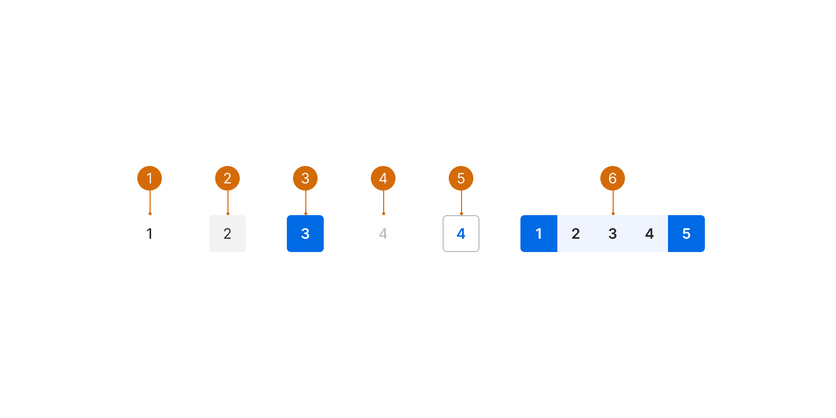
Selected
Disabled
Today
Range
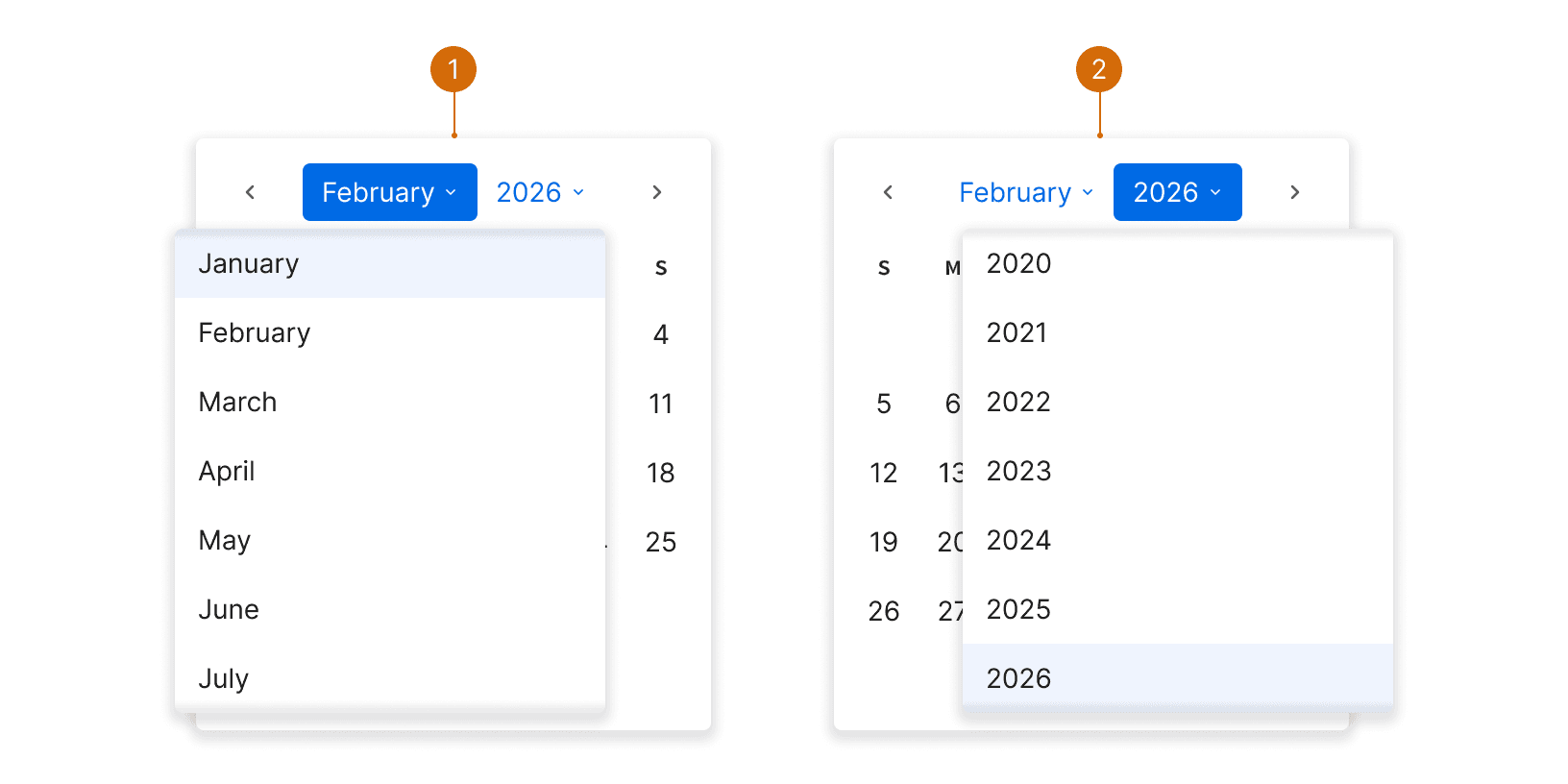
Month and year selectors allow users to navigate or select across large date ranges more easily.
Month Select
Year Select
The calendar uses a --anim-ease-in-out --anim-duration-md animation to help users better understand the direction of movements within the calendar.
Use the Calendar with presets variant to provide a list of common date ranges. This list should be short and should not include unnecessary options that will confuse the user. ¹

Do

Don't
Use the calendar day button disable states to display unavailable days. Do not hide them from within the calendar.¹

Do

Don't
Preset options should be consistently formatted. Use numerals (1, 2, 5) instead of spelling out numbers to save space. Use sentence case.
Do
Last 7 days
Last 3 months
Don't
Last seven days
Last 12 Months
The Ultimate Guide to Design a Perfect Date Picker https://uxdworld.com/2019/03/02/how-to-design-a-perfect-date-picker/
