Anatomy
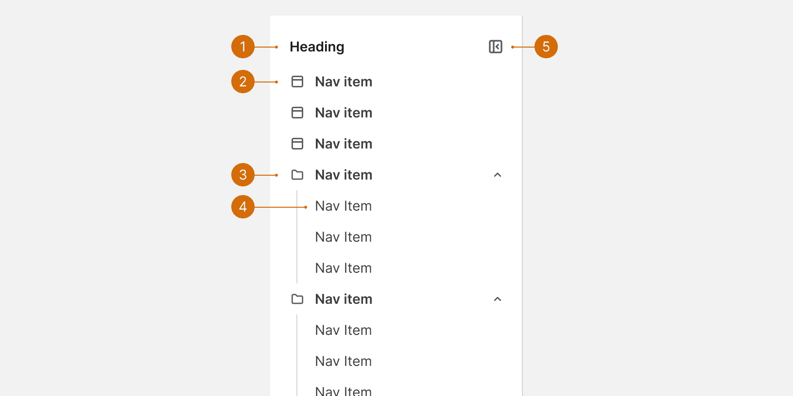
Header
Primary item
Accordion
Secondary item
Expand / collapse control
Variants
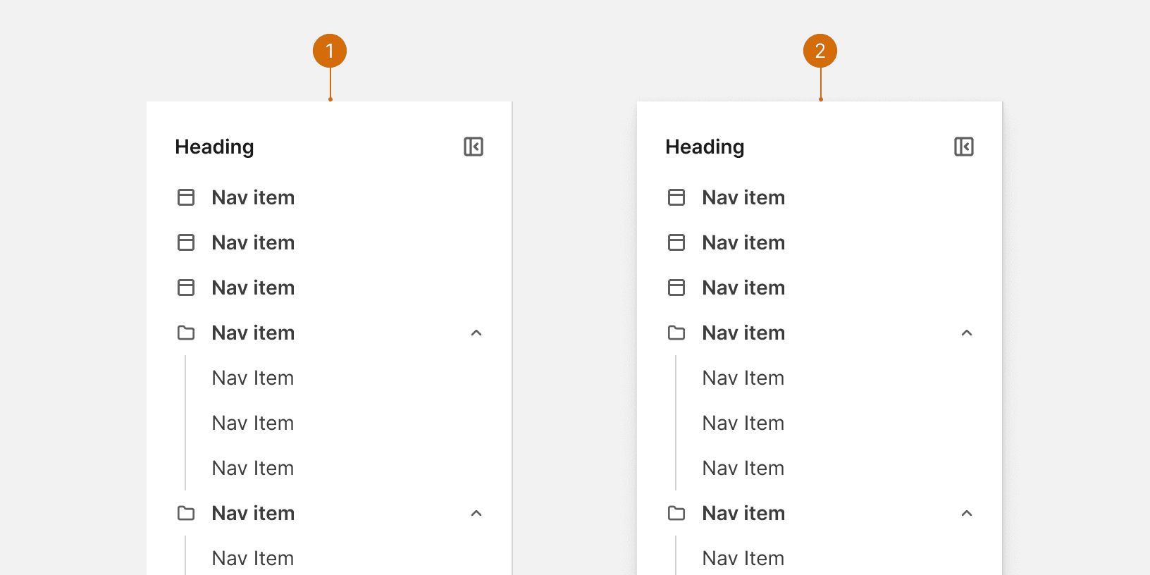
Default
Overlay
States
Behaviors
Responsive
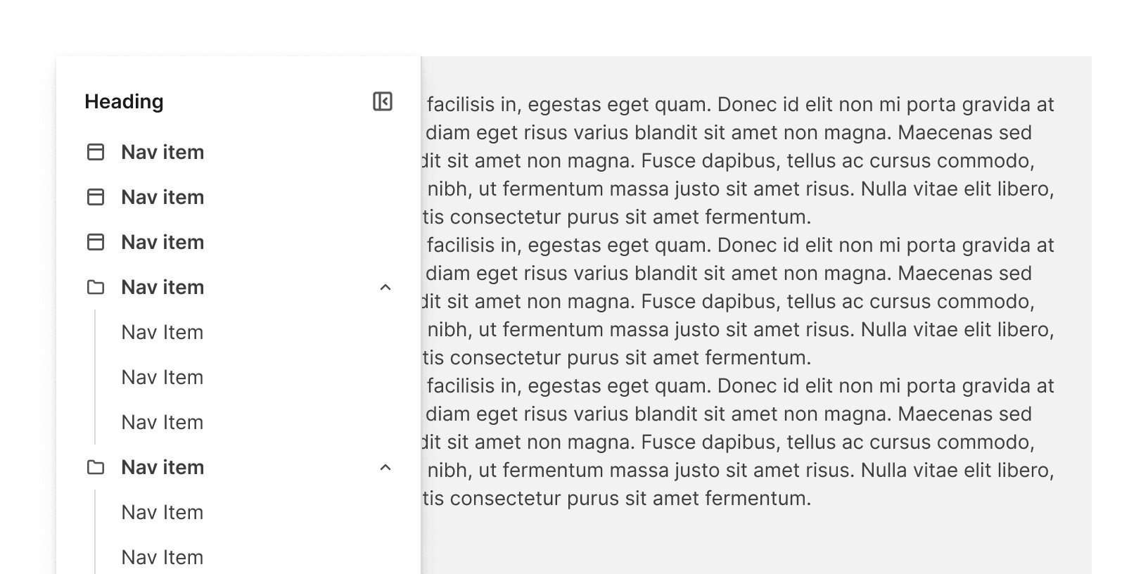
Below the medium breakpoint, the secondary nav will display as an overly, regardless of the selected variant.
Flyout menus
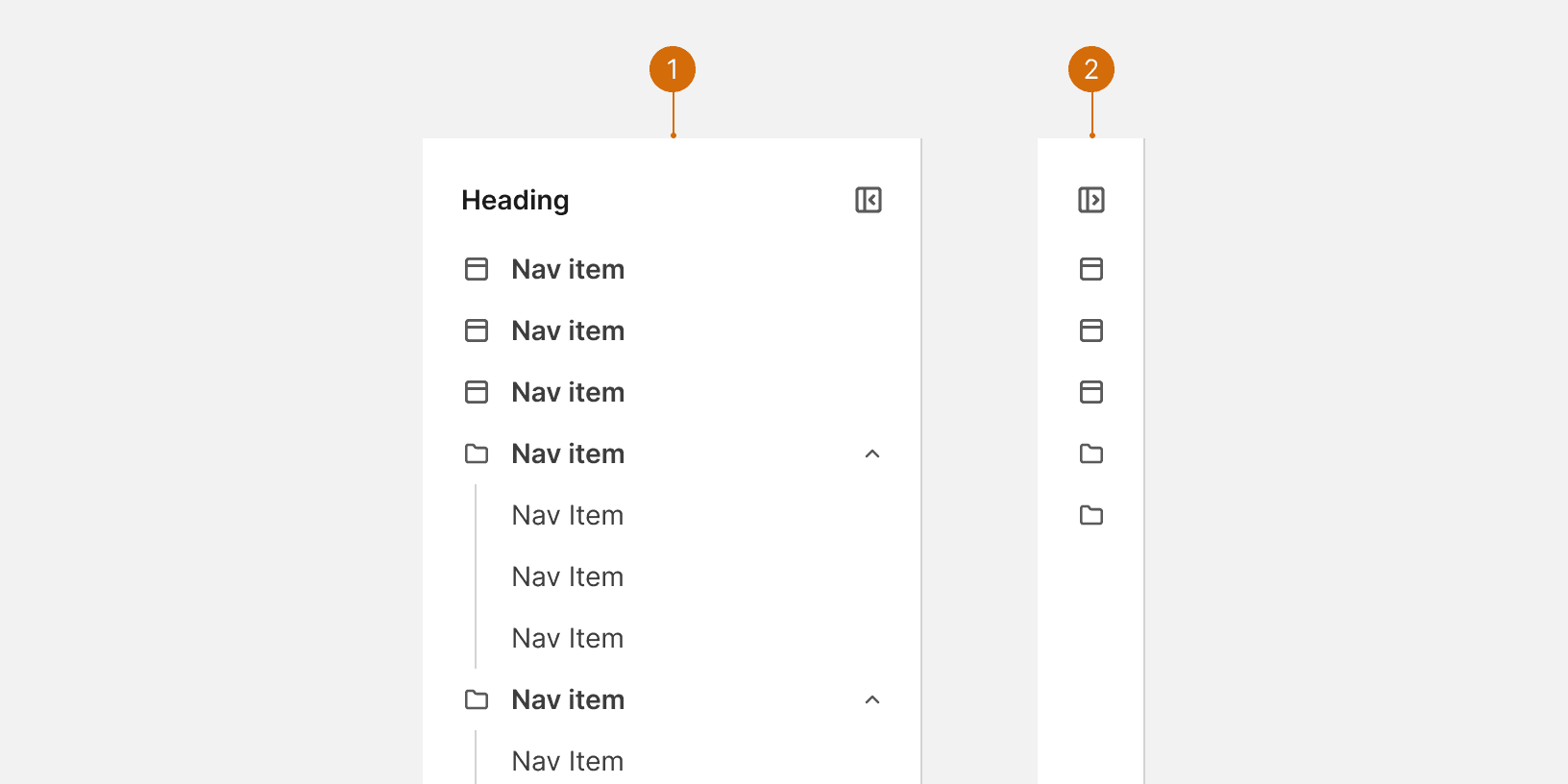
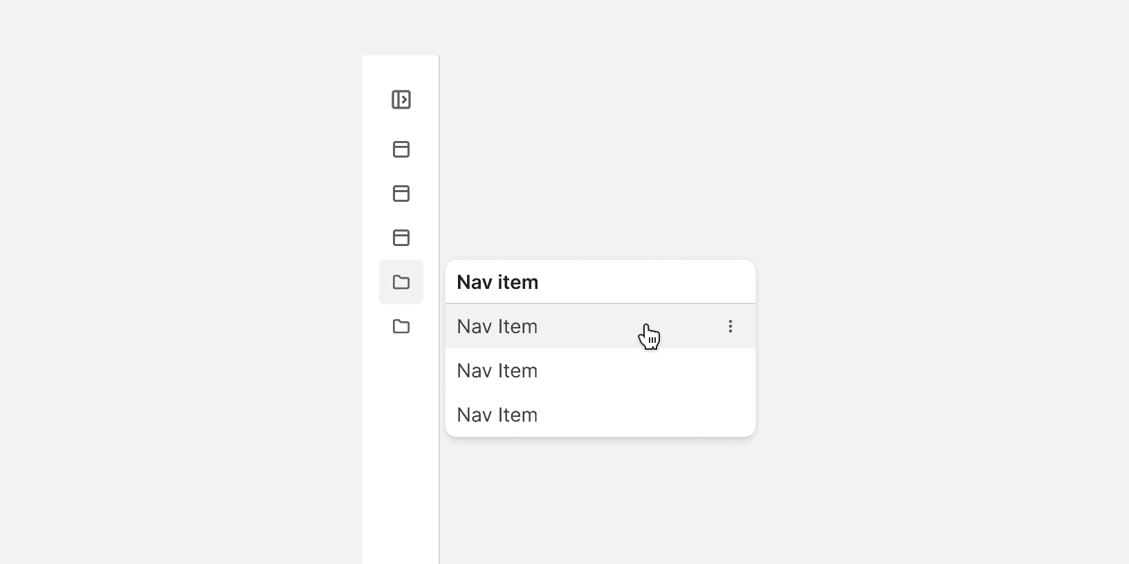
When the secondary nav is collapsed, users can access accordion menus by hovering on the accordion icon.
Item icons
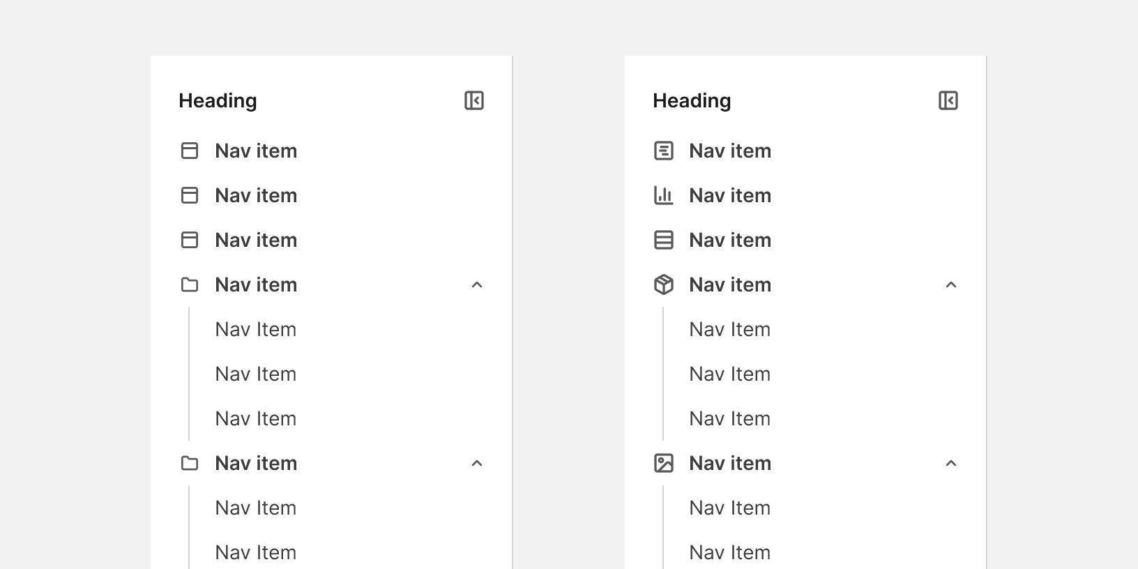
The secondary includes default icons that can be configured based on UI context.
Best Practices
Position
Position the navigation on the left side of the screen: users' visual attention favors the left half of the page, and scanning a vertical list of items is faster than scanning the same items spread across a horizontal bar.¹²

Do

Don't
Visible navigation
Have the secondary nav expanded by default on desktop. Visible navigation is dramatically more discoverable than navigation hidden behind an icon.¹
Grouping
Limit the sidebar to the most relevant items and group related links into a clear hierarchy rather than listing everything at once, to avoid overwhelming users.³

Do

Don't
More
Related Pages


Additional Reading
Left-Side Vertical Navigation on Desktop: Scalable, Responsive, and Easy to Scan https://www.nngroup.com/articles/vertical-nav/
Top Navigation vs Left Navigation: Which Works Better? https://uxmovement.com/navigation/top-navigation-vs-left-navigation-which-works-better/
A Quick Sidebar Tutorial for UI Designers https://www.uxpin.com/studio/blog/sidebar-tutorial/