


Content
Short and simple
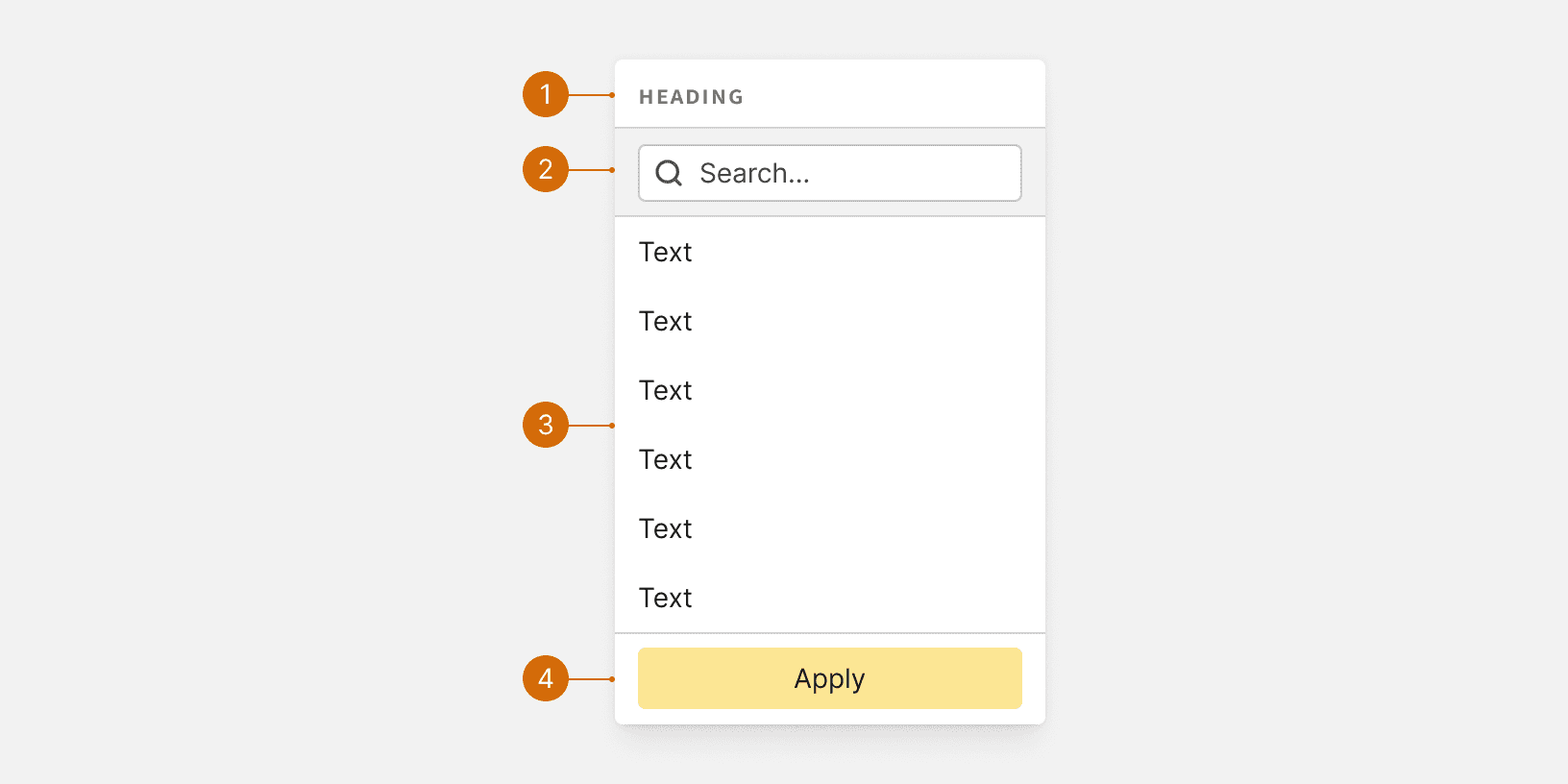
Keep picklist options short and simple. Unless it is an icon button, the button that triggers the picklist should include a label that clearly indicates what they will find in the menu. The button label should be a verb or verb phrase. See Buttons.
Do
Create campaign
Upload creative
Don't
Campaigns
Upload a new creative
Options
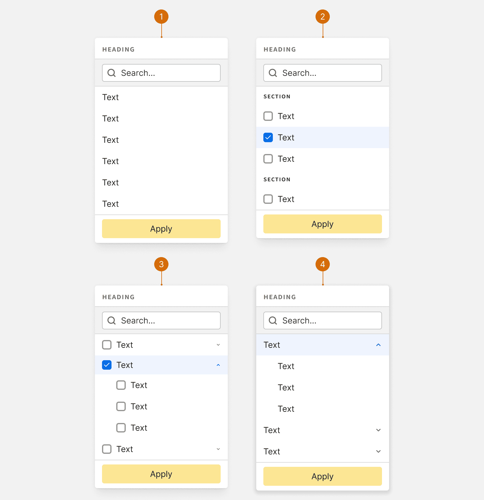
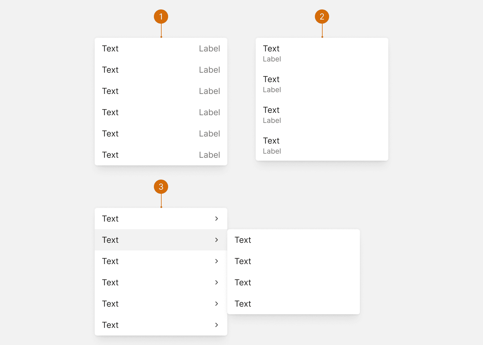
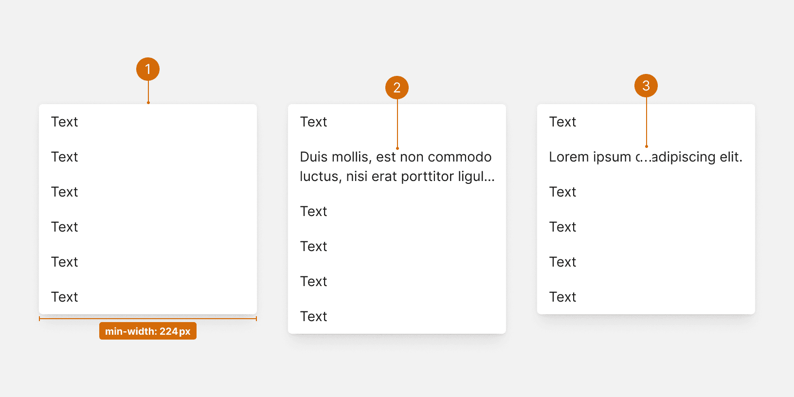
Picklist menu items should be short and written using parallel construction--every item should be a noun or a verb. Avoid repeating words if possible. The number of choices should be limited to 5-8 options. Additional options may be placed in a nested menu. Nested menus should be uses sparingly.
Use sentence case--only capitalize the first word.

Do

Don't

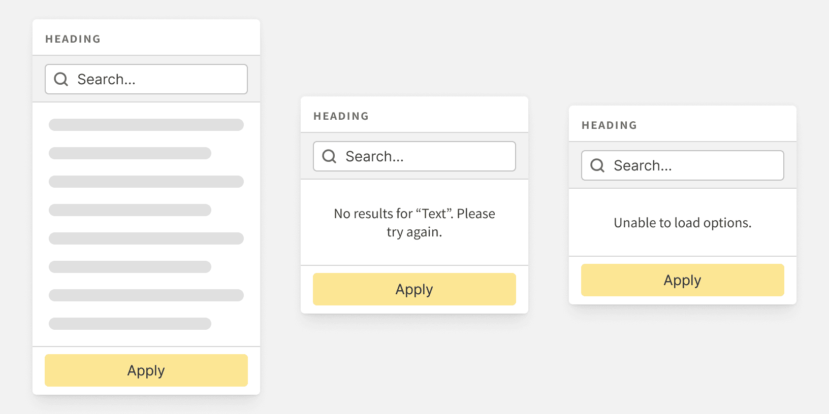
Warning
Order
Options should be ordered in a logical manner, such as by frequency-of-use, or alphabetically as a fallback. Group similar options together to make them easier to scan.

Do

Don't


