Content
1
Actionable
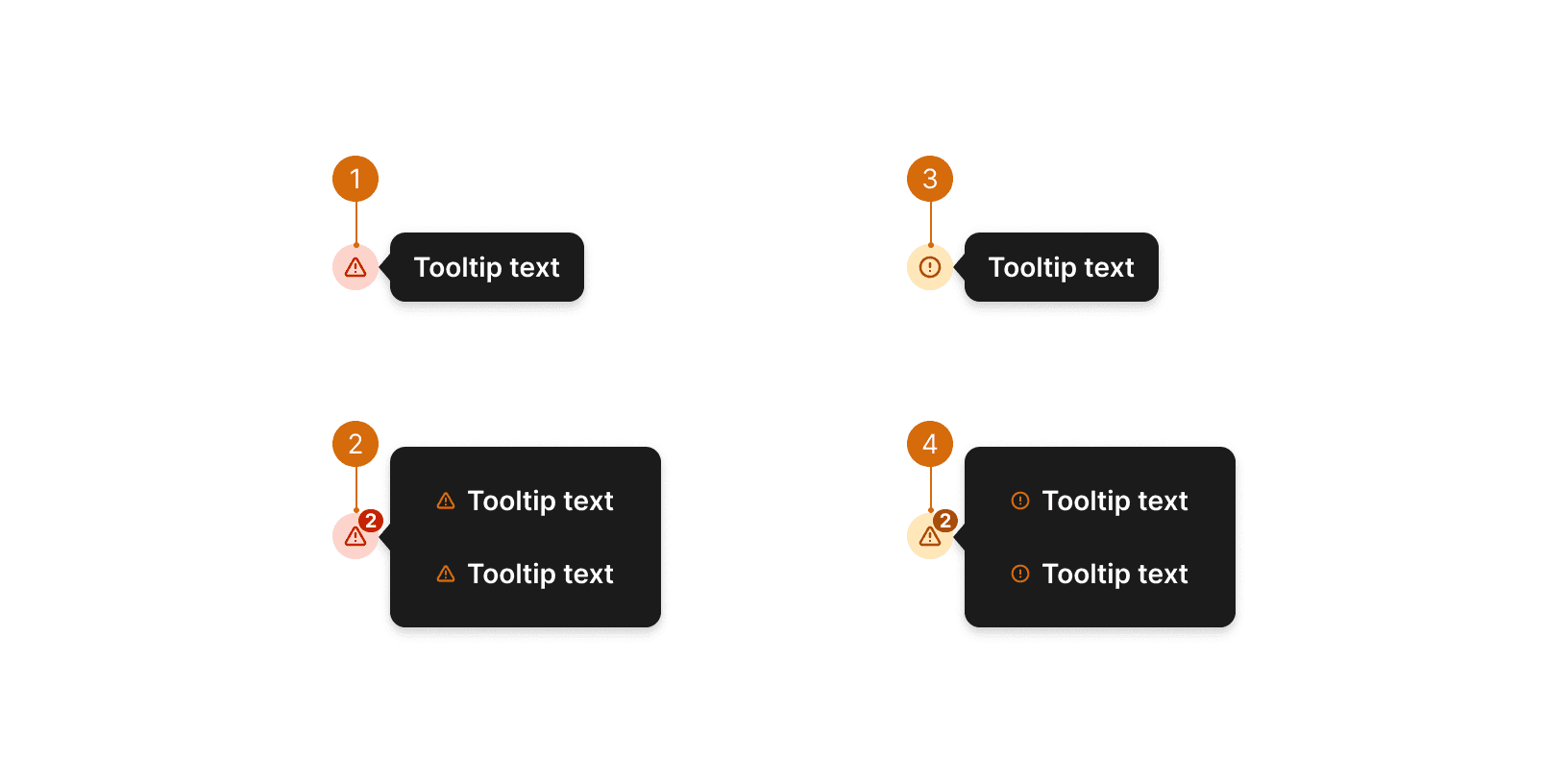
Issue indicators should include actionable or informative information that helps users understand and resolve the issue. Do not include excessive details. Keep tooltip text short and to the point.¹

Do

Don't
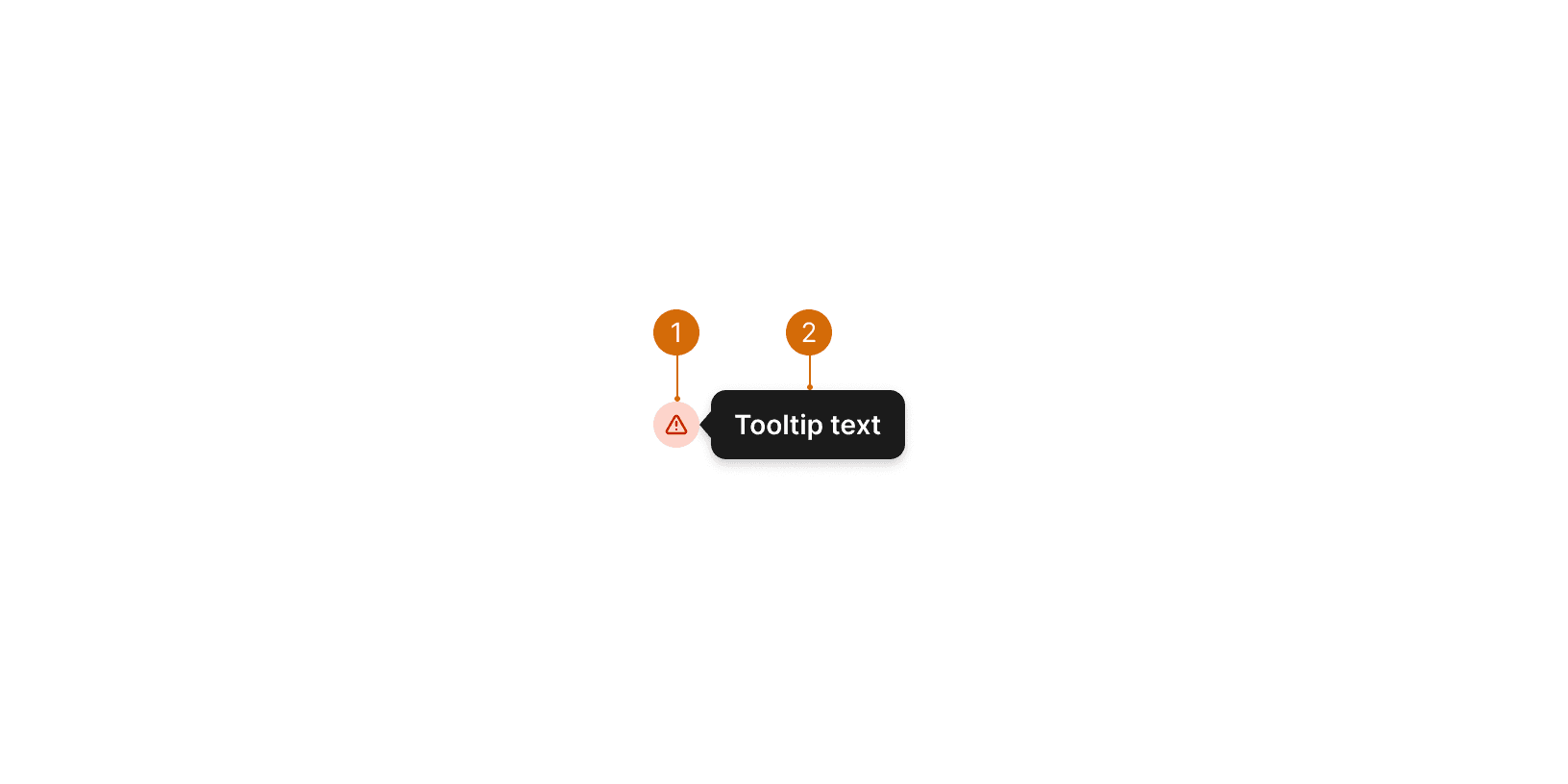
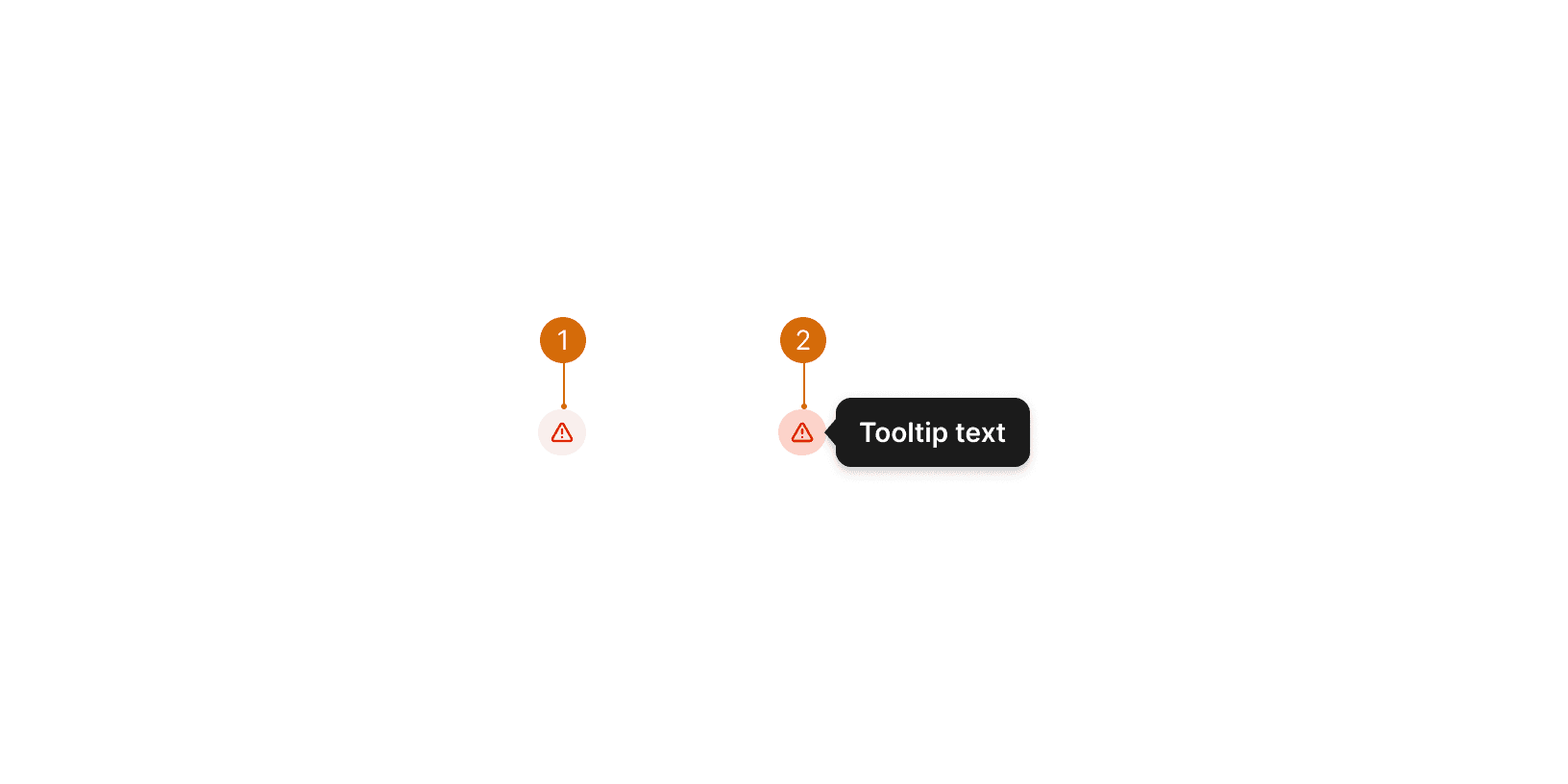
Icon
Tooltip
Error
Multiple erros
Warning
Multiple warnings
Default
Hover
Use the Issue Indicator to highlight issues or errors associated with a specific element or context. Avoid using this component for system errors or non-critical informational. ¹

Do

Don't
Avoid overloading the interface with too many Issue Indicators. Prioritize and group related issues when possible.

Do

Don't
Issue indicators should include actionable or informative information that helps users understand and resolve the issue. Do not include excessive details. Keep tooltip text short and to the point.¹
Do
Don't
Tooltip Guidelines https://www.nngroup.com/articles/tooltip-guidelines/


