Ready

Contextual Menu

Contextual menus display a small set of actions, triggered by a compact button located directly on a piece of content. They contain actions that may otherwise require repeating in a list, table, or other area where space is limited.

Ready

Contextual Menu

Contextual menus display a small set of actions, triggered by a compact button located directly on a piece of content. They contain actions that may otherwise require repeating in a list, table, or other area where space is limited.

Ready

Contextual Menu

Contextual menus display a small set of actions, triggered by a compact button located directly on a piece of content. They contain actions that may otherwise require repeating in a list, table, or other area where space is limited.

Anatomy

Anatomy

Anatomy

  1. Contextual Menu

  2. Picklist

States

States

States

  1. Default

  2. Hover

  3. Active

  4. Disabled

Best Practices

Best Practices

Best Practices

1. Placement

Contextual menus should appear on the left side of the content they relate to. Consistent placement makes them easier to discover.¹

2. Visibility

Contextual menus must be visible without the need to hover on content.

3. Limit Options

Limit the number of options in contextual menus to around 10. Don’t overwhelm users with a large number of choices. All options should be visible without having to scroll.²

4. Option Order

Options within contextual menus should be ordered by frequency-of-use. To help users find the most relevant options, place the ones used most often at the top.²

5. Nested Menus

Avoid using nested menus within contextual menus. Nested menus triggered from contextual menus can be clumsy to operate. Consider grouping several options between dividers as an alternative. If a submenu is needed, none of its options should contain another submenu.²

Content

Beta

Content

Beta

Content

Beta

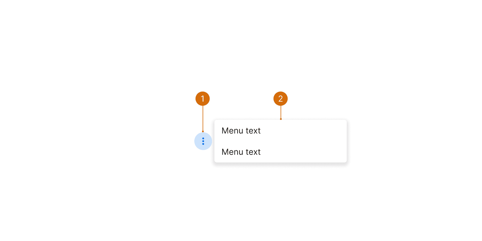
Menu item labels should be as short as possible. Each menu item should fit on a single line. If it spans two lines, it can confuse users because it will be harder to distinguish each menu item.

The label should be a verb that indicates what will happen when the menu item is selected. If the menu item is an option or setting, use a noun or short phrase. Use sentence case and do not include a period.

  • Add group

  • Duplicate

  • Copy

  • Paste groups

  • Cancel

  • Delete

  • Add group

  • Duplicate

  • Copy this group to the
    clipboard

  • Paste group info
    from clipboard

  • Cancel this line item
    until further notice

  • Delete this line item forever

Options within contextual menus should be ordered in a logical manner, such as by frequency-of-use or by placing the most destructive action last. Group similar options together to make them easier to scan. To help users find the most relevant options, place the ones used most often at the top.²

Use alphabetical order as a fallback, but remember that the order may change if the text is translated.

More

More

More

Related Components

Additional Reading

  1. World Leaders in Research-Based User Experience. “Menu Design: 15 UX Guidelines to Help Users.” Nielson Norman Group, https://www.nngroup.com/articles/menu-design/.

  2. World Leaders in Research-Based User Experience. “Contextual Menus: Delivering Relevant Tools for Tasks.” Nielson Norman Group, https://www.nngroup.com/articles/contextual-menus/.

  3. World Leaders in Research-Based User Experience. “Hamburger Menus and Hidden Navigation Hurt UX Metrics.” Nielson Norman Group, https://www.nngroup.com/articles/hamburger-menus/.

Need more guidance?

Suggest an addition or an edit.

Need more guidance?

Suggest an addition or an edit.

Need more guidance?

Suggest an addition or an edit.

© 2025 Basis Technologies