Content
1
Length
Keep badge text short, one or two words maximum. A shorter badge is faster to read and reduces visual clutter.

Do

Don't
Default
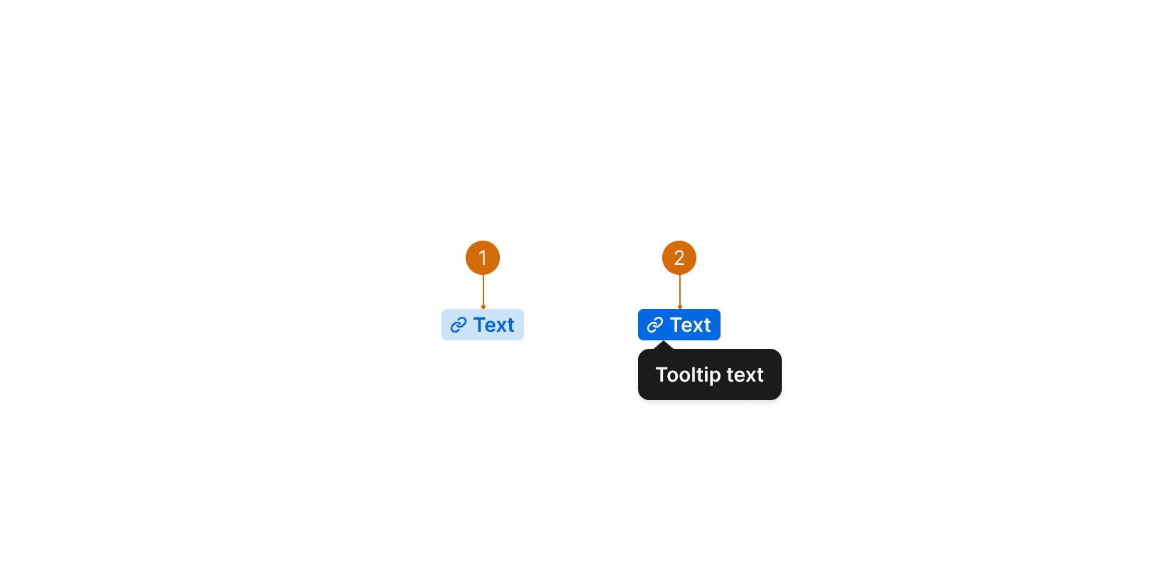
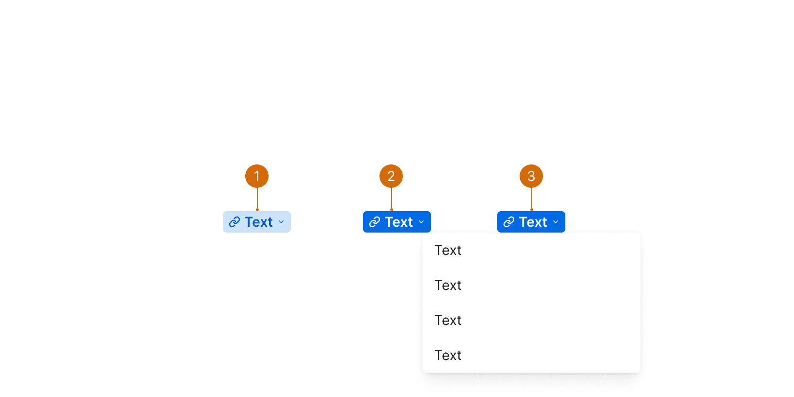
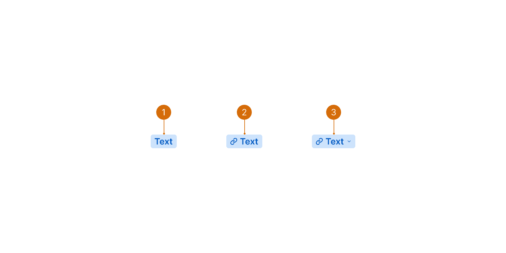
Interactive
Interactive Dropdown
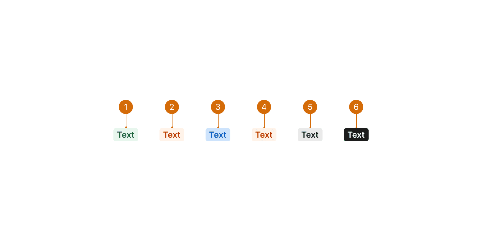
When using badges to display status use established colors:
Green for positive (e.g. confirmed, created, completed, approved, online)
Orange for notice (e.g. on hold, paused, planning)
Blue for informative (e.g. to do, active, updated)
Red for negative (e.g. failed, denied)
Grey for neutral (e.g. archived, removed, deleted, offline)
Grey badges can be used to display properties, meta data, and other information that may be helpful to elevate above regular text.
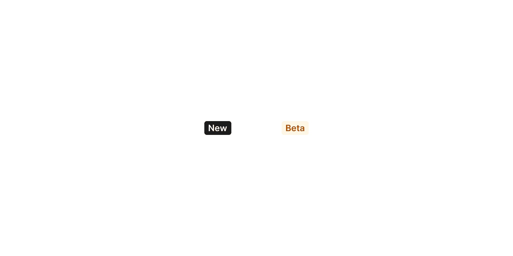
The black badge is exclusively used to indicate new features.
The orange badge is used to indicate beta features.
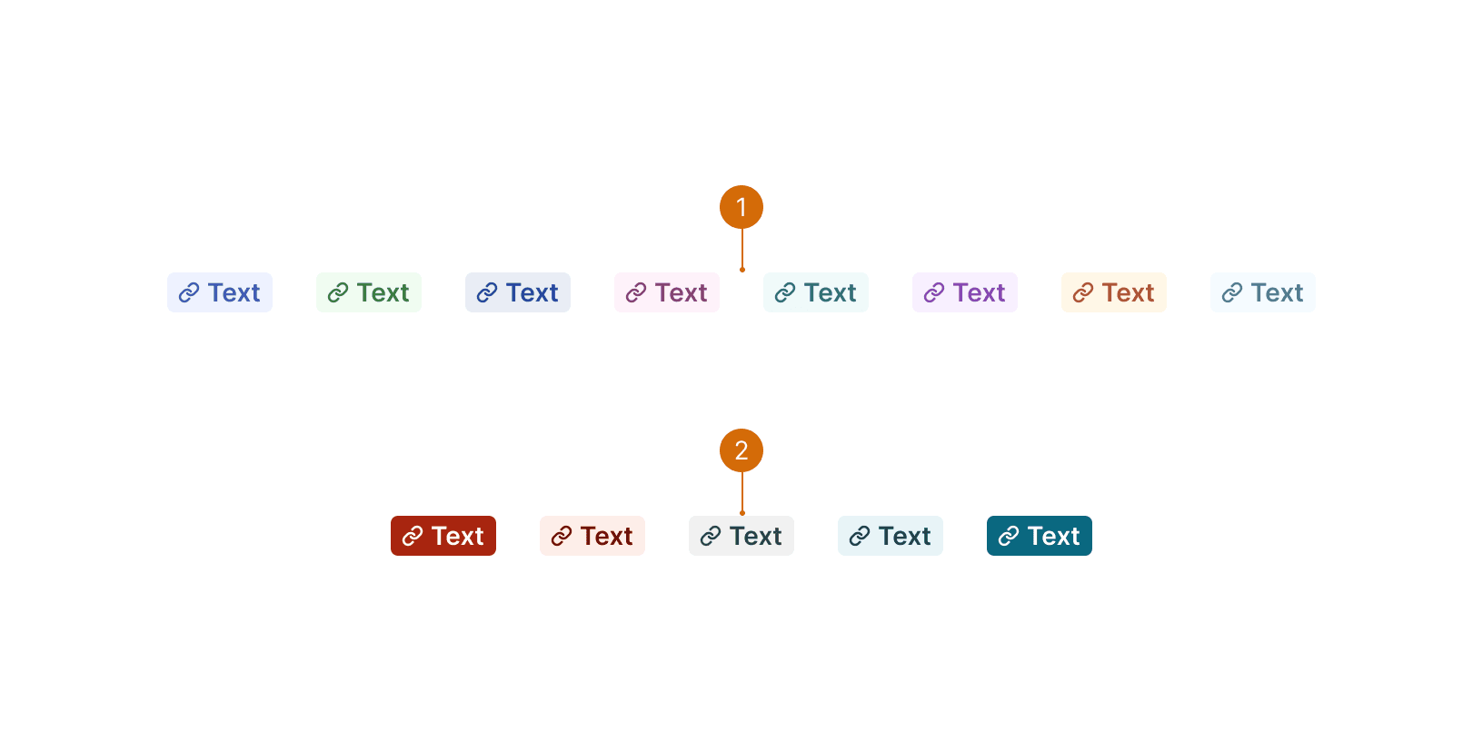
Categorical: Consider if similar categories are implemented elsewhere in the UI and if there’s an opportunity to be consistent.
Diverging: Use to represent is a baseline status between the two extremes
If everything is important, nothing is. Consider what information is most helpful to draw attention to with badges and what is more suited for regular text.
Aim to use colored badges for a single set of information on a page. If more badges are needed, use grey badges to preserve the importance of colored badges and prevent overloading the page with a distracting amount of color.

Do

Don't
Badges should not be used as headers. Use the appropriate sized typography class to establish hierarchy instead.

Do

Don't
Badges are not for communicating immediate feedback or lengthy messages. Use an inline error, message card, or flash instead.

Do

Don't
Badges should be vertically centered with associated elements. Maintain —-core-2 (8px) of space between badges and associated elements.

Do

Don't
Use interactive badge to add additional context and allow the user to change the status, category or property value.

Do

Don't
Keep badge text short, one or two words maximum. A shorter badge is faster to read and reduces visual clutter.
Do
Don't
Badge (or Tag) UI design inspiration https://kamushken.medium.com/badge-or-tag-ui-design-inspiration-de1718059468


