
Checkbox
Checkbox Group
Unchecked

Default
Hover
Disabled
Error
Focus Visible
Checked

Default
Hover
Disabled
Focus Visible
Indeterminate

Default
Hover
Disabled
Focus Visible
1. States
Checkboxes are either unselected or selected. The checkbox can have an additional, "indeterminate" state if they they use a hierarchical structure. Clicking on a checkbox in an indeterminate state sets the state of that checkbox, and all other controls affected by it, to the "selected" state.

2. Checkboxes vs Dropdowns
Use Checkboxes over Multi-select Dropdowns where space permits. This allows all options to be visible to the user, who can easily compare them.¹

3. Click area
Users should be able to select an option by clicking on the Checkbox or the label associated with it. A larger target area helps prevent user error and allows them to quickly execute their tasks.¹

4. Disabled States
Use default disabled styling on Checkboxes and don’t change the opacity to indicate a disabled state.²

Checkbox labels should be short and direct. The text should clearly communicate what happens if the checkbox is selected. Avoid full sentences unless absolutely necessary.
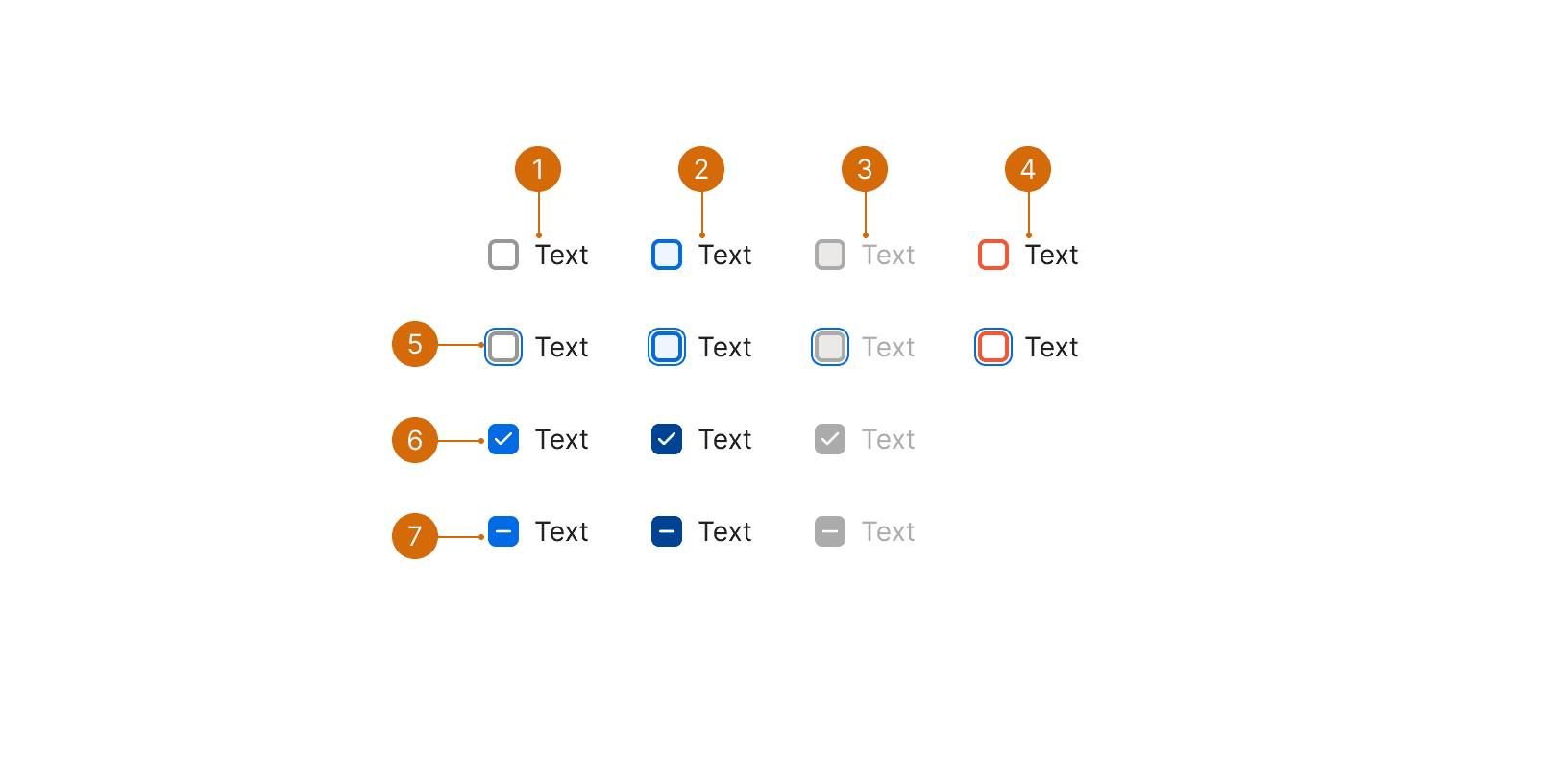
Use positive and active language for checkbox labels. Avoid negative language, which would mean that the user has to check the box in order for something not to happen. This can be confusing. Opt-in scenarios should also be unchecked by default.¹
Use sentence case--capitalize the first word. Do not include periods unless each checkbox label is a complete sentence.
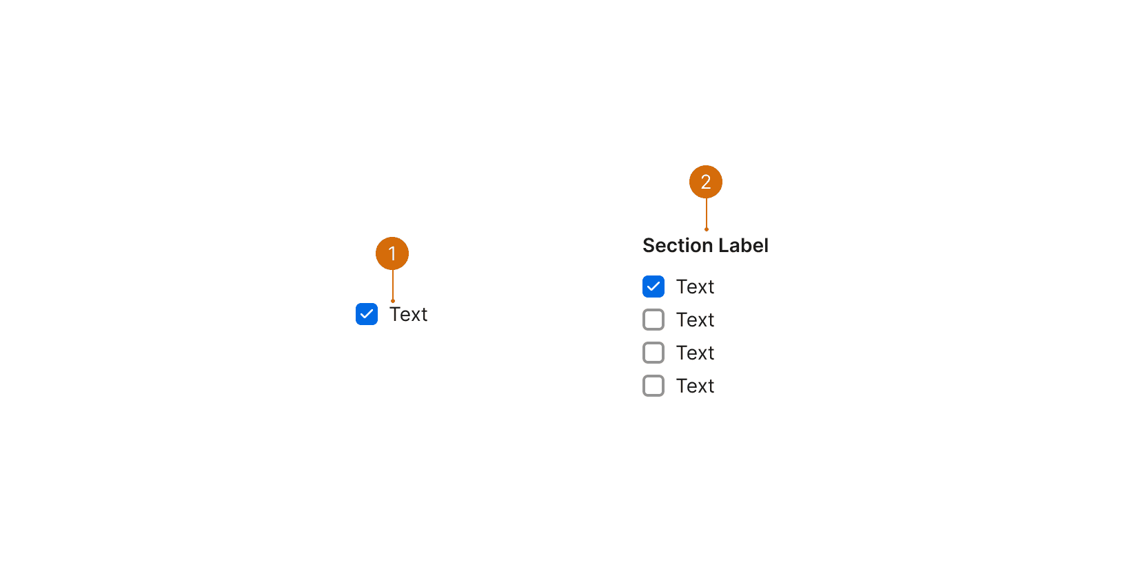
![]() | ![]() |
---|---|
Send me email notifications | Don't send me email updates |
You can optionally include a label as a header to describe a group of checkboxes. Labels should be used if the selection is required, and they should indicate the requirement with an asterisk.
For a group of checkboxes, use parallel construction when writing the labels. For example, each item should be a noun or a short phrase that starts with a verb. A consistent structure makes it easier for users to scan and read the list. Minimize the number of repeated words and try not to start every item with the same word.
![]() | ![]() |
---|---|
Email Notifications
| Email Notifications
|
You may use first person (I, me, my) to clarify how the action relates to the user. For example, "I have read to and agree to the terms and conditions."
Related Components
Related Patterns
Additional Reading
World Leaders in Research-Based User Experience. “Checkboxes vs. Radio Buttons.” Nielsen Norman Group, www.nngroup.com/articles/checkboxes-vs-radio-buttons/.
“Web Content Accessibility Guidelines (WCAG) 2.0.” W3C, www.w3.org/TR/WCAG20/.
“Checkbox.” Shopify Polaris, polaris.shopify.com/components/forms/checkbox
World Leaders in Research-Based User Experience. “Toggle-Switch Guidelines.” Nielsen Norman Group, www.nngroup.com/articles/toggle-switch-guidelines/.