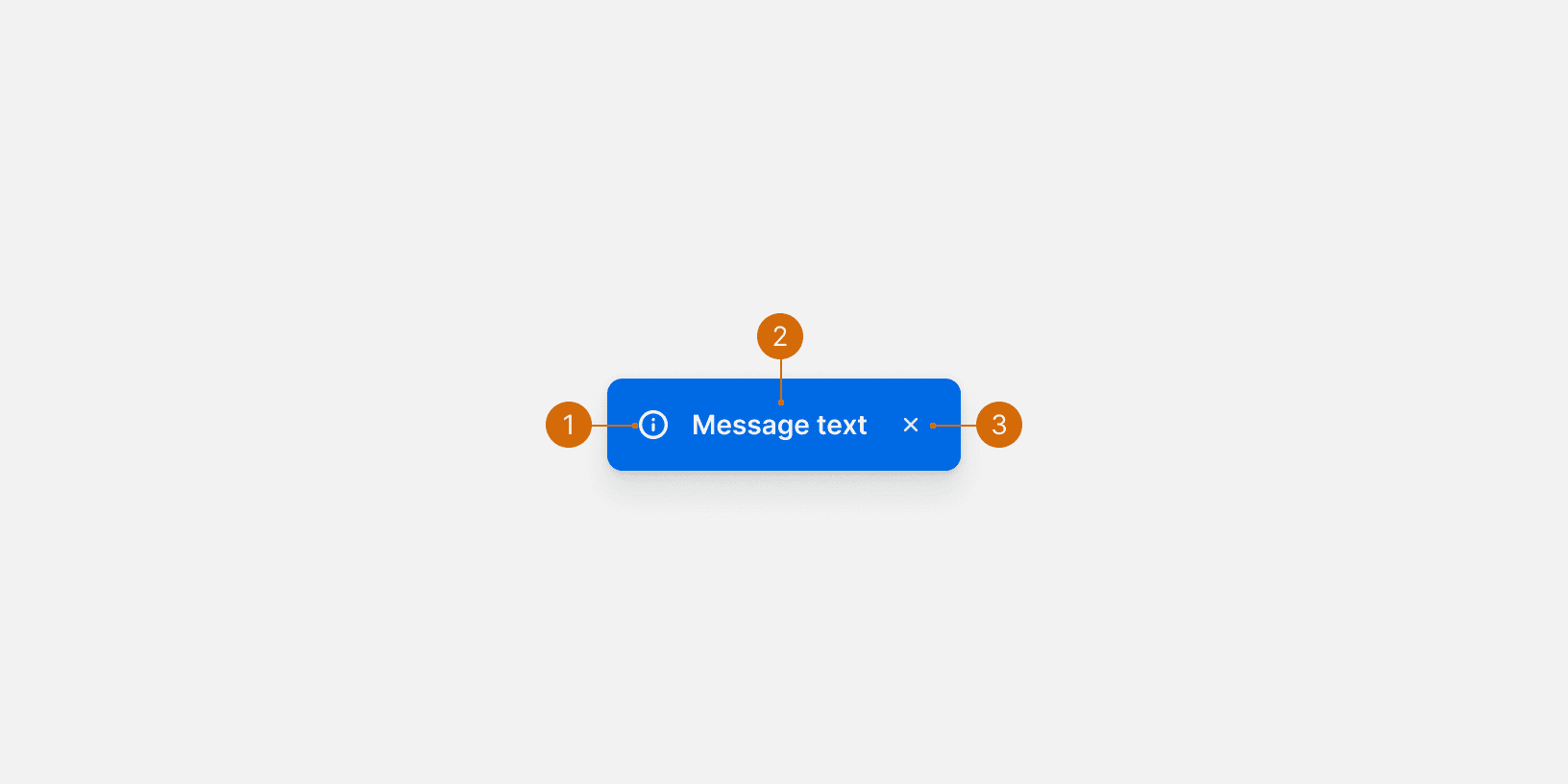
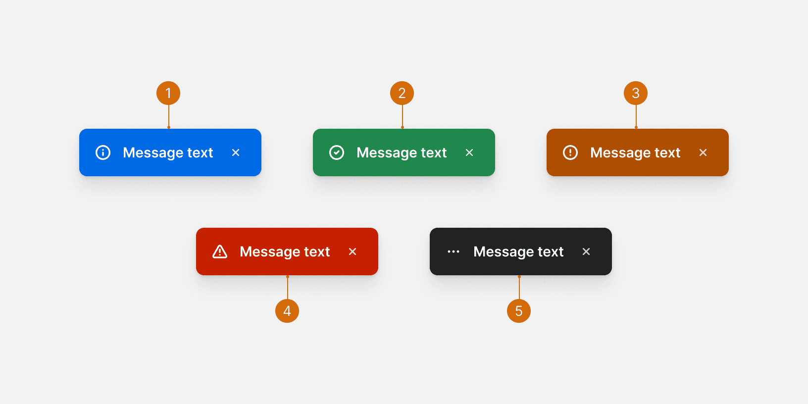
Ready

Flash

Flash messages are used to provide quick, at-a-glance feedback on the outcome of an action. They are always positioned in a consistent place across the app and on top of the page content. Flash messages can be non-dismissive (fading automatically) or dismissive (requiring user interaction).

Anatomy

Anatomy

Anatomy

  1. Icon

  2. Text

  3. Dismiss Control

Variants

Variants

Variants

  1. Informational: Provides additional or contextual information to the user.

  2. Confirm: Indicates the successful completion of an action the user has taken.

  3. Warning: Informs the user that an error has occurred during the course of a workflow; should be used as a warning.

  4. Alert: Indicates a system-level error has occurred.

  5. Action: Indicates an action is processing.

Best Practices

Best Practices

Best Practices

1. Placement

Flash messages should be placed in a consistent location across all pages. Our Flash messages are always positioned on top of the App Header and on the highest Z-index setting of 9999.¹

2. Non-Dismissive

Non-dismissive Flash messages should stay on the screen for 8-10 seconds, then automatically fade out. Flash messages that are less than that amount of time, are hard for the user to read.²

3. Succinct and Informative

Keep Flash content succinct and informative – using a positive, clear, active voice. For more guidance on copywriting, please consult our Voice and Tone documentation.

More

More

More

Related Components

Additional Reading

  1. “Toast Notifications.” PatternFly, www.patternfly.org/v3/pattern-library/communication/toast-notifications/index.html.

  1. Munot, Sneha. “Toast Notification or Dialog Box?” Medium, UX Planet, 13 Dec. 2018, uxplanet.org/toast-notification-or-dialog-box-ae32ad53106d.

  2. “Readability: the Optimal Line Length.” Readability: the Optimal Line Length - Articles - Baymard Institute, baymard.com/blog/line-length-readability.

  3. “Web Content Accessibility Guidelines (WCAG) 2.0.” W3C, www.w3.org/TR/WCAG20/.

  4. “Toast.” Shopify Polaris, polaris.shopify.com/components/feedback-indicators/toast.

Need more guidance?

Suggest an addition or an edit.

Need more guidance?

Suggest an addition or an edit.

Need more guidance?

Suggest an addition or an edit.

© 2025 Basis Technologies