Content
1
Link text
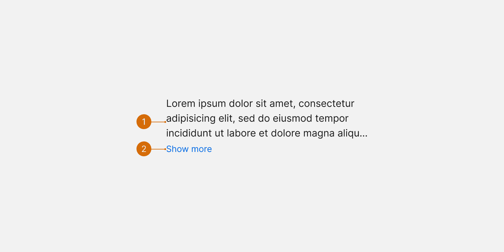
The text that expands the component should be “Show more”. The text to collapse it should be "Show less”.
Body
Link
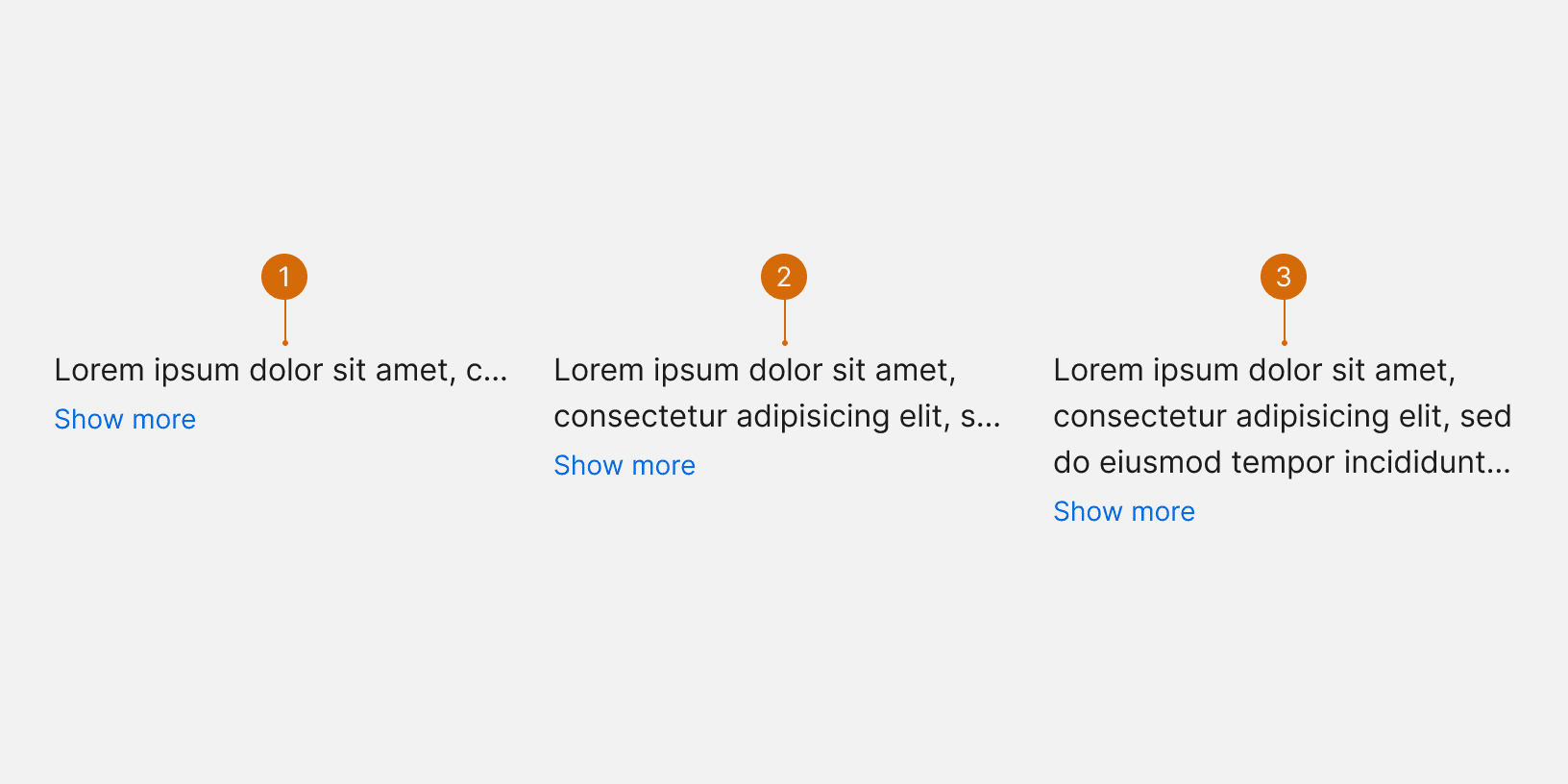
One line
Two lines
Three lines
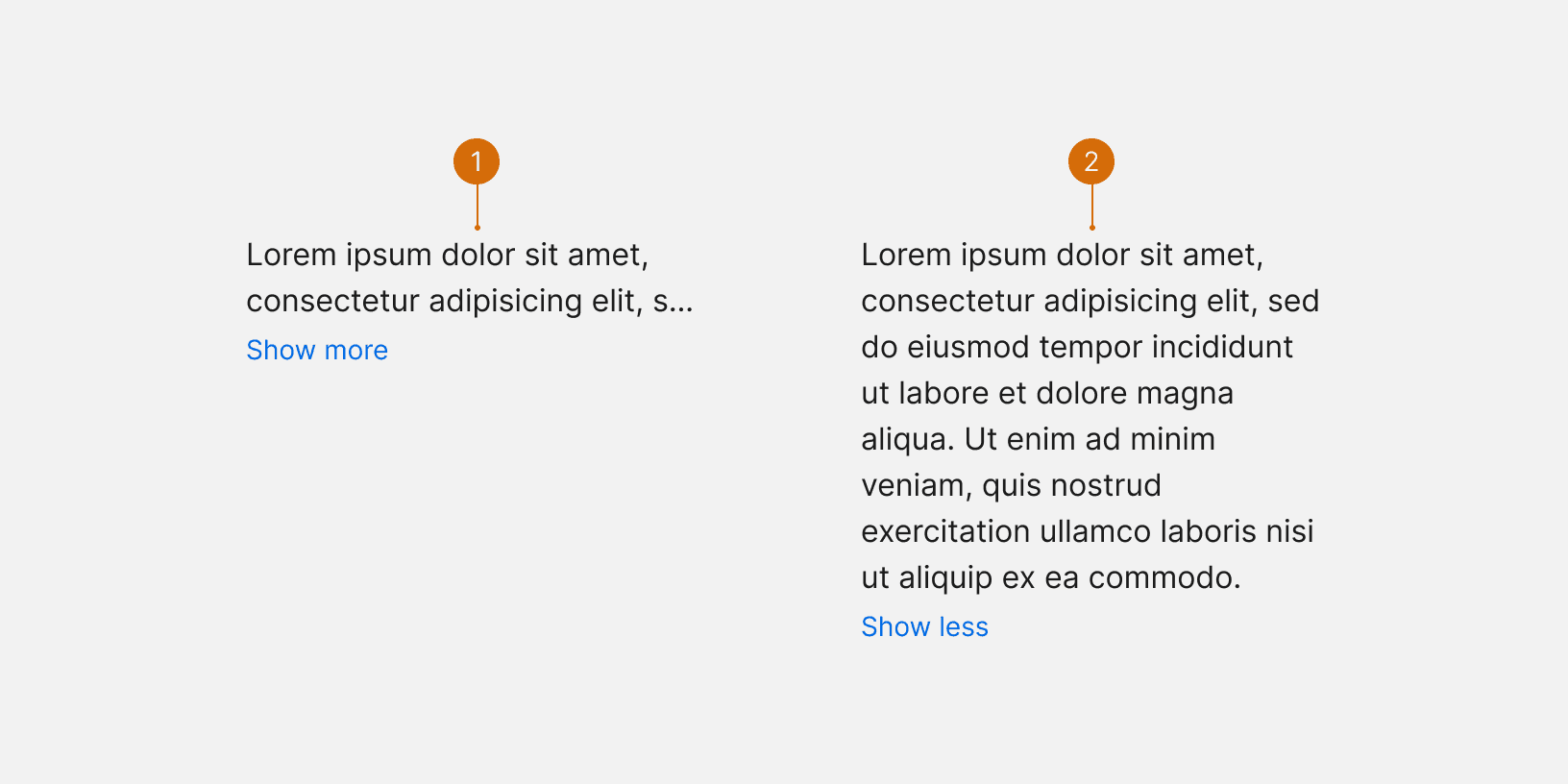
Collapsed
Expanded
Use this component to save vertical space when designing a content heavy page. Do not use this component when there is sufficient space to display the entire content block. ¹
Only use this component to truncate secondary information such as descriptions or additional contextual information. Do not use this component to truncate primary information that is critical to decision making. ¹

Do

Don't
The text that expands the component should be “Show more”. The text to collapse it should be "Show less”.
Wrapping and Truncating Text https://experience.sap.com/fiori-design-web/wrapping-and-truncating-text/
