


Content
1
Short and clear
Radio labels should be short and clear. Make sure they are descriptive enough so that people understand their selection. Don't use full sentences and don't include any punctuation
2
Default selection
The default selection should be appear first in the list. Options should be ordered in a logical manner, such as by frequency-of-use, or alphabetically as a fallback. Group similar options together to make them easier to scan.
3
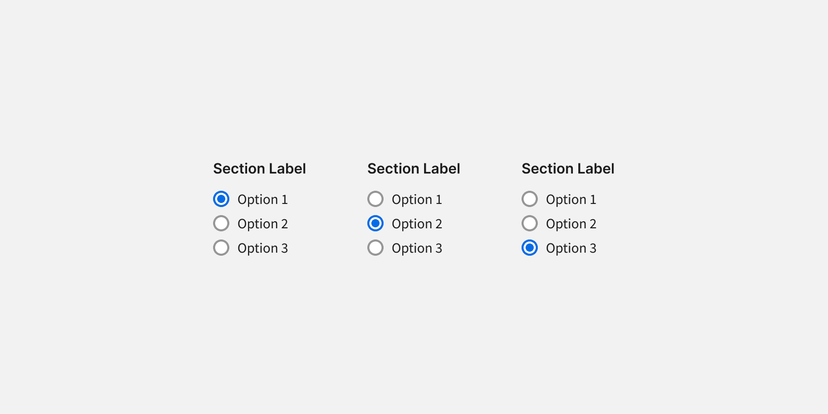
Labels
The section label should clearly describe what the group of options are. Do not include a colon or any punctuation in the label.

Do

Don't

