Content
1
Short and concise
Keep the information short and concise. See Tooltips for writing guidelines.
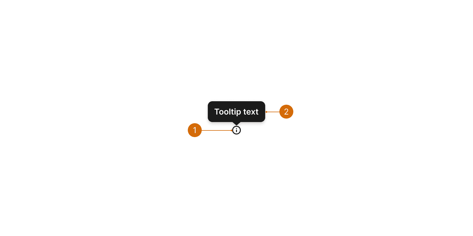
Icon
Tooltip
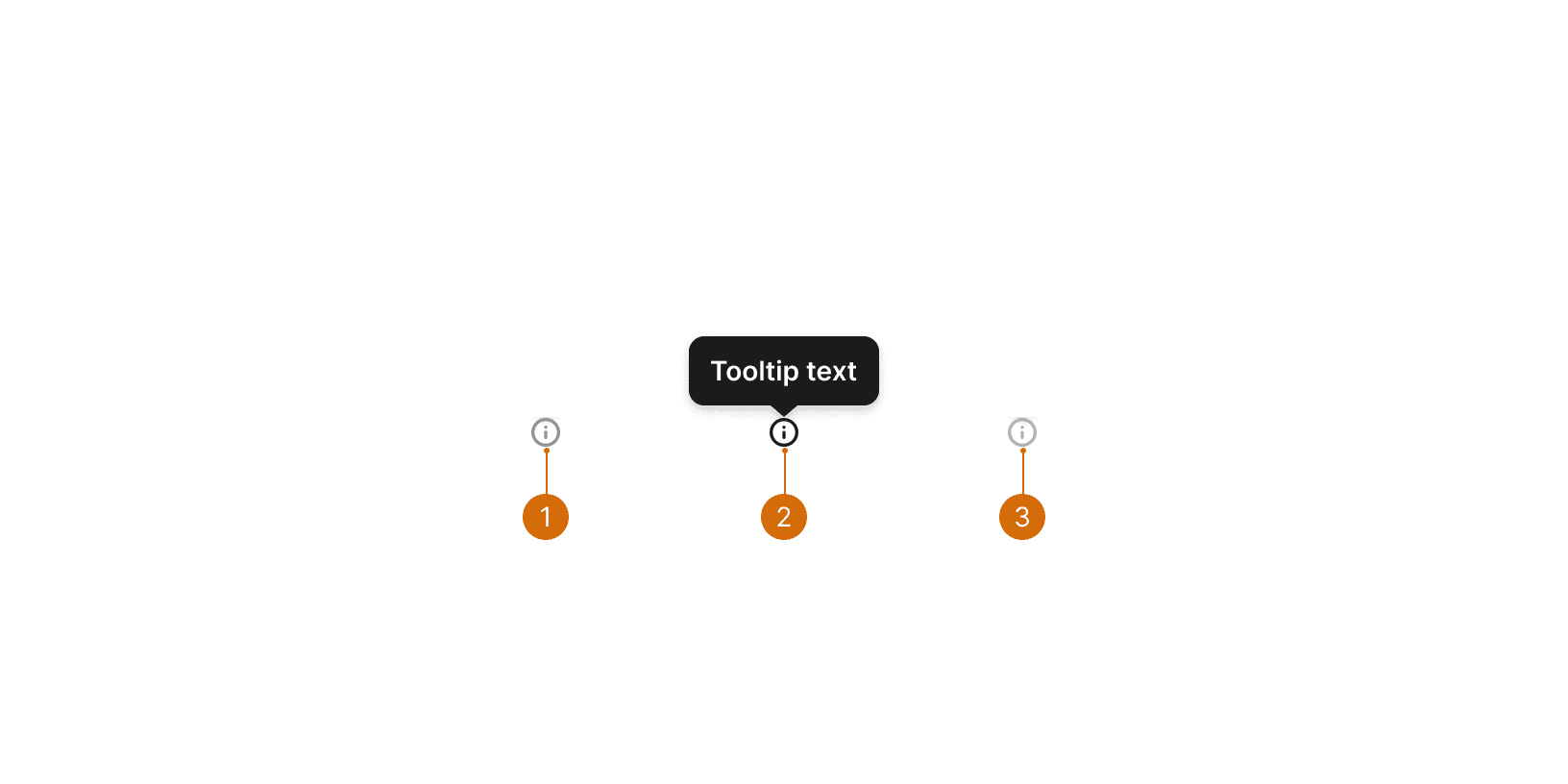
Default
Hover
Disabled
Don't use infotips to call out information that is vital to task completion. Infotips are best used when they provide additional, but non-critical information about a function or element on the screen. Since infotips display a tooltip, the same guidelines for using tooltips apply.
Don't use an infotip to provide redundant information. Infotips should only provide auxiliary information. Infotips can be used in conjunction with a dotted link tooltip if additional, supportive information is needed.
Position infotips to the right of the element they are supporting.

Do

Don't
Keep the information short and concise. See Tooltips for writing guidelines.
World Leaders in Research-Based User Experience. “Indicators, Validations, and Notifications: Pick the Correct Communication Option.” Nielsen Norman Group, https://www.nngroup.com/articles/indicators-validations-notifications/.
“Web Content Accessibility Guidelines (WCAG) 2.0.” W3C, www.w3.org/TR/WCAG20/.
“Tooltip Widgets (or: Screen Tip, Balloon).” Accessibility Developer Guide, www.accessibility-developer-guide.com/examples/widgets/tooltips/.
