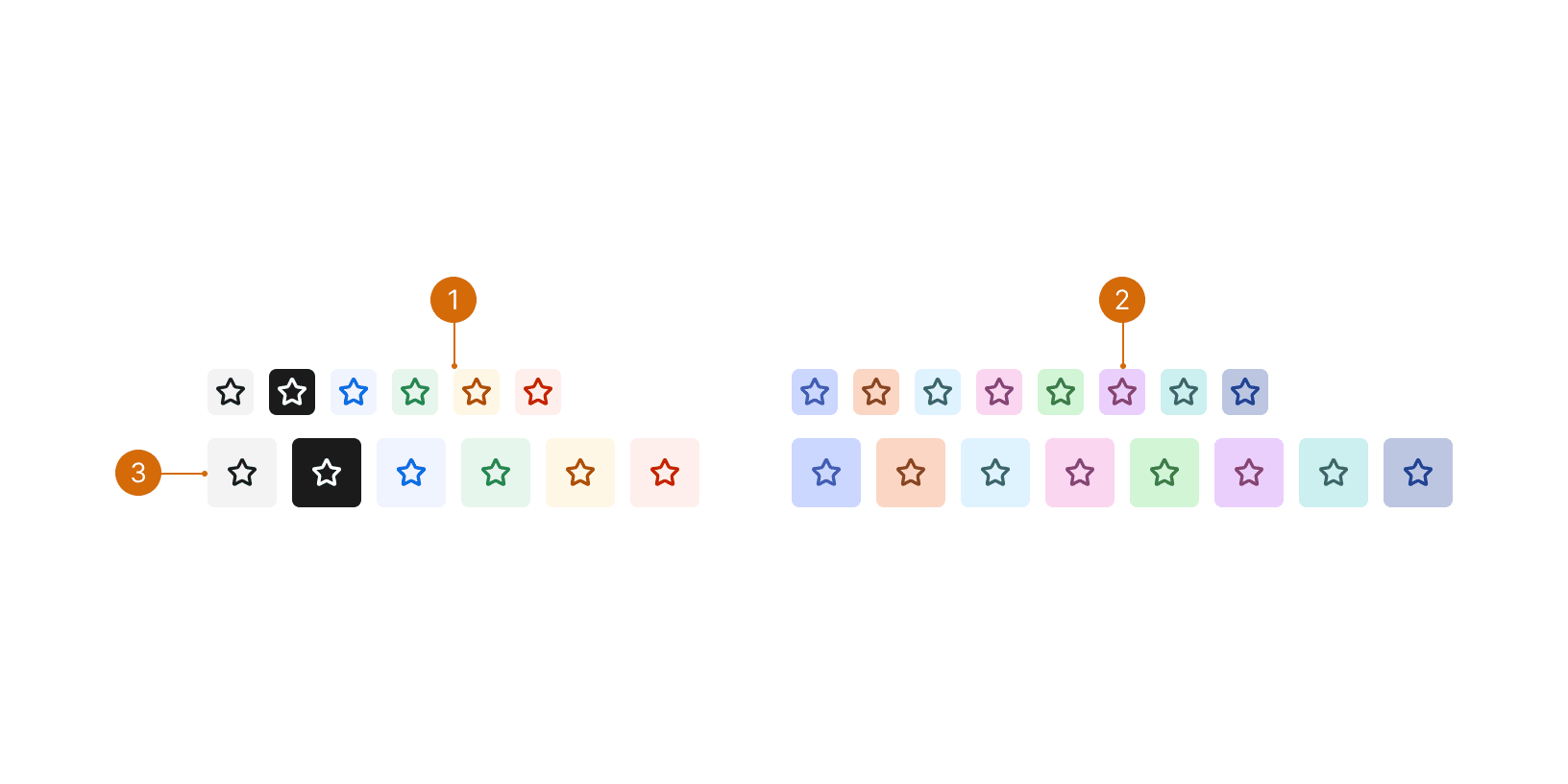
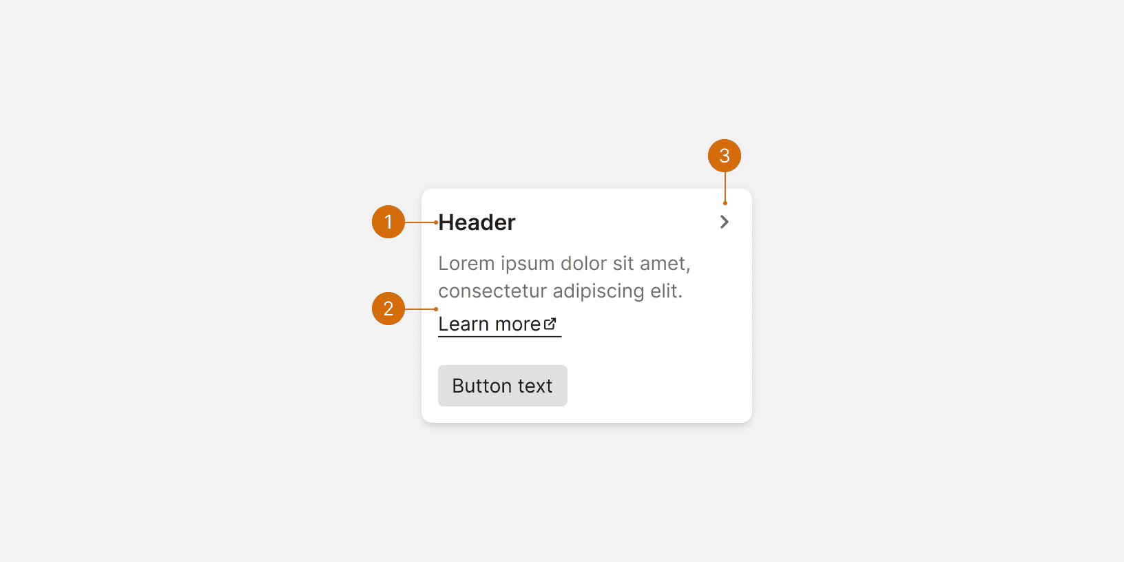
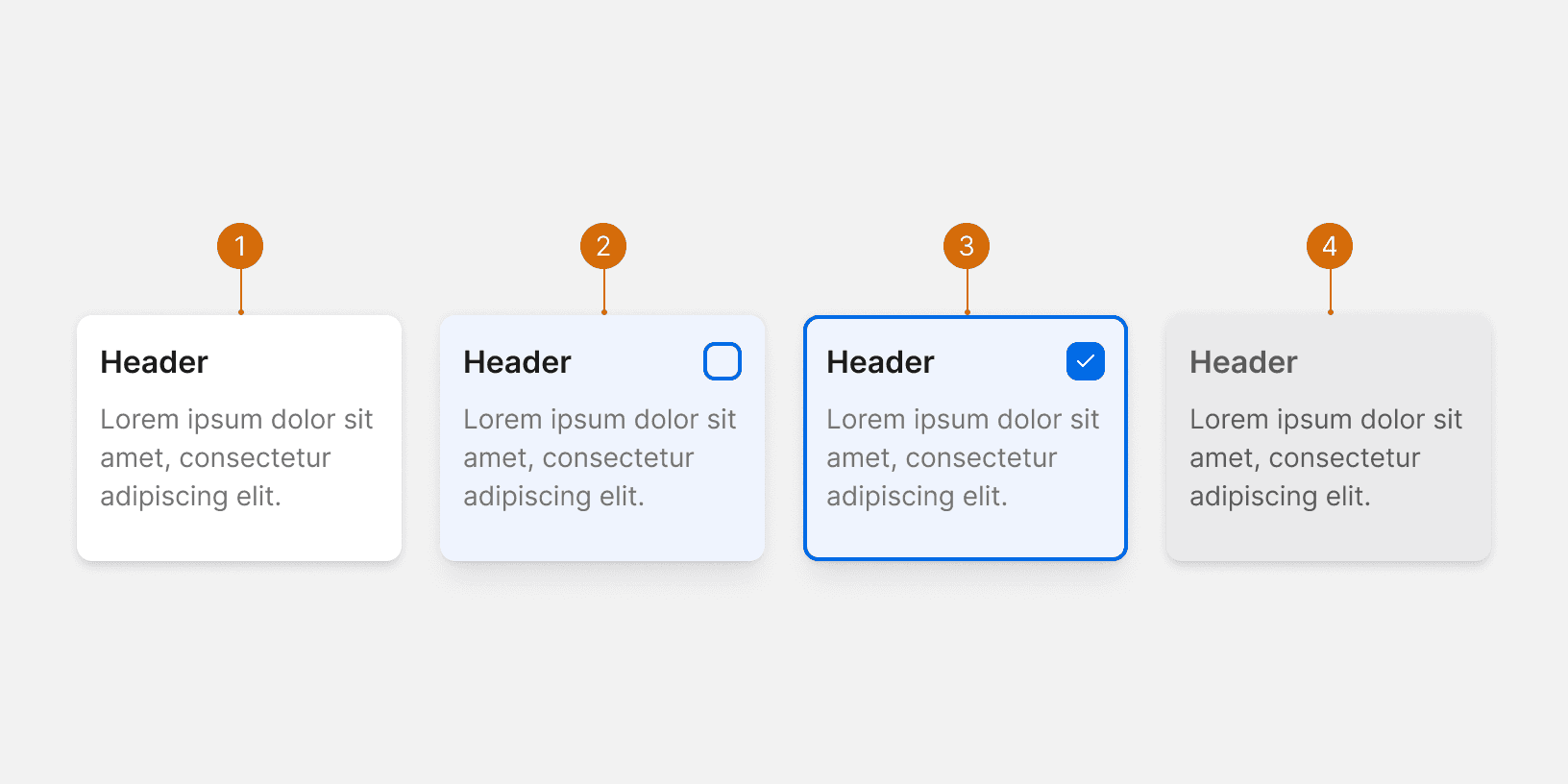
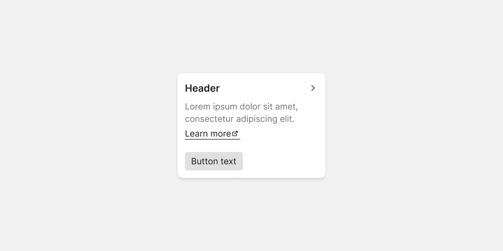
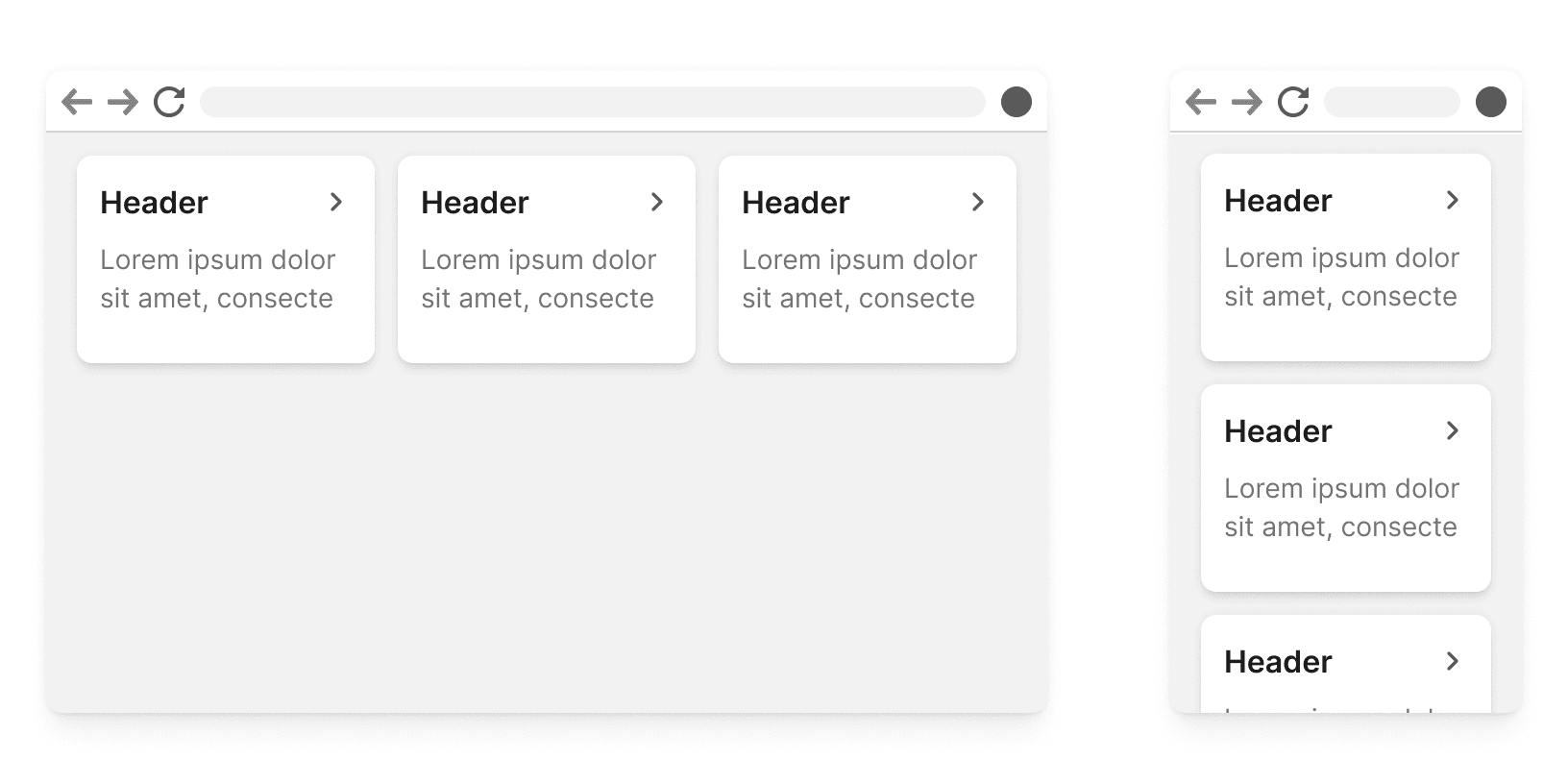
Ready

Interactive Card

The Interactive Card is a flexible UI component designed to display content and enable user interactions.

Ready

Interactive Card

The Interactive Card is a flexible UI component designed to display content and enable user interactions.

Ready

Interactive Card

The Interactive Card is a flexible UI component designed to display content and enable user interactions.

Anatomy

Anatomy

Anatomy

  1. Header: The title of the card, providing a brief context or summary of the content.

  2. Content: Contains the main content of the card, which could be text, numbers, or other elements.

  3. Action: Indicates additional actions or navigational cues. This will change depending on the card variant.

Variants

Variants

Variants

  1. Select: This card is designed to allow users to select from multiple options. These can be used to allow single selection or multiple selections.

  2. Navigate: This card includes a chevron icon, indicating that the card can be clicked or tapped to navigate to another page.

  3. Metric: Designed to highlight numerical data prominently within the card body, making it suitable for dashboards and analytics.

  4. Contextual Menu: This card variant includes a contextual menu, allowing users to access additional actions or settings related to the card content.

  5. Interactive Card Group: This is used to group related workflow starting points on a page. It creates consistent spacing and behaviors for rows of cards.

States

States

States

  1. Default

  2. Hover

  3. Selected (Select variant)

  4. Disabled

Behaviors

Behaviors

Behaviors

The content container of the interactive card can support any type of UI such as links or buttons.

Interactive Card Group Responsiveness

At the small breakpoint, the cards will stack vertically.

Best Practices

Best Practices

Best Practices

1. When to use

Use interactive cards to display a short list of distinct pieces of information or choices such as report types or app features. When presenting a long list of similar information such as campaigns or line items, consider using a data table. Tables are easier to scan because the positioning and structure is more predictable to the eye. ¹ ²

2. Error messaging

When using an Interactive Card Group to display a required selection, a message card should be used to indicate a missed selection.

3. Permissions

When using interactive cards to display features and a user does not have permission to access a feature, use the disabled state so that the user can still see the feature. If the user clicks the card, display a Flash Message to provide a suggestion of how to gain access.


Content

Beta

Content

Beta

Content

Beta

The header should function as the button label that informs the user about what happens when they select the card. Keep the content descriptive, clear, and concise. Do not overwhelm users with excessive information or complex details. Interactive Cards are meant to allow for quick decisions and as entry points to more information.²

Create Build

Set up your Google Ads search campaign in Basis.


Create Build

Set up your search campaign build in Basis. This built-in tool allows you to enter all of your search campaign details, including ads and keywords, and then export it to Google Ads. Features include version control, export to different file formats, and cross-collaboration with team members in Basis.

Upload Build

Upload a Google bulksheet or Basis template file that contains search build details.

Upload Build

Upload the Google bulksheet or Basis template file that contains your search build details. You can download a blank template. If you try creating your own, it may not upload successfully, so we recommend using our template.

Need more guidance?

Suggest an addition or an edit.

Need more guidance?

Suggest an addition or an edit.

Need more guidance?

Suggest an addition or an edit.

© 2025 Basis Technologies