Ready

Row Selector

The row selector allows users to add items to a list. The row selector uses a large target area along with feedback colors, and iconography to give users a visual way to build content.

Ready

Row Selector

The row selector allows users to add items to a list. The row selector uses a large target area along with feedback colors, and iconography to give users a visual way to build content.

States

  1. Default

  2. Hover

  3. Disabled

  4. Remove

  5. Checked

  6. Intermediate


Best Practices

1

When to use

The Row Selector should be used to give user a more visual and explicit way to "add" items to a list.

Do

2

Tooltip

All Row Selectors are required to have a tooltip explaining the action to the user.

Do

Don't

3

Multiple Instances

Row Selectors may be used to add multiple instances of the same item to the parent item. Once a single instance has been added, the user can hover again to show the plus icon and add a second instance.

Do

Content

1

Tooltip

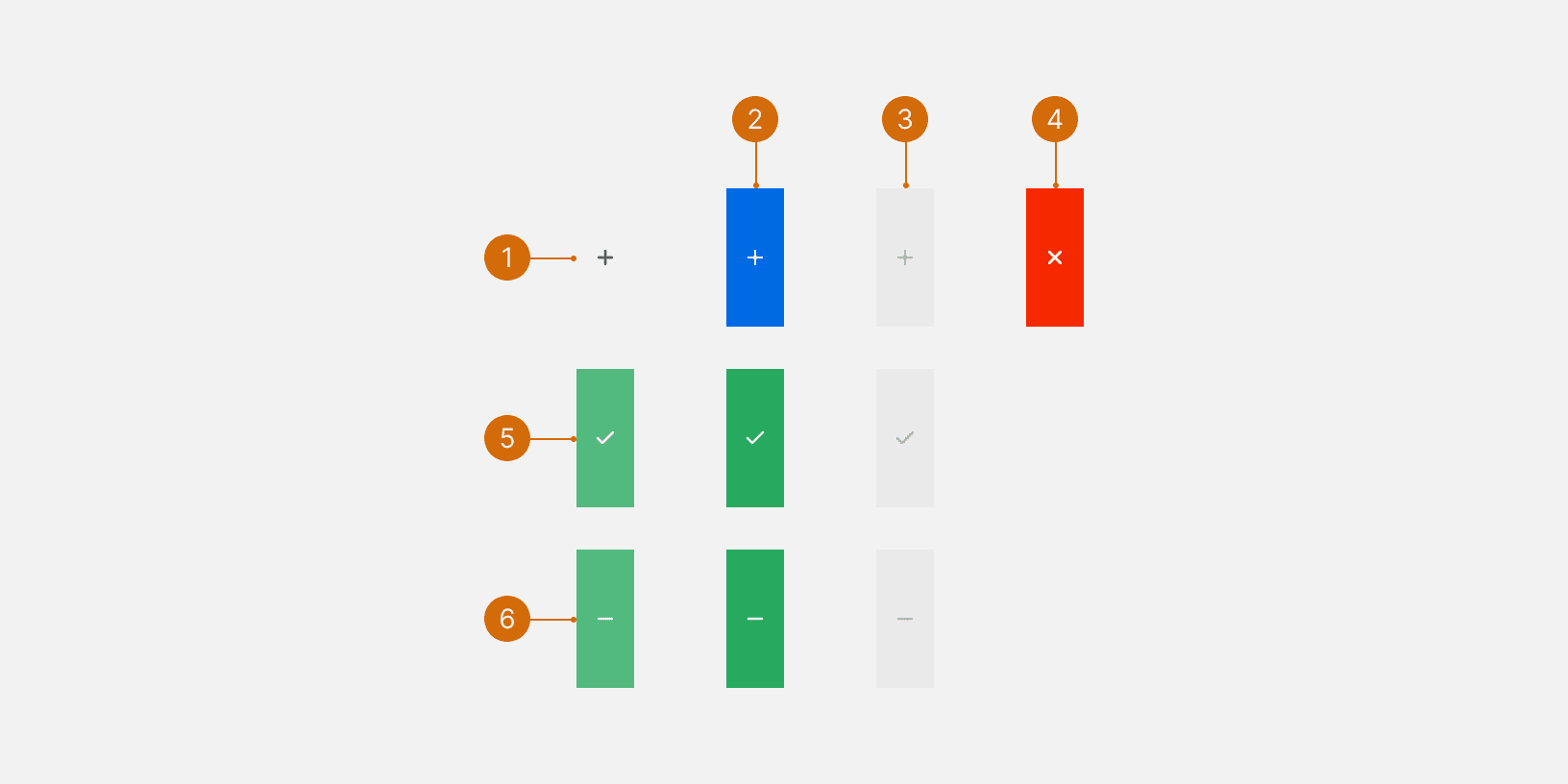
The tooltip should be a verb phrase that includes a verb for the action the selector takes and a noun that describes what is being impacted. The standard verb for selectors that we use is “Add”.

If the selector is adding multiple items, include the total number in the tooltip. Make sure the noun is plural.

Do

  • Add location

  • Add properties (4 currently added)

Don't

  • Add

  • Add properties to the tactic (four)

© 2026 Basis Technologies