


Content
1
Labels
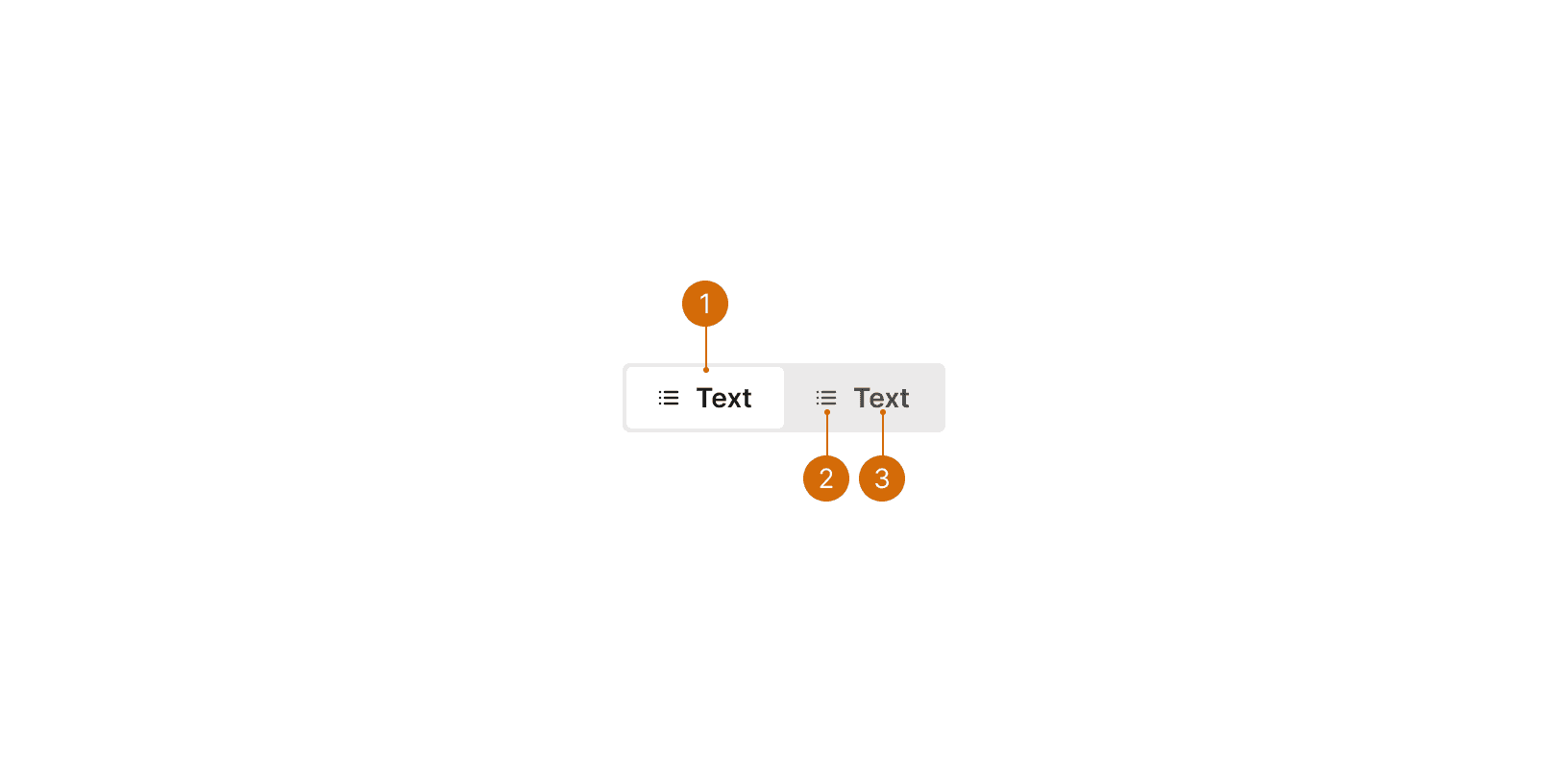
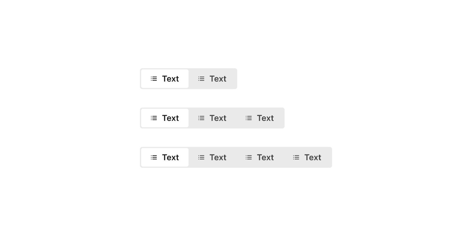
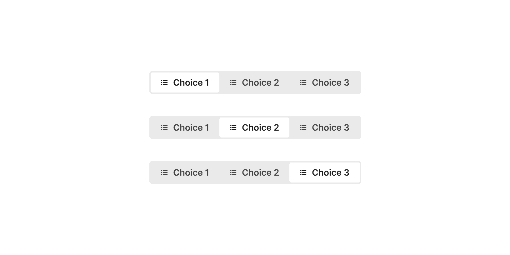
The segment control labels should be short and easy to understand. Try to limit labels to one word. Longer labels will make choices harder to quickly scan and understand.²

Do

Don't
Related
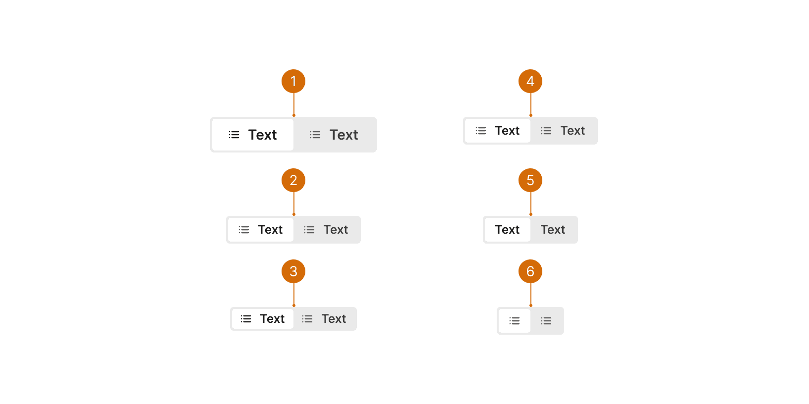
The options in the segment control should be related to a single category or task. The labels should be clearly distinct from one another so that the differences between the options are clear to the user.


