


Content
1
Short
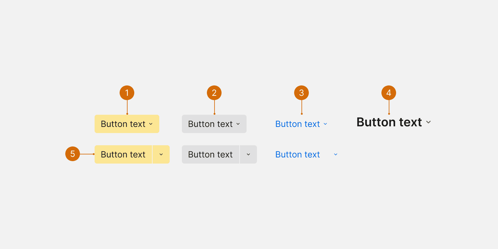
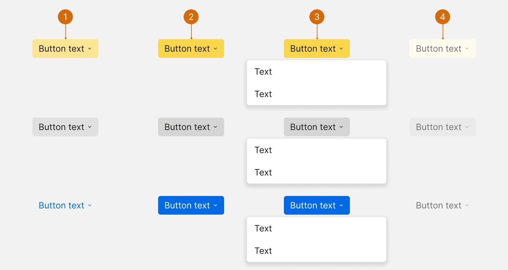
Keep the button label short. It should clearly indicate the purpose of the selection and what they will find in the menu. The button label should be a verb or verb phrase.
2
Sentence case
Use sentence case--only capitalize the first word.
3
Contruction
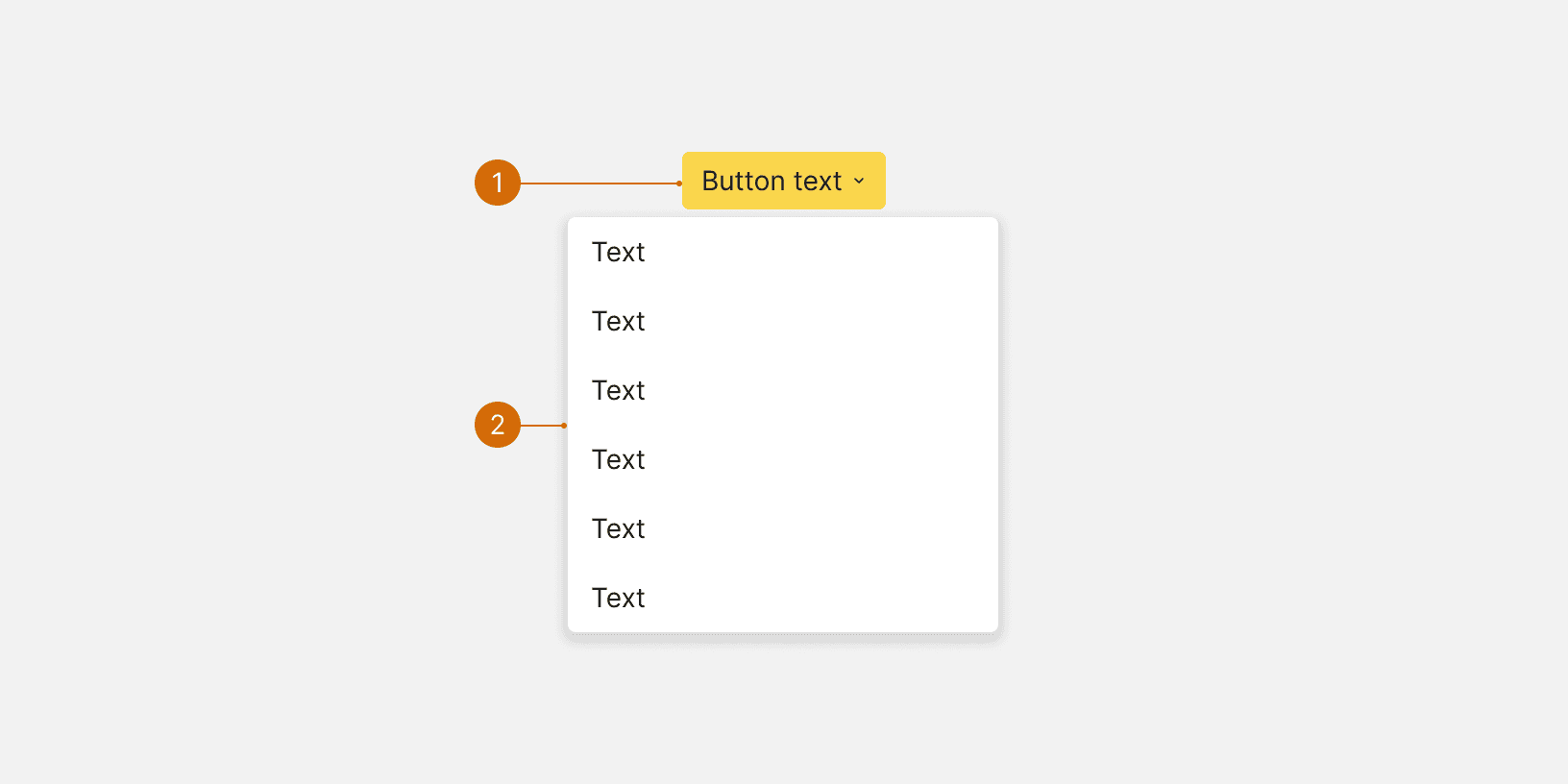
Dropdown menu items should be short and written using parallel construction. For example, every item should be a noun or a verb. Avoid repeating words if possible.
Do
Create campaign
Don't
Campaigns
4
Order
Options should be ordered in a logical manner, such as by frequency-of-use, or alphabetically as a fallback. Group similar options together to make them easier to scan.

Do

Don't

